Venice Lifestyle Center by State of Art Studio
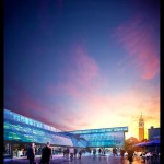
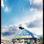
I first learned about State of Art Studio after their Maison Hermès, RPBW post on the forums and the following Making of Maison Hermes tutorial. They have a very unique & vivid style I like very much and a work process shifted strongly towards doing things in post. Their latest entires on the forums showcase this aspect in all it’s glory! You have to check this out if you haven’t yet.
Go to Venice Lifestyle Center and Venice Lifestyle Center #2 Exteriors and see Roberto showcase a part of his workflow and the original render starting points.
I’m currently working on a project that this type of process might be the best way to go… Hope it will work out well so I can share the result here too soon 🙂


Hey Ronen – thanks for your kind words!
Really beautiful work! It’s gives the sense of peeking into the architect’s imagination with an almost impressionistic look with the play of light and color.
Amazing work, vivid colors and great comp.
I really like the shot out of the airplane window, I often find these sort of shots cheesy but I think you did well here, and really pulled it off.
Thank you so much guys!