A Unique Approach to Architectural Visualization
Pushing on with the exploration of the various workflows in Architectural Visualization, I’m presenting you today the unique works of Rafal Barnas. Contrasting the previous article about a Photographic Approach in Archviz by Lasse Rode, you can tag Rafal’s methods as postwork heavy.
Considering the usual Photoshop dose going around that side of the fence, he’s way out there doing his own thing – a UNIQUE VISION STUDIO indeed! I previously featured some of his work in What Do We DO (Dah)? as an exemplar of how to show your potential clients what you can do for them. Here, Rafal presents us how he approaches a project with examples. We might select one of them and go into more details later in a new article. Enjoy!
Author: Rafa? Barna? / UNIQUE VISION STUDIO
Born in 1984. Graduated from Krakow Polytechnic in Architecture and Urban Planning (accredited by the Royal Institute of British Architects). In 1999-2009 as a member of 3-person independent film-making studio called Ignition Studios he realized over 30 short films, widely presented and awarded in many national and international film festivals.
In 2009 he founded UNIQUE VISION STUDIO. Rafal Barnas is interested in various creative fields connected with visual arts: architecture, digital and concept-art, animation, film, music, journalism. Undertaking creative projects that are accomplished on the basis of independently developed creative approach in which the main workload is focused around the idea, concept, thought and high aestheticism.
You can also follow his blog and vimeo channel.
Hi all,
Let me start by stating an important rule that I follow – When working on visualizations I reach for various techniques and I approach each project individually!
Concept and Target
Being always aware of the target… The final effect that I want to achieve for the particular project I work on is always a priority. Once the concept, has a clear shape in my head, I can already say that the major part of the work has been completed.
Everything that happens after can only be considered as the development of the first stage. Being always aware of the final effect makes it impossible to get off the track or to waste the idea on insignificant details.
Aiming at the Target
When I have an idea that both my client and I find exciting I think how to make it real. Choosing proper techniques, design and tools is absolutely crucial as it determines not only the final effect but also the pace of work.
I refuse to approach different projects equally, as frequently practiced by fellow designers (unfortunately). Creativity in finding new ways brings many benefits. On one hand, it allows me to always be passionate about my work. It also helps me develop, learn and makes every new project a stimulating challenge.
At the same time, the appropriate choice of techniques and tools positively influences the final shape of the projects.
Lets see some examples…
Biotherm Radiators
Advertising and Visual Identity
Radiators? … Sounds like a dull and boring project to work on… not so much related to Architectural Visualization too, but great topic to start with in this article to make a point.
The appropriate approach can turn this project into a highly motivating challenge and priceless experience. This was exactly the case when the producer contacted me. Initially, the project was rather discouraging, without the potential or the possibility to create something good and interesting. Of course it was just an impression because every topic, with the right approach and way of thinking, can evolve into an interesting project.
My cooperation with the client involved the creating of a full visual identification. Except for advertising spots, I was also creating websites, catalogs, brochures, business cards, etc. When conceptualizing the whole project I was taking into consideration several issues. Among the main ones was the fact that the product was relatively inexpensive. Mainly because of this, in the very early stage I have out-ruled the possibility of giving it a character of an exclusive or designer product.
Obviously, I also did not aim for working around the word ‘cheap’.
I convinced the client that the identification will successfully present his product if it demonstrates modesty, not invasive information that is carried through witty idea which is somewhere on the edge of a joke. The proposition was that the catalog would look on a shelf as a computer game. The graphic design had to attract attention… For this purpose I have designed several funny illustrations in which radiators were presented in an unusual ways…
As one of the museums exhibits.
A picture created on the sky by the fumes of flying planes.
A large installation giving warmth to the people in an oasis somewhere in the middle of freezing mountain hills.
Billboards became the basis for the rest of the projects. It was the same case with the TV spot based on the animated illustrations.
In order to prepare for the scene with jet planes I took a photo of a radiator under an accurate angle which negated the need of doing 3d for this. Using this photo as the basis enabled me to add the fumes precisely, with the right geometry. All production was done in Photoshop.
And here are the photos taken that later went into the specification part of the brochure…
Thanks to layering it was possible to animate individual elements in Adobe After Effect. I often use 2D+ animation which consists mainly of two dimensions which are embedded in a three-dimensional environment. This was also the case here. Each element of the picture making up of the particular plane was placed in an adequate distance from the cameras lens whose proper movement gave reality and depth (may also be referred too as Parallax Scrolling or Animation).
A Hospital on the Patient Bed
Plastic Surgery on a Hospital + Animated cut-out of a Hotel being Revitalized
When working with Franta Group, one of my responsibilities was to create visualization and animation of a Hotel.
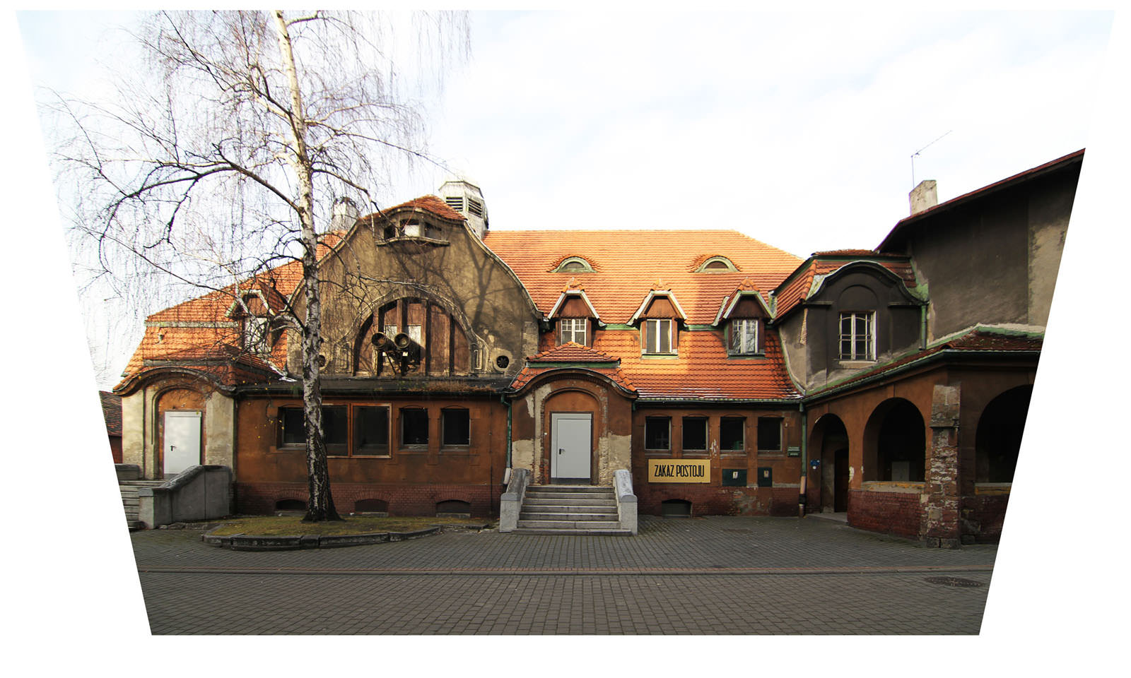
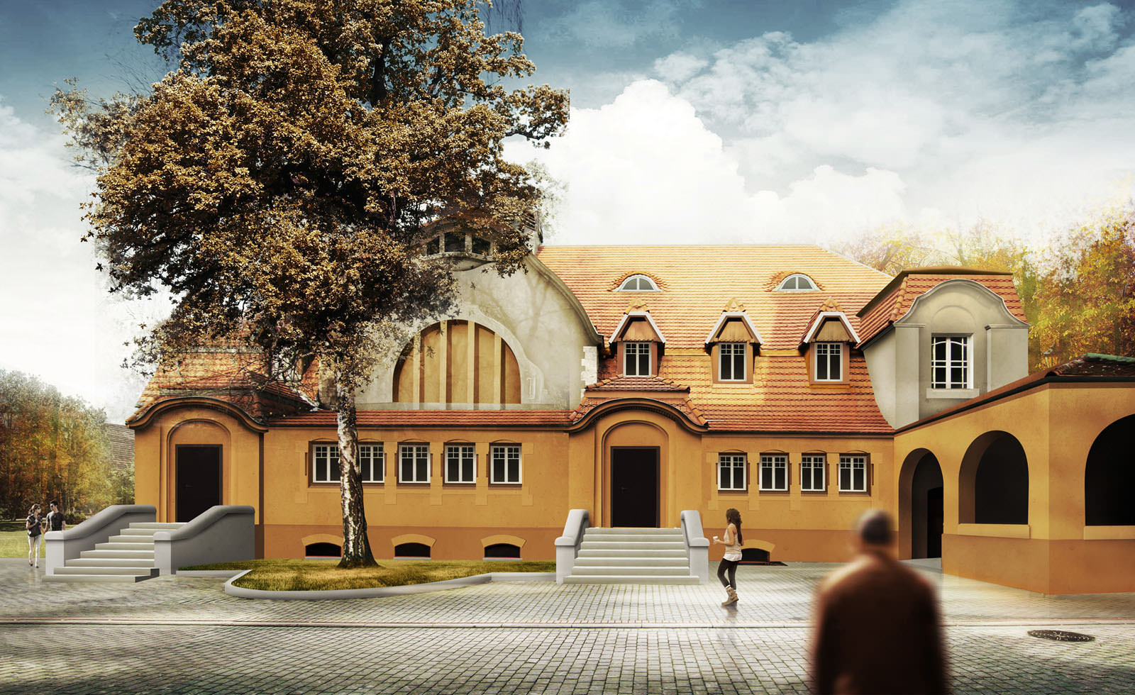
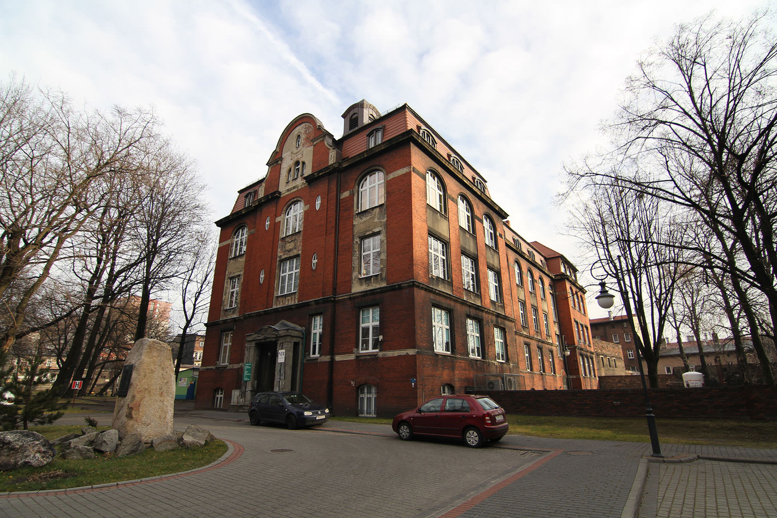
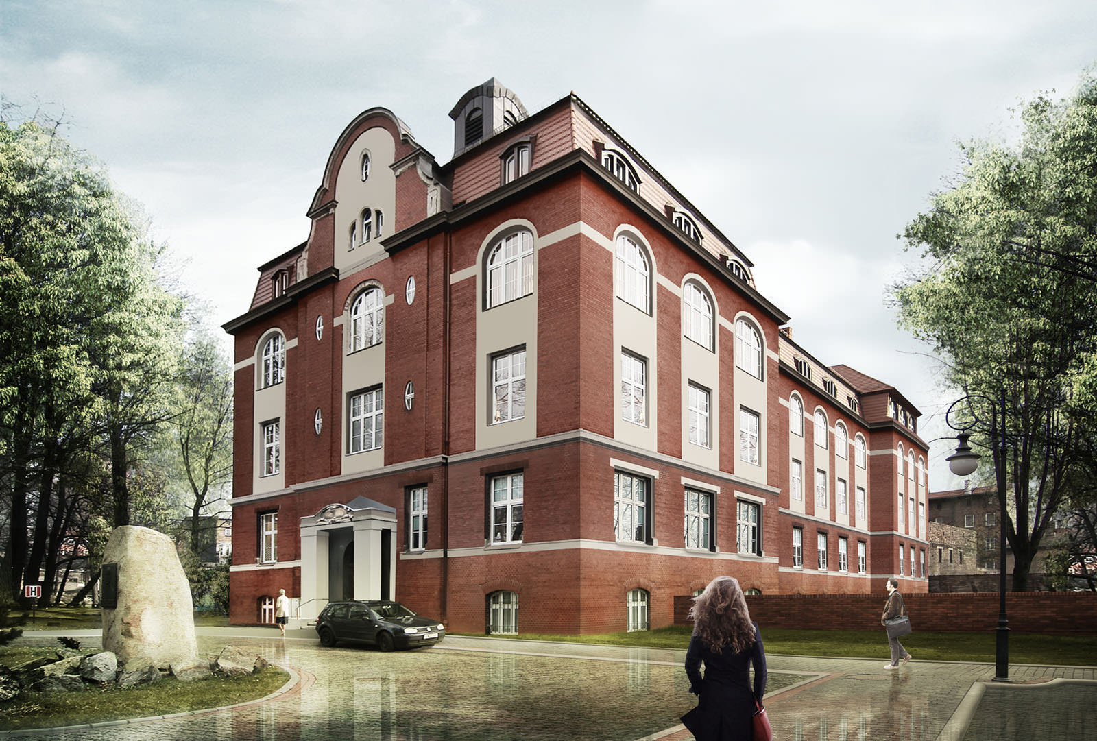
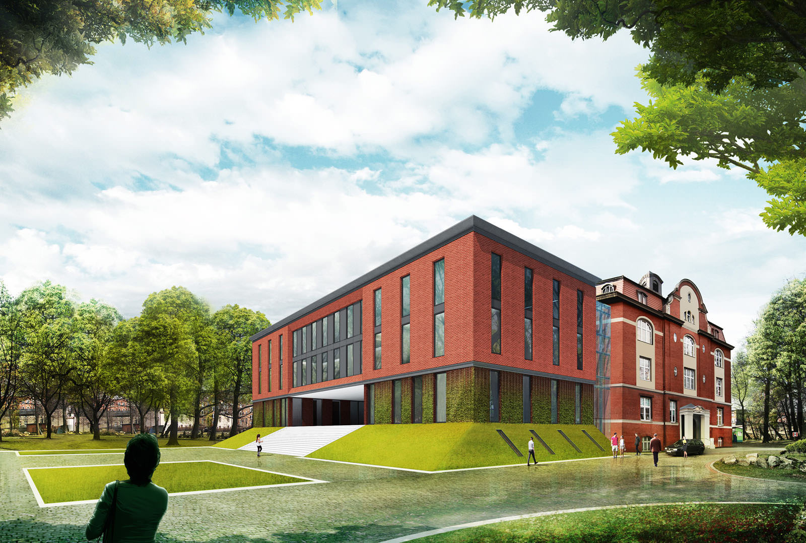
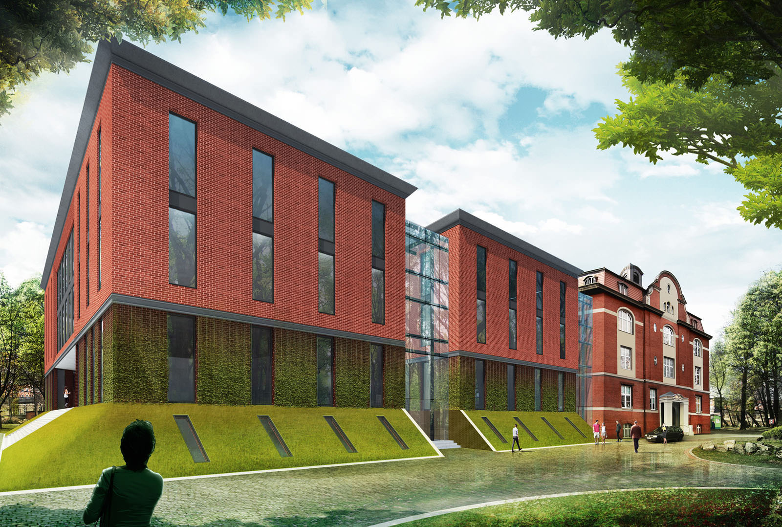
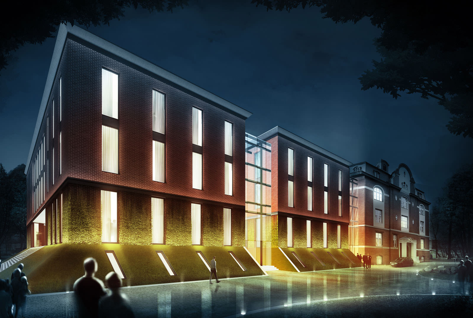
The basis for the project was an already existing but run-down object which, according to the initial projects, was supposed to be super-structured revitalized and its function was to be changed. Similar situation was in the case of the Hospital. I was asked to perform a kind of a plastic surgery on the buildings of the Hospital Complex in Chrzów.
I was therefore put in a position of a doctor and the Hospital was my patient.
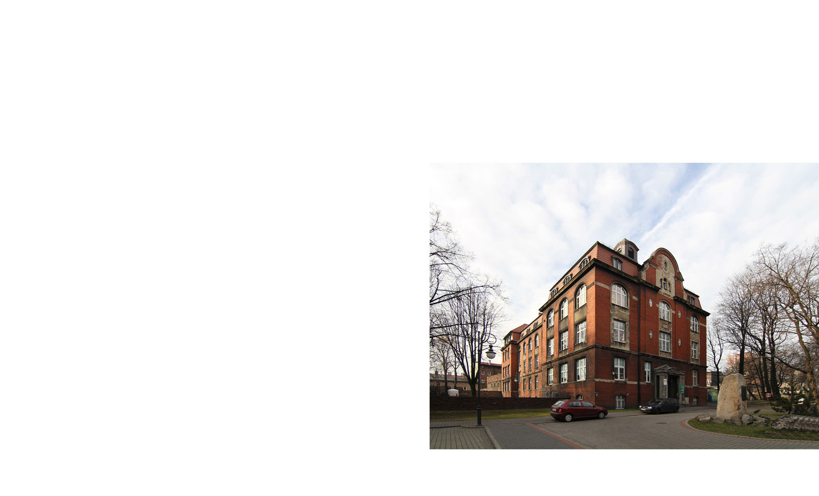
The assignment was to do a photo shoot with the patient and then to perform several beauty treatments which would enable visualizing the objects after rebuilding.
Some of the buildings required work from the basis, others which were only in the phase of a project had to be created from the beginning. The rest was given a heavy make-up. In all cases I was using similar techniques and procedures. In the first stage, I was doing a photo shoot. At my work I use the Canon 7D. On the basis of architects drafts and with the help of the SketchUP program, I created a 3D model of the re-designed objects. The following work was done in Photoshop.
Here are more views of the Hospital…
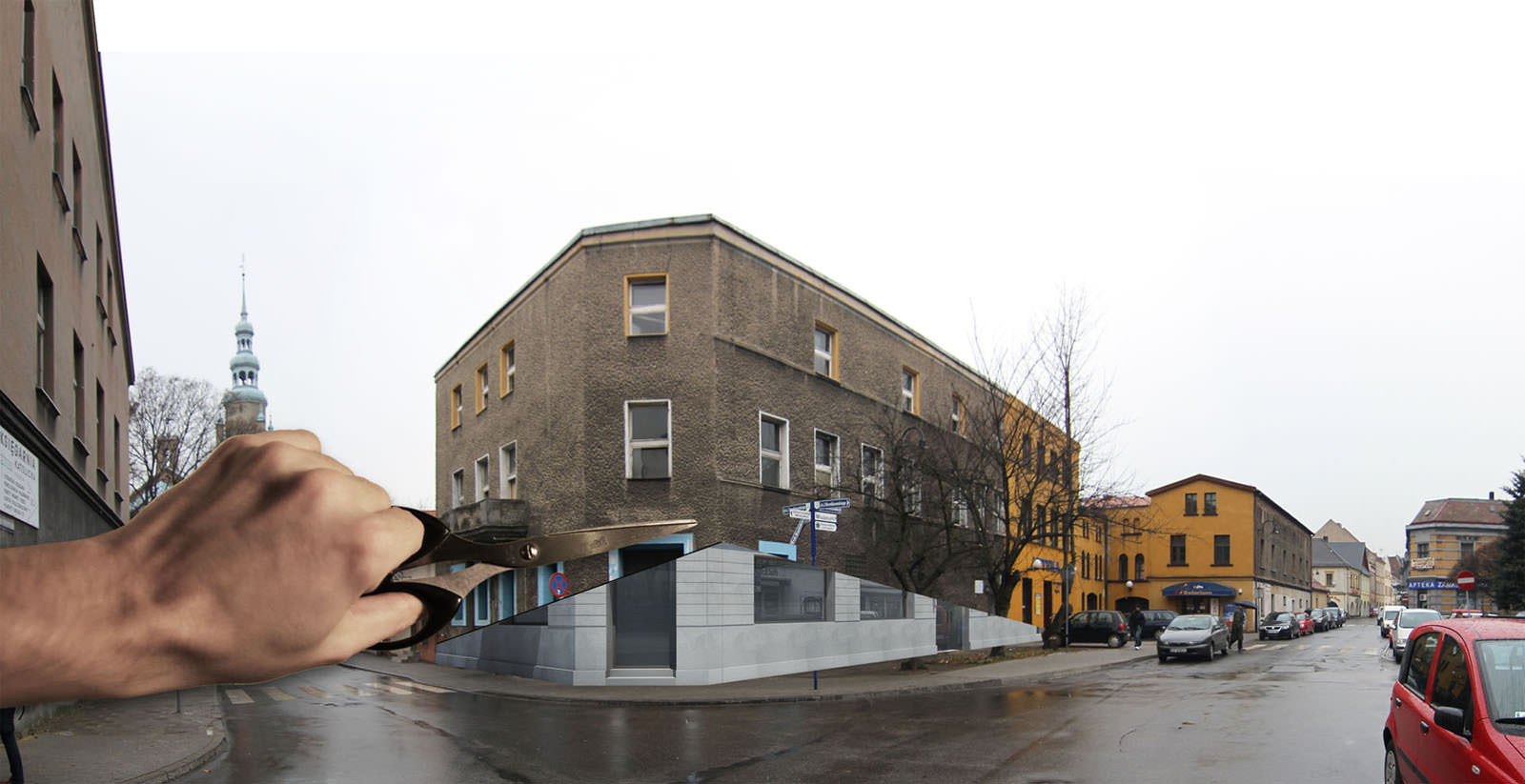
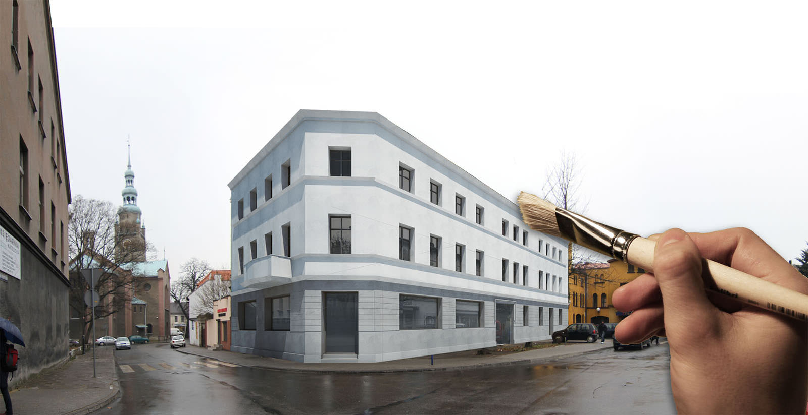
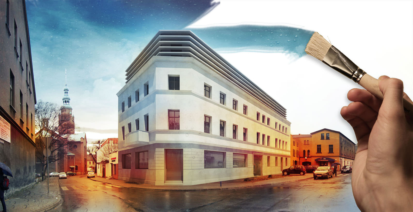
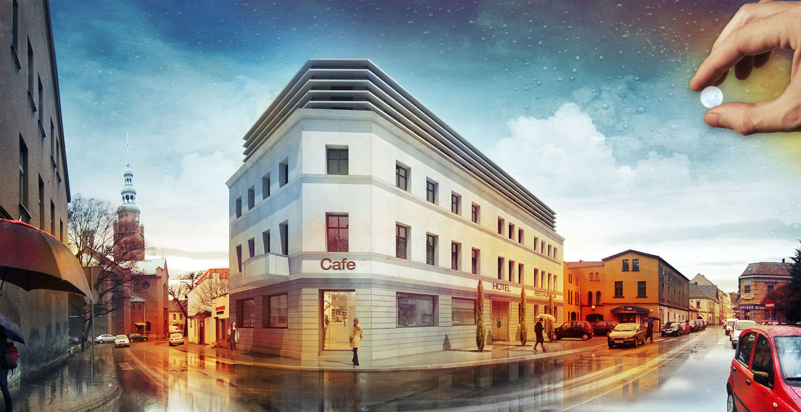
When working on a the short animation of the Hotel, I decided to give it a shape of a cut-out and a painted picture.
This was the photo I started with…
And the final result ended up like this (day + night frames)…
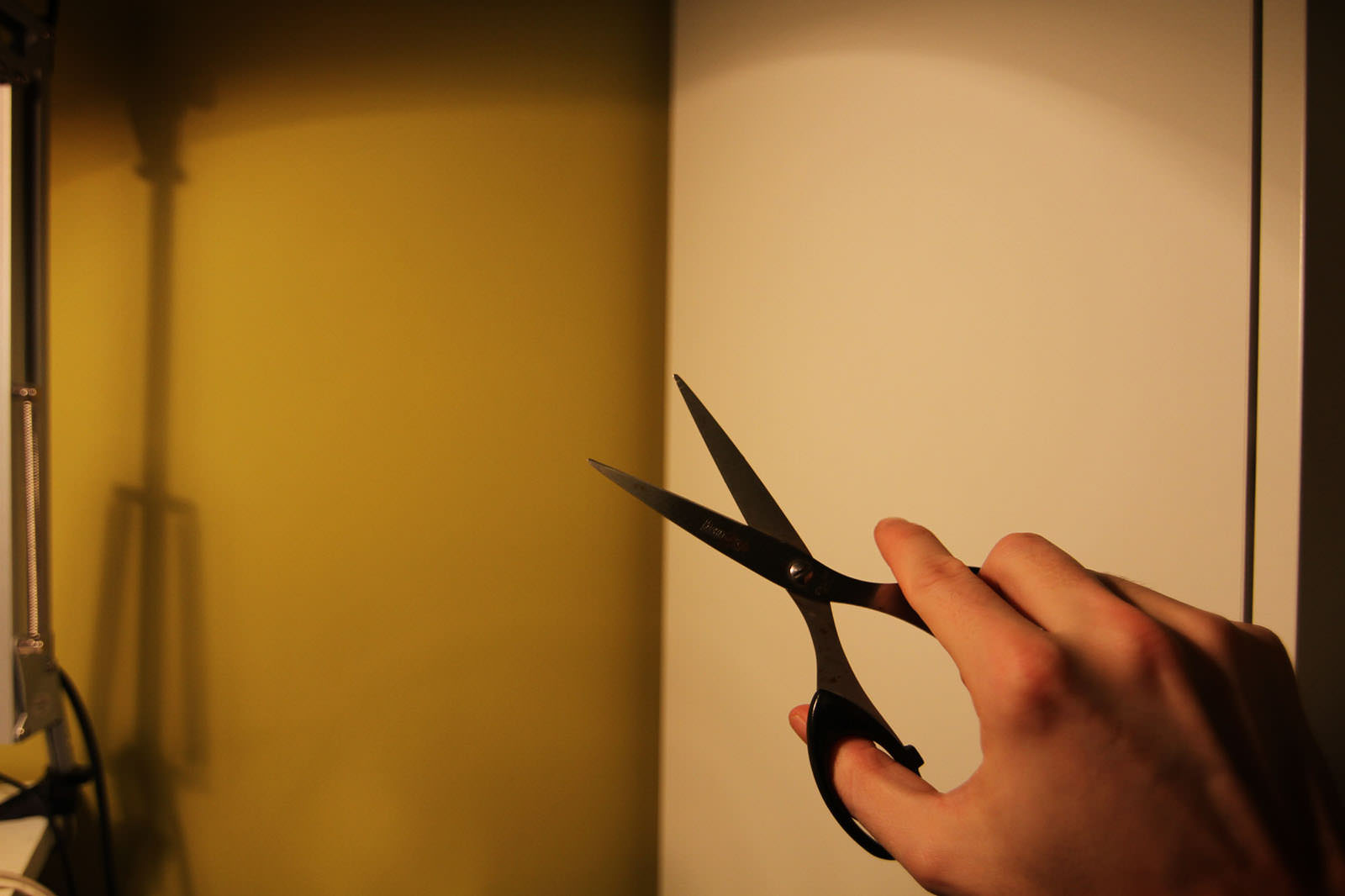
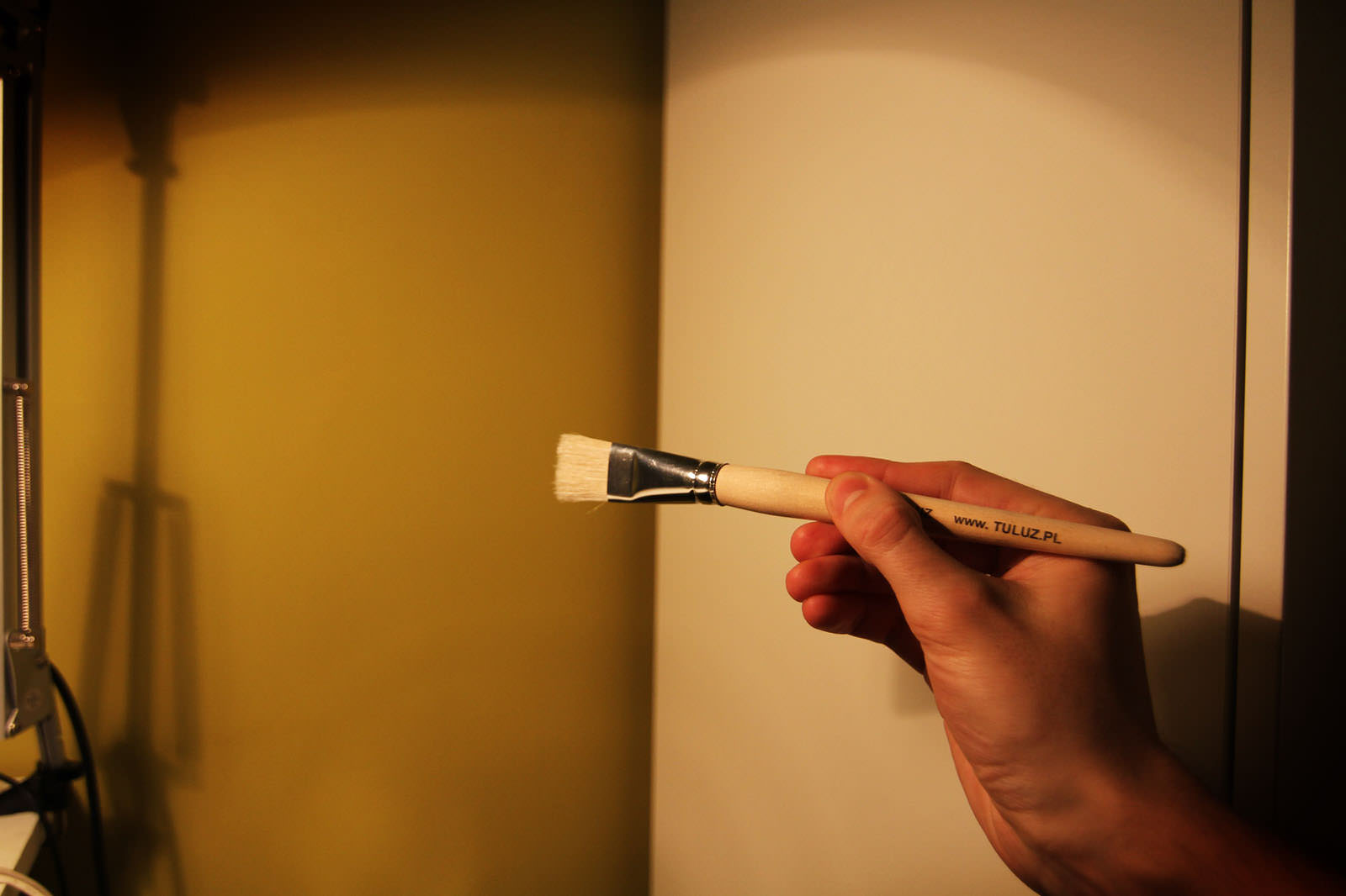
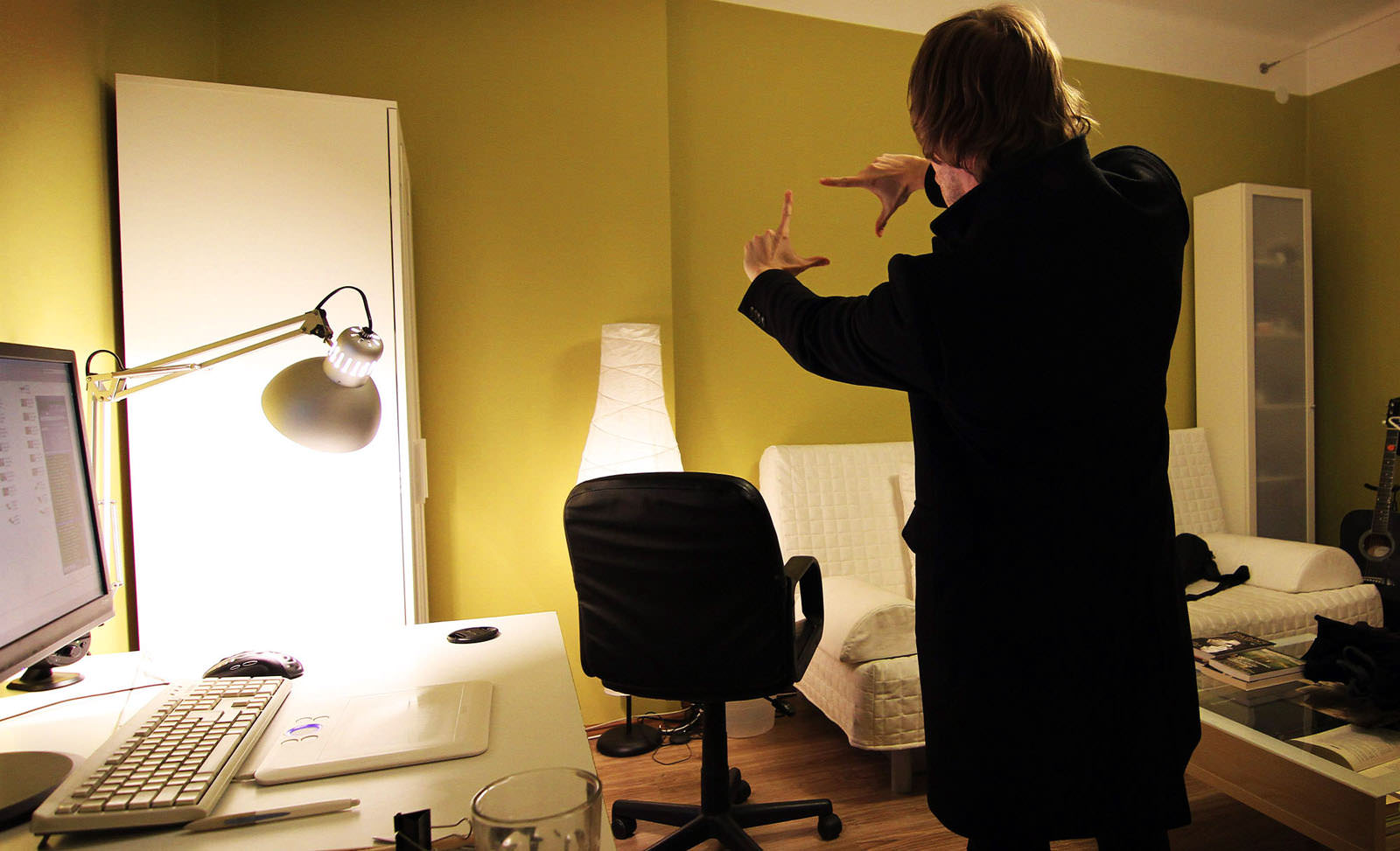
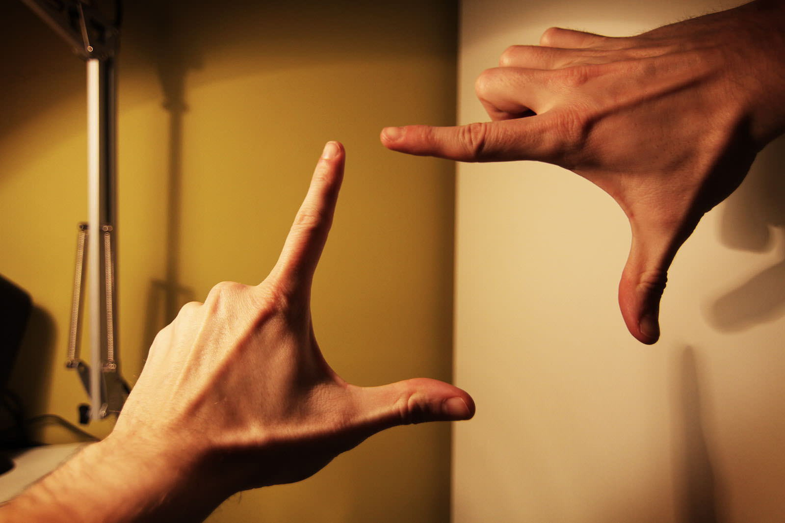
For the animation making I used a stop-motion technique. Individual frames were prepared in Photoshop and the final montage was done in Adobe After Effect. Such elements like hands, brushes or a cropping person were done in a very simple way… It was enough to quickly take some photos of my own hands.
Here are the frames I used in the process…
Here are the animations of the Hotel & Hospital…
Nowa Huta
Precise Visualization without a 3D Model
The task here was to create visualizations for the Krakow architects projects which would later take part in an international competition for the best concept of re-vitalization of Nowa Huta. Illustrations had to present a vast public area, Aleja Ró?, and its surroundings. Therefore, I decided to take one widescreen picture.
As a basis, I used several pictures of its current condition and a very basic 3D model which could outline the height and geometry of objects. This simplistic model was necessary for precision and proper perspective. I excluded the possibility of creating a precise model of the designed area as it included numerous details, very little architecture, and greens. Work on the model would have been time consuming and exhausting so I decided to do it in Photoshop environment.
these are the stages of the process…
At my work I use a Wacom tablet so very often the process of creating visualizations looks like painting.
Harbor
From Architectural model to Visualization
What if I want to make an effective visual presentation of a project but modelling and working with 3D software makes me sick? I would still like to have nice (GREAT) visualizations, but I completely lack the patience to prepare, arrange and wait for the render. What then?
It turns out that an architectural model, a simple, linear 3D model built in just few minutes or even a quick sketch can make the basis for the project.
In this way I created visualizations to the projects on which I was working few years ago – The Harbor.
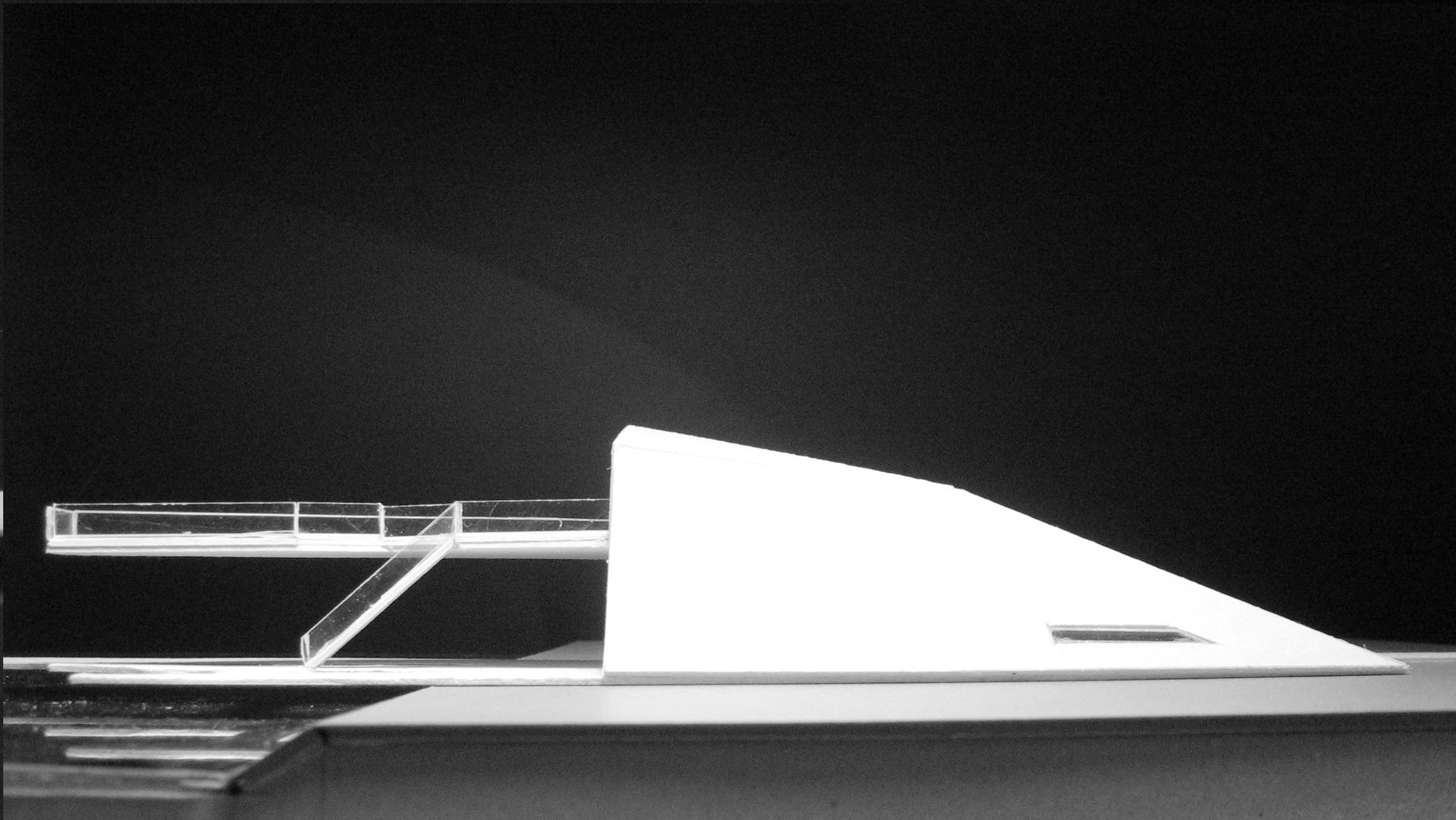
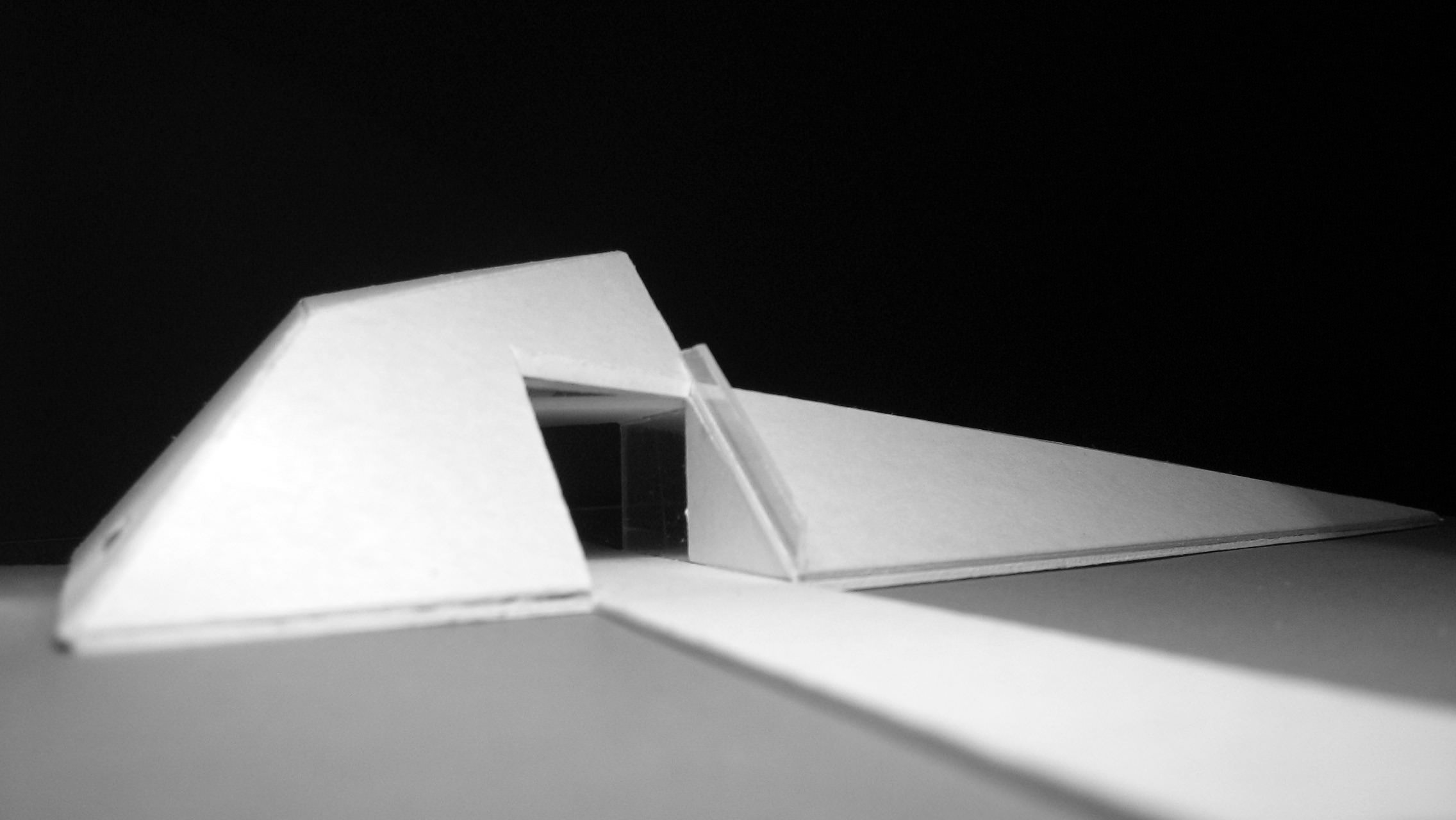
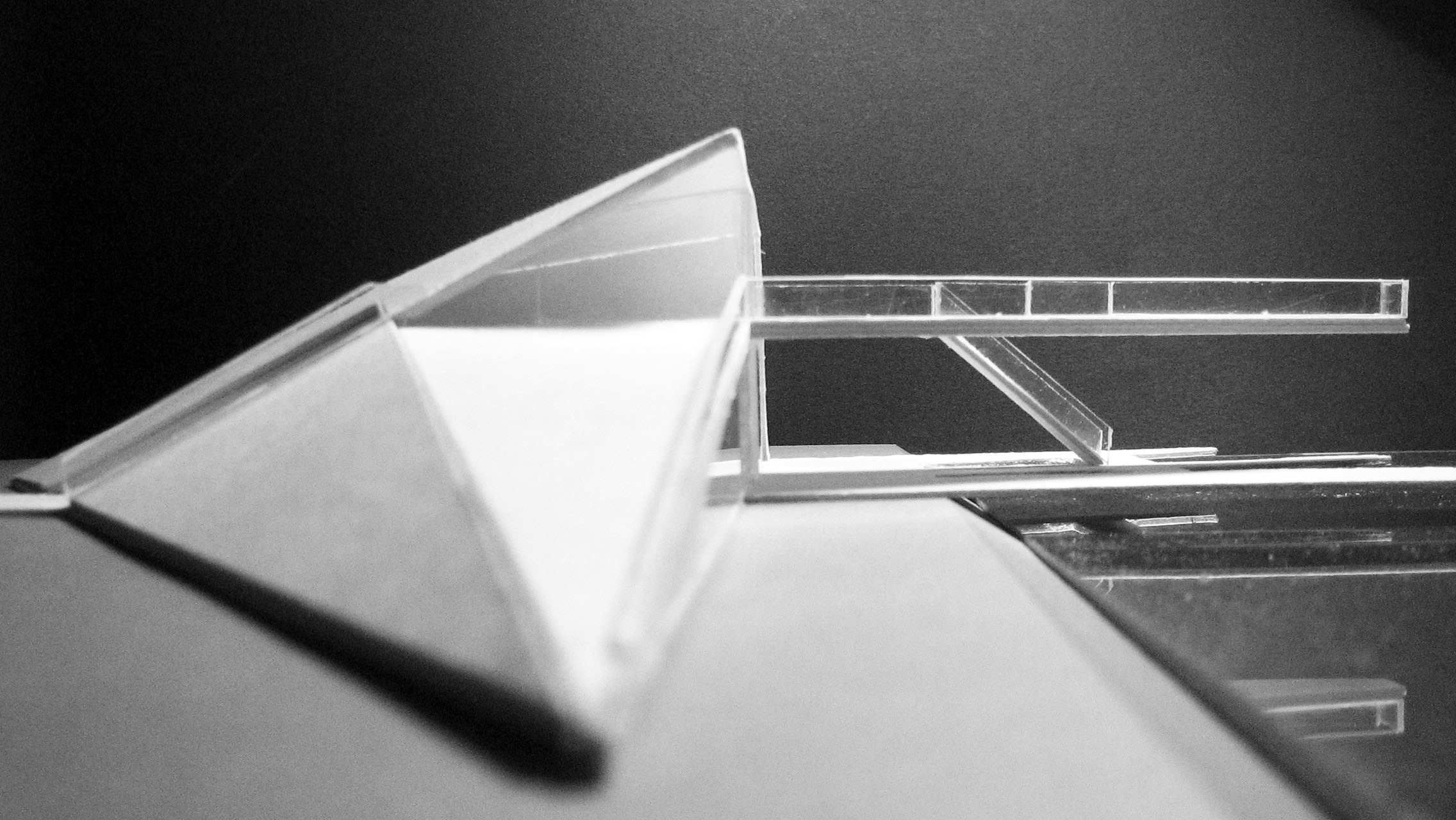
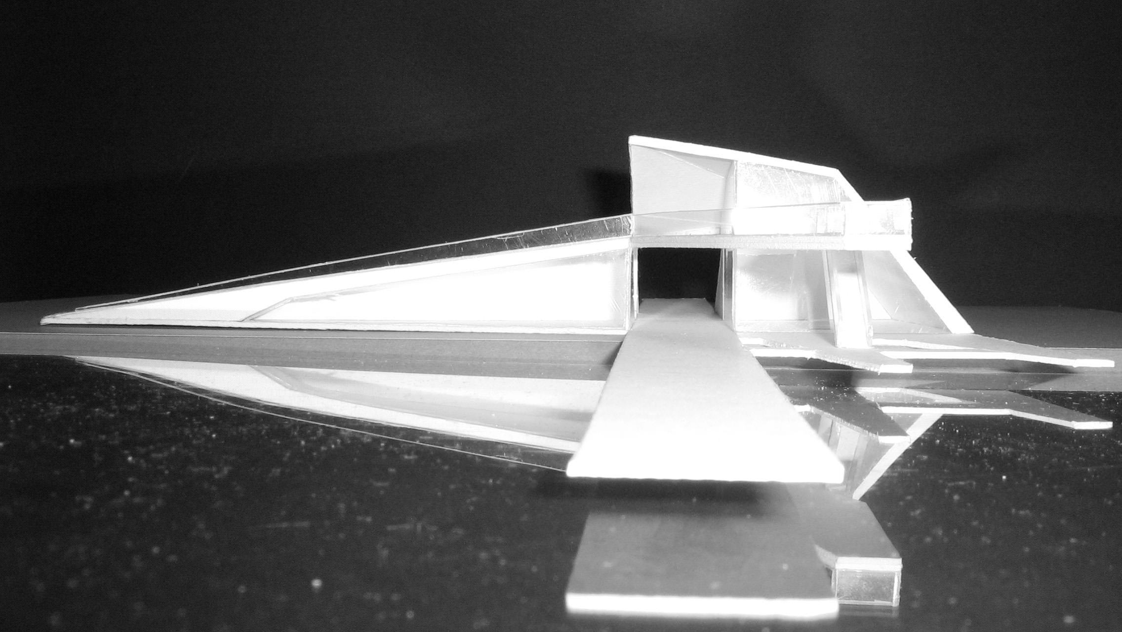
The starting point was the photo of an architectural scale model. Selected from a set of such photos taken of the scale model…
When designing, I am in favor of combining various techniques which can work in an harmonious way. Everything has its beginning in the head, somewhere among various thoughts and ideas, with continuity in sketching, simple architectural model, working 3D model, technical 2D drawings. Such correlation enables fluent and highly conscious development of the concepts, and helps maintaining control over the space, function and aesthetics at the same time.
These are the two final paintings I made of this original photo…
The illustrating process is presented in the video below.
Here’s another more recent use of the scale model in a more extensive way…
Starting with Lines
SketchUP Linework Painted as Final Visual
When working on the visualizations of my independent project of the Aviation Museum I used simple, linear pictures exported from the SketchUP. The whole painting post-production was done inside Photoshop.
SketchUP exported line-work…
Wacom + Me / Painted result…
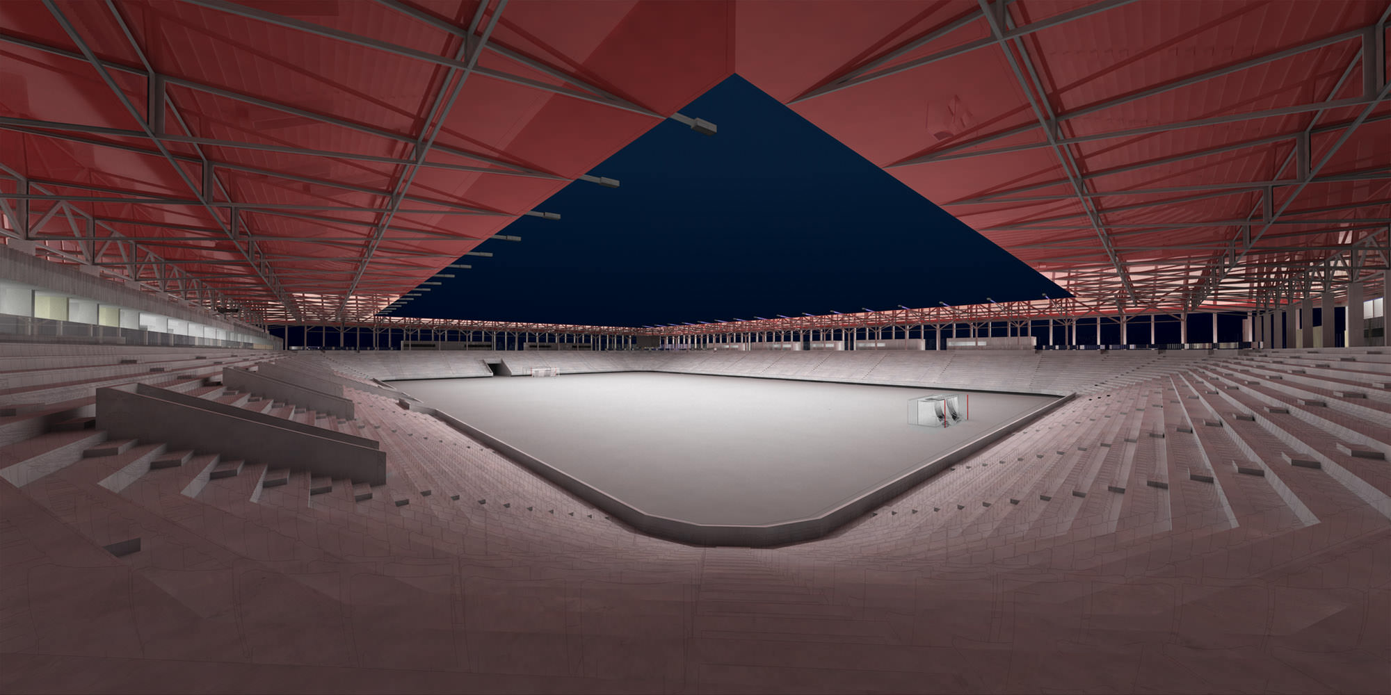
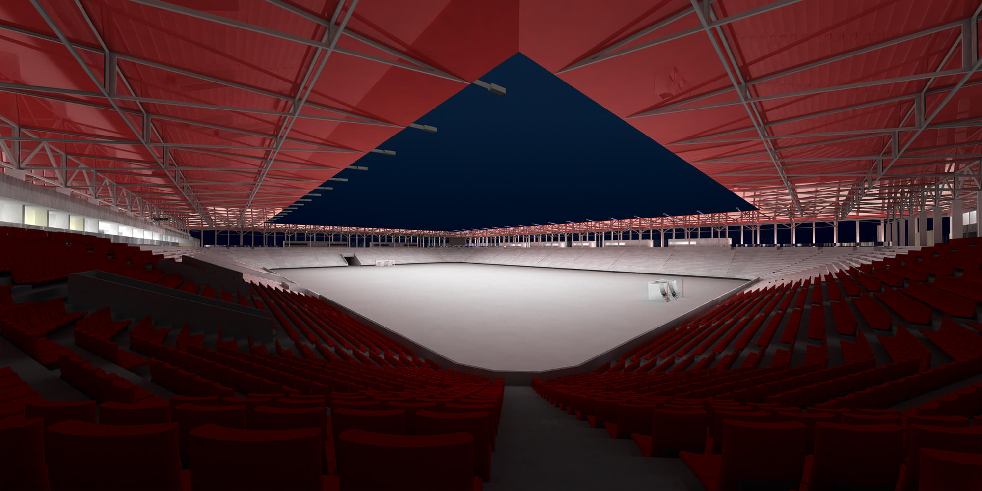
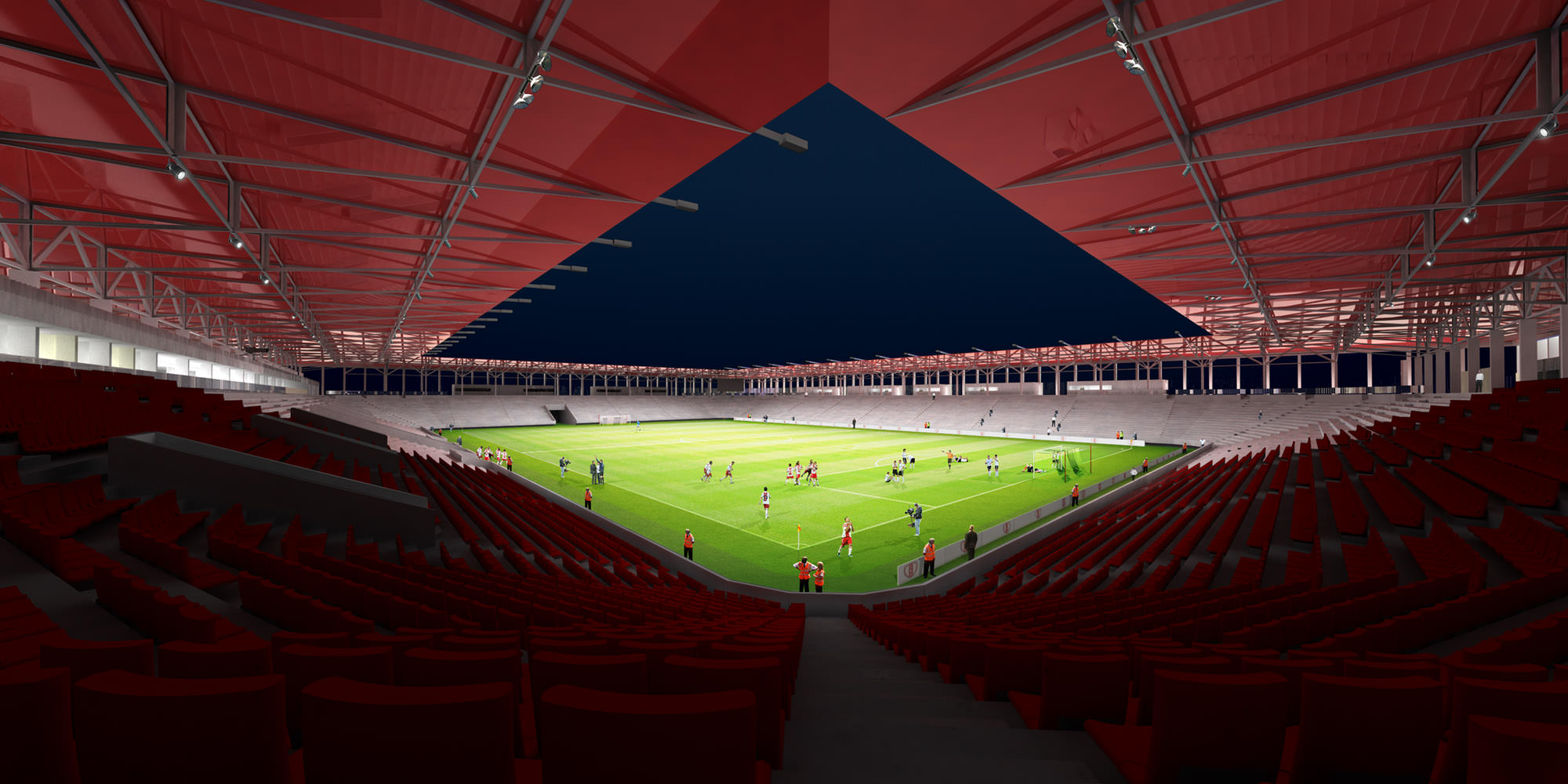
Harmony of Creation, the visualizations I did for Jems Architekci of the LKS Stadium and Sport Complex also started with linear renders exported from SketchUP.
I’ve added to that power of V-Ray rendering to get the basic clay render and shading frame…
Add to that massive post-production done inside Photoshop, painted with the help of my Wacom Tablet mostly (several stages of this shown below).
And you get the final look!
Here’s the animation I created in AE out of all the layers made in Photoshop.
Thanks for following!
Rafal.








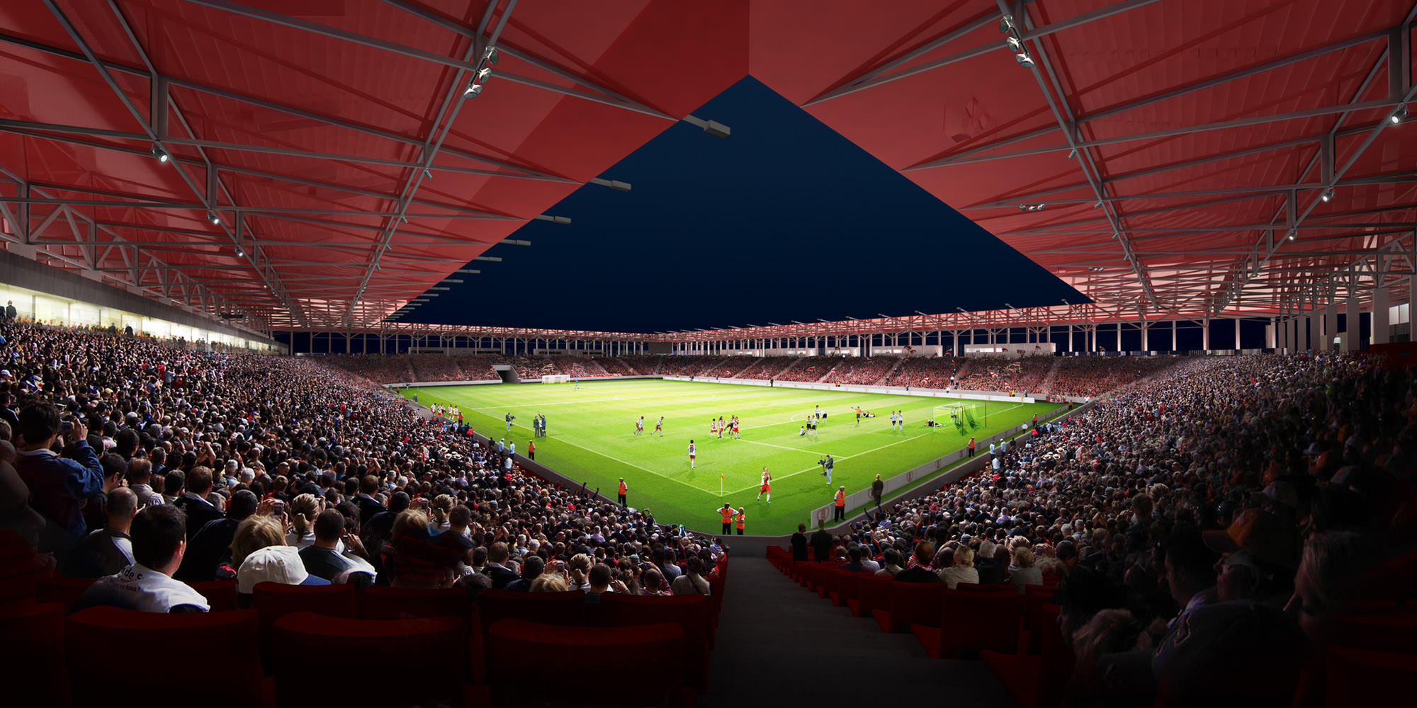


How did you to that arena with all those photos of the crowed??? getting the correct angle is probably a killer. Finding the right images and in the correct dpi is tedious right?
Impeccable 🙂
I am looking forward for some fine tutorials 🙂
Thanks.