The Colosseum by Uniform
Uniform have recently finished a short film showcasing The Colosseum project in Bucharest, Romania. Visualizing retail centers is not an easy task since it is a large scope work and it has become rather difficult to be unique with all those mega structures looking very similar to one another. I had a little chat with Mark Lee from Uniform about this project trying to gain some more insight about their process and Im sharing it here with you too.
Checkout the animation first and feel free to ask anything you like in the comment box below… I’ll make sure Mark gets to see this.
Mark Lee describes the key process points
The concept for the film was for it to be a Teaser Trailer’ for The Colosseum. Its aim was to integrate key messages about the developments offer within the fabric of the building, providing the viewer with a concise overview of the unique offer of the The Colosseum. The messages guide the viewer through the space whilst highlighting the quality of the design and finishes.
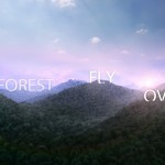
We decided to integrate the text into the fabric of the building and not using standard overlays to highlight different architectural details and material qualities, for example; changes in material, shadows, lighting, and reflection.
We chose a slow pace for the film to emphasize a classic, considered feel. The camera moves emulated jib and dolly moves used in the cinematography of commercials, TV and film. We kept each shot quite short to build a sense of anticipation and show the idea of the film being a teaser of the real thing.
The edit style used fades and dips to black and not straight cuts to add to the considered, quality feel and create a soft edge to the transitions between shots.
Moodboard & Storyboards
Uniform gathered the main ideas for the massage treatment and animation flow in nice and orderly moodboards and storyboards they describe the key points during the animation.
Site overview trick shot
Uniform pulled a clever trick on the last bit of the animation, using a ready-made physical scale model of the project as the base for the night closing overview shot.
Rather than adding in more detail to the model for the entire site, they took a photo of a physical model of the site to turn it into a night-time image. They then added extra animated elements such as water, cars and lights to add to the realism.
Original scale model photo.
The result backplate after postwork.
You are welcome to comment on this article and ask questions using the comment box below!
If you liked this article, and want to be notified when new posts like this are being published, please consider subscribing to the blog via one or more of the options below.
- RSS – Get updates as posts get publish.
- Email Newsletter – Periodic updates plus more 🙂
- Twitter – Updates about the blog and other things too.
- Facebook Fan Page – It’s new and cool if you like Facebook.


AMAZING JOB
I like all present!!!