Personal / Commissioned: Personal Project
Location: Melbourne Australia
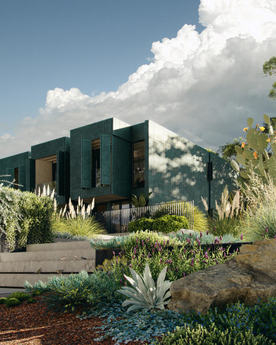
‘Native’
Illustrated by Duy Phan
I have noticed ‘Ordered’ and ‘Chaotic’ are going hand in hand in most if not all great artworks. It’s always that the most satisfying viewing experience is finding the rough imperfection surfaces that go with the sophisticated perfection lines. This, personally, might be the reason for my massive love of native garden design, especially when it goes with minimalist architecture.
I find myself being heavily attracted by the wildness of native vegetation yet the intention of placing and grouping them together from the landscape designer makes them lift each other’s beauty up so naturally.
‘Native’ is my appreciation for indigenous garden design, more specifically, Australian landscape.
As visual artists, if we get a strict architecture brief but an open landscape design to be populated by our own skills, I believe chances are we can have the potential for making great images, isn’t it?


I can definitely relate to that @duy-phan
Probably why I like the gardening part so much, but this really gets better when there is a proper landscaping brief.
Nice touch with the sparrows…
Any other views for this one?
RB
Thank you a lot @ronen
Agree with you, always nice to have a proper landscape design to execute!
There are more views coming! a bit of tweak to work on and will be sharing very soon!
Best,
Duy
Very much looking forward to see these @duy-phan