Studio: Omegarender
Client: Milk Street Baby
Personal / Commissioned: Commissioned Project
Location: - United States
Today we’re going to take a little break from exteriors and show you how product visualizations can perfectly interact with interiors, especially when the product is furniture — one of the utilitarian interior items.
Our new client, Milk Street Baby, is a manufacturer of children’s furniture, specializing in cribs. Milk Street Baby considers cribs to be one of the most important purchases for young parents because, in their own words: “It’s the only place where you will leave your baby unattended for up to 8 hours. You want that space to be a haven; safe, comfortable, and beautiful.”
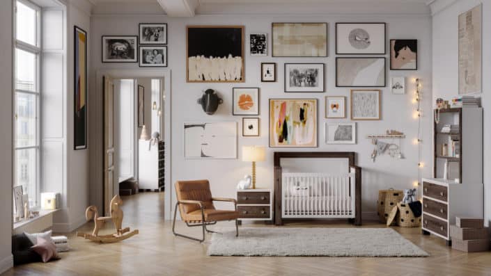
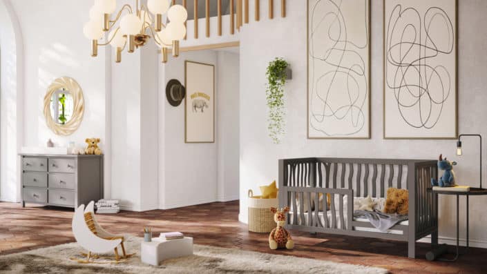
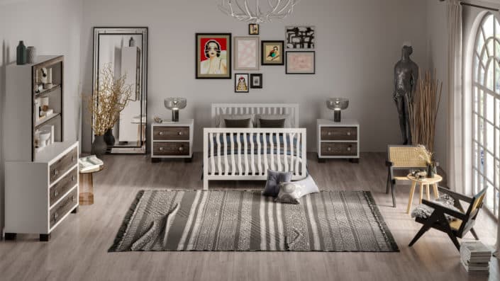
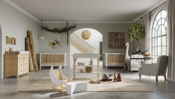
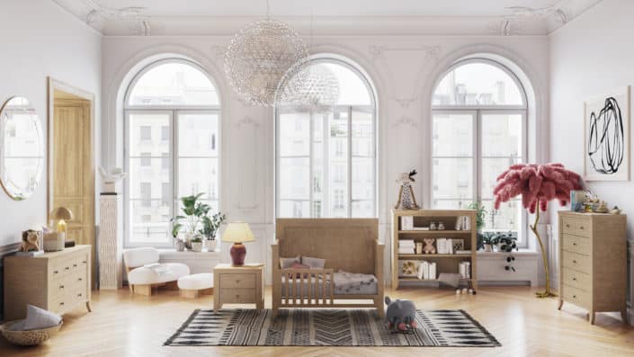
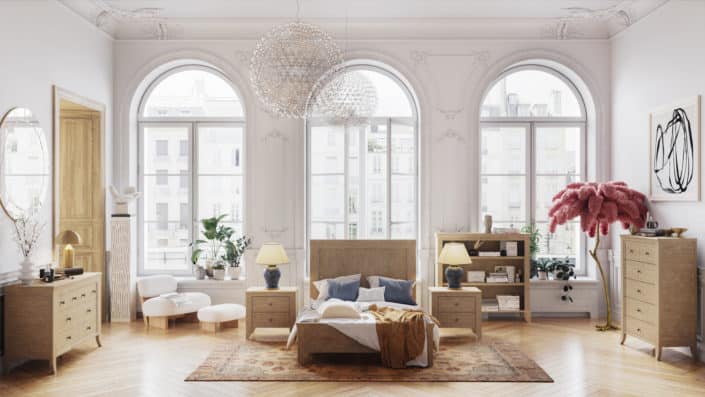
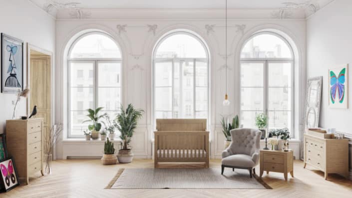
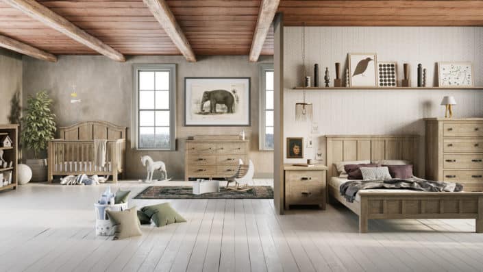
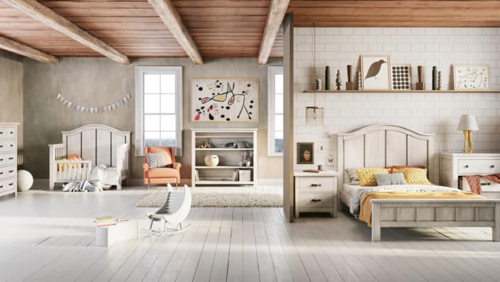
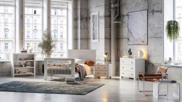
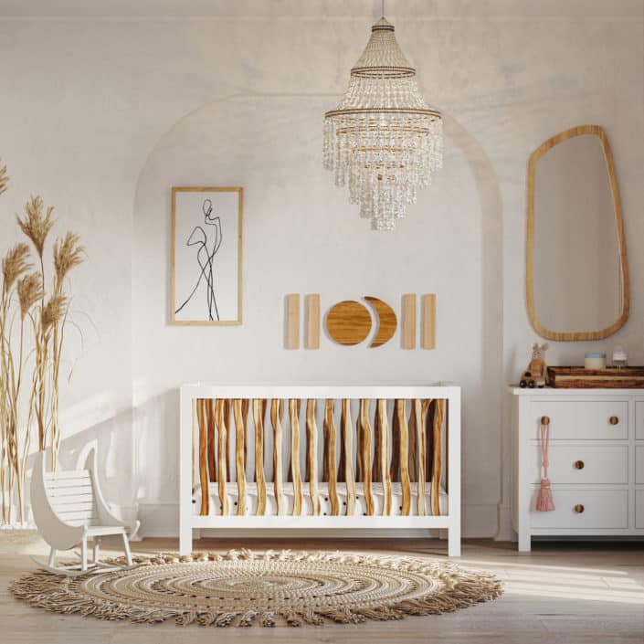
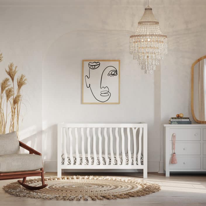
We worked directly with the CEO of the company and, according to her preferences, our team created rooms filled with branded products.
Visualizations recreate this feeling of comfort and safety in absolutely every detail, and the primary concern is the choice of colors. Delicate cream and white create a feeling of purity, innocence and the peace of a child’s sweetest dreams. We were also very demanding on how objects are arranged in the rooms. The client even asked us to hang interior items on the wall so that the child could not reach them and accidentally get hurt.
MORE PROJECTS ON: https://omegarender.com/gallery





Start the discussion at talk.ronenbekerman.com