Pillows test

Very unbusy in the studio. The entire image was an accident. It is the result of a gentle soujourn through some studio max and V-Ray curiosities. I first came across a pillow tutorial on youtube and managed to get it to work, which was quite nice. “hmmm, wonder if I can do the duvet?” I thought, and then, “well I might as well make a sheet and a bed frame, so it’s not floating in midair.” Once I had made the bed and was proud of it, I didn’t want it to stand alone, so I lit it with a gentle cool light from one side and a small warm light from the other so that it’s natural curves would be shown off (real beds have curves!). From there I was also curious about the reason for the light, so I built sash windows (what makes them real? is it detail? texture, faded paint? water drips? dirty windows? I don’t know. I tried them all). I wondered about wallpaper, about photography in Vray, about how to make fur, about interior design, about atmospherics, depth of field, balance of colour, contrast and I wondered and wondered until the image was done, and I knew I had to leave it alone or risk ruining it and after all that wonder, my wife said the best bit was our daughter playing the violin in a picture above the bed.

Casa Barcelona

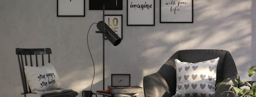
Inspired by the work of Jaime Hayon, I made this simply interior CGI images.

With warms materials, I like to imagine it located in Barcelona.

ceramic

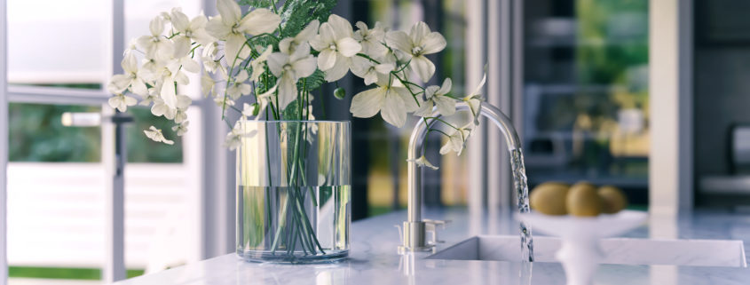
This project Created to display Ceramic on Washbasins. It modeled on 3ds Max and rendered with V-Ray. Then some color correction, Glow and vignetting added by Photoshop.

Activity Center / Adaptation

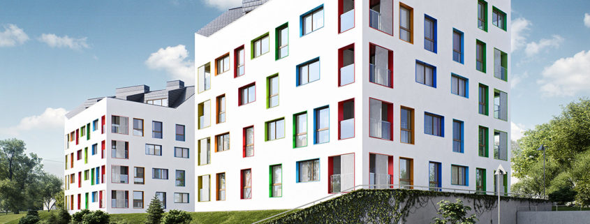
Adaptation of grange unit in Gdańsk, Poland.

The area neighboring the place of the project struggles with many problems involving spatial order, sociology, and architectural quality because of suburbanization phenomenon. Farm ground itself is in far-reaching degradation and has not been used for several years.

In responding to the area’s issues a complex of buildings, which makes the region look, more alive was designed, in which residential function and large mercantile structures dominate. The assumption of the project was to stick to the historical composition of the agricultural structure which includes large yard surrounded by buildings. The point of that is to create a public zone that integrates users. At the same time, it was planned to leave a part of historical tissues which are not distinctly degraded and valuable architectonically.

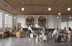
The project consists of three public utility buildings. The first facility has a function of a sports hall that is adapted to functional training (weightlifting, gymnastics, cardio sports and physiotherapy elements). The second facility is a restaurant with the idea of Slow Food. The third building is designed to be a hostel. The entirety closes with a preserved open construction of a traditional wooden barn which has an ecological market with local products in front of it.