Beauty and The Bit + SLA Architects COMPETITION WON

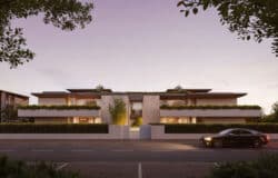
It is always intimidating when a client tells you “make it look nice”. That was our main aim in this one we made for SLA.
Kudos them because they did it again.
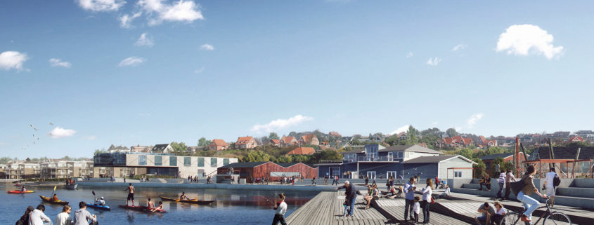
We are happy to share that they won the competition for the climate adaptation and development of Lemvig Harbor.
Champagne for everyone.

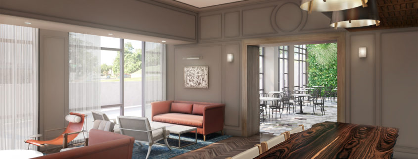
Wine room rendering

– A series of images was produced for the restaurant.
-Space is designed by architect (client).
-We modeled the space, furniture & fixtures ourselves. All are custom models produced within the studio.
-Hexagonal tiles were custom modeled. Herringbone wood floor is modeled using floor generator plugin.
The foliage on the far wall was created using forest-pack.
Client was happy with the outcome. Even though the production time was too tight we were done ahead of the schedule. 
I hope you have enjoyed the work.
Please visit www.7cgi.com for more images!

kitchen

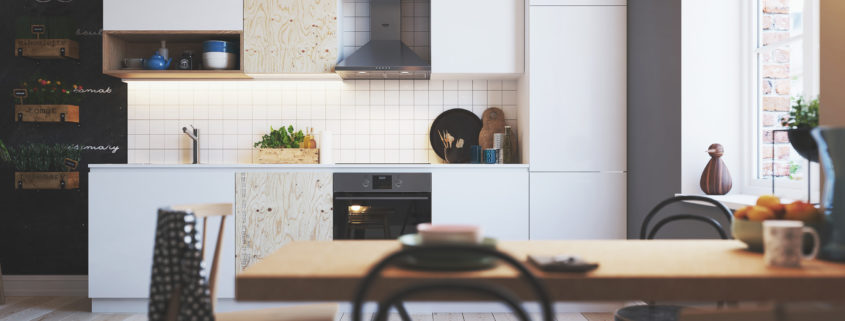
Here is some kitchen made for Finnish home appliance manufacturer UPTO. The task was to make the traditional Scandinavian kitchen, for UPO marketing purposes.
It’s done by using 3Ds Max and Vray, post with PS, lighting with Vray sun and light portals on the window.

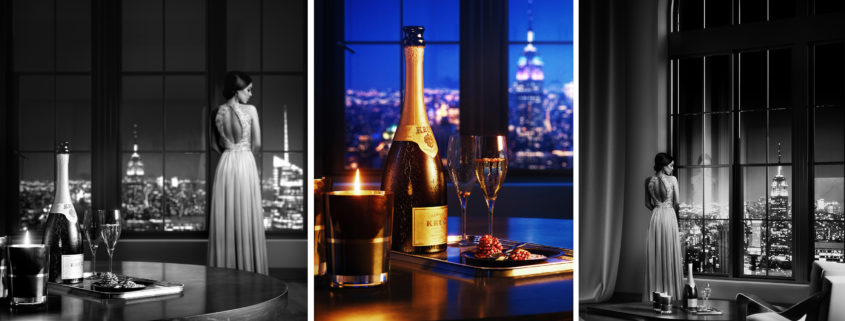
Her

The brief was to express elegance and a sense of grandeur.

The early evening invokes the potential of the night ahead, and coupled with the model’s glamourous attire, this creates a sense of anticipation. She looks down at the city below from the high window, contemplating her night at the most important event of the year. The champagne and pomegranate on the table in the foreground speak of a sophisticated and refined palette.

Imbuing an image with a simple narrative in this way can really help to enhance what is a fairly simple scene. We can try to question the spaces we are dressing and the motives of the people who will come to inhabit them. Who will live here? What are their aspirations? What is their story, and how can we best tell it through the images we craft?

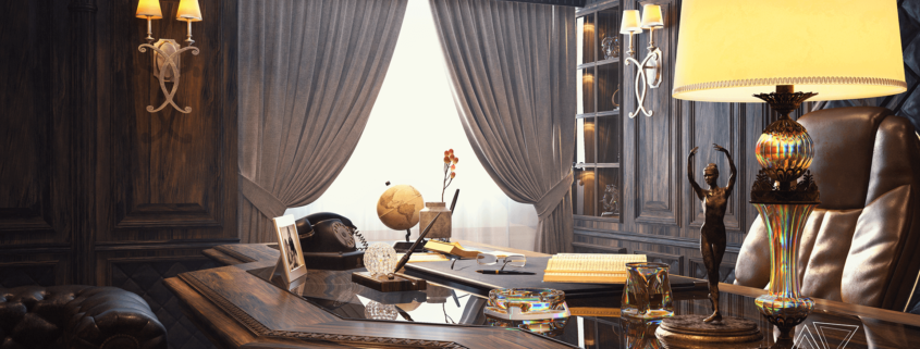
Classic Office

A classic office we designed for a customer in Nablus, Palestine.

First of all we started with taking the site’s dimensions and then we drew them using Auto Cad. Secondly, we started the process of collecting references and sketching our own ideas for the design. We tried so hard to meet the customer’s desires, which was an old-looking office. a Classic one to be more specific.

the height of the ceiling didn’t actually help since it was 2.30 cm. so we thought about using vertical lines and shapes to make the space look higher, and personally i believe we succeeded in that.

When we finished the design and prepared the work drawings, we moved to the lighting process. and then we started texturing the scene and trying to simulate it as real as possible.

you can find more high resolution images for the project on my Behance
https://www.behance.net/gallery/52294731/Office-in-Nablus

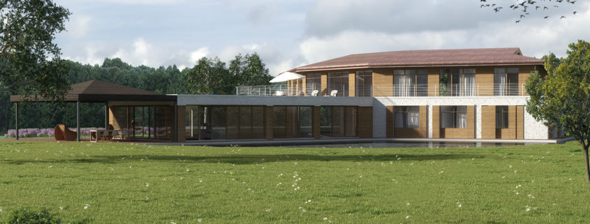
private house_bremen

The project is subject to a long series of designs, the client tests many variants and would like to look at them in 3D visualizations, so he can better decide how the final result should look. More pictures will be produced soon.