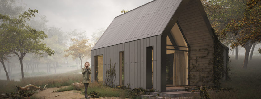
Light & Shadow – 3
The third one,
this has mixed response, some like it, some don’t.
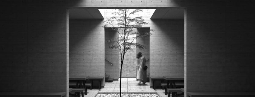
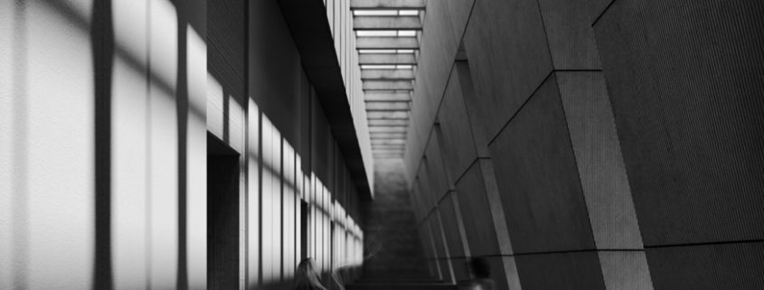
Initially it just had a bench against the wall with a cutout in the ceiling but then we thought of adding to it. we added a dimension by growing the scene in depth. And it came out okay


