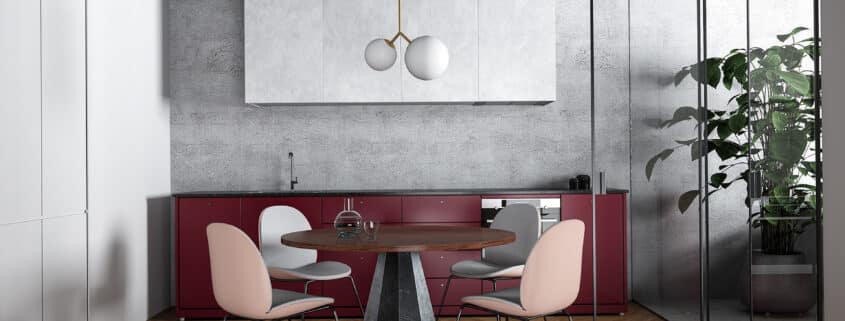
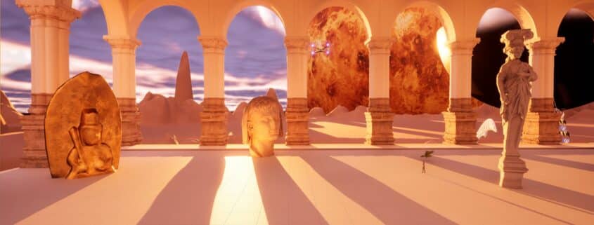
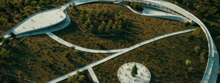
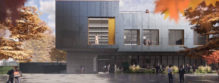
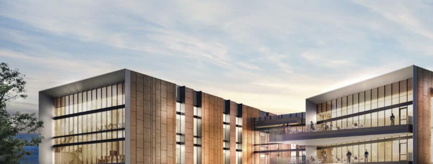
This is a personal project that I used to test the capability of Enscape and create a portfolio piece. I work as an Architect and usually have very limited time for any architectural visualisations so I often have to make this part of designing the building in Revit. Enscape works well as I can constantly refine the scene and see the updates in real-time. I try to achieve everything in scene as there’s nothing worse than spending a lot of time in Photoshop and the client changing the angle last minute (guaranteed to happen).
Concept
I was inspired by the image MIT Day Versus Night by Alex Hogrefe that can be found here:
https://eur02.safelinks.protection.outlook.com/?url=https%3A%2F%2Fvisualizingarchitecture.com%2Fmit-day-versus-night%2F&data=05%7C01%7Cadam.brennan%40bdp.com%7C9287e2fc39014939021408db16a7ca7f%7C40f4096c6d404821a38016520cde7af3%7C0%7C0%7C638128682134053943%7CUnknown%7CTWFpbGZsb3d8eyJWIjoiMC4wLjAwMDAiLCJQIjoiV2luMzIiLCJBTiI6Ik1haWwiLCJXVCI6Mn0%3D%7C3000%7C%7C%7C&sdata=u%2BqfpSw6w%2BdtVsa6%2Fc5BzNDwZaYXn%2BT3th5mpjzx1QI%3D&reserved=0
I created a quick concept image to test ideas and framing for the scene. I quite liked the image, but without a theme pulling it together it still felt quite empty and aimless.
Enscape Assets
I try to use Enscape’s base library of assets to generate scenes as much as I can, I find they’re of a great quality especially at a distance from the camera and it allows me to keep my workflow in Revit checking the results in the real-time renderer. Creating a narrative by making the assets interact with each other or the architecture is key. In my company most architects will just scatter these everywhere and it actually takes you out of the scene when the people look unnatural.
Texture Generation
Rain, puddles and good fog aren’t really available in Enscape like in Lumion. This article called “Cyberpunk in Enscape by Lasse Herbo Madsen” on the Enscape blog inspired me to try something new and try to create that wet weather look we often have in the UK. A link is provided here: https://eur02.safelinks.protection.outlook.com/?url=https%3A%2F%2Fblog.enscape3d.com%2Fenscape-users-render-cyberpunk-2077&data=05%7C01%7Cadam.brennan%40bdp.com%7C9287e2fc39014939021408db16a7ca7f%7C40f4096c6d404821a38016520cde7af3%7C0%7C0%7C638128682134210180%7CUnknown%7CTWFpbGZsb3d8eyJWIjoiMC4wLjAwMDAiLCJQIjoiV2luMzIiLCJBTiI6Ik1haWwiLCJXVCI6Mn0%3D%7C3000%7C%7C%7C&sdata=%2FRDTp%2BvxVmGvjyyrhF9UNOCt5IuUO54pjw1%2Fkao3AFo%3D&reserved=0
I edited and combined some assets to create my own seamless textures for raindrops splashing on the ground and fog. These were then applied to multiple planes in front of the camera and staggered to achieve an equivalent to the volumetric effect possible in other software.
Another great discovery from Herbo Madsen was using Quixel Mixer to generate a seamless texture that reduces the usual repetition that often makes the CGI obvious. I’ve since experimented with this more and it’s a really useful tool and free to use! I used it to generate a large scale texture for the playground without obvious repetitions and a reflection mask for the puddles.
I used Rhino & Grasshopper to generate the perforated texture of forest scene for the facade from an image. It’s quite a simple process that can be found on YouTube. A short piece of code uses an image sampler on a monochrome image to set the radius of the circles from the pixel’s brightness value. Ideally I like to use this as modelled geometry, but it can generate a high poly count, so I opted to create a transparency (cut-out) mask instead.
Lighting
I tried a number of different lighting setups on a white material override, it’s a good way to test the colour cast of the lighting and really focus on the shadows in the scene. I opted for an early morning autumn light with part cloudy skies to soften the light, it made sense for the school scene.
Post-Production
I was really pleased with the image straight out of Enscape, putting the work into the model pays off. The only photoshopping I ended up doing was the autumn leaves framing the scene. Enscape does a bad job of a shallow depth of field look and so the bokeh of the leaves in the foreground came out quite poor quality. I always try to minimise photoshop work.
Conclusions
There was a lot more I could have done to this image. I was still learning Quixel Mixer and would have liked to apply it to the bricks specifically as I find they often look like “brick wallpaper”. Chamfering some of the edges would have reduced that sharp edged look that doesn’t really happen in reality and gives away the CGI. The interior could have done with more work to add details behind the glass, it was a bit rushed. On the note of glass Enscape is lacking a reflection pass so it would have been good to render the camera view 180 degrees to get the reflection and photoshop it in. I often make a alternative glass material to use as a Material ID when photoshopping (it doesn’t render glass).
I hope this was interesting and helpful. Thank you for reading if you got to this point, I’m glad I could contribute something back to this blog. Please let me know if you have any questions!


