Approach

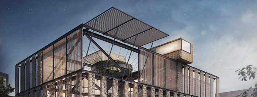
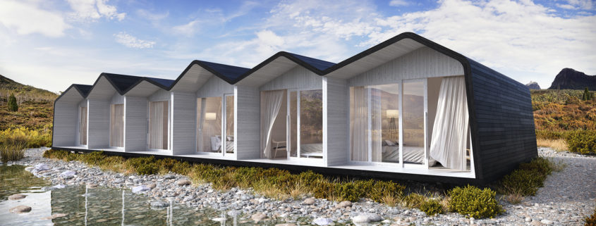
We are finally glad to release our March Image of The Month (remember, our internal project of developing one image a month made exclusively in B&TB, all the design and art direction is made in house).
We felt really struck by some killer images made by Jama Jurabaev time ago and we though of that kind of environment as a nice container for some iconic piece of architecture. The result is Approach.
Sometimes our clients ask us which is the way of achieving a striking and iconic visual. We guess the answer is not being afraid to show the less washed out face of a project.
Thanks for watching.

THE STEP

The Concept in a Nutshell
​​
The house is intended for a couple, amidst a forest. I wanted to come up with a different definition of the space we live in. There are three levels to the building. The lower level is the drive in garage that opens to both sides.  The mid level comprises of the interiors. Here the living spaces are situated on adjacent decks so that every living space can be seen/accessed from every other space easily; except the “His & Her” private space. Every space has some great views to the exteriors and plenty of space, specific areas for each dream corner you may look forward to having in your house. The upper level is the terrace with an infinity pool with cozy sitting & relaxing areas. A secure elevator at the rear most end connects all the three levels.

When it came to designing the building, the idea was to make it fit as an extension of a natural terrain. The building itself sits with its rear placed against a hill, meaning that you can walk up from the terrace to the hill behind. With spaces for trees to grow inside, openings on the ceiling for sunlight and rain to come in, the pool on the terrace sunken in over the bedroom; several other features I have come up with in the project. So please go ahead and do let me know your valuable feedback, it means a lot to me!

About Interiors!

I am hoping to make Part 02 of this project covering the Interiors in detail. I believe selecting the correct models/modeling a few and texturing to suit the character of the house including placement of props is a delicate thing that needs to be looked at carefully and that it deserves it’s own time. I hope to do that in my next break. Thank you!

THE LONGER STORY

Is available at my Behance page with images and explanations in sequence guiding you through the concept.I have also posted the marked sections, 2D Elevations & Plans there. Clay renders as well. I apologize… I guess I could not mix images and paragraphs here (Wish I could).

Link

https://www.behance.net/gallery/51047581/THE-STEP

Thank you!

Thank you so much for taking time to see my works. It has been a lot of work and patience making all this come together, so your support means a lot to me. If you liked my work please feel free to share, drop a comment, ask anything related to the project or about me I would be more than delighted to answer. Thank you once again!

Budapest

For this project I have been inspired from a very old project of the danish studio 3xn. I took as a refernce their conceptual render and I tried to image it in real life. I have chosen to locate it in Budapest (a city I love) to create a contrast to the beautiful existing buildings.