The Concept in a Nutshell
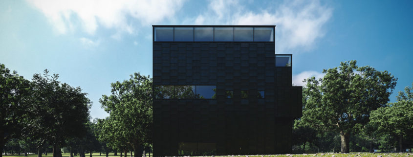
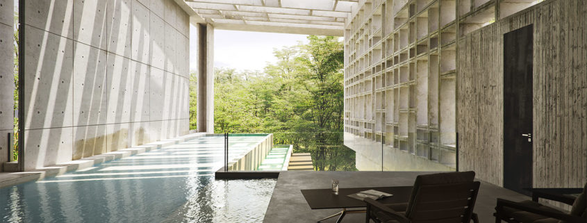
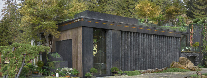
The house is intended for a couple, amidst a forest. I wanted to come up with a different definition of the space we live in. There are three levels to the building. The lower level is the drive in garage that opens to both sides. The mid level comprises of the interiors. Here the living spaces are situated on adjacent decks so that every living space can be seen/accessed from every other space easily; except the “His & Her” private space. Every space has some great views to the exteriors and plenty of space, specific areas for each dream corner you may look forward to having in your house. The upper level is the terrace with an infinity pool with cozy sitting & relaxing areas. A secure elevator at the rear most end connects all the three levels.
When it came to designing the building, the idea was to make it fit as an extension of a natural terrain. The building itself sits with its rear placed against a hill, meaning that you can walk up from the terrace to the hill behind. With spaces for trees to grow inside, openings on the ceiling for sunlight and rain to come in, the pool on the terrace sunken in over the bedroom; several other features I have come up with in the project. So please go ahead and do let me know your valuable feedback, it means a lot to me!
About Interiors!
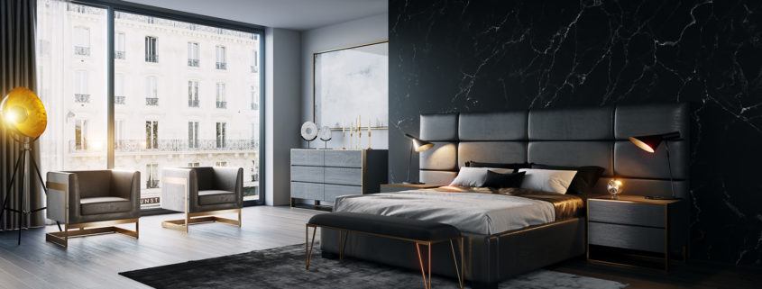
I am hoping to make Part 02 of this project covering the Interiors in detail. I believe selecting the correct models/modeling a few and texturing to suit the character of the house including placement of props is a delicate thing that needs to be looked at carefully and that it deserves it’s own time. I hope to do that in my next break. Thank you!
THE LONGER STORY
Is available at my Behance page with images and explanations in sequence guiding you through the concept.I have also posted the marked sections, 2D Elevations & Plans there. Clay renders as well. I apologize… I guess I could not mix images and paragraphs here (Wish I could).
Link
https://www.behance.net/gallery/51047581/THE-STEP
Thank you!
Thank you so much for taking time to see my works. It has been a lot of work and patience making all this come together, so your support means a lot to me. If you liked my work please feel free to share, drop a comment, ask anything related to the project or about me I would be more than delighted to answer. Thank you once again!


