Madina Mall & Residency by Pixarch

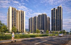
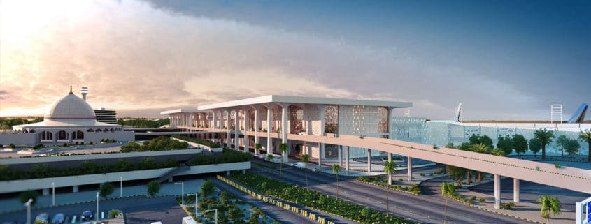
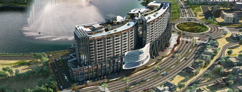
The classic columns set Madina Mall & Residency apart. The sparkling spaces are surpassed in their superb presentation by Pixarch’s visualization. The 3D walkthrough with the larger than life views uplift this classy complex to another level. The branded outlets are showcased in their splendor through the virtual tour, which makes these quite desirable for investment and shopping.

The unique camera angles with a 360-degree projection layout the residential and rooftop retreat on the magnificent skyline. The well-lit and themed interior are depicted with an ultra-modern outlook and a touch of opulence. Pixarch’s augmented reality elevates the prestigious property for an up-close feel and a perfect lifestyle you want to pursue.

Kitchenette

Kitchenette Interior visualization

The inspiration was a photo I found on Pinterest and I liked the simple design and material (stucco lustro or stucco veneziano, the grey wood). I also loved the lightning the indirect lights and the illumination by the natural light and the downlights.

TSR 007: Luis Inciarte on His Journey to London, Things Learned at Hayes Davidson and Making Killer Images

The Investigator of Architecture

Even though he considers himself more of an investigator of architecture than a participant of architecture, Luis says he doesn’t spend loads of time designing architecture. But he does recognize the emotion that architecture can inspire in people, and the way it can make them feel things based on the composition and lighting of the image, and such. He calls it psychology, I call it the driving factor for his ability to create such good art.

Making the International Leap

When Luis decided to move from Venezuela to London, he started researching some of the most inspiring 3d artists at that time in London, including Alex York and Iain Becks. He quickly discovered that they had one major thing in common — their time spent at Hayes Davidson.

As soon as Luis moved over to London, he applied at the industry leader, and not long after, he was hired on as a freelancer. It was there that he learned many of the essentials, from using architectural images as references, to the psychology behind the images.

All around, Hayes Davidson gave Luis the necessary education to get his skill set where it needed to be.

The Process of Creating A Killer Image

Luis approaches his work like an investigator.

Ask the right questions, figure out the target audience, and always let the project dictate the style of the image. He explains why early images don’t need to look as stylized and complete as the final images, and it all has to do with getting the clients to see the the journey the images are taking.

Luis himself is comfortable with the entire process from early design stages to the high end marketing, and considers any image that makes people feel when they see it, a successful project.

Luis shares three essentials for getting clients on board, and it all starts with listening. Patience is essential — being really disciplined and honest with yourself about what it will take to get the results that you are looking for. And always keep an eye out for inspiration, because it may come in the most unexpected places. You’ll want to hear the details of his creative process and more, so be sure to listen to this session of The SpectRoom, with Luis Inciarte.

Main Quotes

“I’m a slightly impatient person.” — Luis Inciarte

“It’s a lot easier to get your message across when you have beautiful architecture to go with it.” — Luis Inciarte

“As long as you get people to feel when they see your images, then you’ve succeeded.” 
— Luis Inciarte

“Always keep an eye out for inspiration.”— Luis Inciarte

“I want people who have a continual thirst for learning.” — Luis Inciarte


Double Nursery School Erlach, CH, Competition Entry

We’re very happy to see Kast Kaeppeli Architects from Berne and Bâle, who we have known for a long time and have enjoyed working with on numerous occasions, win this competition for the Erlach nursery schools.

We were pretty excited that they followed our suggestion for a one-point perspective and couldn’t be happier that their courage paid off. The surrounding landscape lent itself to a soft and dreamy light and mood, that then again made it easy to show the chosen materials and even some critical technical details such as the accessibility ramp.