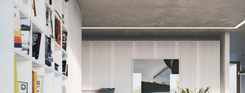
I remember seeing the ‘quietness’ posted on Archdaily a while ago and loved the architectual details and thought the space made intricate interiors. I never got round to modelling it until a couple of weeks ago, i looked at the photo’s and began to build up the walls and main elements of the interior, i then decided to put a twist on the interior and create something for a musician.
I used an online book cover designer to create around 50 book cover designs, i then mirrored placed each one into photoshop leaving a central strip clear to which i added text for the spine of the book when UVW mapped.
A lengthy process but worth the gain in assets
The floor is made with floor generator and CG source timber texture with a dirt and scratch map blended over the top.
F 5.6 i thought was the most sucessful for the soft shallow DOF
My composition was driven by attempting to create a continous circle of interest running from left to right (bottom left lead in line to piano – picture – pot plant – table flowers and repeating to keep the eye moving across.
The scene was lit by a peter guthrie HDRI, late afternoon which i felt helped with the idea of calmness. i wanted to bring the light in and across the piano as i did plan on comping in a pianist sitting on the stool playing the piano but i think it took away the idea of the initial concept – the dilema of reading another book or play the piano?


