FEELING FRESH

The power of visualization is the ability to represent the generated idea of a #design concept to the clients. It brings to life anything that has occurred in someone’s mind ✨

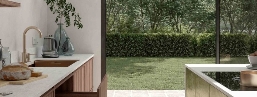
In this #visualization project we tried to combine old elements with new ones. For example, we’ve used this technique for the flooring when the old-styled floor outside meets #modern flooring inside.

Mixing of #contemporary and old design elements creates a whole new fresh style of the interior.

A lot of examples of this blending process can be found all through the room in general. That’s the theme of this project.😎

For more information visit our official website – https://regionrenderstudio.com/ .

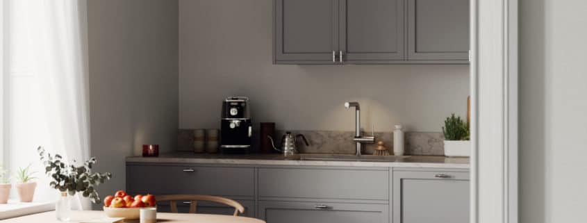
COFFEE MOOD

In this post we would like to discuss the main stages of architectural visualization 👇

Phase 1️⃣
The phase of #modelling.

We pay attention to this step a lot because the right model is the basis of this process, the fundamental part of the project. In case anything is wrong with the model, every other step will contain very noticeable flaws.
So to create a faultless performance, we always put lots of effort starting from the beginning.

Phase 2️⃣
The phase of #lighting

In this step one could see how the lighting is being costumized.
Getting the right proportions of the shadow and light help us understand the form and the material of an object in the #interior.

Phase 3️⃣
The final image

Following previous steps correctly, we get the perfect final image with all the little #details included. At this step, the final image is being provided, and it usually is received with joy and gratitude 🤍

To order visualization projects contact us at your convenience.
Find more information on our website – https://regionrenderstudio.com/ .

Vertical \ Revolver

Hi guys, here are the images from our latest in-house project, images are done in 3ds max, fstorm and a little bit of photoshop.
Marvelous designer was used for the curtain.
Lighting is a simple HDRI and some portals on windows, plus some spots and a candle.
Materials are all very simple, I don’t like to overcomplicate things.
If you have any questions feel free to ask. 🙂

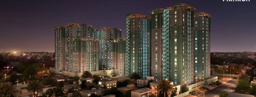
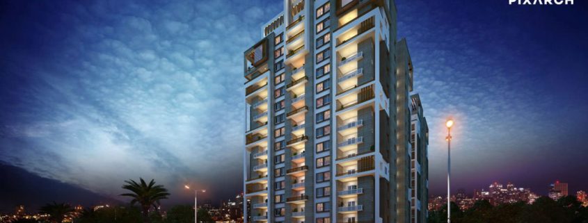
FALAK NAZ TWIN TOWER

Fine high rise structures of resourced and restful residences. Interconnected by an illustrious infrastructure to the main University Road contiguous to Malir Cantt, it’s a prime location. A collection of aesthetically designed rooms, rest areas and recreational spaces. It represents an all encompassing hub with gymnasium, indoor games, community hall, sustainable power source, reserved parking and 24/7 security.

Visually appealing walk-throughs with TVC, floor plans and photorealistic views spurred by the 3D technology, lustrous brochure, premier print media plus customized web designing are digitally powered by Pixarch.

Small Details

This is a small animation I did for TheRookiesco Competitions.

I really like to focus on the small details when I’m doing 3d, but these days the clients want wide images to show the whole space. So this project is going to be about close-ups and details.

Also, I decided to have a little fun with phoenix fd, tyflow, and growfx, so I force myself to learn new skills animating liquids, smokes, plants, and cloth.