Clarence
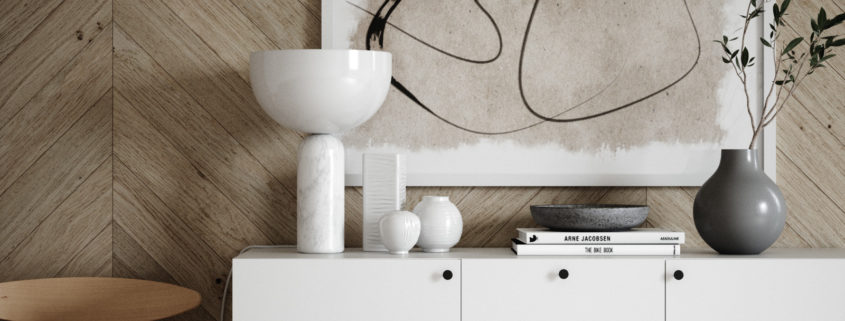
Just a simple interior scene made for fun and to learn a few new (for me) tricks
Access the Best Articles about Architectural Visualization. Learn about all aspects of crafting images that tell stories.
Making Of's Case Studies WorkflowsShare your work and get immediate appreciation through discussion, feedback, and a possible nomination for the…
Submit Your Work Explore ShowcasesA weekly experiment, exploring the creative minds in Architectural Visualization and more. Find out what makes us all tick and push the limits.
Listen Now! Subscribe on iTunesOut with the old and in with the new! In Converted, I’m asking you to take an in-depth look at existing architecture near you or one you love worldwide and introduce something new.
See Entries & Join! About ConvertedJust a simple interior scene made for fun and to learn a few new (for me) tricks
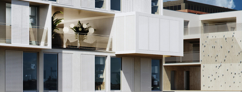
Together with Kimi Architecture (Gliwice, Poland) we’ve created a set of images to show a concept of Academic Dorms.
The buidling is made of modular system. All flats have same dimension – the designers have created every room as multi-fuctional as it can be – giving to the user the best place to live and learn.
Main materials used in project are a painted white – perforated metal plates, plywood, white concrete.
As 3D graphic I wanted to create images which will speak by them selves. These sunny days remaind a young summer vibes. It allowed to play with light and shadows in the interior creating the feeling of that lazy weekends when we should learn for exams but we don’t 🙂
Full resolution – https://www.behance.net/gallery/76380821/CGI-Concept-of-Modular-Dorms
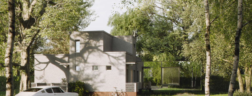
Concept of rebuilding old modernist house located near Warsaw, Poland. Designed by Hornik Chmura Architektura.
As you can see HCA cleaned the original structure from worned and destroyed parts and leave a clean minimalist architecture. The next step was to create additional space for client adding the new part of the building. In this case their concept was to maximally hide or expanse the new part of home.
So the task was to create a two visuals – two same images – one with the polished stainless steel and with corten.
First idea assumed an autumn atmosphere but we declined it quickly – it was too colorful – we needed to see it in more neutral situation. So I tried to make as greeny park as it can be with touch of retro feeling in the scene to make it a bit more emotional.
Results of our cooperation you can see below.
Would you choose mirror or the corten panels?
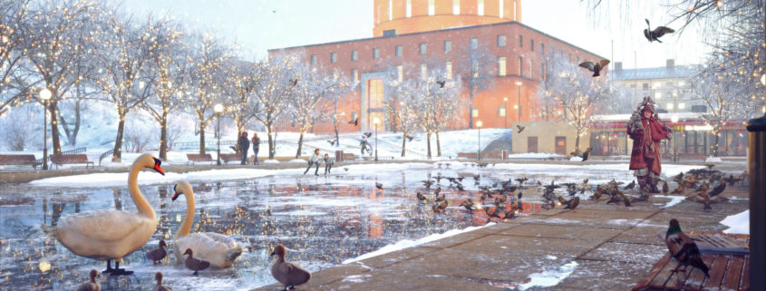
My goal was to recreate the nostalgia of the 90s through a wink of the movie home alone 2
I used a pretty vintage color palette
Project: Sprzeczna 4
Architects: BBGK Architekci
Manufacturers: GEZE, Daasag, Budizol, Dierre
Location: Sprzeczna 4, Warszawa, Poland
Source: www.archdaily.com
Architectural Visualisation: VisEngine Digital Solutions