TSR 005: A Journey from Animation to ArchViz, Details Obsession and Blaming it all on Banks with Recent Spaces

Why ArchViz Beats Animation

The pathway that takes you from absolutely nothing to a fully animated scene is a very complicated one. Comparing that to the modular and linear process of architectural visualization — which Alex and Iain have found comes with the huge appeal of being able to create a scene rapidly and then focus intensely on the details. That gratification is what has kept these two firmly based in architecture.

Animated Stills are Becoming A Client Favorite

Transitioning from still images to animated stills allows clients to see a more natural pathway through projects. Alex and Iain have fine-tuned the art of taking their images and creating less CGI and fly-through, and a more filmic approach to the building by viewing them like an architectural photographer would do. They’ve also found a few other tricks that clients are enjoying as well.

Corona is the Perfect Replacement for V-Ray

In the Recent Space toolbox, you’ll find Corona Renderer, 3ds Max, Forest Pack, and RailClone, but you won’t see much of VRay anymore. We talk about the reasons why, and it all has to to do with being an artist — not a technician. Alex and Iain have found that Corona allows them to spend their time and energies on their true passion, and to create the high-end renderings that their clients want.

Photographers and Visualizers — Who Gets the Credit?

Architectural visualizers know how difficult it can be to get full credit for their images, especially in comparison to architectural photographers. Copyrights and image credit goes to photographers, and their position of prestige is much more established. Visualizers, on the other hand, are still seeking to secure the same place of respect. Alex and Iain share their thoughts on the difference between the two, and potential solutions to the problem.

References

The image Alex did back in 2005 (the copyright year on the image below is not the actual creation date) that was featured on CGTalk and led to him to work at Hayes Davidson.

Alex's Visual of the Naoshima Gallery in Japan by Tadao Ando

Alex’s Visual of the Naoshima Gallery in Japan by Tadao Ando

The making of “The House”, now known as Radlett Place, was the first time Alex York’s work was featured on the blog back in 2011. We did a written interview shortly after and also collaborated on a project in which I introduced Forest Pack to Alex and he used V-Ray for the first time as well!

"The House" - Radlett Place. Location: Primrose Hill, London. Architect: MMM Architects

“The House” – Radlett Place. Location: Primrose Hill, London. Architect: MMM Architects

The Seaford Court project video…

Main Quotes

“I’m obsessed with the details.” — Alex York

“As a visualizer, it’s very important that you not get bogged down in what ‘they’ want.”
— Iain Banks

“What we’re trying to do is move away from CGI.” — Alex York

“We try very hard to produce images that are not just accurate in detail, but are really beautiful in a classy and understated way.”  — Alex York

“We want our employees to enjoy working here, and to produce something that is amazing.”
— Iain Banks

Showcasing Edition in Parnell

The Making of Edition

Since we posted this showcase, we also published the making-of Edition in Parnell on Ronen’s Blog.

Check it out here!

Concept / Mood

In an oversaturated property market, where there are many great render studios creating lovely images, we felt this project warranted a different formula. When I talk of formulas, I am referring to the standard late afternoon/sunset shots or if a client is feeling ‘crazy’ they will run with 1 or 2 dusk shots to compliment the suite of everlasting sunshine for the remaining 20 shots. Let’s not forget that it is always sunshine and smiles in the 3D world of architectural visualization!

Auckland is known for its cloudy skies and rainy days, especially at this time of year (Winter). We like to keep real-world values, it gives a place a true sense of locality. Like all good restaurants, keep it seasonal where possible, don’t be afraid of rain or cloud. Our studio is really pushing clients to think about the time of year and locality when generating an overall mood for projects.

Everyone in the studio is a big fan of Iwan Baan’s work as a photographer, his super soft blue grade for dusk or silver white days really float our boats. We felt his tone and grade to his photographs would suit the Auckland mood perfectly. With this inspiration we presented a mood board to our client of the direction we wanted to take the images and to our surprise, they jumped straight on board.

Composition / Lighting

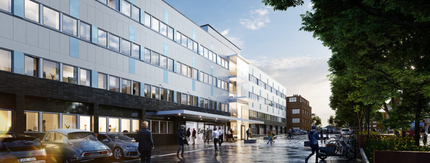
The facade of the building is made up of thousands of handmade glass bricks from Italy. This was a really important/expensive design feature to highlight, to do this we knew the shot had to be a silver dusk. We needed to play up the reflective qualities in the brick whilst still being able to see pockets of interior light within, giving the facade an ethereal quality. The ethereal quality of the facade was amplified further by elevating the camera position, this helped us make the cantilevered upper 3 floors float above the podium entrance/reception below, something the architects were keen for us to demonstrate.

New Workflow

This was the first set of images that our studio had used Corona for the entire project, normally we mix between V-Ray, OctaneRender and Corona Renderer.

We also grew all of the plants in GrowFX and made custom shaders using Megascans. Railcone was also used for the glass bricks, curbs, and some hard landscape elements.

Lakeside Home

After a long stint of rather repetitive projects, I decided to start a personal project around my true CGI passion: interior/exterior design. And since I’ve done a lot of interior scenes in the past, I figured it’d be a challenge to go all in on a exterior scene.

I really enjoyed being completely free in my creative decisions, not having to take into account the wishes of a client, the input of a creative director or producer. So I made a scene that few clients are likely to request: a rainy, moody scene with no direct sunlight.

While things went fairly smoothly, I did struggle a bit with getting the lake to look right and to have the ripples from the raindrops feeling more or less natural.

NORWEGIAN

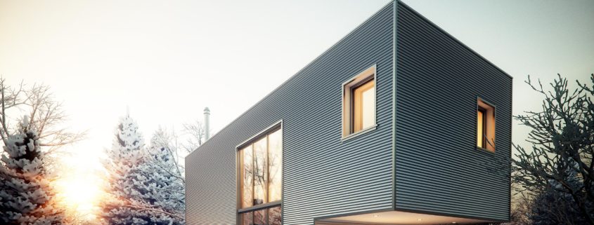
Interpretation of Scandinavian architecture. Simple geometric shapes, characteristic materials and color palette. Modest dimensions and no frills. Abundance of light, air and possibilities.

Whirlwind

The project is set under the new highway above the river in the industrial zone of Beirut. It is composed of two elements: the linear architecture settled along the river and the park rotating above the river.