Amstelblokken
Competition entry near a railwaystation in Amsterdam. Awarded first place
Access the Best Articles about Architectural Visualization. Learn about all aspects of crafting images that tell stories.
Making Of's Case Studies WorkflowsShare your work and get immediate appreciation through discussion, feedback, and a possible nomination for the…
Submit Your Work Explore ShowcasesA weekly experiment, exploring the creative minds in Architectural Visualization and more. Find out what makes us all tick and push the limits.
Listen Now! Subscribe on iTunesOut with the old and in with the new! In Converted, I’m asking you to take an in-depth look at existing architecture near you or one you love worldwide and introduce something new.
See Entries & Join! About ConvertedCompetition entry near a railwaystation in Amsterdam. Awarded first place
There were no drafts, designs or predefined camera positions for the two parking areas. In order to have a basis for discussion with the customer, we sketched in Photoshop and determined the viewpoints and moods. After the meeting with the customer, we converted these sketches into 3D and inserted numerous details. The detail shots were created later on our own initiative.
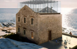
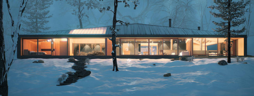
Approached by an estate agent in Cornwall. I was asked to create an internal and external visual based on design by Mclean Quinlan Architects.
The client was specific that the internal had to show off the fabulous view of the North Cornish Coast, and was keen to have a external view at dusk/night.
End result was a happy estate agent, architect, client, and visualiser 🙂
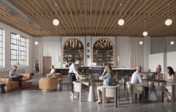
The WeWork Visual Studio has created this collection of images to showcase WeWork’s next location in Jakarta, Indonesia.
The intention of this project was to situate the hut into a natural environment in a way that felt harmonious and comfortable. We wanted viewers to feel as though they could picture themselves there.
We used an array of site photos to help us get a feel for the Canadian shield and lake country in eastern Canada – and from there we iterated the landscape (100% imagined) and foliage a great deal to get to a point where we were satisfied. One of the greatest challenges was making a believable rocky shoreline complete with moss, lichen, and other plants. In the end, it was a combination of Megascans surfaces/atlases/3d with Real Displacement Textures.
Megascans was used heavily throughout the process and we developed a solid workflow for building assets from atlases and using Forestpack to catalogue and distribute. We rely on Forestpack Library and Corona proxies to keep our file sizes to a minimum so autosaves are quick and the files stay snappy and crashes are minimized. The final size of the site model was just over 50mb. We are also very strict with layer and object organization with a rigorous standard that is always being refined.
The architecture itself was the simplest part of the project in spite of using some of the earlier draft versions to iterate on the design of the cladding and some detailing. We’ve found that using rendering as a design tool is extremely valuable for clients and helps refine their project but does come at a time cost.
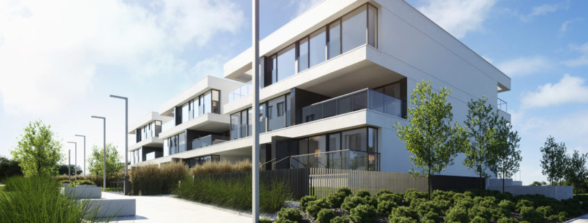
Outdoor view highlighting the terrace wich comes with the ground floor apartment.