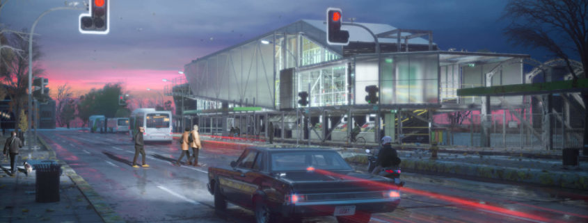
Dusk river station
Hi.
I am sharing you one of the most important project for me, this is the final stage of a long and hard process of eight years of University, it’s my Architecture graduation project: “SPORTS INFRASTRUCTURE: Access station to Mapocho River”. Santiago, Chile.
The concept born from creating a station that brings access to the Mapocho river as a new public space in Santiago, capital of Chile, and upgrading of poor sport infrastructure of the city.
The project was modeled on Rhinoceros from the concept and the context and details completed at 3dsmax.
For the images, I tryed a different atmosphere than common sunny days, something more evocative and thinking in the actual local autumn season.
And Render engine was Corona Renderer 1.5, then just some people in Photoshop for post-production and some minor adjustments at Ligthroom.
I hope you like it.
Thanks for the space.


