Abandoned Room #1

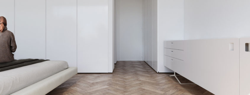
This is my new project , at this project I tried to mix between modern and classic using an imaginary old abandoned interior space mixed with modern furniture ,
I also tried to get the photography feeling of interior Catalogues for both lighting and composition .
I intend to make other interior spaces with the same style in the near future .

please check high resolution work on Behance :
https://www.behance.net/gallery/72097711/Abandoned-Room-1

WTO

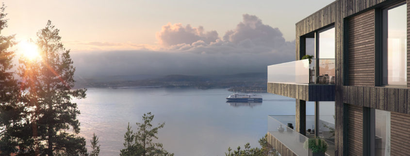
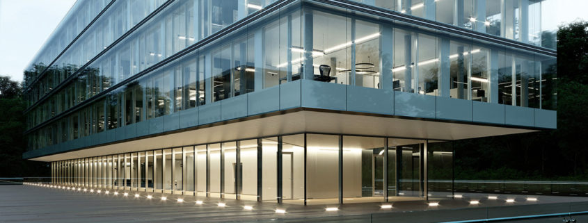
I remember coming across a post about this building on Peter Guthrie’s blog years ago, when I was just starting looking into CGI, and since then I wanted to recreate the architecture and the mood in CGI.
I’ve finally found some spare hours at night to recreate the atmosphere, tweaking some things here and there according to my taste.
The challenge was to re-create patiently everything in 3D, exteriors, interiors and environment, with just some few late night hours of work. Patience, perseverance and a good hardware setup made the trick.
Only disappointment is the crazy amount of noise generated by HDRIs and the extra render time needed to clean it.

For full resolution images take a look here: https://www.behance.net/gallery/71464385/WTO-CGI

“The New Barn” – Full CG Showcase

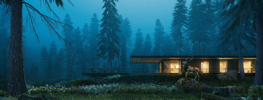
Richard and where inspired by Dorte Mandrup´s “Barn” and needed a 3d showcase for potencial clients to show VR, AR and full CG rendering.
Richard created the architecture and we planed the shape of the landscape.
Than it was about one week of texturing, lighting, scattering, painting, populating and finetuning.
The final shots are rendered in 6k, about 8hrs of rendertime.

Farnsworth House – Full CG Showcase

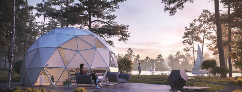
Full CG – Showcase I made, after I saw the beautiful nature during a hike in Schweden.
The picture at the buttom shows the original foto I made for inspiration. I thought about, which architecture could be interesting in this setting and decided for “Mies van de Rohe´s” Farnsworth House.

For plans and Details of many architectual classics, see the Book: “Key buildings of the 20th century” incl. 3d Data.

Farnsworth House – architecture build from original plans by Mies van de Rohe

The Clifton Vault

Project Summary

Clifton Vault is a state-of-the-art automated parking solution with a full concierge service located along the Atlantic Seaboard in Cape Town, South Africa. Clifton is at the heart of luxury real estate and living. The concierge service fits perfectly into an environment where finding a safe parking spot is often impossible, and it is accessible all with the push of a button. Clifton Vault’s coffee shop and a boutique hotel proposed to perch on top of the car park, showcasing panoramic views across the Atlantic, are anticipated to become popular hubs of Clifton.

ThinkLab’s full brand design and visualization solution included name generation, logo design, brand identity, print and digital brochure design, CGI’s and an animated sales video packaged to illustrate Land Equity’s concept and design to prospective buyers.

What made the project so interesting is that it is currently the only parking solution of its kind in Southern Africa, making it a complete marvel nestled within one of Cape Town’s most beautiful coastal locations. This was a full collaboration with the world’s most advanced and innovative parking system suppliers and will be fully functional from the touch of a button.

Challenges

We had a fair number of challenges to overcome like any other architectural visualization project. One of the biggest hurdles we faced was integrating the real-life footage with our animated footage because there was were so many moving elements in each scene. We adapted by carefully curating our animation movements to flow naturally alongside the contextual visuals.

We had to accommodate for design and architectural processes as well throughout our project which made it particularly difficult to produce good quality content in the time frame we were given. We adapted by pre-empting most of those changes and making our adjustments accordingly ahead of time.

Producing visuals to the highest quality standard required detailed modelling of the parking systems we had no prior knowledge of. We were able to address this challenge by doing thorough research and educating ourselves as a studio on how such systems work.

Lesson Learned

This was one of our first attempts to fully implement Corona Renderer to our workflow. We learnt a lot about the potential it has, and how it is busy shaping our industry for the better. We realize that Corona is perfect for animation as our render times were much better in relation to Vray and we had zero flickering in our final passes of this project which created a crispness to all our visuals.

In all, this project resulted in our team gaining vital new knowledge and we completed a project that was well executed and received very well by our client. Clifton Vault was a huge success for the ThinkLab team and raised the quality standards for our growing company.

Thank you