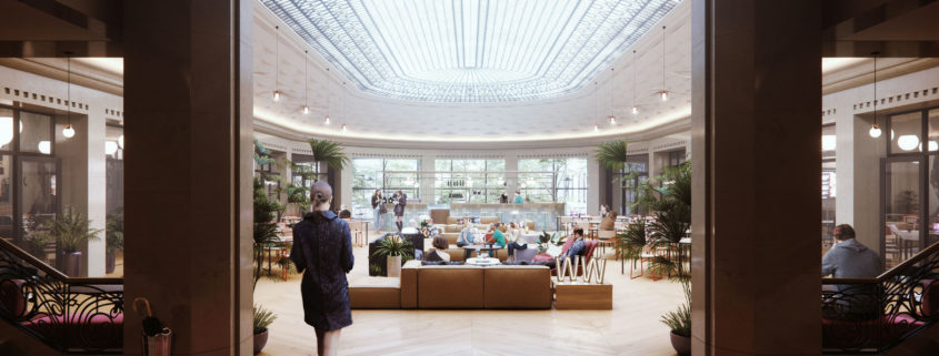
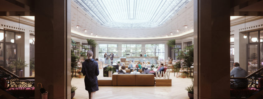
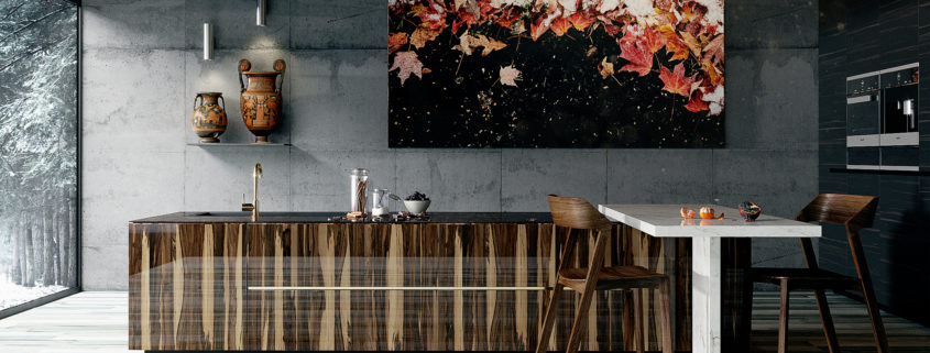
The Collector

This is my full set of submission / winning submission for Design Connected (https://www.designconnected.com) competition, “the mirror”. The idea delves mostly on representing ID & furniture through an imaginary architectural semiotics. “the collector” represents current issues of war, gentrification & displacements. Archviz concept ideas was loosely base on ian mcque paintings and other contemporary visuals references and the most challenging part for me was to translating them to an Archviz / ID concept that fits the theme. Elements,furniture and accessories represents those unlucky victims of such incidents, and perhaps represents loss etc.

WARM KITCHEN ok

I tried to create a interior composition with balanced colours into the scene…in this case I chose corona render for the outstanding quality and i tried to play with outside cold colors/inside warm color of fruits vases and posters. I played with photoshop for light fx in glare and dust particles, i played with bokeh camera setting for give attention to the scanned vases with photoscan. I did the scanning process of vase by myself with 300 photos and photoscan sfw

WeWork Visualizations

Together with the 3d Visualization team at WeWork HQ, we are proud to share a collection of some of our favorite work from the past 12 months. These images represent WeWork’s rapid global expansion with locations across the globe from Colombia, to Paris, to Australia, and everywhere in between. Our team has the opportunity to provide images which help bring awareness to these ones of a kind office spaces that are being opened on a monthly basis around the world.

Wework Visualization

Together with the 3d Visualization team at Wework HQ, we are proud to share a collection of some of our favorite work from the past 12 months. These images represent Wework’s rapid global expansion with locations across the globe from Columbia, to Paris, to Australia, and everywhere in between. Our team has the opportunity to provide images which help bring awareness to these one of a kind office spaces that are being opened on a monthly basis around the world.

WARM KITCHEN

I tried to create a interior composition with balanced colours into the scene…in this case I chose corona render for the outstanding quality and i tried to play with outside cold colors/inside warm color of fruits vases and posters. I played with photoshop for light fx in glare and dust particles, i played with bokeh camera setting for give attention to the scanned vases with photoscan. I did the scanning process of vase by myself with 300 photos and photoscan sfw

Potafiori

This project was made for the sake of learning and training corona . the design by Storage Associati located in Milano – Italy . The aim was to follow the flow of neat geometric forms, the loud voice of raw materials, all wrapped in a natural and soft light during the day and on through the night.