Lennox Residence
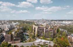
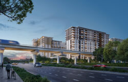
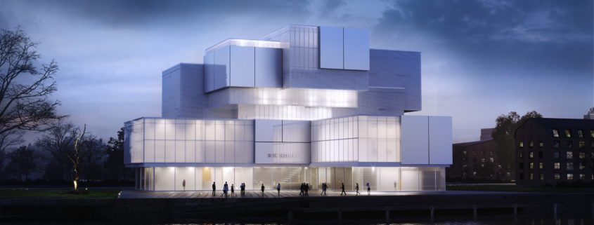
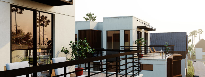
The goal was to achieve a photo-realistic images of this nice building in Belgium.
Access the Best Articles about Architectural Visualization. Learn about all aspects of crafting images that tell stories.
Making Of's Case Studies WorkflowsShare your work and get immediate appreciation through discussion, feedback, and a possible nomination for the…
A weekly experiment, exploring the creative minds in Architectural Visualization and more. Find out what makes us all tick and push the limits.
Listen Now! Subscribe on iTunesOut with the old and in with the new! In Converted, I’m asking you to take an in-depth look at existing architecture near you or one you love worldwide and introduce something new.
See Entries & Join! About ConvertedThe goal was to achieve a photo-realistic images of this nice building in Belgium.
Hi
My new exprience in corona renderer
just a practice in spare time for an online corona workshop. hope you like it.
Ayat Sharifi
Instructor: Mohammadreza Mohseni
The main key of this masterplan was to offer a modern-stylish office space in which it should be a pleasure to work. The project should be also focused on the need for integration with the residential neighborhood and its singular landscape.
This image was the result of a smooth cooperation between Stantec and Pictury.
My proposal was focused on the creation of a space for a team that is dedicated to the creation of software, hence my focus on the Matrix.
ARCHITECTURAL SCOPE
The composition of Orangegic includes two main areas a public and a private one. The main retail area consists of various ambiences such as clothing rails, stands and a lounge area.While the private one is an innovative, collaborative, impactful working environment.
Within an old industrial shell, we developed a new clothing boutique store. Our preference in this project was a gentille, sharp and warm design of a store inspired and motivated of the orange color pallette and clean lines. We tried getting away with a fine tuning between the retaining white bounding walls, the original concrete structure pillars and the clean plasterboards. On the lighting section we aimed on making a white cloudy overcast enviromental condition and enchance a cozy atmosphere with some hanging spotlights that floods the interior with warmish light.
DESIGN FIELD
The desire to bring some warm touches that would be involved to the general structure of the store guided our design decisions about combination of materials and the composition of surfaces. Taking advantage of the old shell we implement some metallic finishes such us copper and brass which incorporation with velvet’s soft structure produced high contrast and depth in a natural state. Among the materials chosen, coper and velvet predominate due to their rich dark orange-browny colours. Our goal of a more sophisticated orientation underpinned of the Thonet’s seatweaving woven pattern on the wall hanging panels and the booths.
A pattern of palm tree’s leaves was embossed in a plasterboard and some shades of green, cement and white marble was added in the space.
CGI TECHNICAL ASPECTS
Corona Scatter. Having tried before the multiscatter plug in, this time we wanted to give a try to Corona’s native scatter for the distribution of some hairs over the knits to achieve wool softness.
Deformed Edges. To achieve the deformation on the “old shell” of the building we used the deformed edges script by Branko Zivkovic that we found out on Jakub’s Cech first manifest.
Damaged Pillars. We used some damaged textures found on textures.com and we implement them on our pillars with Arrimus 3d techincs.