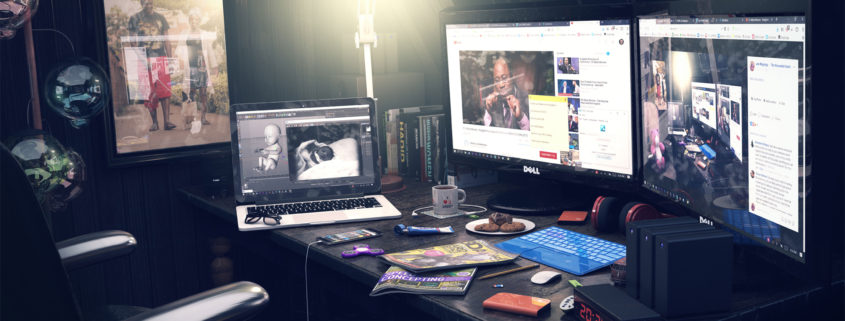
Personal projects are often the most motivating part of my work as a designer. They’re an excellent way to learn new techniques and they provide a platform for me to demonstrate my own abilities and progress. A few weeks ago, I embarked on creating something I’ve never done before, a night scene! It was the perfect opportunity to visualize how my dream home studio setup will look like 1 year from now. God works in mysterious ways.
On the technical side, I started by gathering as much imagery and reference material as possible. Obviously, there are tons to explore online. Certain resources, such as Instagram can be a danger, however, since there are so many people referencing the same small handful of images. I’m a big advocate in looking outside of the motion graphics community for inspiration.
As always, the modelling part was the least interesting for me. With the exception of the cookies, all assets were modeled by myself. The composition is always interesting for me. In fact, it is one of the most important phase of my process.
I wanted to create a “tech-ish” space that is both in order and a mess at the same time thus the placement of what at first glance appear to be random objects on the table not only constitutes overall composition, but also helps adding personality to the scene.
The main light source for the scene was the reading lamp. I used a group of 3 spot lights all positioned at the bulb of the lamp. One spot light illuminates the room, the second one creates the illusion of a glowing light bulb and the third simulates fog.
It’s tricky to get perfect lighting with just one light source even with Global Illumination in use. That’s why I used a fill light with slight blue saturation and positioned behind the camera to further brighten up the scene. In addition to this, I wanted to simulate the impression of moon light falling through the window and onto the chair. I achieved this effect by placing an Infinite light outside the room.
I created more than half of the textures from scratch because I just couldn’t find any suitable textures for some objects like the chair or the cookies. All textures had a minimum resolution of 512×512 while the resolution of specific textures was up to 3K to preserve as much detail as possible.
To finish off with the stats, the images were rendered with Cinema 4D’s Physical renderer (Irradiance cache plus Light mapping). This project was completed over a period of one month, working very occasionally whenever time allowed.
The one thing that saved the project was a remote render farm. Google ZYNC Render was just brilliant. Smooth and painless as far as I am concerned. Using only a laptop I was able to render 4K resolutions with maximum GI settings which would never be possible otherwise. Render time 12 hours locally vs. 6 hours on the farm – you can’t resist this power! Final color tweaks and lens distortions were done in Photoshop.
This project is dedicated to my wife and new born baby girl. It’s nowhere near the level I wanted it to be, but I’m so bored of reworking it over and over that I just decided to post it and move on. Hope you enjoy it nonetheless.


