Architectural Visualization
Typology: Exterior
Visualization: Region Render Studio
Completion Time: Five Days
Our Position: Visualization
Access the Best Articles about Architectural Visualization. Learn about all aspects of crafting images that tell stories.
Making Of's Case Studies WorkflowsShare your work and get immediate appreciation through discussion, feedback, and a possible nomination for the…
Submit Your Work Explore ShowcasesA weekly experiment, exploring the creative minds in Architectural Visualization and more. Find out what makes us all tick and push the limits.
Listen Now! Subscribe on iTunesOut with the old and in with the new! In Converted, I’m asking you to take an in-depth look at existing architecture near you or one you love worldwide and introduce something new.
See Entries & Join! About ConvertedTypology: Exterior
Visualization: Region Render Studio
Completion Time: Five Days
Our Position: Visualization
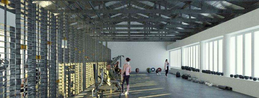
My last academic architecture project. An old office building in Lisbon, belonging to an Energy Company, is adapted to a gym. The concept of energy production is applied, when harnessing the kinetic energy of the weights the athletes activate. This huge wall of steel profiles, the weights, is inspired on the old tall shelves used to store the electricity meters.
This is my first ArchViz project. I did it to participate in CGarchitect 3D Awards 2017 and I was about to quit on the eve of the submission deadline, because I only had the building modeled and textured and didn’t know how to create the environment in 3D! Fortunatelly, I spent the night in the good company of Photoshop, so…that’s me rowing.
I knew from the beginning how the shot was going to be: at water level, with human presence to show how colossal the scale of this artificial-natural landscape is.
I had a lot of fun with this project. I textured and rendered in Blender, with an imported model from Autocad.
Architectural Concept:
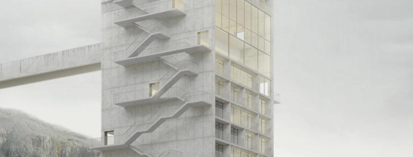
The recent industrial legacy was the motto for the development of this project, given its inhibiting potential for the urban development of Sines, which can only take place towards the North or East. One of the large urban scars identified was the quarry, however vacant, adjacent to the north of the industrial port. An urban void measuring 500x400m and 60m deep is the most immediate urban obstacle in the southeastern part of the city with a great visual impact as well, so it needs attention.
The selected program was a hotel aimed at those that the industrial sector often calls to Sines. The
intention is to transform the quarry into a potential destination, re-establishing a thriving connection
between this harsh territory and the people. The proposed building connects the upper level of the
promontory (city) and the lower level – where an artificial lake, a dam would be created for the population to enjoy, which at a later stage of planning could become a reservoir – creating a direct access from the city. Through this intervention, the intention was to create new perspectives and uses, creating a harmonious dialogue between architecture, the semi-natural landscape of the quarry and the artificial one of the terminal. The issue of memory and industrial identity of this colossal place was of extreme importance in creating an inter-relational language.
In an investigation of the industrial past of quarries, cataloging images that support a local identity, almost as Bernd and Hilla Becher did, a photograph by Tito Mouraz was preponderant in the development of this language. In connection with the huge cranes that tower over the quarry from the sea, the hotel emerged in a vertical proportion, in direct communication with them and in contrast to the irregular horizontal rings of the quarry, inspired by the K5 frame (3-Step Attractor) by Michael Biberstein. The two bridges that connect the tower to the rocky terraces recall the vertical structures from which the conveyor belts that transport the rocky material extracted from the quarry are stretched.
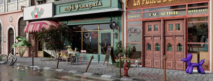
This project is an attempt to make lifelike visuals of the vibes of Paris and its Streets.Its almost so surreal when the friendly and peaceful ambience of paris can be felt through its streets. The making of this particular project involved a lot of research. The cafes, footpath and all such small detailed elements add to the beauty of it.Through the medium of this Visualization, I want the viewers to immerse in the vibe of an authentic and vibrant Paris neighborhood.
Most of the thinking process was trial and error in AutoCAD.
The modeling of the project was done using Sketchup 2020 and the surreal renders were made on Lumion 11.
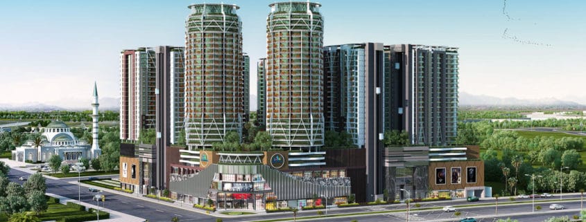
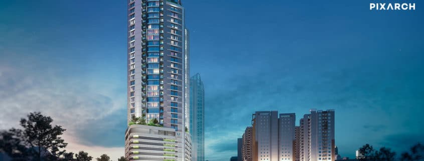
We at Pixarch, are the leaders in architectural animation, longest-serving and the most trusted company of the country, a powerhouse elevating your brand to the highest pedestal with our contemporary 360-degree campaigns. Recently, we have designed a 360-degree campaign for a high-end edifice of the metropolitan city, The Court Skyscraper. After burrowing deep with our team of master crafters, we emulated reality through every ray of light, surface texture, and finish and delivered an impeccable result. Using the holistic marketing philosophy, we have positioned the brand perfectly. After burrowing deep into insights, we have created a systematic customer touchpoint array starting from Brand Identity to Realistic 3D Views, 2D and 3D Floor Plans, Print and Outdoor Design to Realistic 3D Architectural Walkthrough for both social and electronic media.
We have created an ultimate brand, The Court Skyscraper.
Cozy bedroom
Design: Eng.yazdi
Render: yahya jafari
Oct 2021
Hope u like it…