Peter + Alison Smithson / Upper Lawn Pavilion 3D Recreation by Lasse Rode
I never heard of Peter and Alison Smithson and their Upper Lawn Pavilion that they designed for themselves as a weekend house. Loving brutalist architecture, I have to thank Lasse Rode form studio xoio for doing such a remarkable 3d recreation of this house. This set shows the house in the way it probably looked early on in its life. Brutalist creations have a tendency not to age so well if not kept in check… especially in landscaped, humid areas. However, I kind of like that derelict, rustic look.
Visit Lasses original forum thread at – Peter + Alison Smithson – Upper Lawn Pavillion // Lasse Rode, xoio
You can find more information about this house following the links below
- Alison & Peter Smithson’s Upper Lawn Pavilion
- Upper Lawn Pavillion
(A negative viewpoint about it)


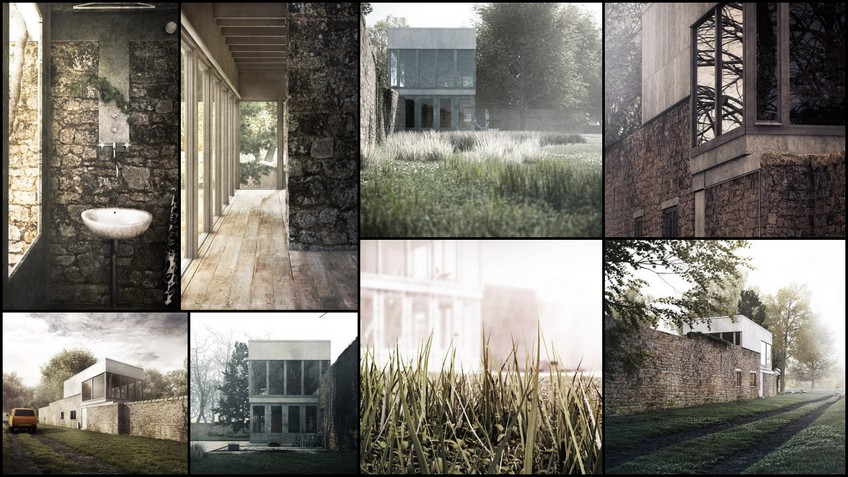
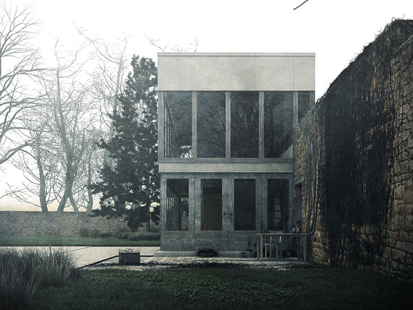
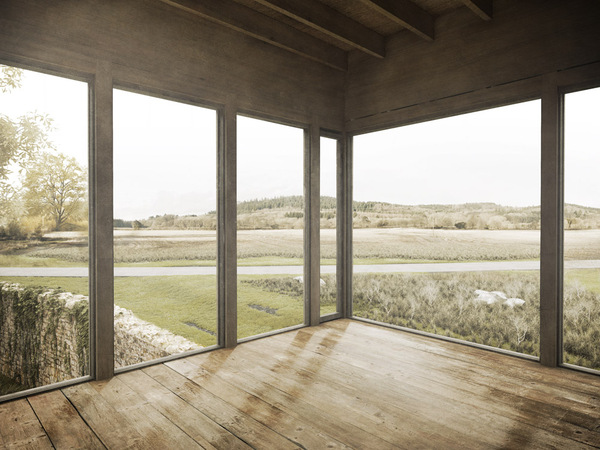
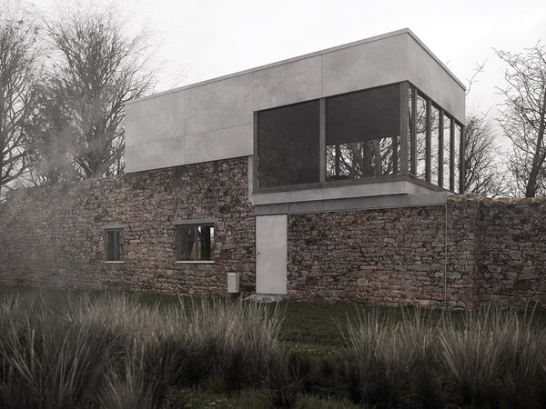
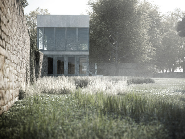
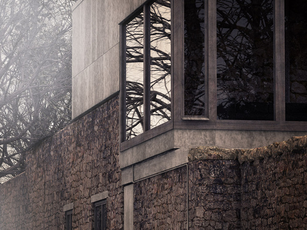
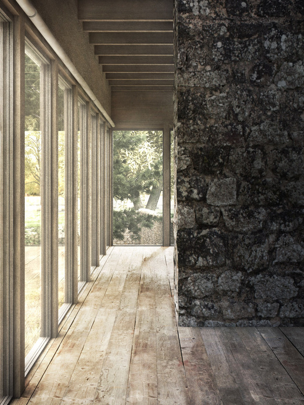
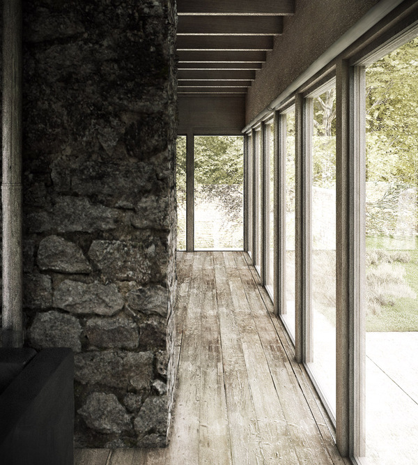
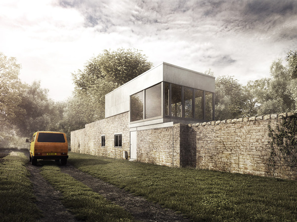
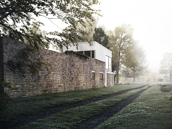
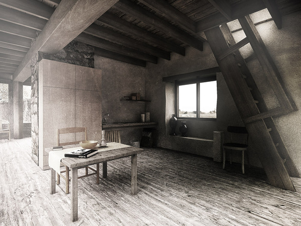
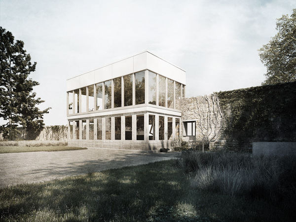
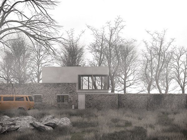
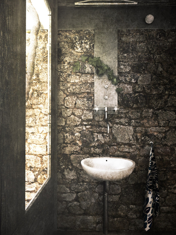
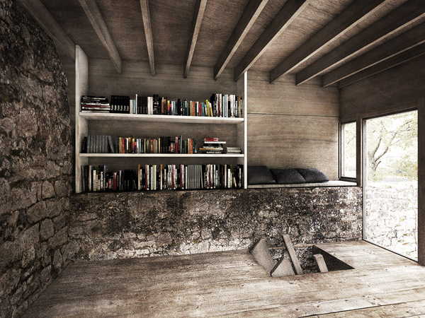
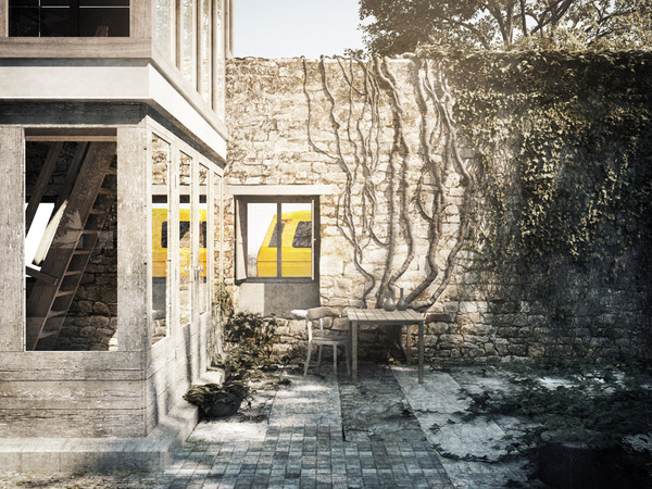
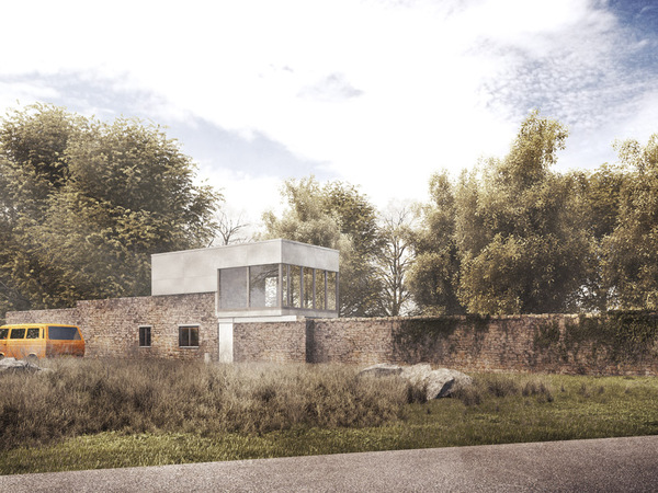
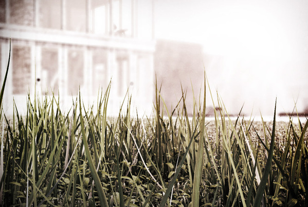
Amazing atmosphere! Would love to see a photoshop postwork breakdown of this! If it’s done with Photoshop, of course 🙂
Really Amazing ..
Btw Ronen . Where can i find your works ?
i would really luv to see them
if you could prvide me the link
@anwar522 Check out the studio website at http://www.polytown.com 😉
These are great renders in my opinion, some kind of a expressionist style I’d say, I love it.
I think that your philosophy is to extract a lot of render Elements to have full control and play with it in post production so I have a question: what render elements do you use exactly ? Are you minimalist and play only with some slight curves corrections, or are you”maximalist” and tweak all materials one by one in post prod to achieve the exact feeling you want to … ? And, in that case, how would you manage with a video where you cannot play anymore with VRayWireColors or Multimatte elements … ? I think it s a crucial aspect of our work.
Anyway, hats off to you, and thank you for sharing.
@LightCash thank you for your comment.
you are absolutely right when you say it is some kind of philosophy of how you treat your render – and i must say that i am kind of half-way.
i tended to do this post-material tweaking thing in a lot but due to the reasons you already mentioned i more moved into the “minimalist” area – which does not mean render-output=final-image (which i absolutely admire!)
I mostly do color corrections that could also be done in an animation somehow… so most of the time it is curves, hues and saturation levels, some grain and an AO-pass and sometimes a lens-flare 🙂
but: why do you think you cannot use wirecolors and multimatte in animation? actually compositing programms like AE,nuke or fusion handle masks very good – sometimes better than photoshop, no?
replacing textures can be very tricky – but i’m not doing this anyhow
again,thanks a lot for the hats off 🙂
best regards
Lasse
@xoio @LightCash
@xoio “why do you think you cannot use wirecolors and multimatte in animation?”: just because I am a newbie with animation, I just didn’t imagine I could use such renderelements. I still have to learn AE …
I too admire people with final image = render output from 3dsmax and I think it is just a few of us, Peter Guthrie seems to have such a workflow, with only minimum post production work, and his work is stunning.
Hello!
I also have to say I love your renderings! I have one question regarding the use of “grain” as you mentioned you did in post-production. I was always looking out for the right answer creating this kind of “look”, for example the wooden ceiling on picture 15/18. It somehow looks CG-rendered, somehow real, but it also has a special “diffuse” or “grainy” touch to it. Some images look, as if they where printed out on thick, rough paper, where you also get kind of this diffuse-effect, because the paper is sucking up color and slightly blurring the image. I hope you know what i mean? Would you be so kind, telling which kind of “grain”, “filter” or which program you used for giving your images that “grainy-diffuse” look? Thank you and keep up your great work!
@David K. thank you 🙂
well – there’s no general way actually, as everytime lighting conditions and so on vary. but in this special case it is somehow a mixture of desaturating, adding a cross-processing-curve and lifting up the higher color values. also adding painted glow and hiegh-contrast helps. but: it is always a special trial-and error thing.
i hope i could help you?
best regards
L
Thanks again, Lasse…
not only for your beautiful atmospheric images. but also for the architectural projects you choose. This one is definitely a favorite Smithon project which i really love. Also the bus is great, same as the one my parents had…reminds me of childhood holidays..
Keep on going…
@micarstens you are very welcome 😉
i always liked the smithsons as well. in the first year at university we had to analyze holiday-retreats build by famous architects – the girl on the table next to mine was working with this house and i was very fascinated about that. building a house on top of the wall of an old one.. how crazy is that ?!
all the best
L
Worst interiors i have seen in a long time.. i am surprised Ronen selected this for home page.. really? exterior images are better and beautiful.. real shame when u say “I like noise” heh..
Worst interiors i have seen in a long time.. i am surprised Ronen selected this for home page.. really? exterior images are better and beautiful..but not all of them.. only some.. real shame when u say “I like noise” heh..
@Dollmaker hm – i can see your point somehow. but look: i had fun making these images and wanted to share – hoping some people would enjoy looking at them 🙂
“i like noise”: i made a smiley behind that. matheus asked if i had a problem with vray – i don’t have. so please don’t take this too serious 😉
peace
L
@xoio No.. i am not 🙂 I already said i like some of exteriors 🙂 its just that i dont think it have quality to deserve a home page..specially with all excess noise.. and now as I see it is on home page.. i wonder what am I doing here all this time.. may be i should just top posting on this forum .. 🙂 I will do just that 🙂
Good luck to you 🙂 and thanks for all free stuff released by you Xoio 🙂
@xoio
No.. i am not 🙂 I already said i like some of exteriors 🙂 its just that i dont think it have quality to deserve a home page..specially with all excess noise.. and now as I see it is on home page.. i wonder what am I doing here all this time.. may be i should just stop posting on this forum .. 🙂 I will do just that 🙂
Good luck to you 🙂 and thanks for all free stuff released by you Xoio 🙂
@Dollmaker @xoio Eh calm down Dollmaker … In my opinion interior renders are very good: CG is a way for all of us to express yourself, to communicate the way you see life. I think you should give more respect to Lasse work because it is clear that he masters the technical aspect of the rendering process, now, maybe you Dollmaker doesn’t like his style but for sure he can be on the home page !! Just because, as I mentioned, no doubt he masters VRay, but more because he puts his own feeling into his images, and this grainy effect is here for that. It gives some kind of photography look that I really love: I just hate too sharp / clean renders.
Respect.
@Dollmaker Well you might be right at your point that the interiors looks bad but i beilive its for me like taking a photograph of an haunted place ..
And that noise gives really an amazing feel …
@LightCash @Dollmaker @xoio There is more the one way of doing visualization, and certainly each one is entitled to have his own opinion about it 😉
The post production @xoio / Lasse used here is very much in tune with the brutalistic and aged subject matter wish is the Upper Lawn Pavilion. In that Lasse captured something really special and presented it in an expressive way a so called “clean” image would not managed to do.
@ronenbekerman @LightCash @Dollmaker @xoio Soo truuee .. If he would render this in Clean way with no noise you be then really be Disappointed 🙂
I like the syle. Good viz work. I just wish there were bigger images. 🙂
Nice Post, I hardly found useful post which contains real and useful information. I am 100% sure who ever read your post will definitely going to learn something useful.
http://www.iftekharahmed.com