Making of Taekwondo – The Fighters
Karim Mousa’s Egyptian ethnicity led to many “descendant of the Pharoah” jokes in the five years he lived in Bergen, Norway working for the highly regarded visualization studio Mir. If only his colleagues had known his true claim to fame was as a former international Taekwondo champion. Well, in this article we get a glimpse into that world of his as he recreates the pinnacle moment of the sport. This one is a dozzy! I’m sure you’ll enjoy diving into this amazing breakdown.
First of all, I am very grateful to be invited to write a making of/behind the scenes of my recently finished project titled Taekwondo – The fighters. I have always held a great deal of respect/admiration to Ronen Bekerman’s Blog and learned so much from it. I love this community and enjoy the knowledge sharing and interaction between the artists, so do share this around for all to see!
Introduction
I will walk you through this project process and stages from the beginning of the initiation of this rough idea till I managed to translate it into this set of visuals. I have to say I have enjoyed this journey so much and was a very emotional experience for me creating this project and seeing it finished.
Inspiration – Motivation
I had practiced Taekwondo professionally from when I was only nine till I quit at the age of 25 to pursue a professional career as an architect/visual designer and artist.
Taekwondo for me was more than just a sport; it was a way of life, it taught me so many things, it forged my personality, I have passed through some extensive experiences through it good and bad, happy and sad, painful and inspirational. It gave me purpose and goals.
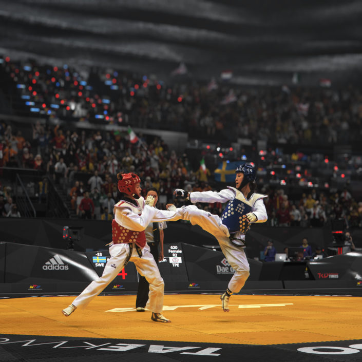
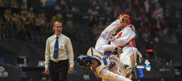
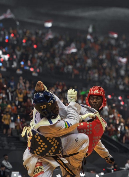
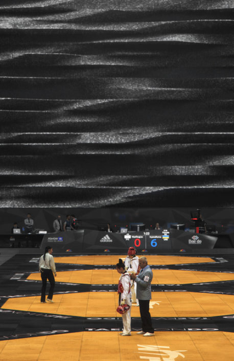
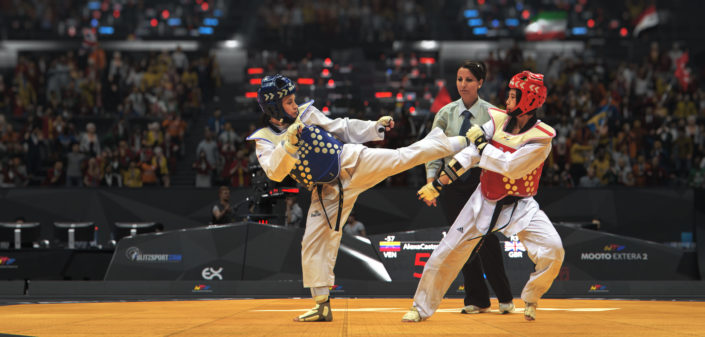
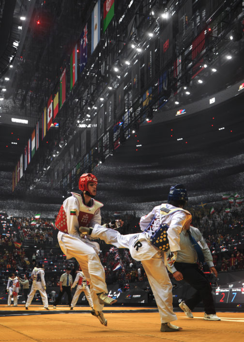
Doing a project about Taekwondo was always in my mind. Creating a set of visuals that will translate a few moments from the Taekwondo players fighting experiences. Moments you can’t feel being a spectator. I wanted to get the viewer as close as possible to the fighting scenarios, with its speed, its power, its dynamic motion kicks, its victory, its defeat.
That was the pivotal inspiration and motivation that kept me going.
Art Direction
I started to lay down some initial directions and thoughts about the visual intent having in mind the experiences I wanted to communicate and present.
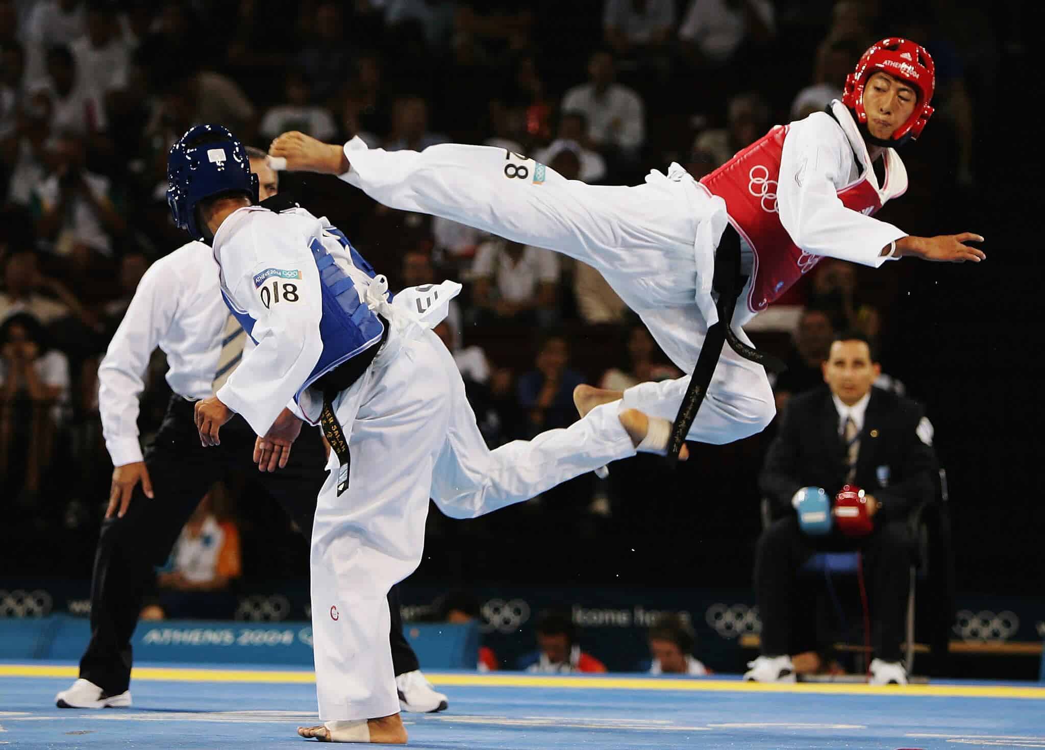
I started by gathering some relevant references that could inspire me and boost the idea that I have in mind. In this case, one of the most influential inspirational moments was a fight my wonderful ex-colleague was competing at the Athens Olympics against this fantastic Chinese Taipei competitor, and they were both movie style moves.
Things like crouching tiger hidden dragon type of stuff!
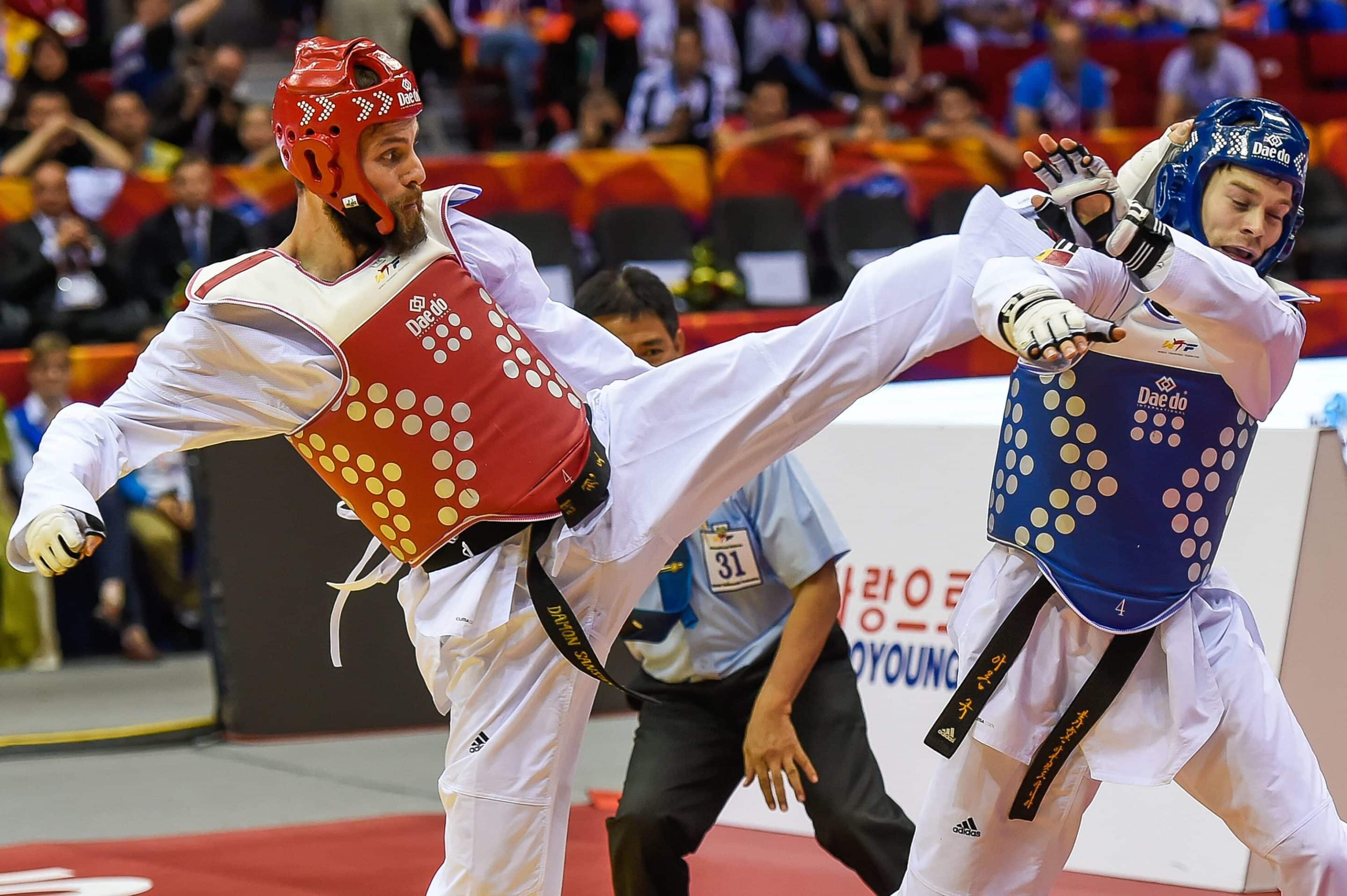
crazy flying double kicks that are almost unreal, I never forget this fight, and to my luck, I saw one amazing photo taken in this contest that just boosted my inspiration and art direction like no other.
Planning & Process
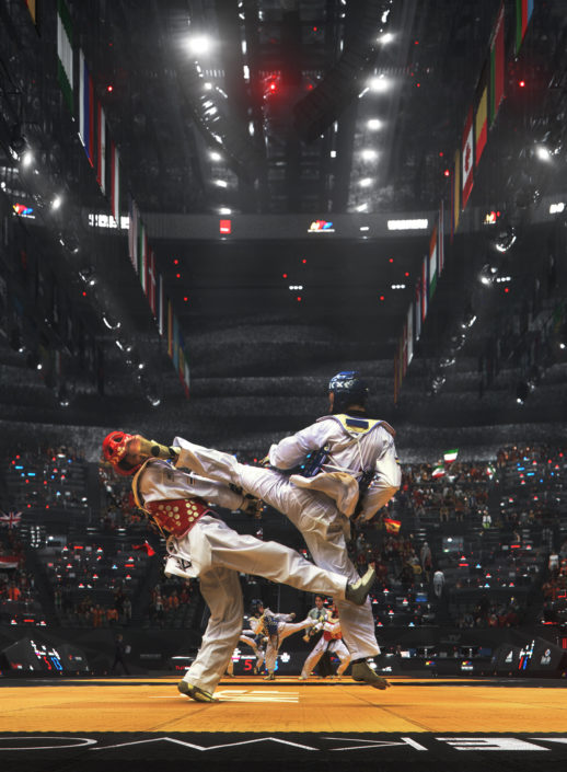
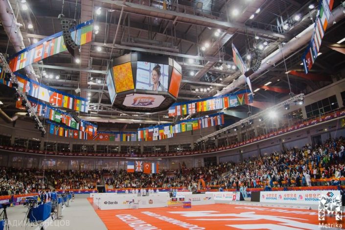
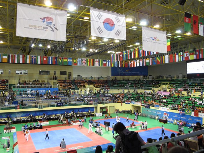
I started putting some guidelines for the planning of the project and the process. I knew from the beginning I will have to model the entire stadium elements and features full 360 as I will take several shots from several vantage points.
I also knew that I needed an outstanding amount of details, especially in the foreground elements like the court and the structure in some cases to achieve the realism and make everything as believable as possible.
That is why I decided to break up the scene and use XREF scenes to keep all files at a reasonable size and reasonable saving times for easy handling.
- I wrote down all the elements that I need to add and search for or model like for example.
- Taekwondo competition scoreboards.
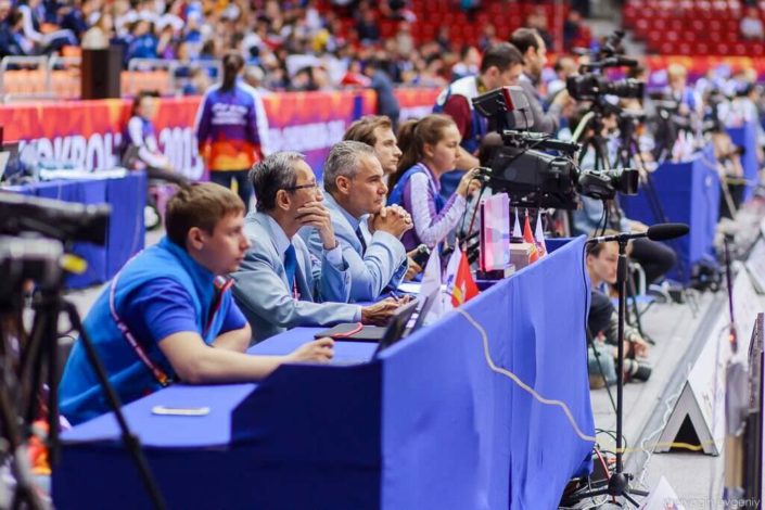
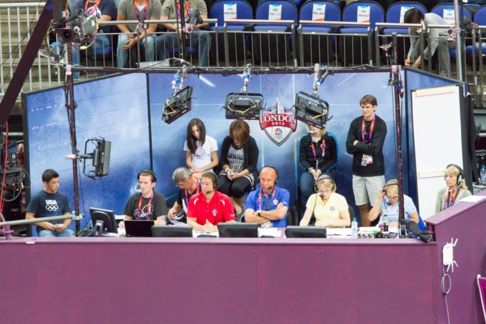
- Judges and press benches and tables.
- Court judges and managers.
- Video cams and recording accessories.
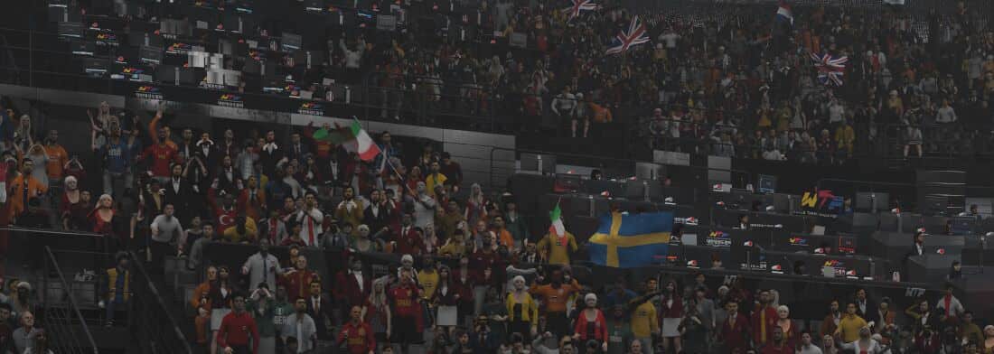
- Crowds with deep variations in poses, textures and sports training suits.
- Countries flags.
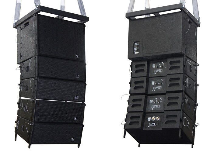
- Structure deep details, light projectors, and speakers.
- Dynamic back stadium wall.
- PC’s, laptops, press tables and judges accessories.
I am not usually a fanatic in custom modeling everything, so whenever I find a ready model to use that is close to what I need is always a great aid. If I didn’t, I would try to custom model it.
I have used V-Ray Proxies / Instances as much as I can as I intended to scatter it all around in high numbers while keeping RAM use in check.
I used models from Evermotion, TurboSquid, and AXYZ Design.
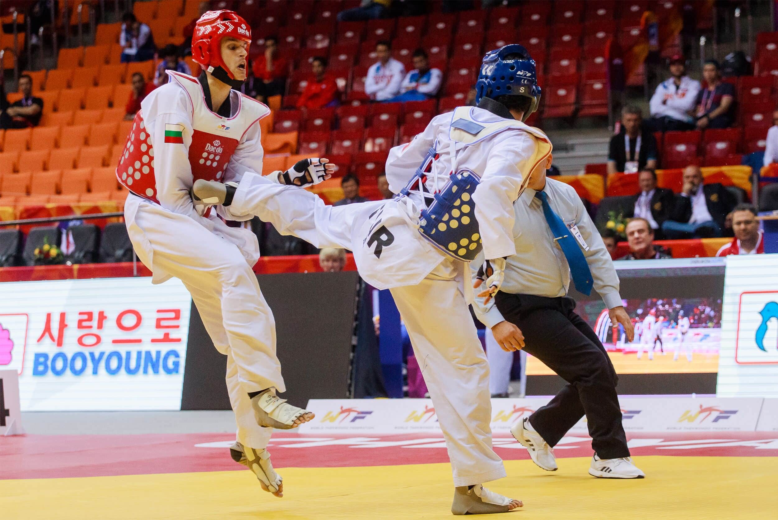
Fighters – Photography
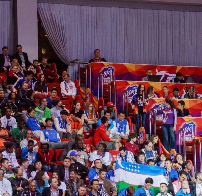
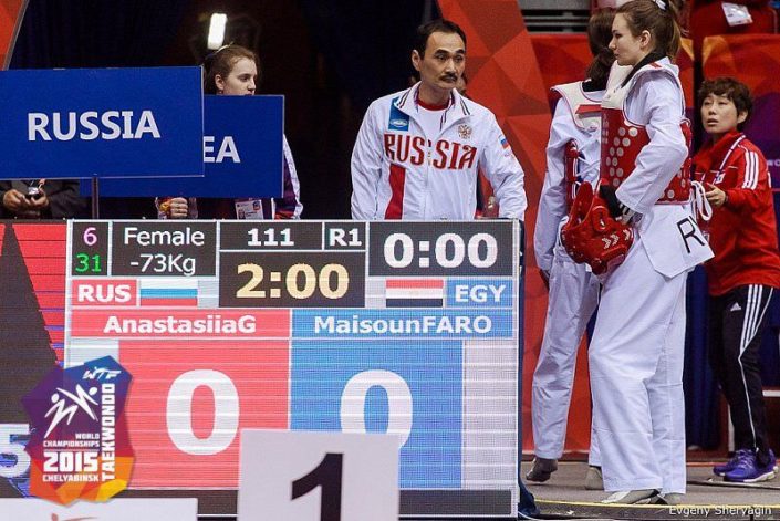
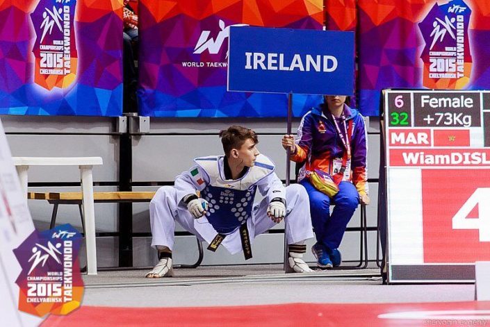
From even before I started the project, I knew a 100% that I had to plan a photo shoot session in a real tournament. Since I wanted to inject my visuals with many variations of players with different nationalities and different looks I thought the World Championship would be the best event for taking these photos.
I thought that I would travel to attend the World Championship in Russia several years back, but I have discovered that I have to have an official sports photographer license to be able to get permission to get closer to the court and the fights to take these photos. I have then contacted the World Taekwondo and Russian Federations to ask about photographers that I could assign to get me those photos and also to ask for their permission for the copyright usage.
They sent me several photographers contacts, most of them were Russian. I sent one of them which I liked his work the most, and he replied in Russian, stating he is apologizing that he cant write in English.
I was quite frustrated at the beginning, but I thought why don’t I just Google Translate his email and reply in Russian after translating my email too. We kept going like this, and I have explained what I need from him, and he took the photos that I needed perfectly!
This story is a bit of a funny story, but I wanted to share it to show that we usually face a lot of challenges that we need to solve along the way, I would say persistence is the key.
Design Concept
I wanted to achieve design aesthetics that resembles and reflects characteristics of Taekwondo like Speed, Motion, Dynamic, Powerful, Sleek, etc. I also wanted all the elements and features to work together to convey this experience accurately and highlight the quality of the fight and bring more focus to the power of the game.
I have gathered many references for elements that I liked from movies, real life or photos. I wanted the stadium to be mostly black and slightly reflective and the court to be yellow to catch most of the attention.
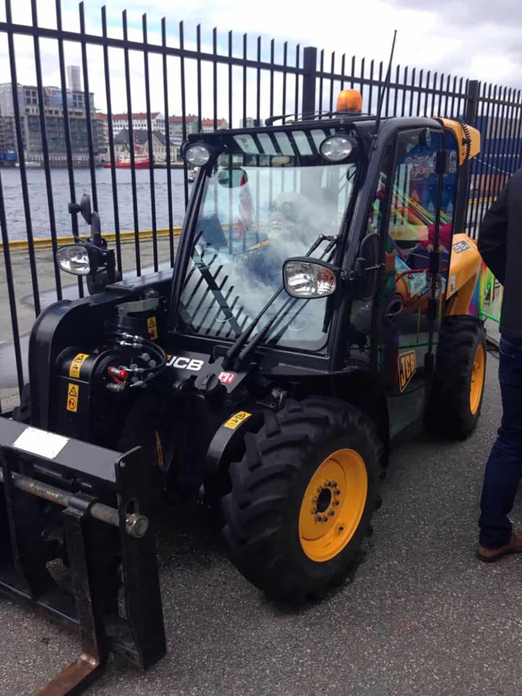
One day I was walking by in the beautiful City of Bergen, Norway after I left my work day at the awesome MIR office, and on my way, I saw this small truck that caught my eye. I felt I had in mind the same scheme and aesthetics in my Taekwondo stadium, so I took some photos of it and used it as one of my main inspiration direction.
I can see a lot of artists (including me) only looking for inspiration in a specific field like visualization or architecture. I would recommend embracing a wider range of inspiration sources. There is just amazing different stuff that we can get inspired by.
Modeling Breakdown
As mentioned, I saved each category/element in a separate file and used XREF scenes. I have worked on each file separately, so everything is nice and smooth.
There is nothing special about the modeling process at all, especially as I mentioned I had used a lot of assets after modification or so but some specific elements needed custom modeling and custom texturing. I also had to unwrap some elements which after lots of years of experience I am still considered one of the lamest artists in.
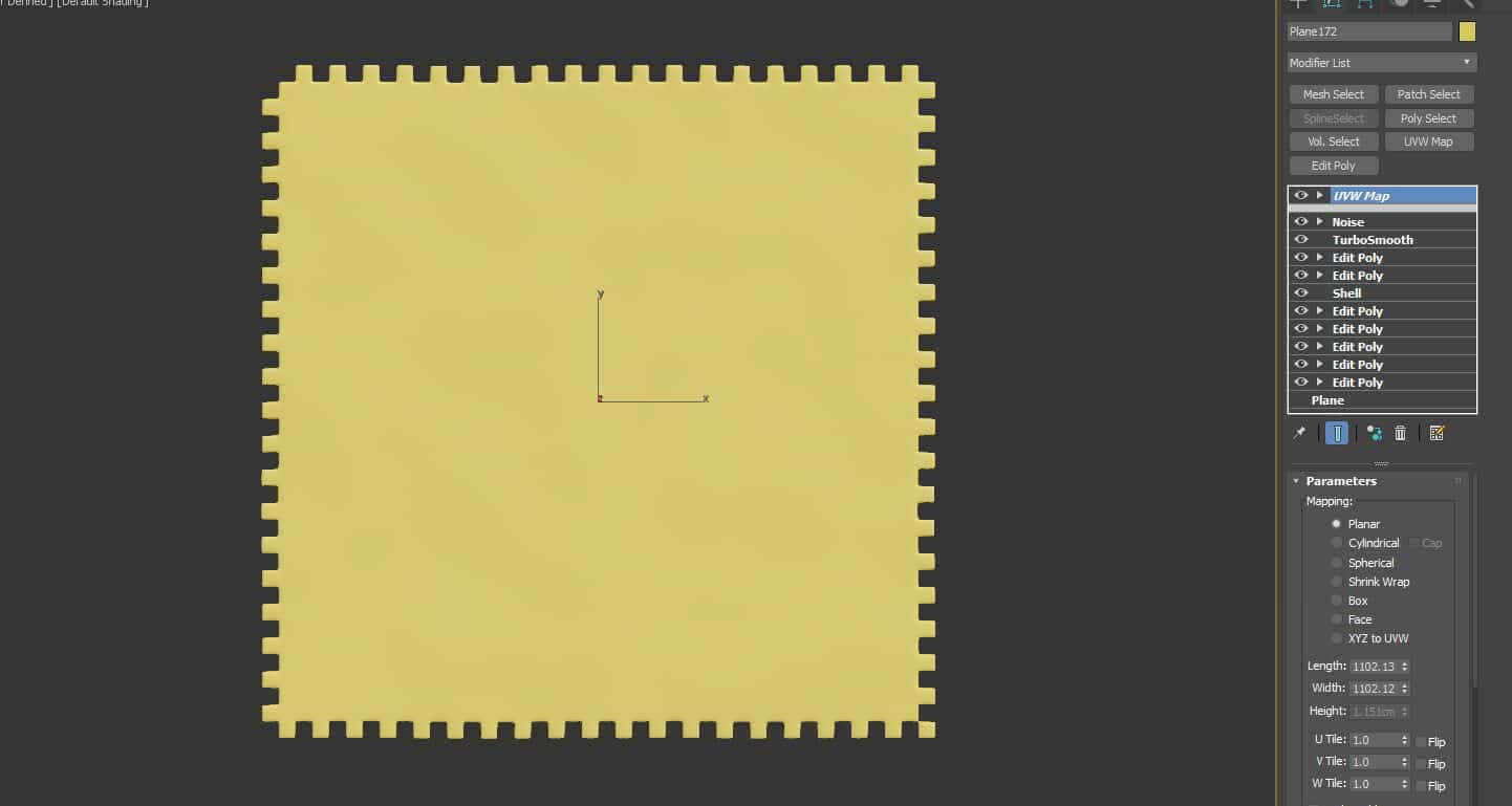
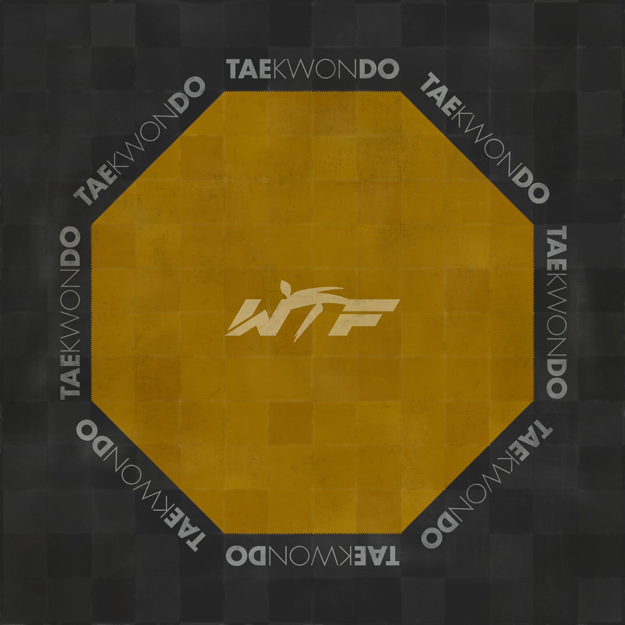
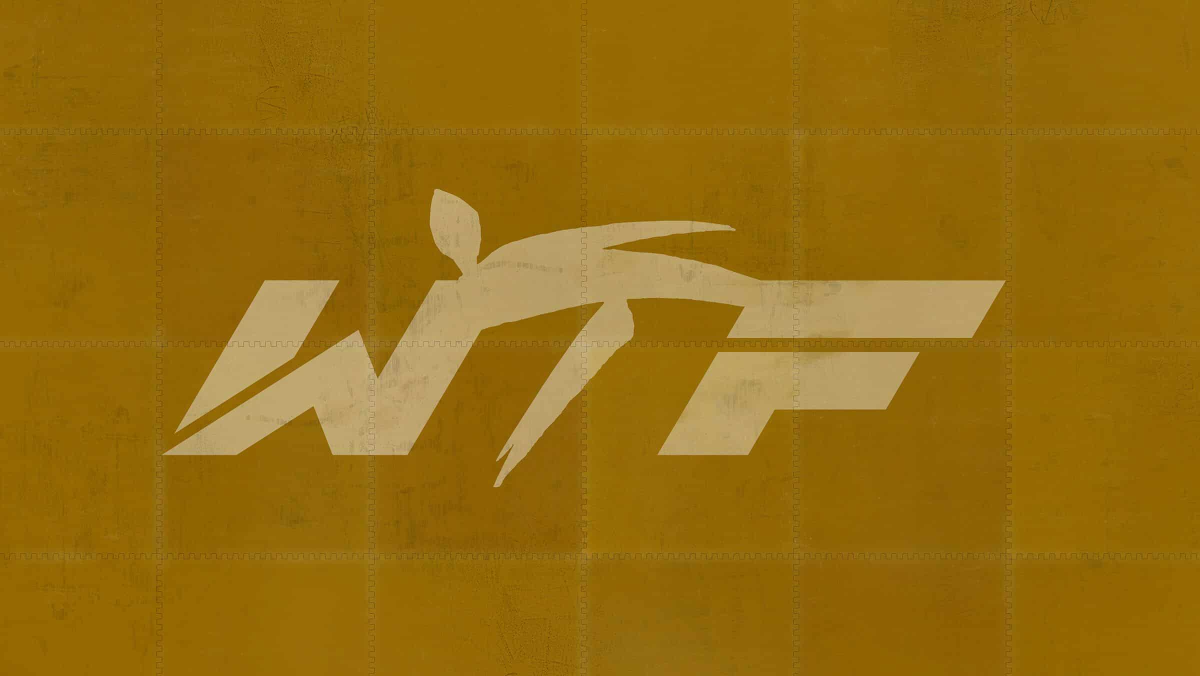
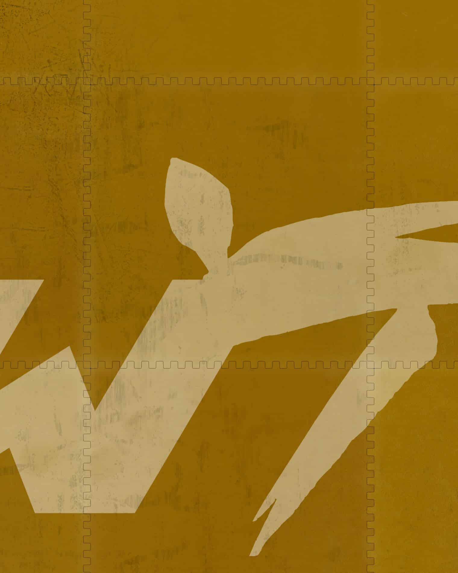
Some of these few elements that I had to custom model and most importantly is the mat court. Especially since I knew that it will always be visible in the foreground of my visuals so needed it to be very detailed.
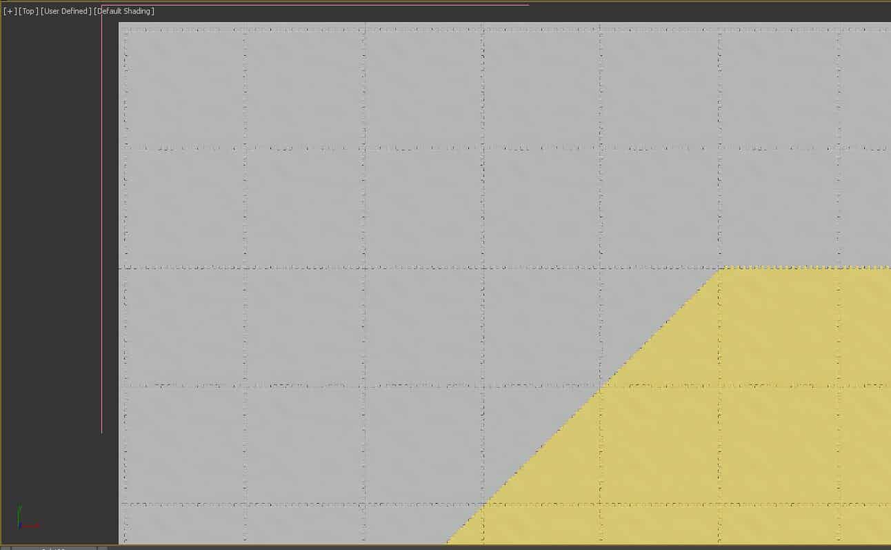
I have gathered a reference to model it piece by piece and added some noise modifier to create very subtle almost unnoticeable imperfections.
Then rendered a top view high-res to use for the texturing, to continue the rest in Photoshop with all the expected slight tear and wear here and there from the fighters feet.
I added the logos and projected back the texture to align perfectly with my model ending in fine detailed, realistic court.
Dynamic Back Wall with Forest pack
The Back Wall was one of the most tricky elements of the stadium. I wanted this wall to represent the dynamic qualities and speed of Taekwondo strongly. It took many attempts to achieve this.
I tried many ways, and eventually, I realized that with the help of the fantastic IToo Software Forest pack I could achieve what I wanted with full control.
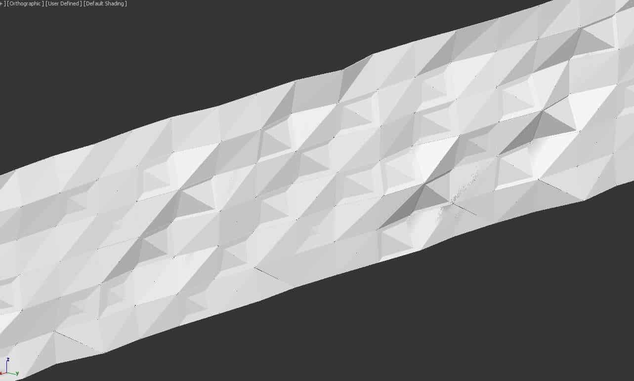
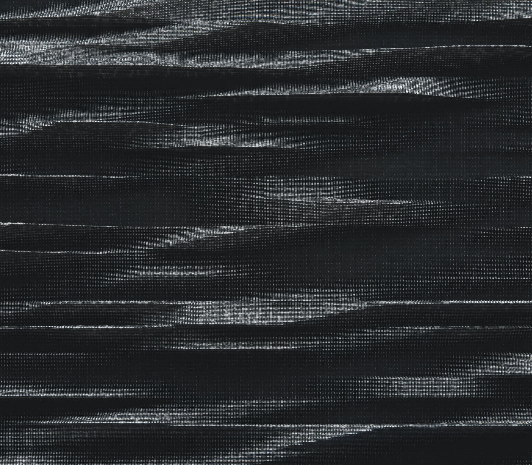
I scattered a simple box geometry on the perimeter back wall, using a map to derive the variation of protrusions. I created this map by modeling something like the attached image below. I then rendered it front view applying multi-sub-object with material by element modifier to generate some random tones and materials. I then opened this in Photoshop and blurred it which made this cool texture map that I can use with forest pack.
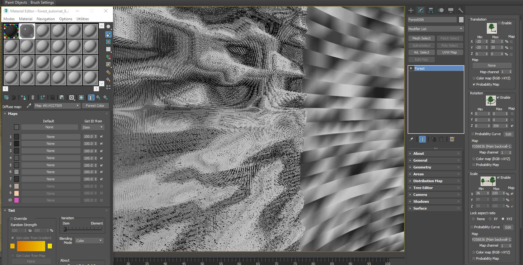
I plugged it into the transform scale, and also to the rotation, so it gave a beautiful effect.
I have also used forest color texture to achieve diffuse and reflection random tone variations. You can see in the image below the map on the back wall which I used in the transform sections of forest pack.
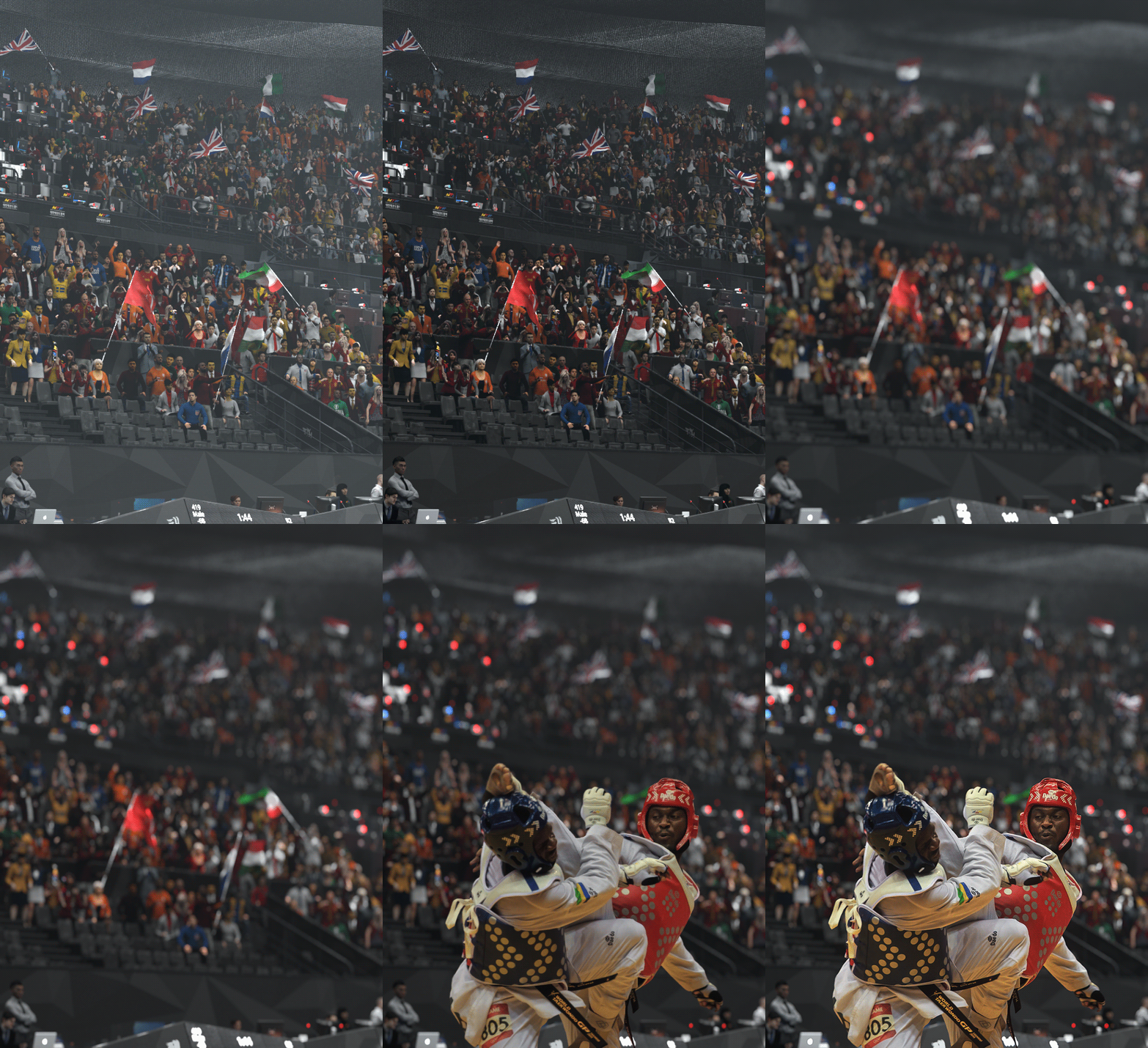
Crowd Characters with AXYZ Design
The crowd had its significant share of work!
The tricky thing about the crowd in such situations is the number of variations needed. In real life, you can find a vast amount of differences in a crowd from their clothing to their poses and so on. I was trying to somehow mimic a little bit of this with a reasonable amount of work.
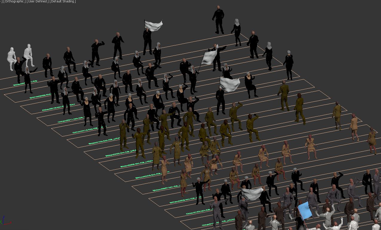
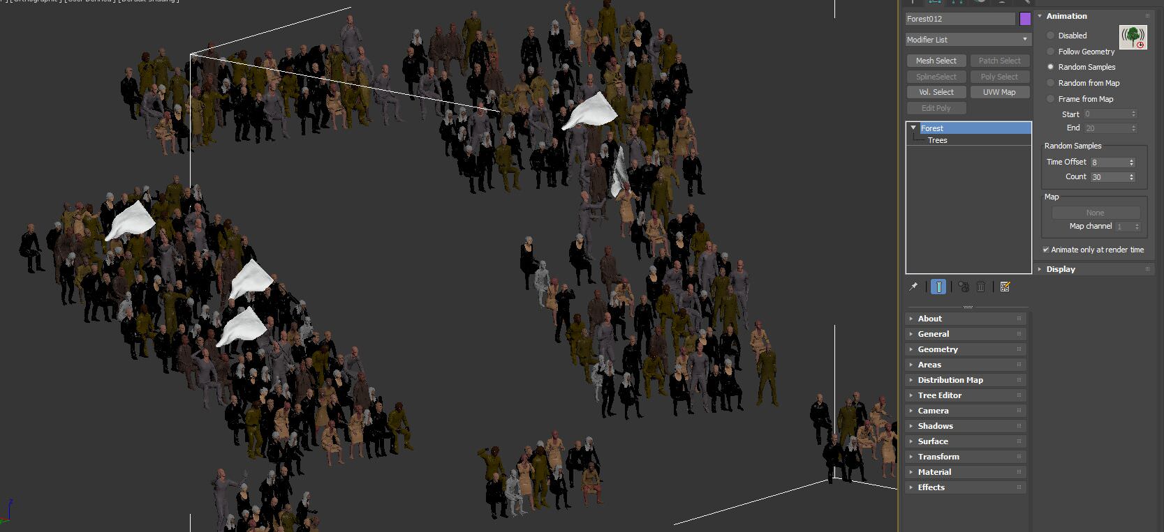
I scattered the seats with Forest Pack along curve lines with equal spacing. I scattered the crowd following the same lines.
I knew that I would be using Forest Pack with the excellent AXYZ Design 3d People collections I purchased. I bought the rigged models so to be able to get a lot of pose variations.
So what I did is that for each AXYZ 3d model I have plugged several rig/biped files :
- one seating ambient
- one cheering
- one clapping hands
- one waving the flag
And so on…
For each model, I created ten different animated sequences. I also saved each to proxy with the animation timeline.
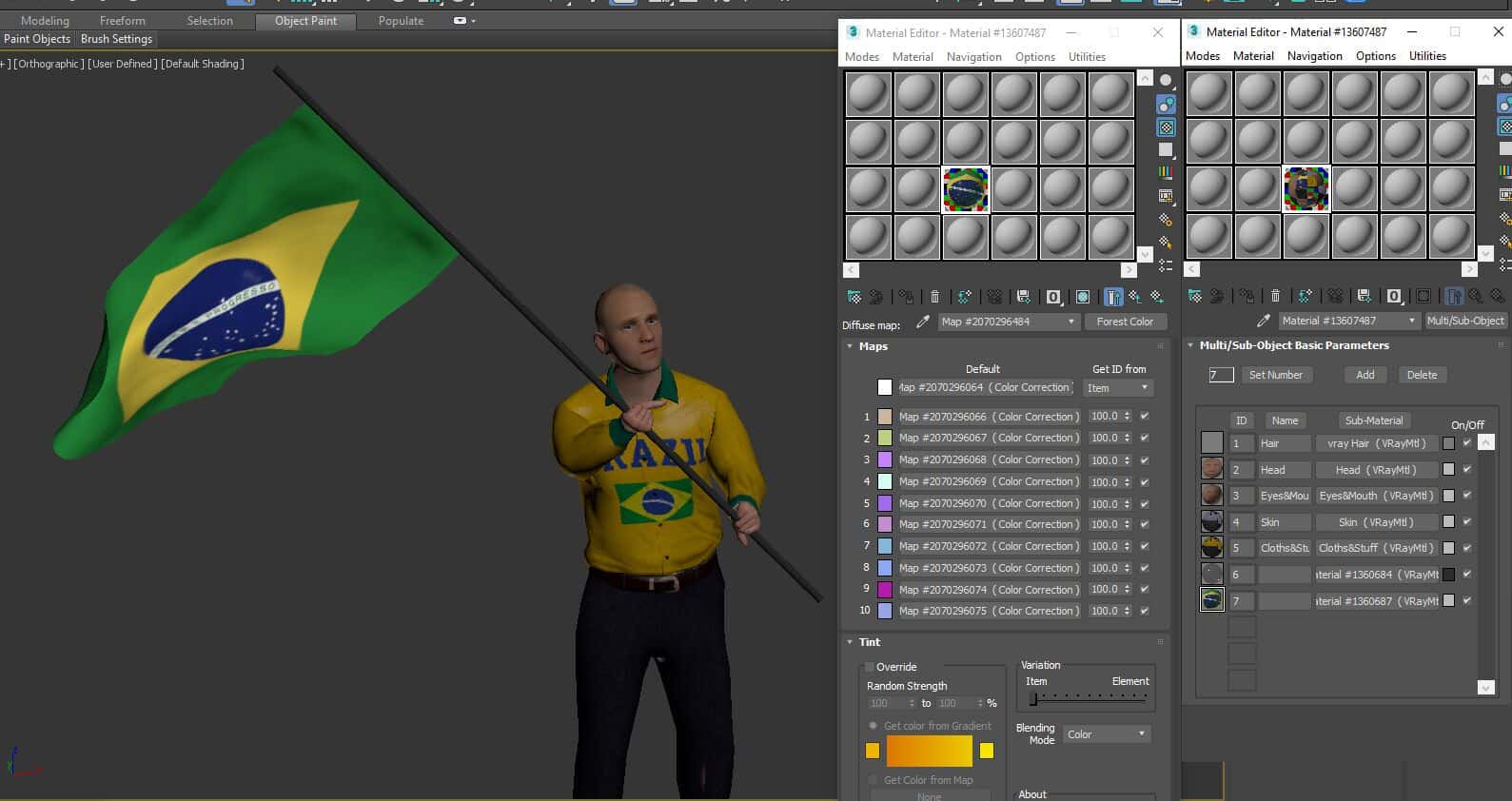
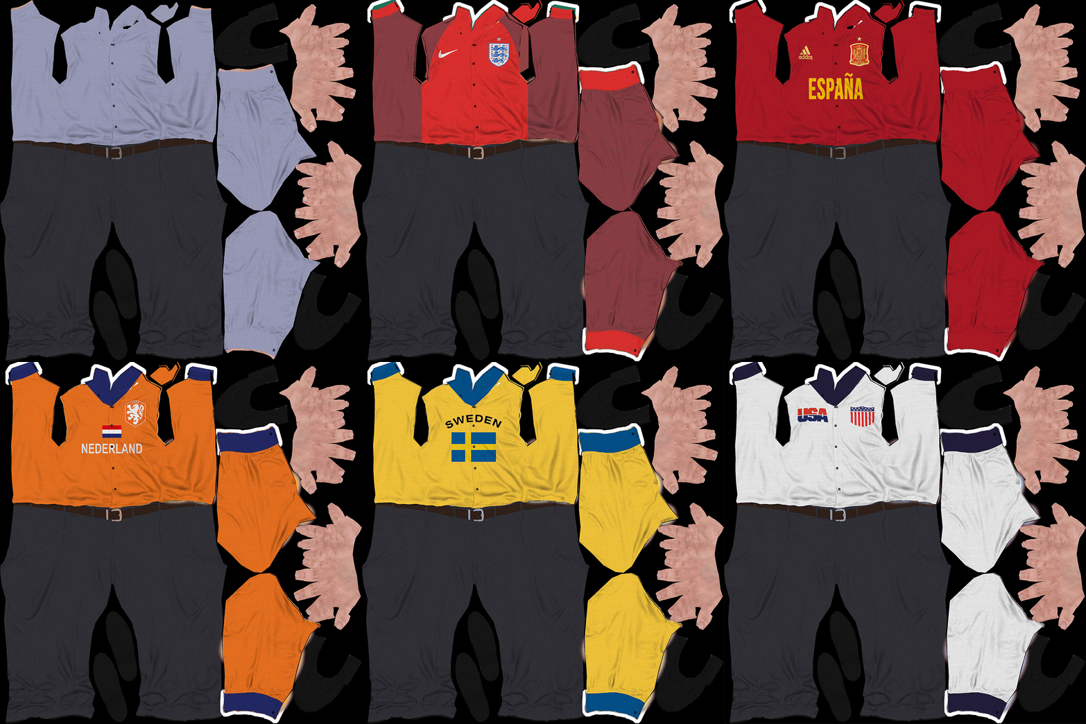
Then, for each 3d model, I created a forest color texture in the diffuse to plug multiple national teams training uniforms. I did the same with their skin face color and hair and with the flags too so that when Forest Pack scattered randomly the guy wearing Sweden uniform, he holds the Swedish flag.
You just have to follow the same Forest color numbers.
I have created the different cloth variation from the diffuse map I got with the AXYZ Design model. Changed its colors and used the texture on top of the uniform colors and logos to still maintain the cloth creases and such details.
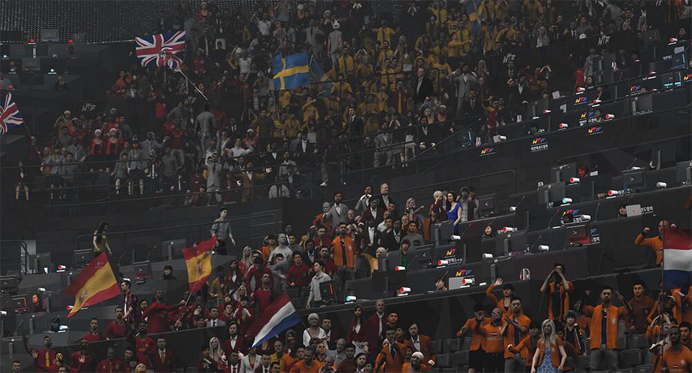
I also planned to create clusters of teams, not just random team individuals sitting. You can see in the tournaments that each team fans sit together to cheer for their players.
Combining the…
- Pose variations I made using the rigged 3d people;
- Cloth and Skin variation;
- Forest Pack animation random sampling to create endless variety of posses and different keyframes from each 3d model;
Gave me the rich, realistic amount of variation I needed and made me feel satisfied with the people in my shots.
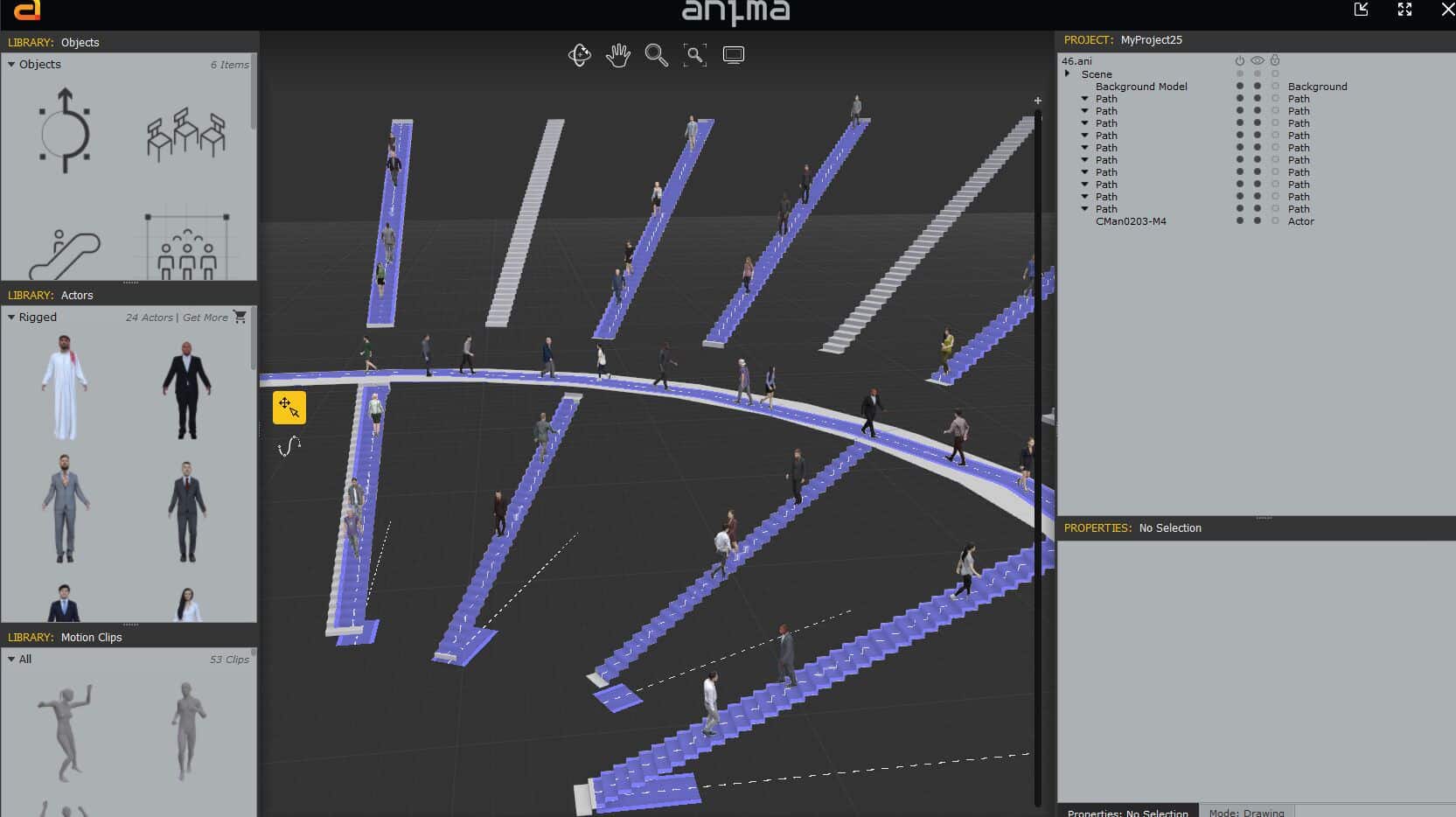
I also used AXYZ Design’s Anima, for scattering the people walking down, up the stairs and in the walkways.
Lighting
I always try to use the most simple light forms especially in complex scenes like this one.
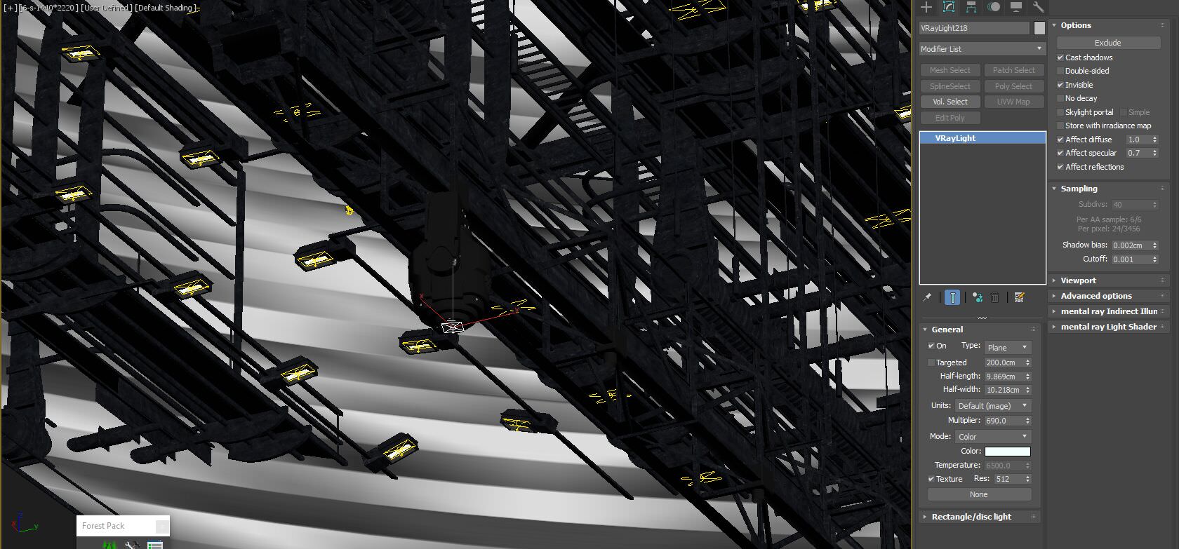
I used V-Ray rectangular light planes in all the light projectors. It is super fast to render, and you can achieve outstanding results with it. No need to complicate it more. I instanced most of them so its also easy to control them all from a single place.
In the beginning, I have a light version of the 3d model to test the lighting with V-Ray RT, and it was working super good. I can quickly check the light intensity and temperature and adjust it to my needs. Of course eventually after putting all the details and doing test renders I had to change it a little bit more, but this kick-start was super helpful in getting the right exposure and brightness.
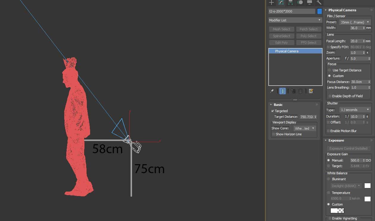
It is also where I see if the camera compositions work or need additional tweaking. I use native 3dsmax physical camera with simple settings… nothing special.
Materials
I always try to simplify my materials without digging very deep into plugging 50 blends and mix maps if it does not show in the final image.
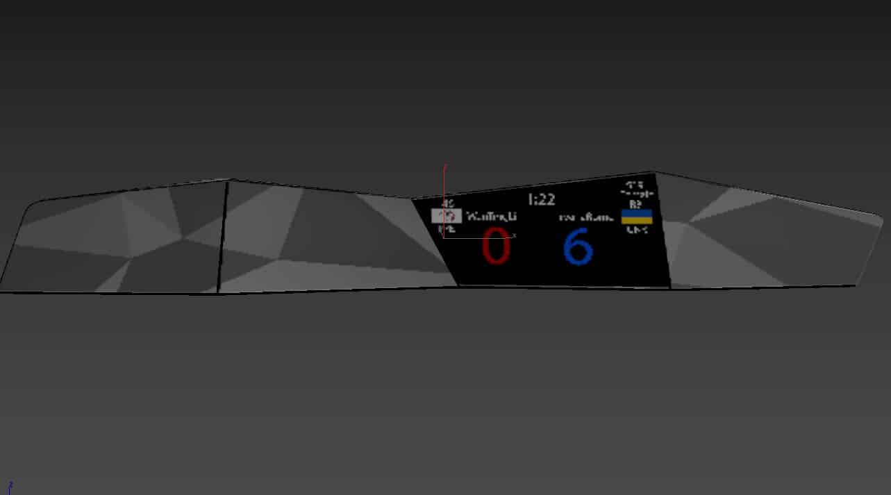
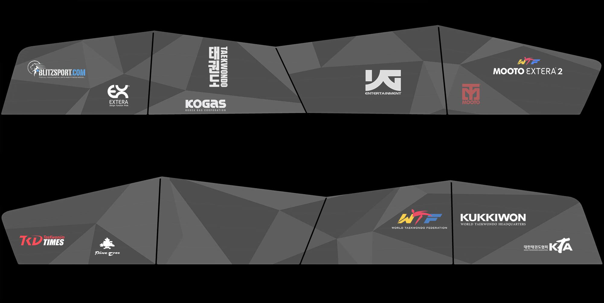
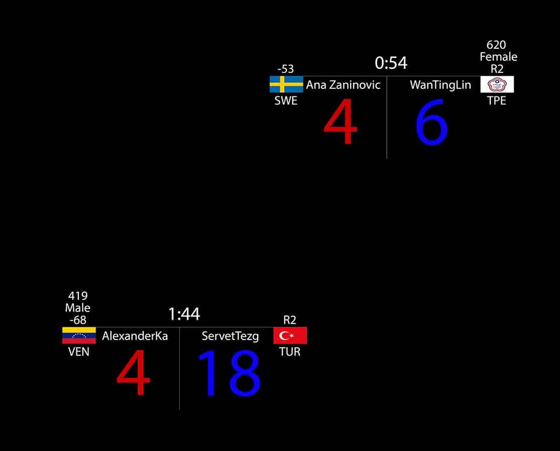
Most of my materials are very simple and straightforward. A few have slightly more details like the ground court scoreboards for example.
After rendering the UV layout, I have textured it in Photoshop and put the logos and relevant details.
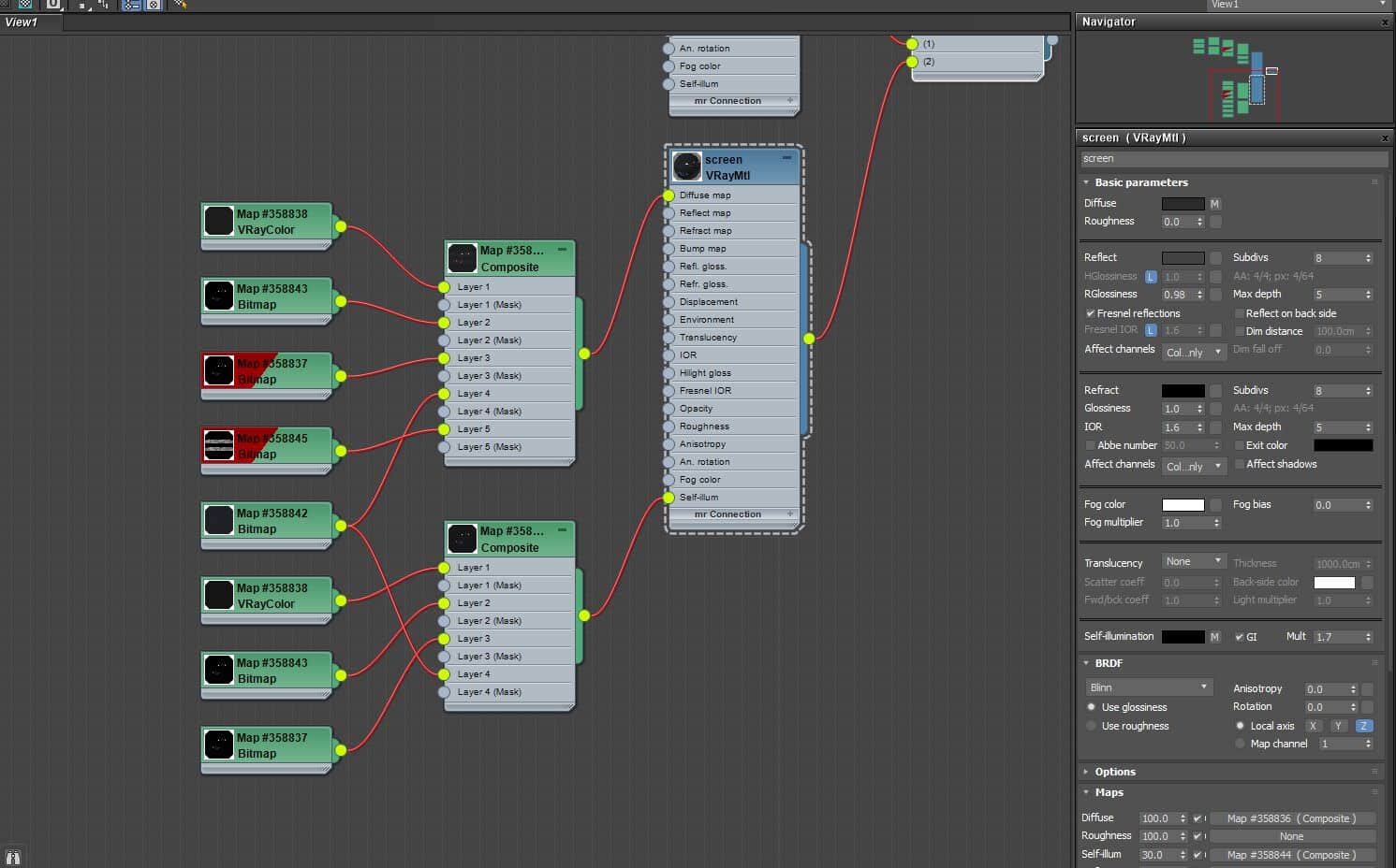
I have used Multi-sub-object to separate the screen from the main body and gave each one different material.
I used a composite to control the appearance of the logos on the main body and also on the screen as to control the brightness of the score as I also used it in self-illumination.
Rendering & Post-production
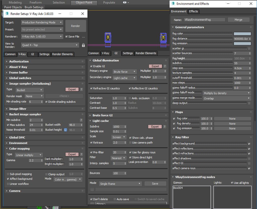
I have rendered all the images using V-Ray brute-force. It was blazing fast, and the quality was superb. Nothing extraordinary here but you can find the settings I have used below.
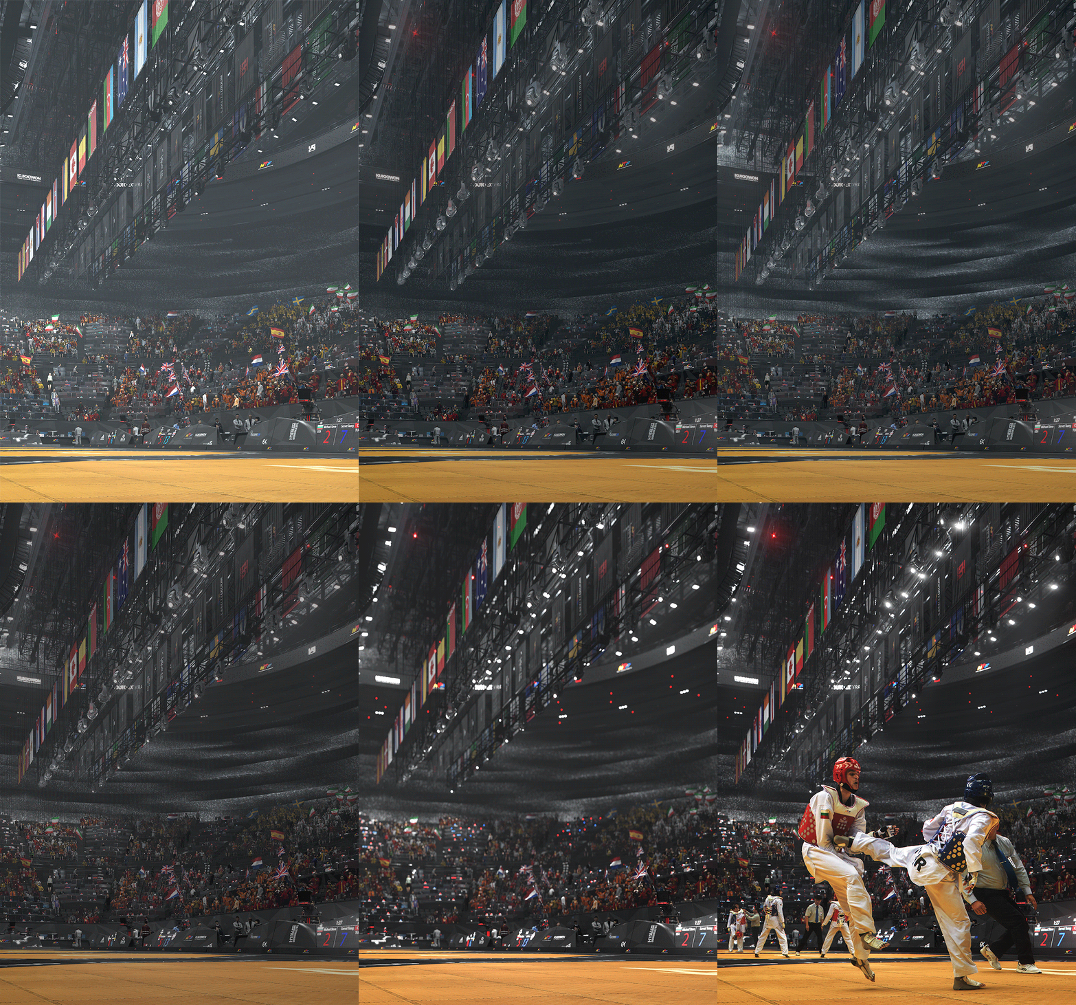
I used subtle V-Ray Fog which also gives nice depth effect in the render. I also use the V-Ray Atmosphere render element to boost the depth effect even more in post-production.
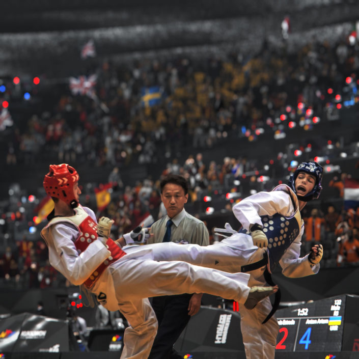
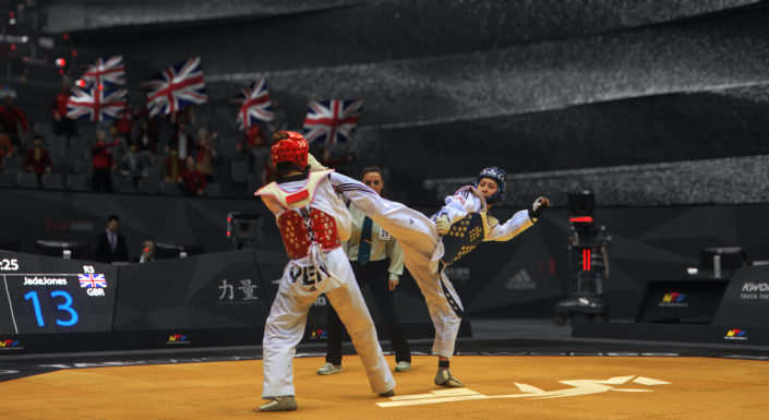
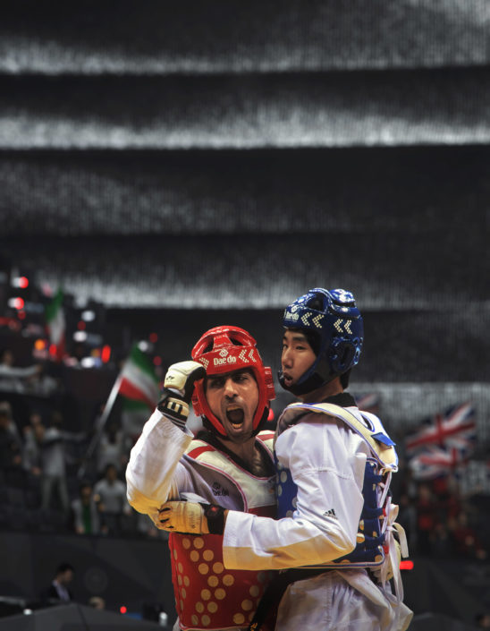
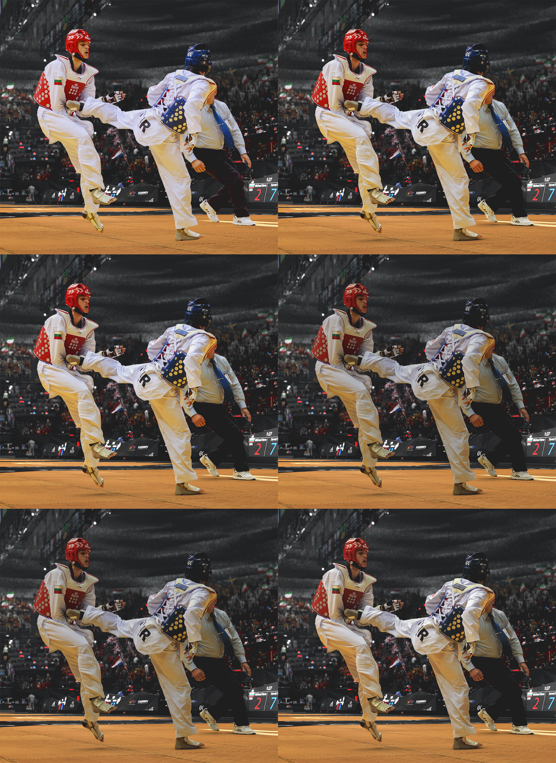
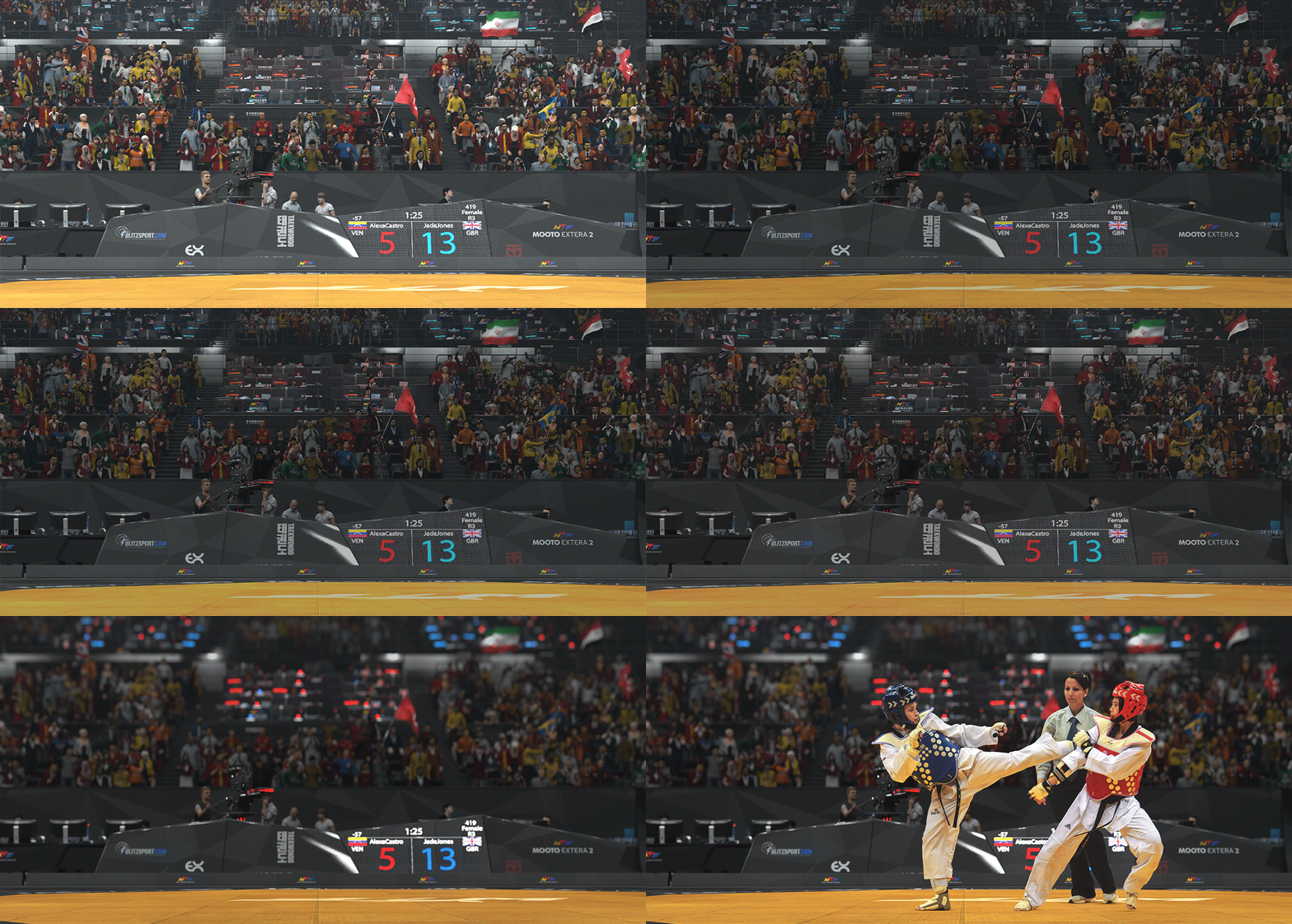
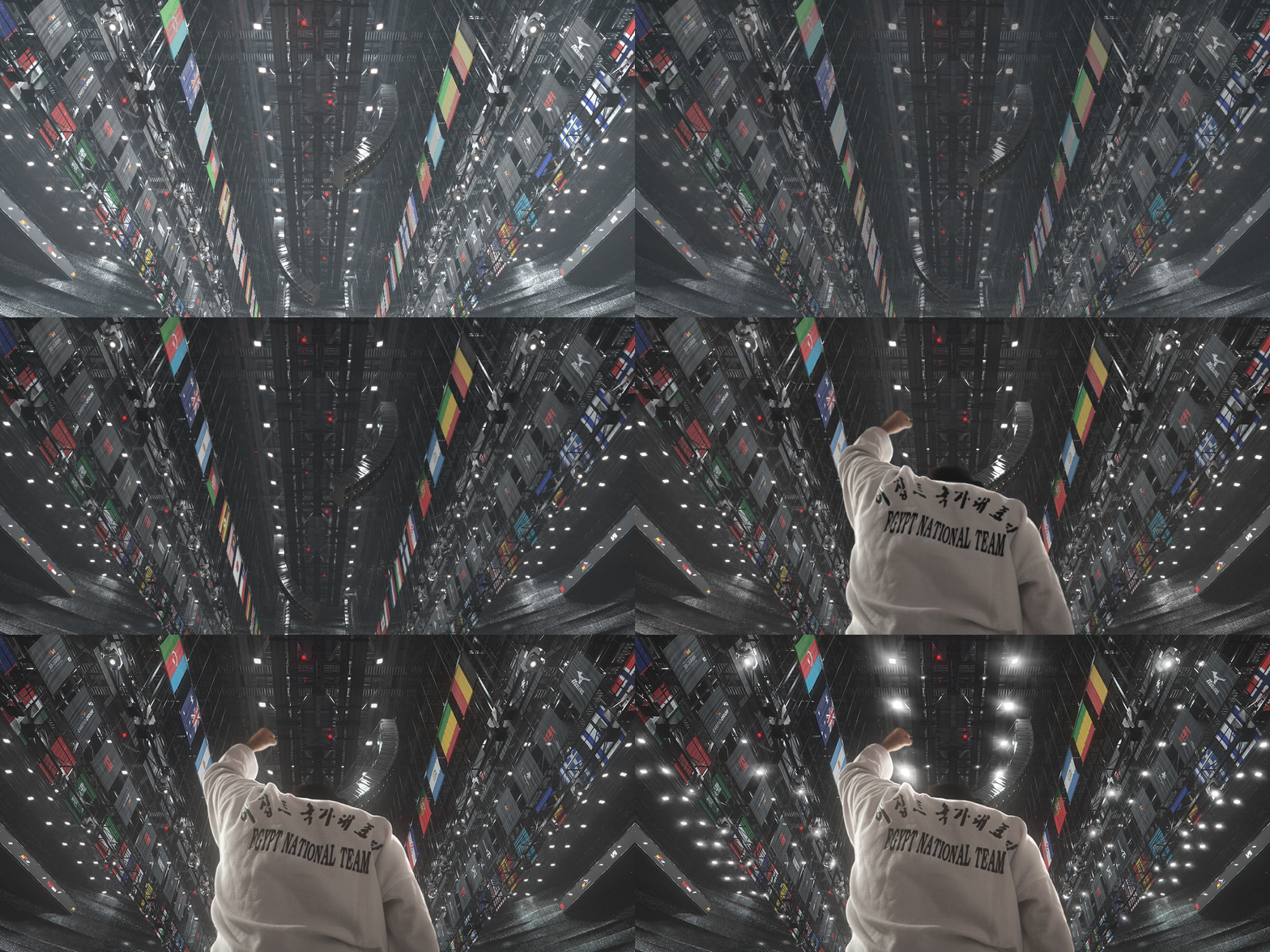
The post-production started with trying to match the player’s photos to the render, so it feels seamlessly integrated. This matching process was a very crucial part of the project to get the players as best integrated and feel a genuine part of the whole visual experience.
As you can see below, the photos I have received from the photographer were washed out, and the colors/temperature didn’t match very well with my rendered image.
I had to tweak the brightness, contrast, black point, color values and shadows to get a seamless integration.
Below you can find a GIF sequence showing some of these steps. I used simple adjustment layers in Photoshop to achieve things such as color balance, curves, levels, etc.
There is no recipe except trusting your eye for it.
Another important aspect was that I wanted to create the depth of field in post-production. I did several tests to get the best results for it, and I noticed that with Open EXR format I could get beautiful details while using the depth map and the frischluft depth of field plugin for Photoshop.
I created the primary exposure and levels adjustments and the depth of field on 32 bit. I also used Magic Bullet and Nik Color software for the final tweaks.
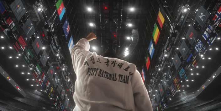
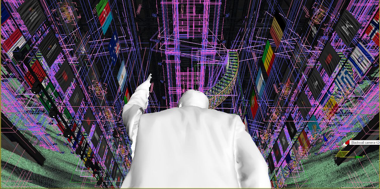
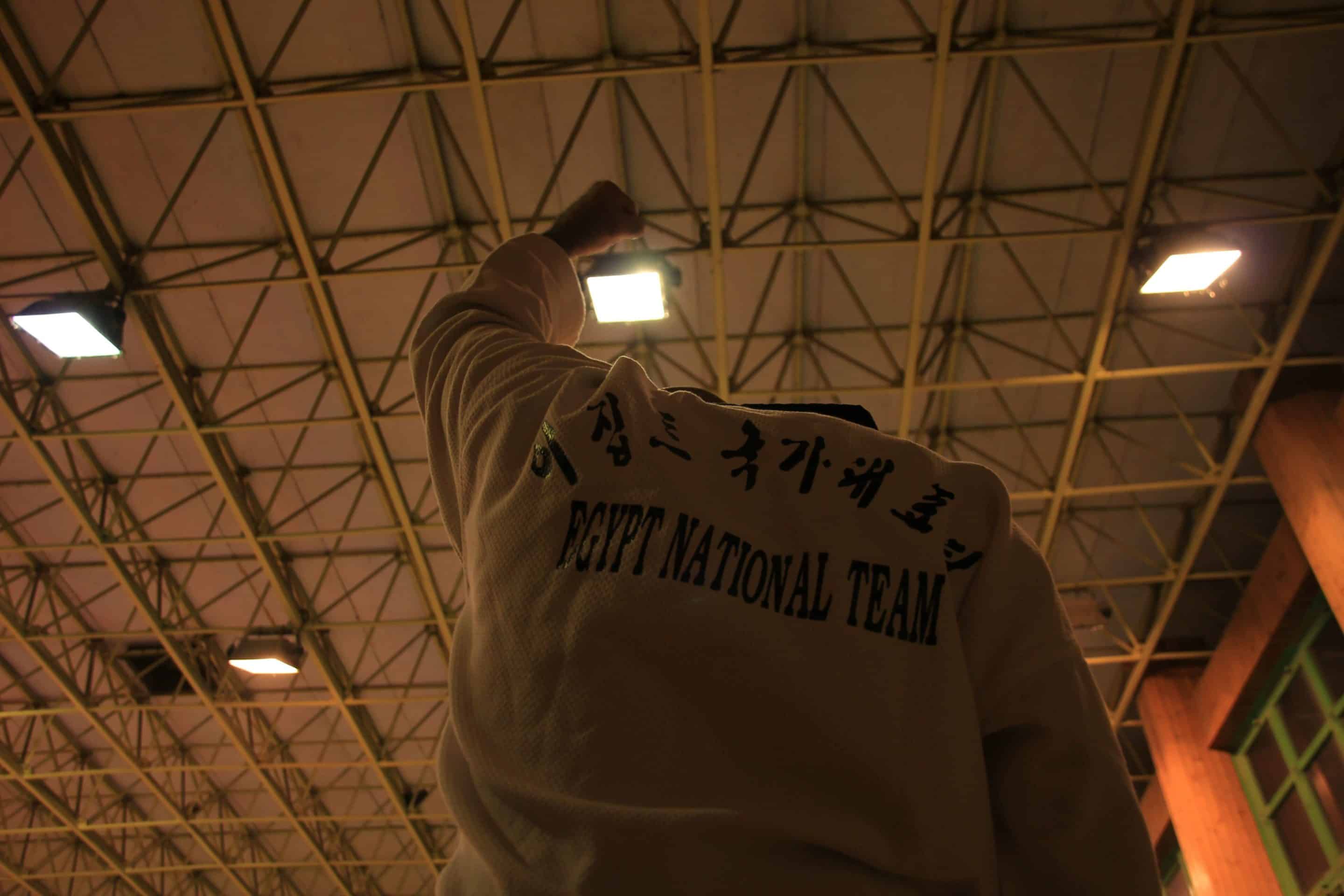
In the victory shot, I have first placed a 3d model in the shot to know how high the camera needs to be, as well as the distance and other parameters. This information was used to do a custom photo-shoot.
Luckily I still have my Taekwondo uniform that I used to compete with, so I went with a friend to the club I used to train in and took the photo I needed.
I am thrilled that I had the persistence and patience to finish this project I dreamed of several years back along the way with my busy commissioned work schedule.
It is always a great pleasure to work on these type of personal projects where you have the freedom to explore without any restrictions.
Finally, I hope you can find something useful in this making of, and I will be glad to clarify anything or answer any questions in the comments below.
Karim Moussa / MOZSES
–
Karim has lived abroad for more than a decade as he was based in Dubai for six years before Bergen, developing architectural work for global project design consultancies such as Dar Al-Handasah. Today, Karim is still kicking the martial arts sandbag and using his powers of art direction and worldly experience to bring unbuilt architecture to life via his visual design experiences and explorative approaches.






very nice
I’m a bit disappointed as I always thought the fighters were full CG as well. But with hindsight, the whole thing is still pretty amazing! Great job Karim
Super amazing… CG people or not 😉
Thanks so much Ronen, totally appreciate it 🙂
me too
Thanks for your words, i appreciate it, to make these in CG would be an insane job i believe and if you can take photos in reality with what you want then it might be a little waste of time maybe if you even have the skills to do so which surely i dont hehehe
Actually, I think that the seamless integration is just as stunning a feat as making them in 3d. You can swear those are photos.
Plus, you can’t really achieve that, not even with photoscanned models, just look at 3d portraits and characters, we’re not htere yet.
no words grate job
Great project but why is there a Swedish flag next to Ana Zaninović =)
I was gonna say the same thing 😁
Thanks so much for your words, ouch i totally missed that, its my mistake Ana Zaninovic is a Croatian world Champ, probably was late night when i was doing this score board hehehe
AWEsome development and compositing.
😀
AWEsome development and compositing.
WOW AMAZING
One of the most amazing CGI content I have ever seen. Well done Karim.
Simply stunning! Congrats. I wonder how long this project took you?