Making of Z’Axe Boutique
Frank Raymond‘s ‘Z’Axe Boutique’ visual captured my attention for its color, light, composition and for being so rich in details to a point I awarded it the Best Visualization of the Week NO. 32/2014. Starting with SketchUP, Frank takes as through the process of creating this great visual using 3dsmax, V-Ray and Photoshop. Enjoy!
Author: Frank Raymond / Symbiose Design
Frank Raymond is an Architectural Visualization Artist based in Quebec, Canada. He has 7 years of experience, 4 of them working at an Architecture Office as a technician initially and later as the main imagery director. He recently decided to make a big move and become an associate to an interior designer nearby Montreal City. With Symbiose Design they work hard together to get unique designs and imagery.
Hi everyone,
First, i’d like to thank Ronen Bekerman who invited me for this making-of Z’Axe Boutique in Montreal, Quebec. I was glad to win Best of Week 32 on his blog and today it’s an honor for me to share and show you the behind the scene.
For me this project was a premiere. Back when I was working in an architect office in Quebec city, most of the projects I worked on were residential, commercial and some institutional. The owner of Z’Axe Boutique contacted us to get a new and fresh look for the winter season. The main task was to integrate all sale products in order to offer a nice customer experience. This means that many custom objects and furniture had to be modeled and textured for the scene. I obviously shopped in my personal library and on the internet to find the best articles to fit in first.
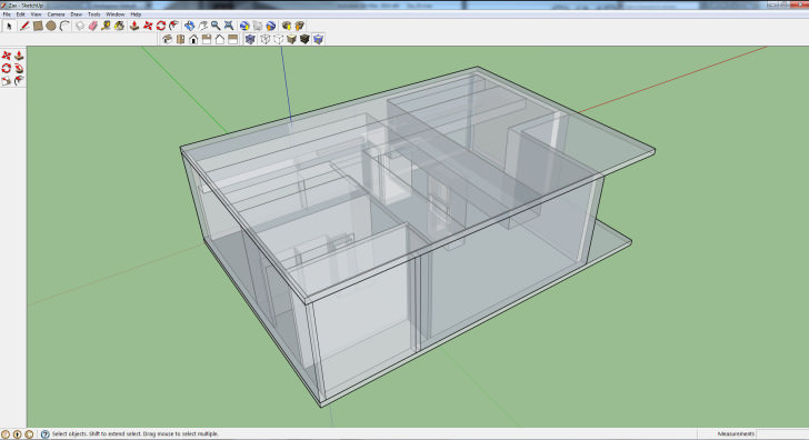
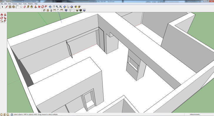
Starting out it was crucial to have perfect dimensions of the space. Based on a technical drawings, I started modeling the space using one of my best programs, SketchUP. All of my base buildings and interiors are modeled with it cause it’s very easy to use, fast and really fun too! After 10-15 minutes of work, I get my rough model ready to import into 3dsmax.
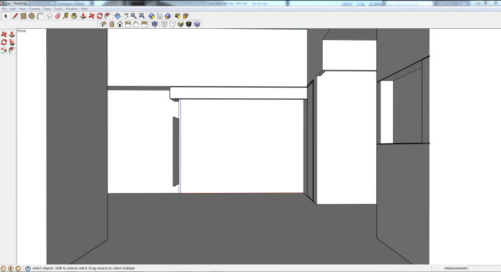
SketchUP Model
Some views of the basic model inside SketchUP
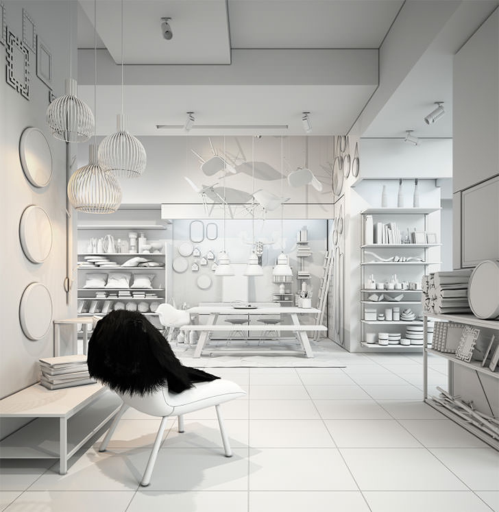
Once the model is done, I always start by applying a neutral material (medium grey) on all the model to avoid any non V-Ray material causing strange results. This technique allows you to set your cameras and lights by imitating light absorption for the furniture you will add to your scene later on.
Lighting
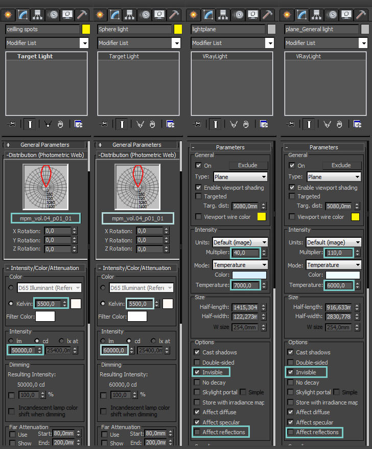
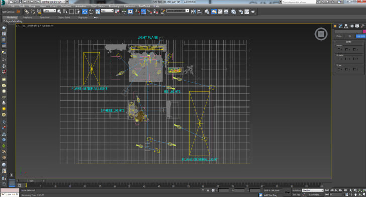
For the lights, I used some V-Ray planes for global lighting and hidden linear sources, sphere lights for pendant and .IES for spots on the ceiling.
These are my lights settings :
Top view lights positions :
## Camera
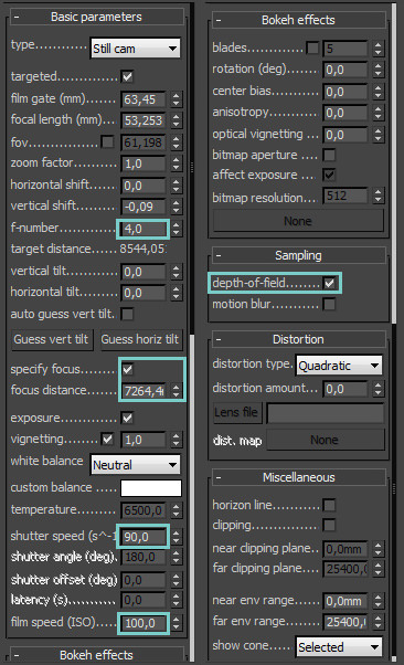
For cameras, I set a low F-Stop number of 4,0 to get nice DOF for the final images. I left the ISO value at 100. Color balance set at neutral and finally adjusting the shutter speed value to get a nice and clear image. In this case, 1/90 was perfect for me.
Here are my cameras settings :
Extra modeling and arrangements
As previously mentioned ,I had to recreate some shelves, tables and objects with precise dimensions from the client, all the rest comes from the Design Connected, model+model (The best 3d models websites by the way) and some more. Placing, instancing, rotating, scaling to fit our design.
Texturing
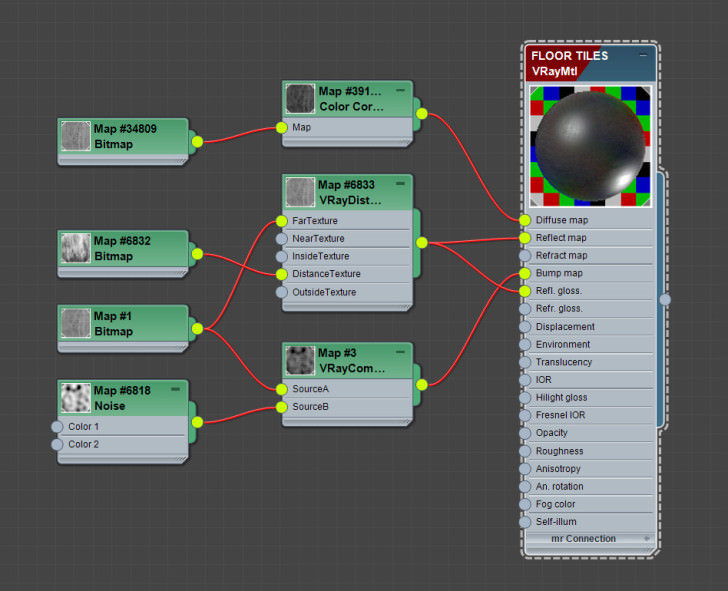
The floor was created with the popular Floor Generator plugin that you can download for free at cg-source.
Here is the material setup :
I collapsed the UVW modifier and rotate / mirror different tiles to achieve as varied pattern as possible.
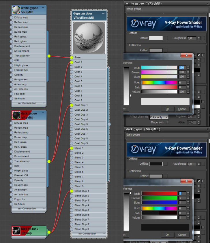
For the deer print on the left wall, I used a simple V-Ray Blend material with two gypsum materials, a dark tone as main material for the deer print and a lighter one in the coat slot for the normal wall color with a pure black and white deer image into the mask slot. UVW modifier to set it in the right position and it’s done!
TIP : Don’t use pure white or black colors in your materials. You can learn more about in Lasse Rode’s article – Photographic Approach in Architectural Visualization.
Here is the material setup :
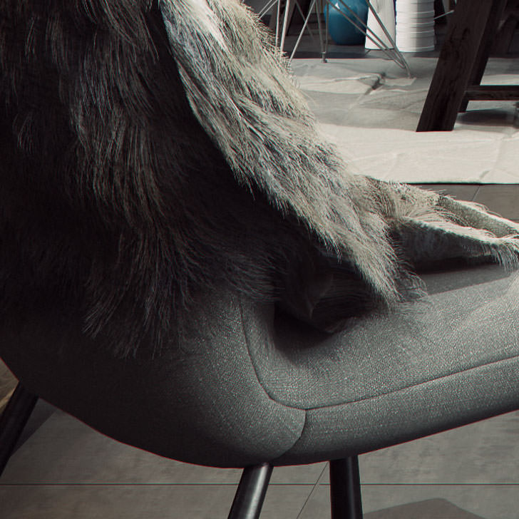
I used Marvelous Designer for the cloth dropped on the chair and Hair and Fur modifier to create this realistic fur.
I won’t go any further on theses two processes but here’s just a quick tip for the Hair and Fur modifier.
First of all, when you import your mesh from MD, apply a ProOptimiser to decrease the polycount, a value of 40 seemed to be right every time I did it. Collapse it and then apply the Hair and Fur modifier. Brush, place, rotate to get a nice fur shape and then, apply a shell modifier and a turbosmooth on top if you want to be a little crazier!
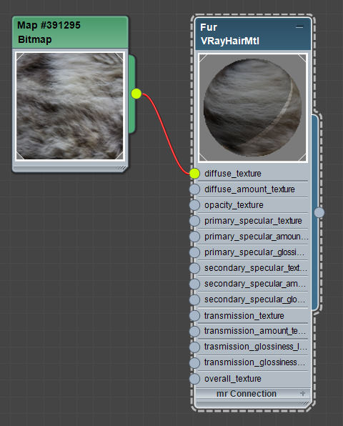
I used a simple V-Ray Hair Material with a fur texture into the diffuse slot.
Here is the material setup :
Composition
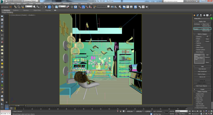
For scenes with a lot of objects and large textures maps, I check Object Color into the display panel, This will help your graphic card a lot! Don’t forget to lock your camera position too! Just select your camera and the target, go to Hierarchy Tab / Link Info and check all boxes.
Rendering
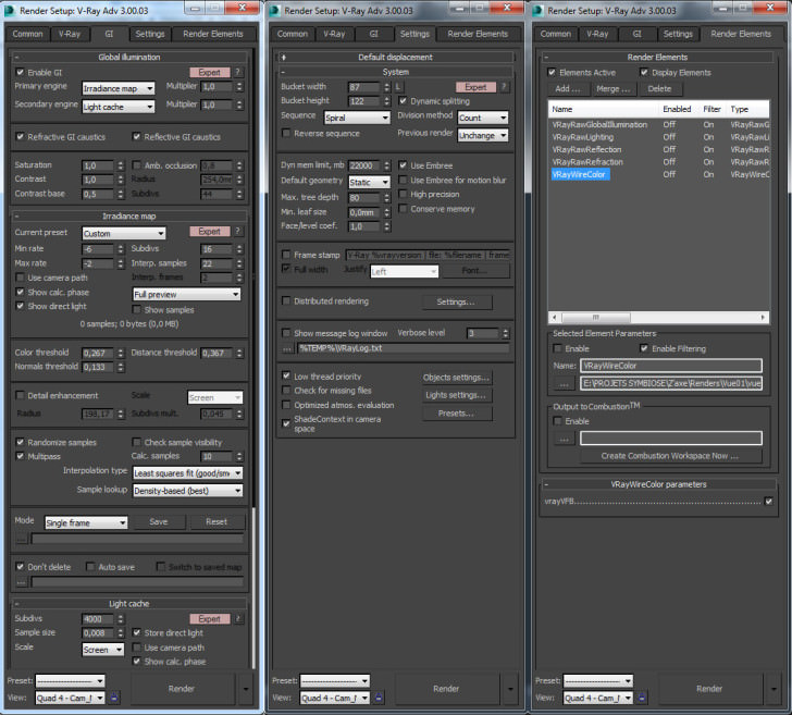
Here is my render setup :
I always add these 5 render elements :
- VrayRawLighting
- VrayRawReflection
- VrayRawRefraction
- VrayRawGlobalIllumination
- WireColor
Saving all in .TIF format at 16 bits per channel and add them into a single file in Photoshop.
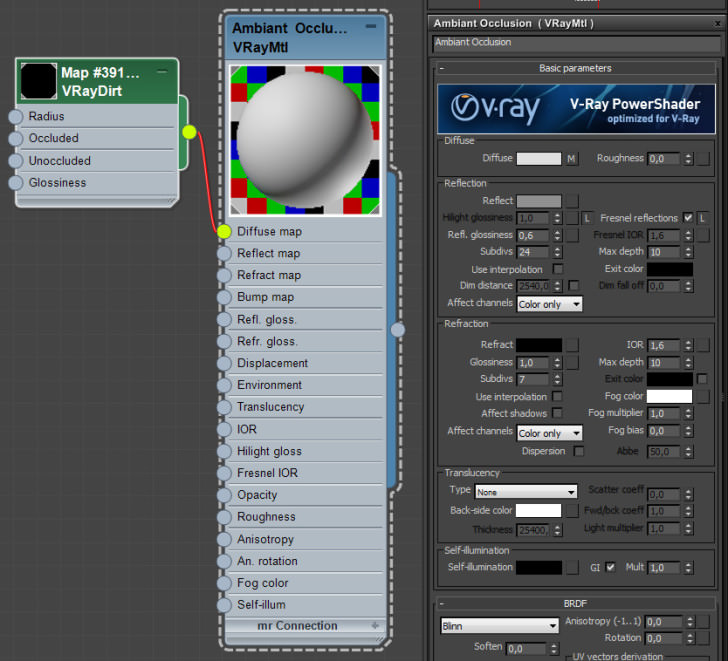
I did an extra Ambient Occlusion pass to give more detail in small areas.
Here is the material and the V-Ray setup :
Post Production.
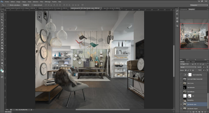
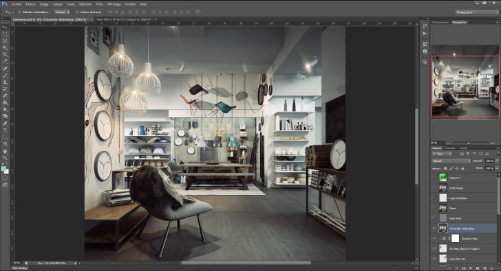
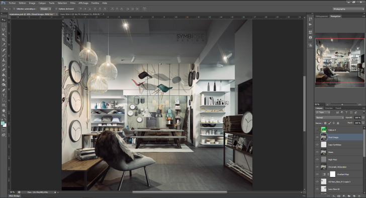
Here I will share my best technique to achieve a nice and color balanced interior image with Photoshop.
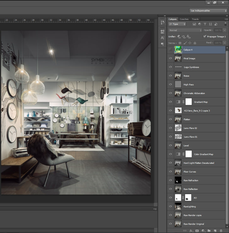
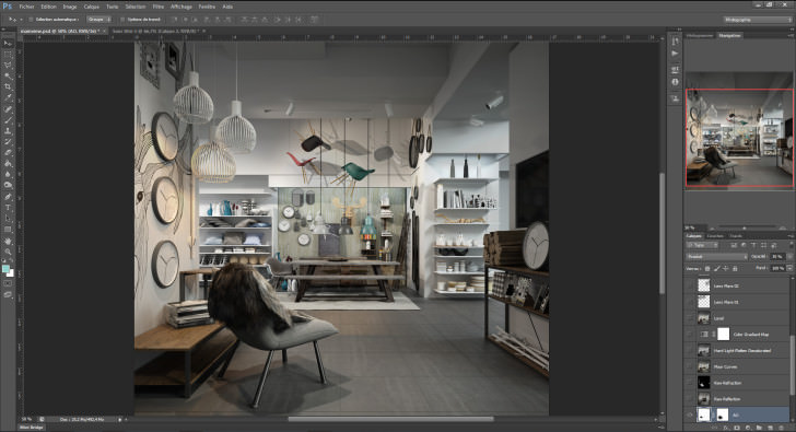
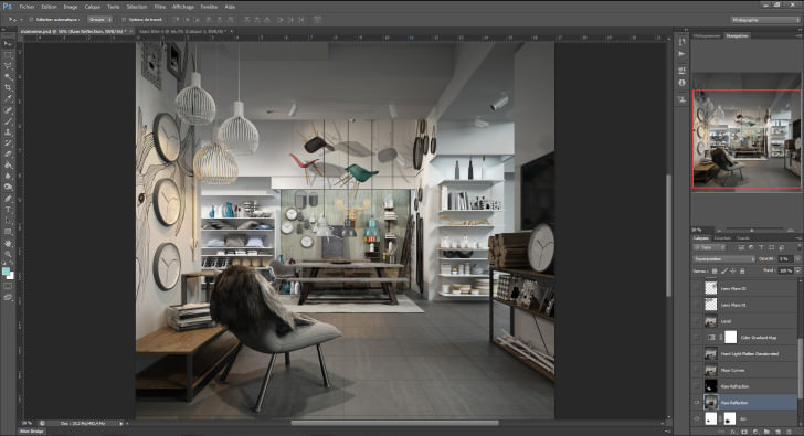
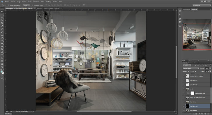
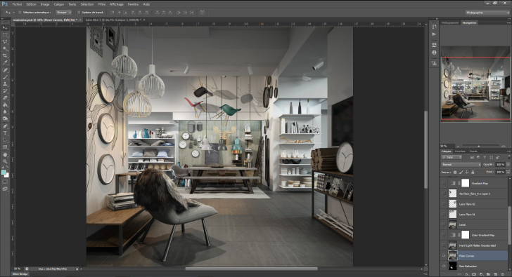
Photoshop Process
Copy the Original Render
Apply RawLighting pass on Soft light mode, adjust opacity between 40 and 70%
Apply the AO Pass on Multiply mode, adjust opacity between 20 and 40%
RawReflection pass on Screen mode, adjust opacity between 2 and 10%
RawRefraction pass on Density Color – mode, adjust opacity between 10 and 20%
Next, I copied the floor area using the WireColor pass and I adjusted the contrast just for this part.
I Flattened the image using the shortcut Shit+Ctrl+Alt+E and desaturated it, I put it in Hard Light mode and adjusted the opacity.
At this point, I usually adjust the color balance, but in this case, I was happy with the overall coloring.
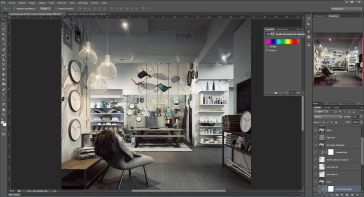
I added a Gradiant Map, using the rainbow color gradient and set the opacity to 2%. This gives a nice color effect.
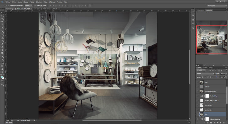
Level adjusting
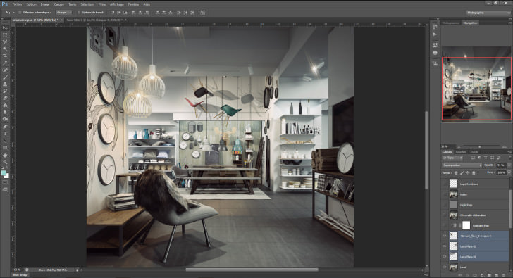
Adding some Lens flare in Screen mode and erasing borders.
Flatten again.
Lens flares for pendants lights that I forgot… Does not matter.
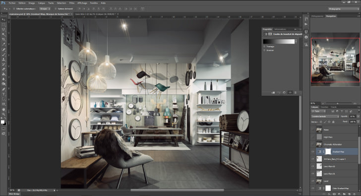
Another Gradient Map but this time black and white, set it to Soft Light mode, adjust opacity.
Flatten.
Add some Chromatic Aberration under Filters / Lens Correction / Custom
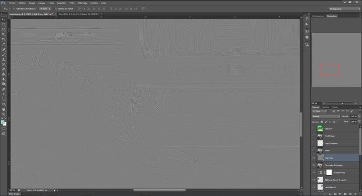
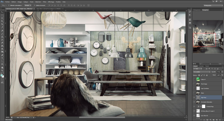
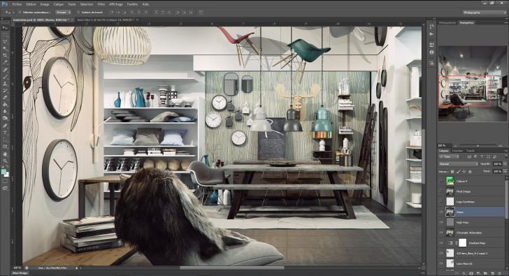
Flatten again, desaturate and go under Filters / Others / High Pass and set a value under 10, adjust the opacity if it is too sharp for you.
Flatten!
Add a bit of noise to get a much more realistic finish.
Add the logo and it’s done!
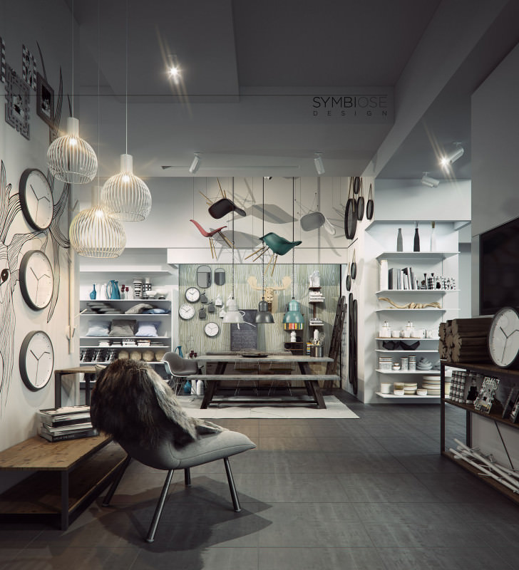
Final Image
This 4K Image has been rendered on my main machine in less than 4 hours using the new Vray 3,0
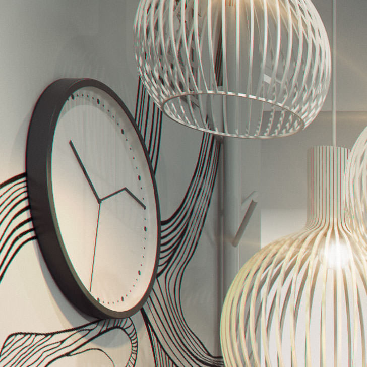
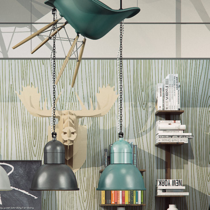
these are crops for the full size…
Computer Specifications
- Intel(R) Xeon(R) CPU E-5-2630 v2 @ 2,60 GHz (2 Processors)
- 24 Cores
- 32 GB (RAM)
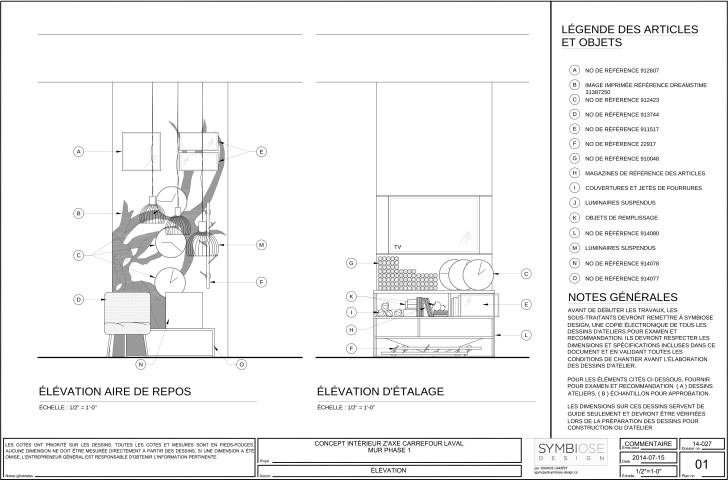
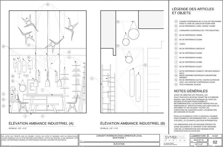
Here are the technical plans that we provide to our client.
It’s been a pleasure to share my knowledge and I hope this will help you for your future projects!
Best regards,
Frank, from Symbiose Design




Outstanding!
thanks for referencing to my article. unfortunately i have to quit now 😛
Its great, thanks for sharing your tips with us, I’m wondering how did you manage to get those technical drawing? Are they base on your 3D desige or just ordinary 2D drawing from zero ground?
FarrokhRostamiKia Thanks for your appreciation, I’ve just decrease polycount of the chair using ProOptimizer Modifier and then export 3dsmax model to .dwg. Rest is pure 2D drawings.!
Frank
thank ! but DENSITY COLOR – MODE no ps cs5 help me
you dont show anything for materials…