Making of “The White”
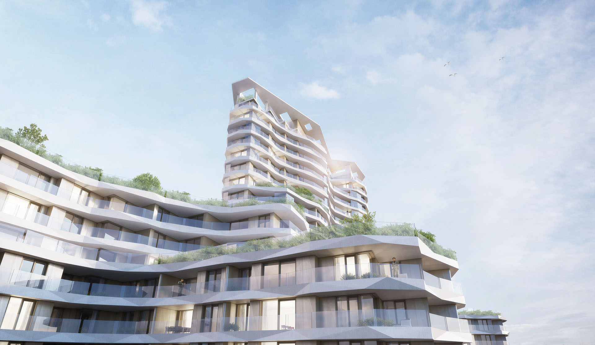
Maarten Demey from A1 Planning posted last month some still images of “The White”, an interesting looking residential project located at the Belgian coast near the historical center of Ostend. The architecture captured my attention and the visuals had a nice feel to them, it was interesting for me to learn more about this project and the balance between pure 3d and postwork that was done on the visuals. Maarten is kindly sharing this information with us all in this article which includes several slides of the post-process stages. Enjoy!
Author : A1 Planning
A1 Planning is an architectural office in Ostend, Belgium. Founded in 2001, the office now has a team of fourteen creative minds. After thirteen years of making our own visuals weve come up with WhiteBox, a creative studio that creates 3D visualizations and animations for architecture and real estate.
Project Forum Thread : The White // Group Sleuyter Real Estate
Introduction
The White started as an architectural competition in 2009. Robbrecht & Daem Architects and A1Planning won the competition for Group Sleuyter. The plot, 30000 m² big, is located at the Belgian coast near the historical center of Ostend. A team of three people at A1Planning made all 3D images.
Inspiration
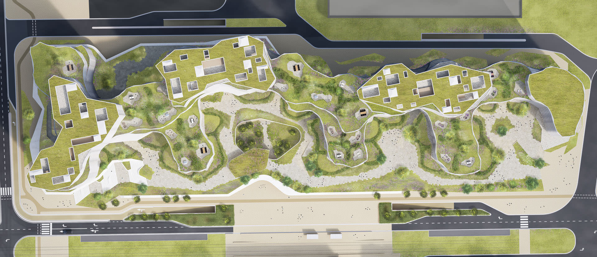
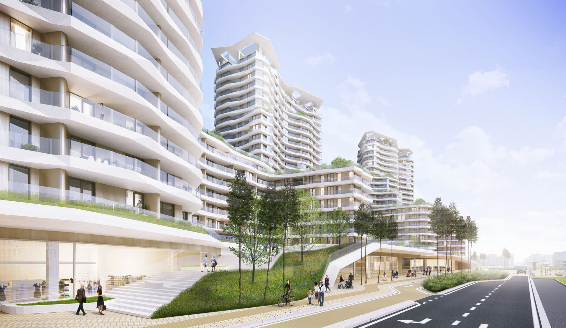
The design itself is inspired by nature. Icebergs, cliffs and rice fields from around the world and are reflected in the shapes and forms of the building. In the first place its a residential project. The architects had a lot of details for the sun and view orientation of the apartment units. One of the most important features in this project was the integration of the green element. Next to 800 apartments, the building has approximately 5000 m² of commercial area at ground level and 1250 parking spaces below the ground.
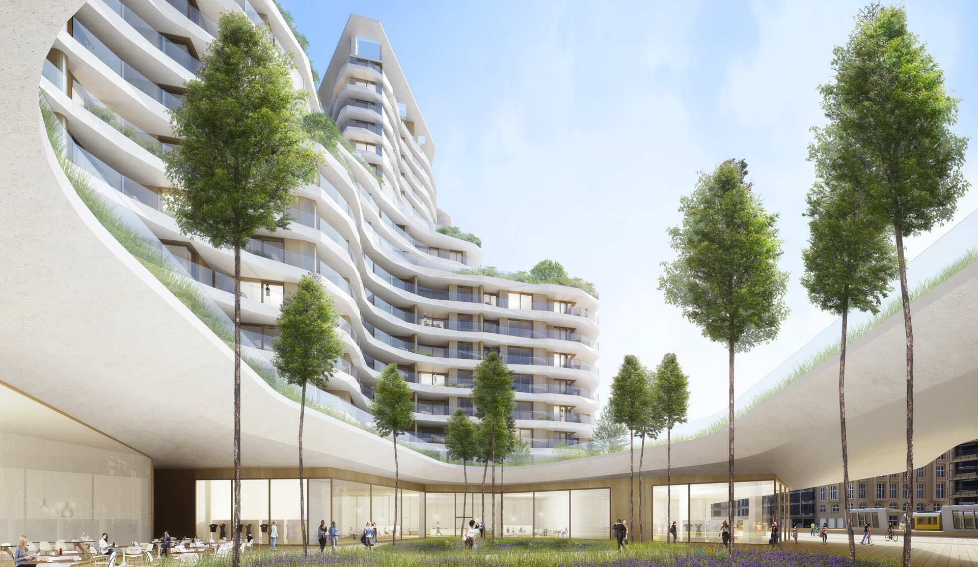
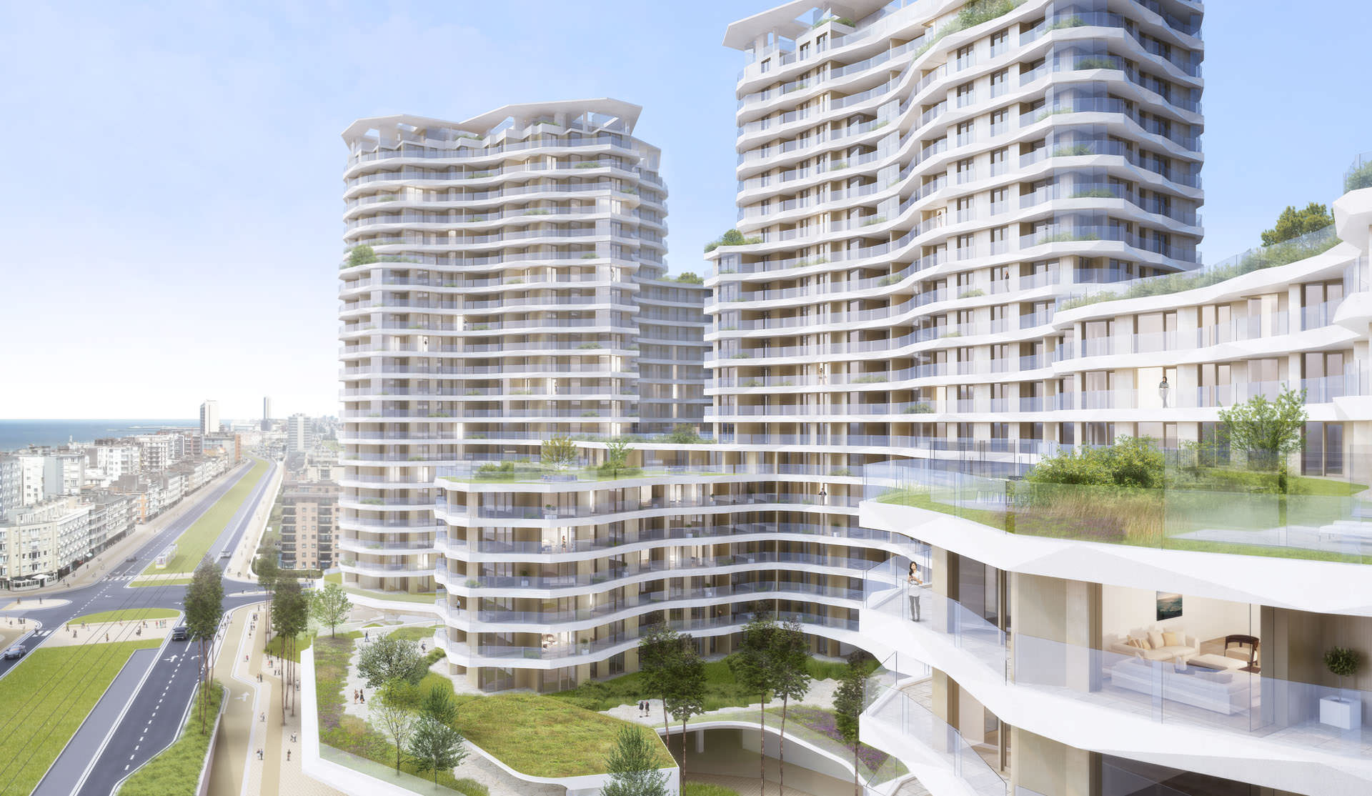
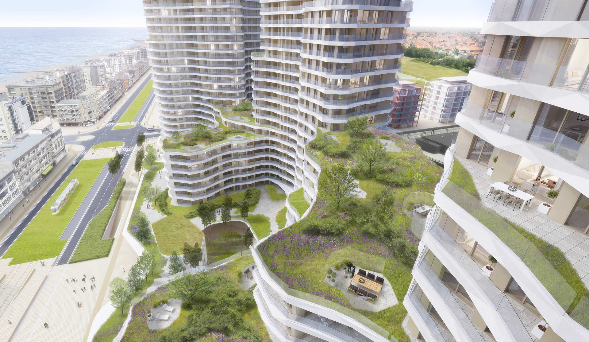
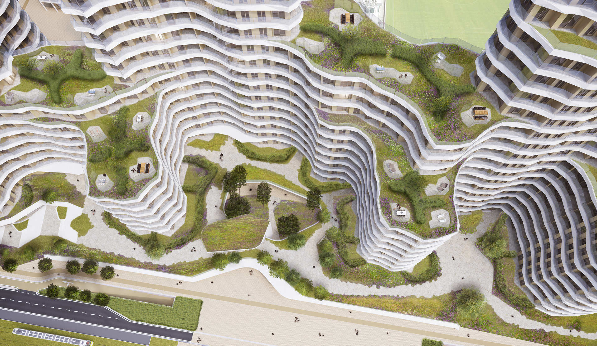
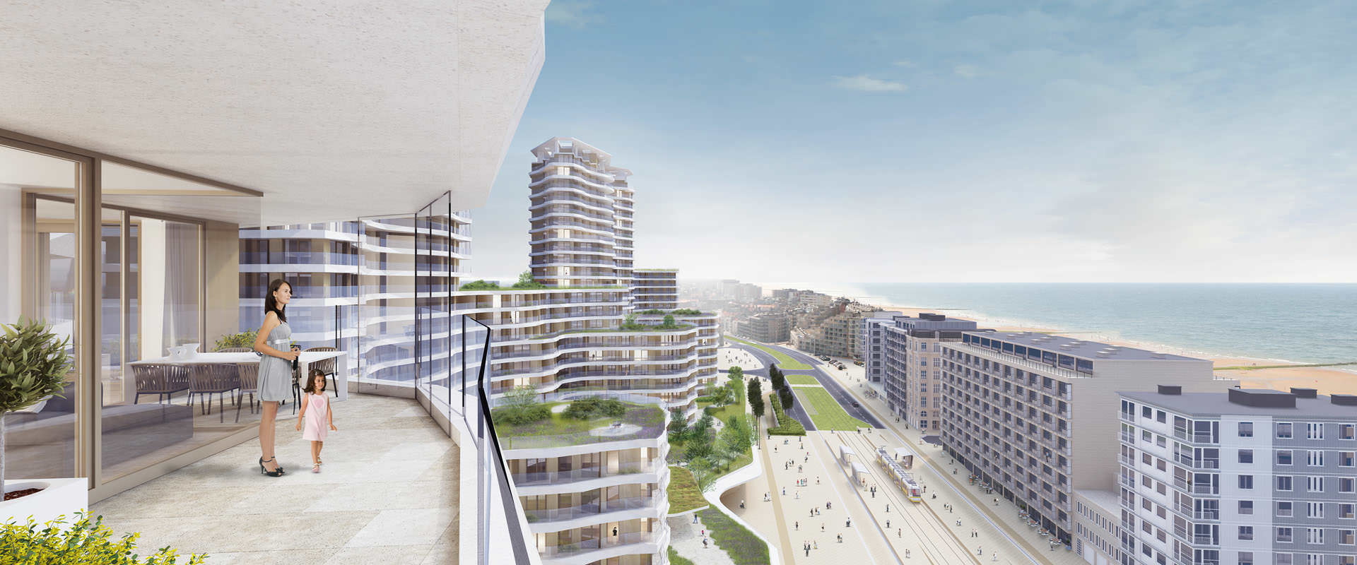
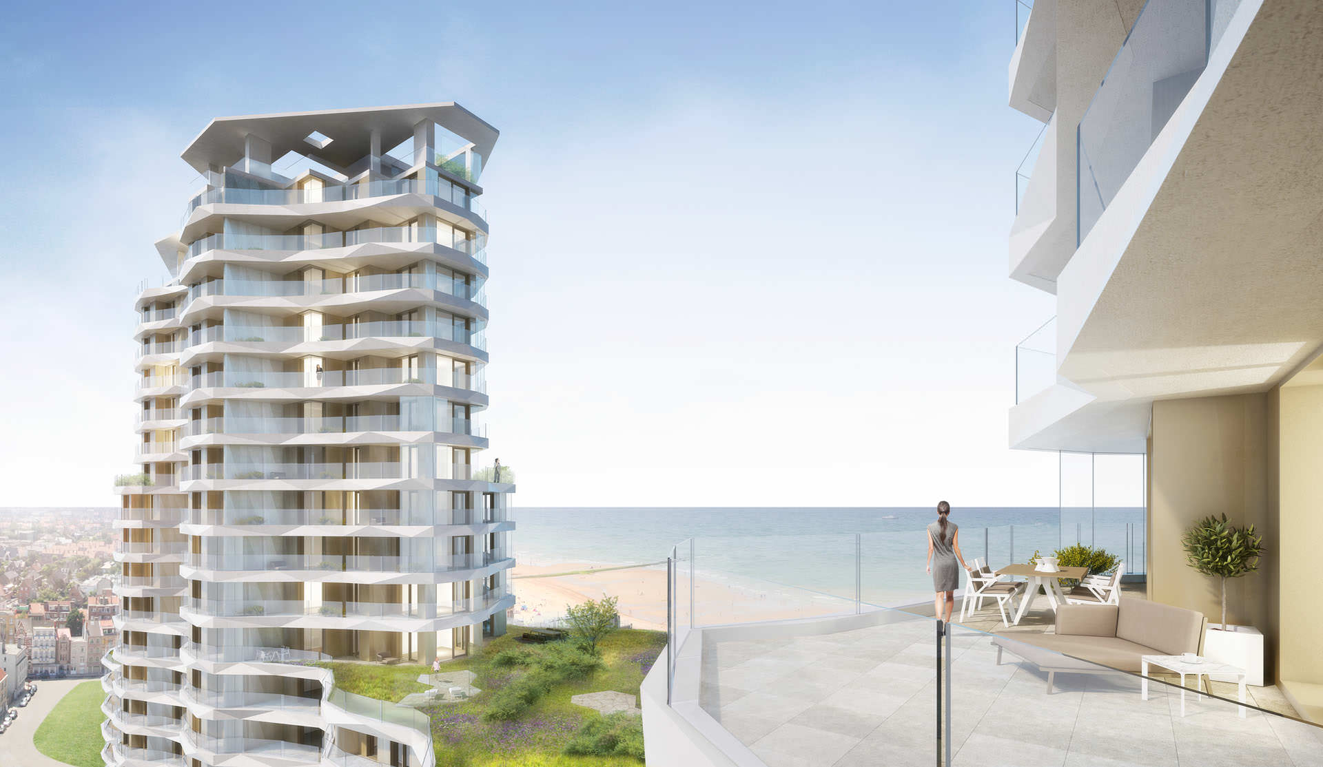
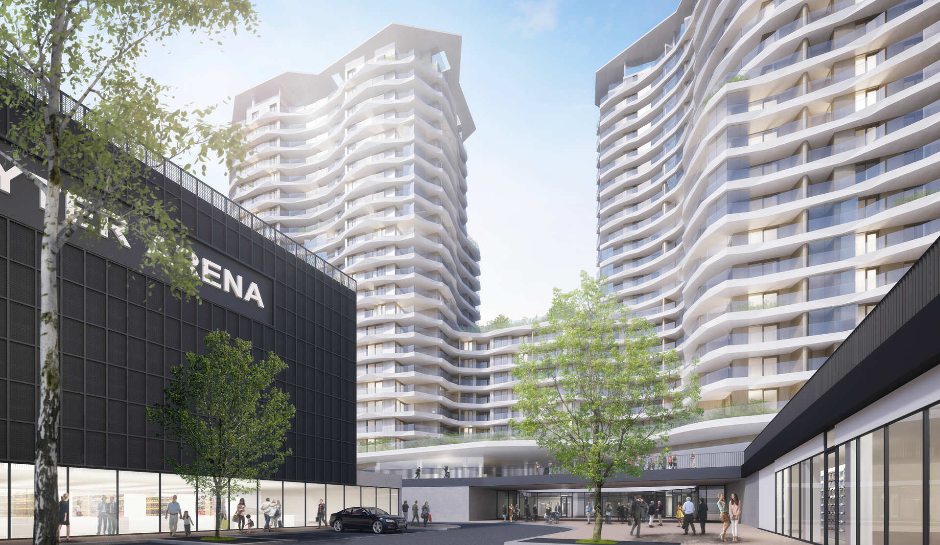
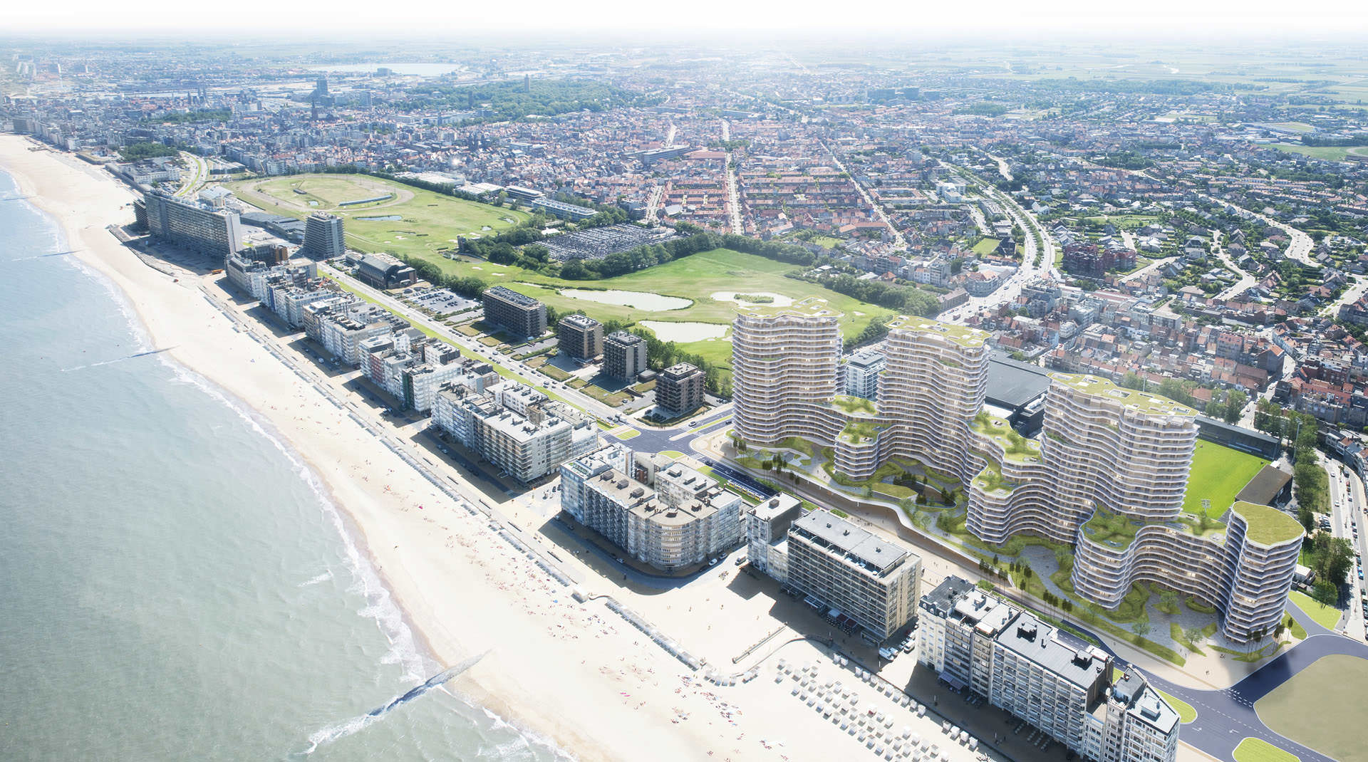
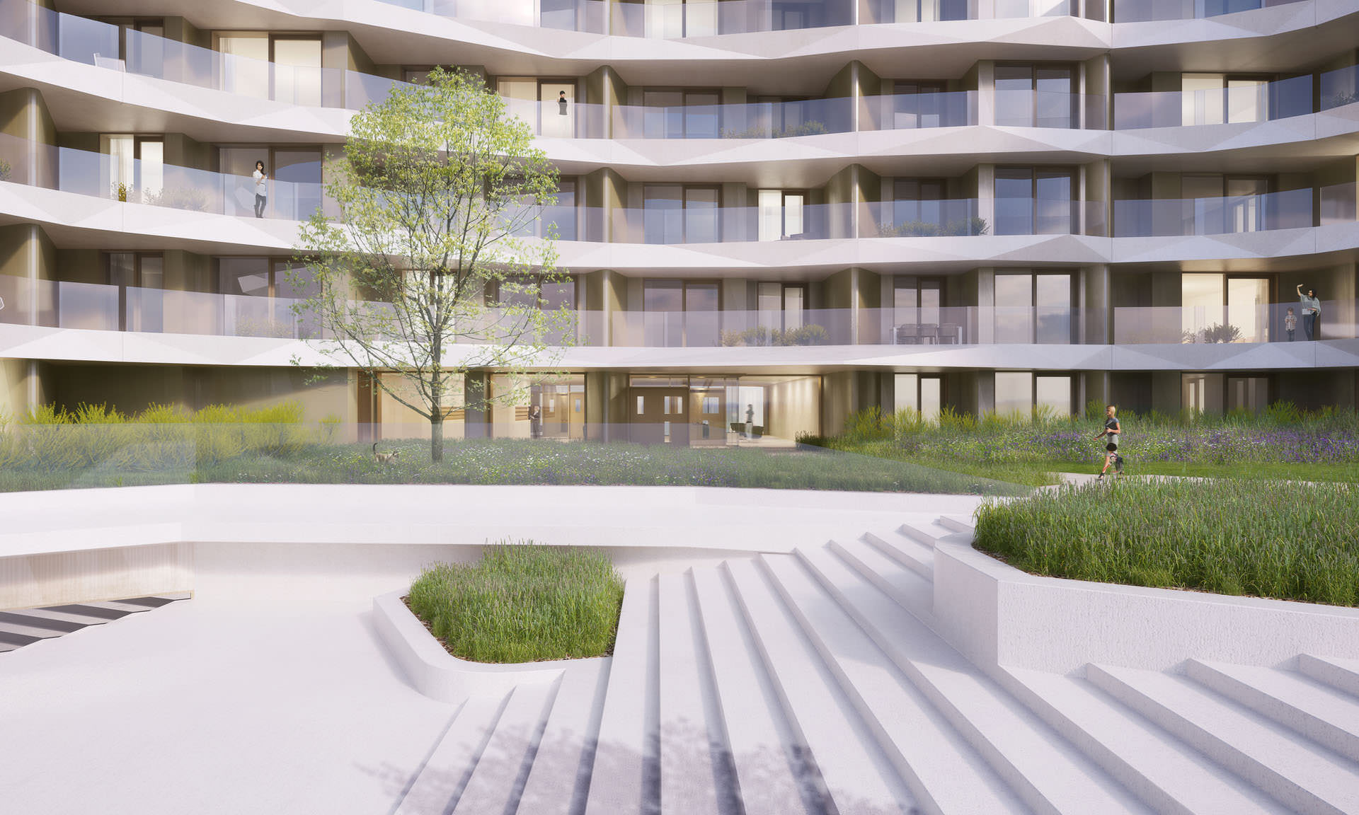
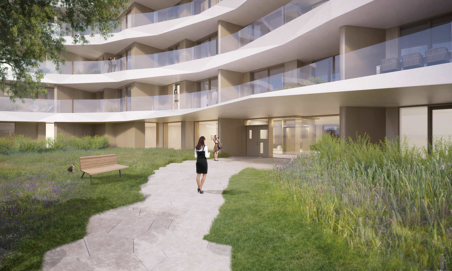
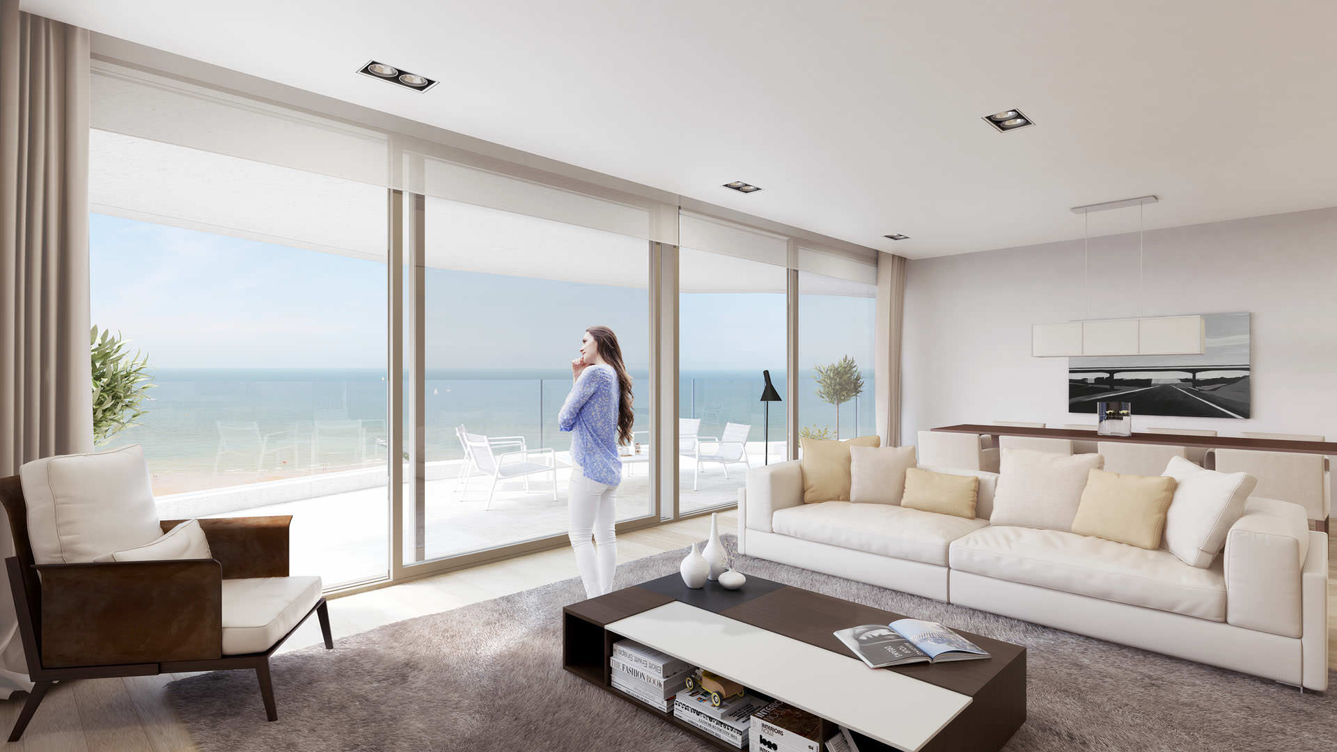
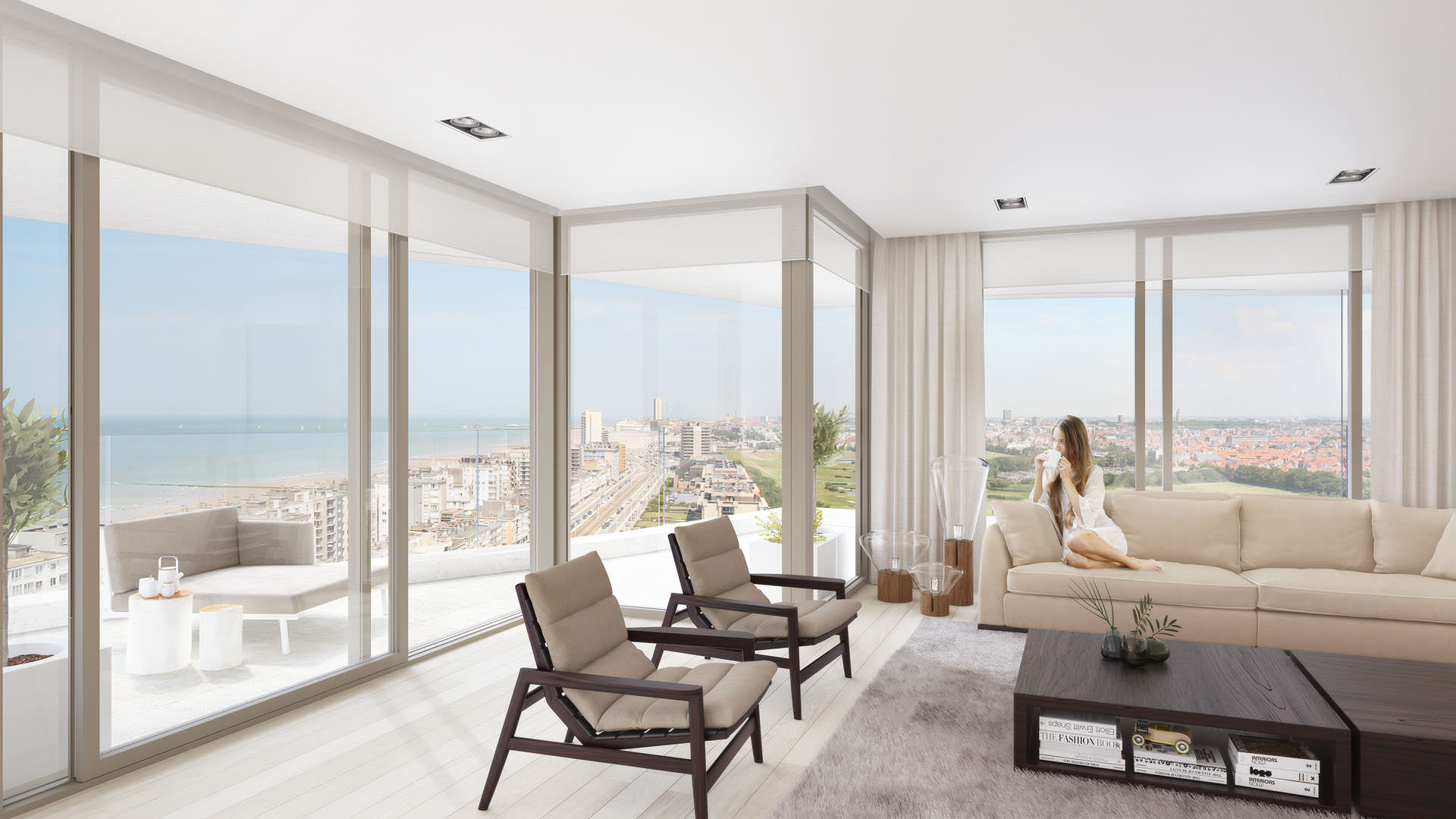
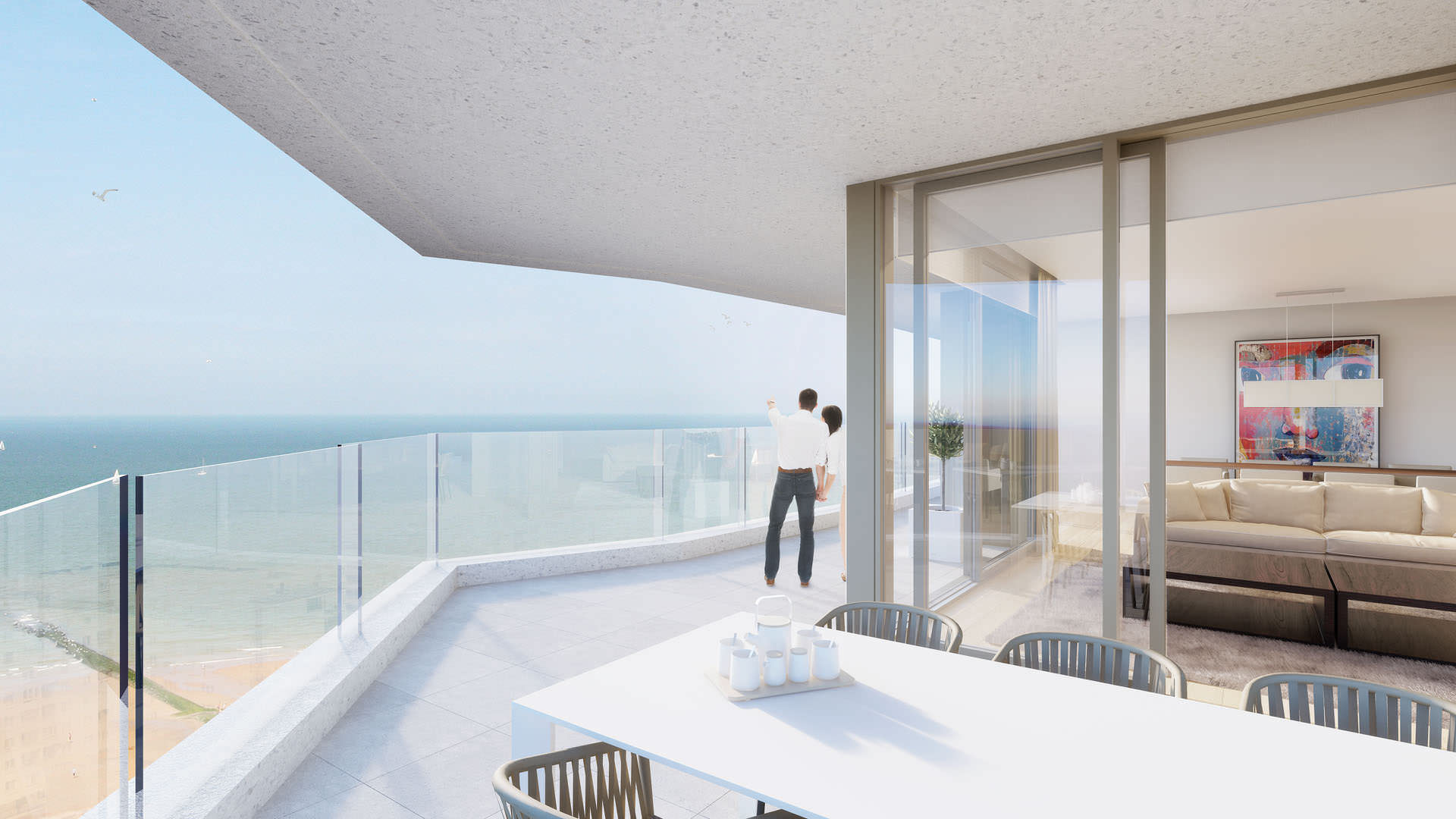
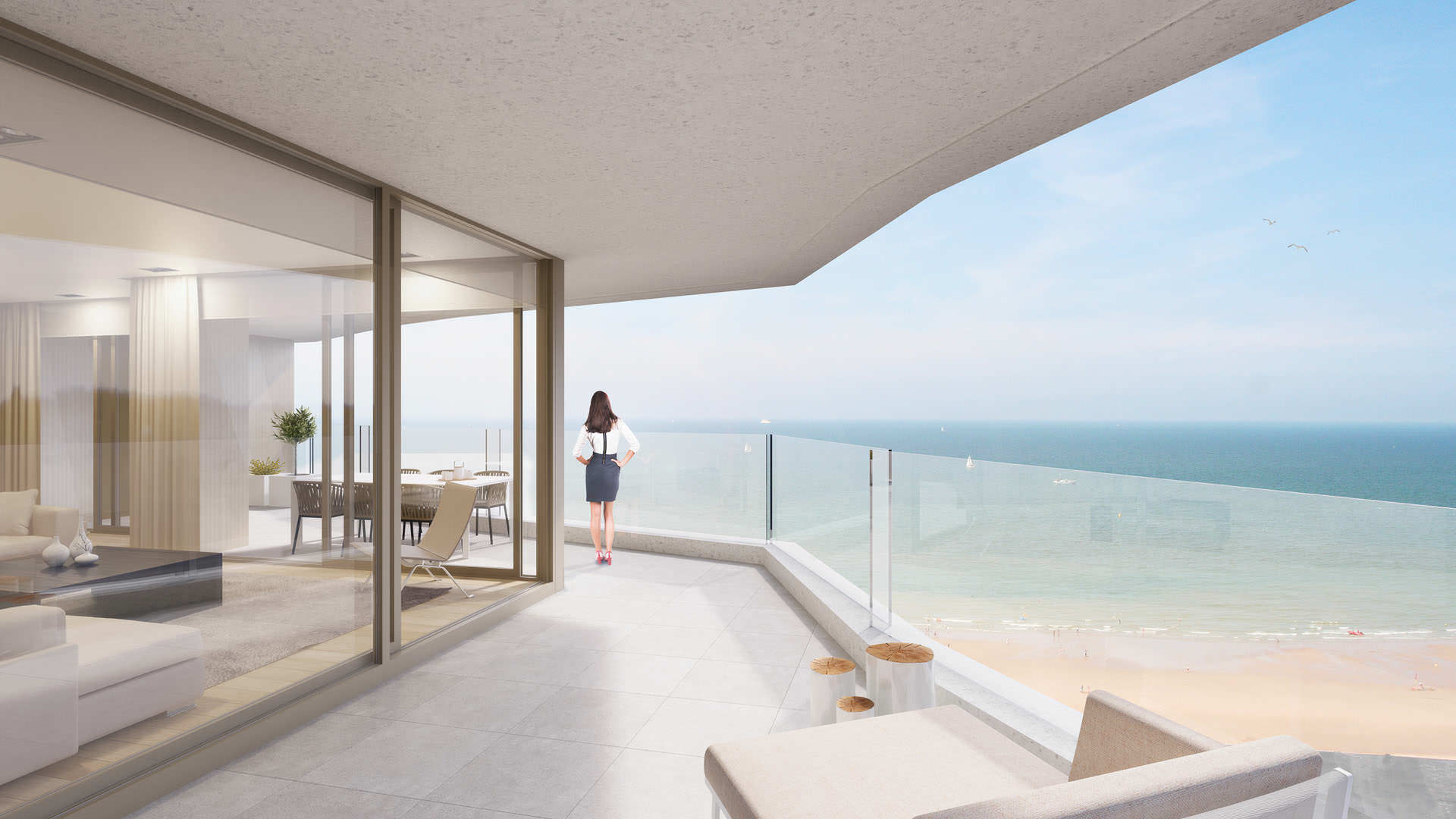
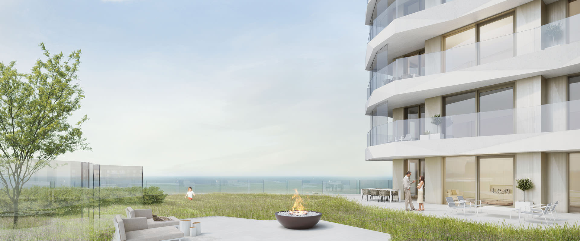
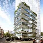
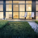
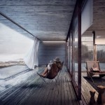
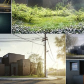
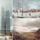
Here are all the renders we did for this project.
Approach
The biggest challenge for us was to find the right balance between architectural and commercial images. Because of this difficult task, we decided to use a workflow with a lot of post-production so we were able to change the mood and atmosphere of the images accordingly.
Modeling
We used AutoCad to make the architectural model. Because the project was still in a designing stage, AutoCad made it easy to adjust the different blocks and adapt the floor plans. We made our models in different layers, depending on the material. This workflow made it easier in 3ds Max to select the different parts of the building.
We also modeled a big part of the environment which made it easier to understand the scale of the project and to later integrate the building in the environment. After we imported the model into 3ds Max, we did some simple editable poly modeling to have a nice and clean model to start from.
We like to build the entire model without thinking about camera views or perspectives. In a later stage we cut up the model to make our scene workable in 3ds Max.
For the interior views, and some of the close up exterior shots, we’ve used the Floor Generator script to model the terrace tiles and parquet floors. iToo Software‘s Forest Pack Pro was used for the close-up vegetation.
The Vegetation
Vegetation was one of the most important features of the project and key in these visuals. The architects had a clear idea of what they expected like the types of trees, bushes and colors.
The first thing we had to do was to make a library with all the different types of vegetation and references. We used a combination of rendering RPC (archivision.com) and 3D trees on a green screen, cutout trees from gobotree.com and Google images.
For the close views we used iToo Software‘s Forest Pack Pro to give the general look of the vegetation, like the different lengths of grass and some flowers found in the library of Forest Pack. In post-production we added some extra layers with colors and photos of flowers and grass. This gave the vegetation more variation and detail.
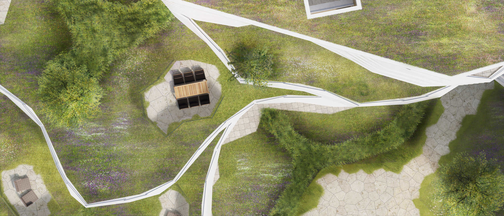
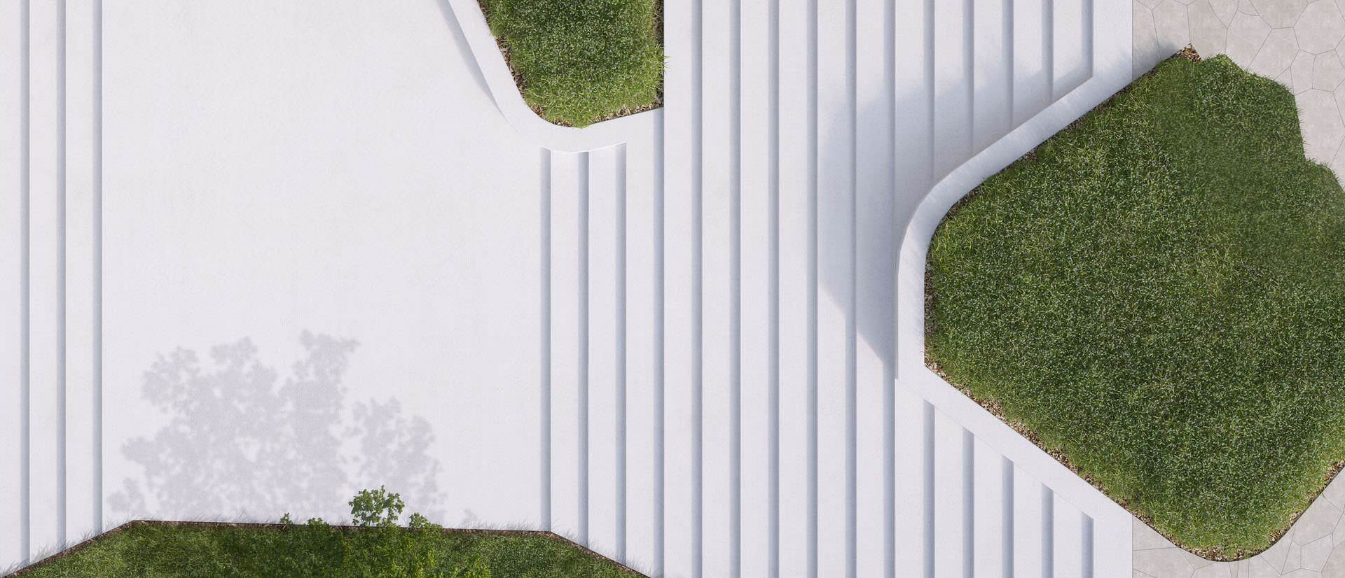
The vegetation on the rest of the images is completely done is postwork. We did this to be able to adapt the green and the colors more easily in consultation with the architects. Using the image library we first added the general layers of grass, trees and bushes. Then giving extra colors like we did in the close views and in the end we added some shadows just using a black brush in Photoshop to give some depth to the different layers of vegetation.
Click to see the GIF sequence…
Lighting
For the lighting we always use a V-Ray dome lights with HDRI texture applied to them. In some of the interiors we added V-Ray plane lights in front of the windows to avoid dark areas on the walls and the ceiling. This was needed because of the big overhanging terraces.
For the exterior shots we put V-Ray sphere lights in some of the apartment units to create a lively atmosphere. We used three instances scattered around the building to have some differences in the color of the lights.
Texturing
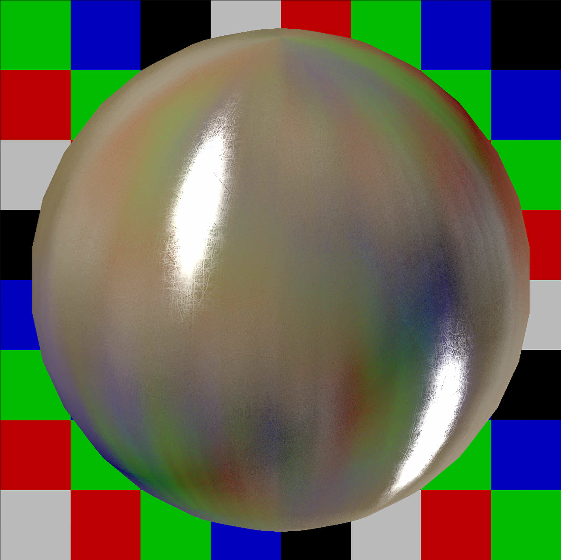
We assigned V-Ray materials to all of the objects in the scene. By playing with the blur value of our bitmaps the textures became more detailed. Real scale mapping was used to make sure that every material had the correct size (especially useful for brick and floor textures). Below you can see some of our created materials.
Render Setup
Irradiance map and Light cache are the GI engines we always use. Medium quality settings were used to keep the render times relatively low. The images were rendered on three workstations using Backburner at a resolution of 6000 pixels wide, because they were intended to be used on billboards and in commercial brochures. The render times were around 6 to 7 hours per image.
Post-Production
This was the most important part of our process. Every image had around 8 to 10 hours of Photoshop. We put a lot of attention in details, small things like butterflies were added, because you dont see it when they are there, but you see it when theyre not, it just gives that little extra.
We always use render passes in our postwork. These are the ones that we use most :
V-Ray WireColor – This pass makes it easy to select specific items in the render. It matches the layer and color structure of the AutoCad/ 3D studio MAX model.
V-Ray ExtraTex – We use a dirtmap as ExtraTex pass to give subtle depth to the image.
V-Ray Raw Reflection – We use this pass to preserve or strengthen the reflections in the windows and other glossy objects.
Below you can see several .gif’s of our workflow in Photoshop (click to see the stages).
And here is the promotional video that was made for this project with our stills and some animations too.
This was quick summary of how we approached this project. Hope you liked reading this article and if you have questions, dont hesitate to comment below.
For a more in-depth tour of the project with extra animations you can visit The White.


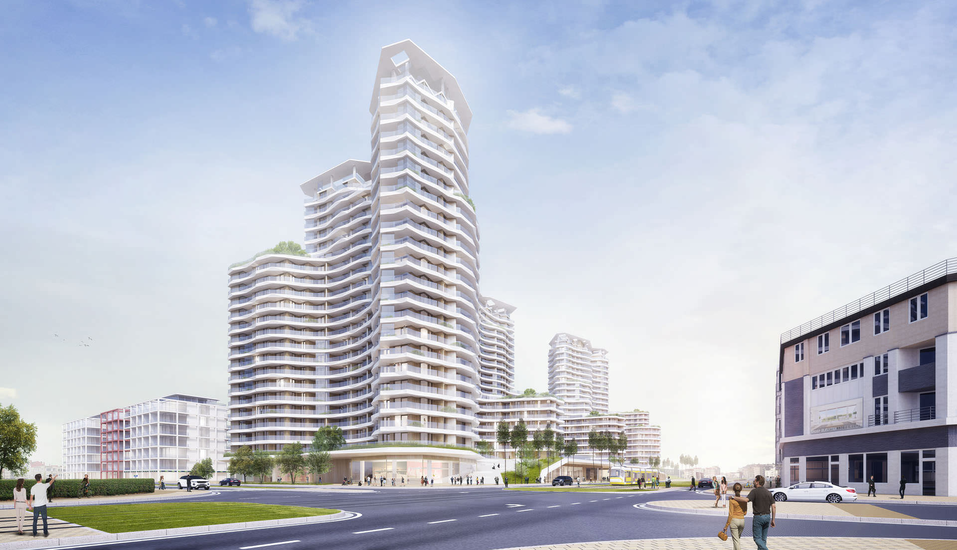
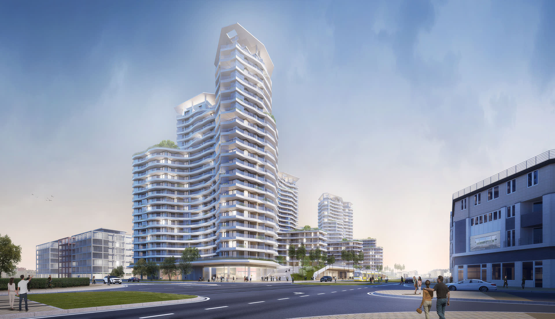
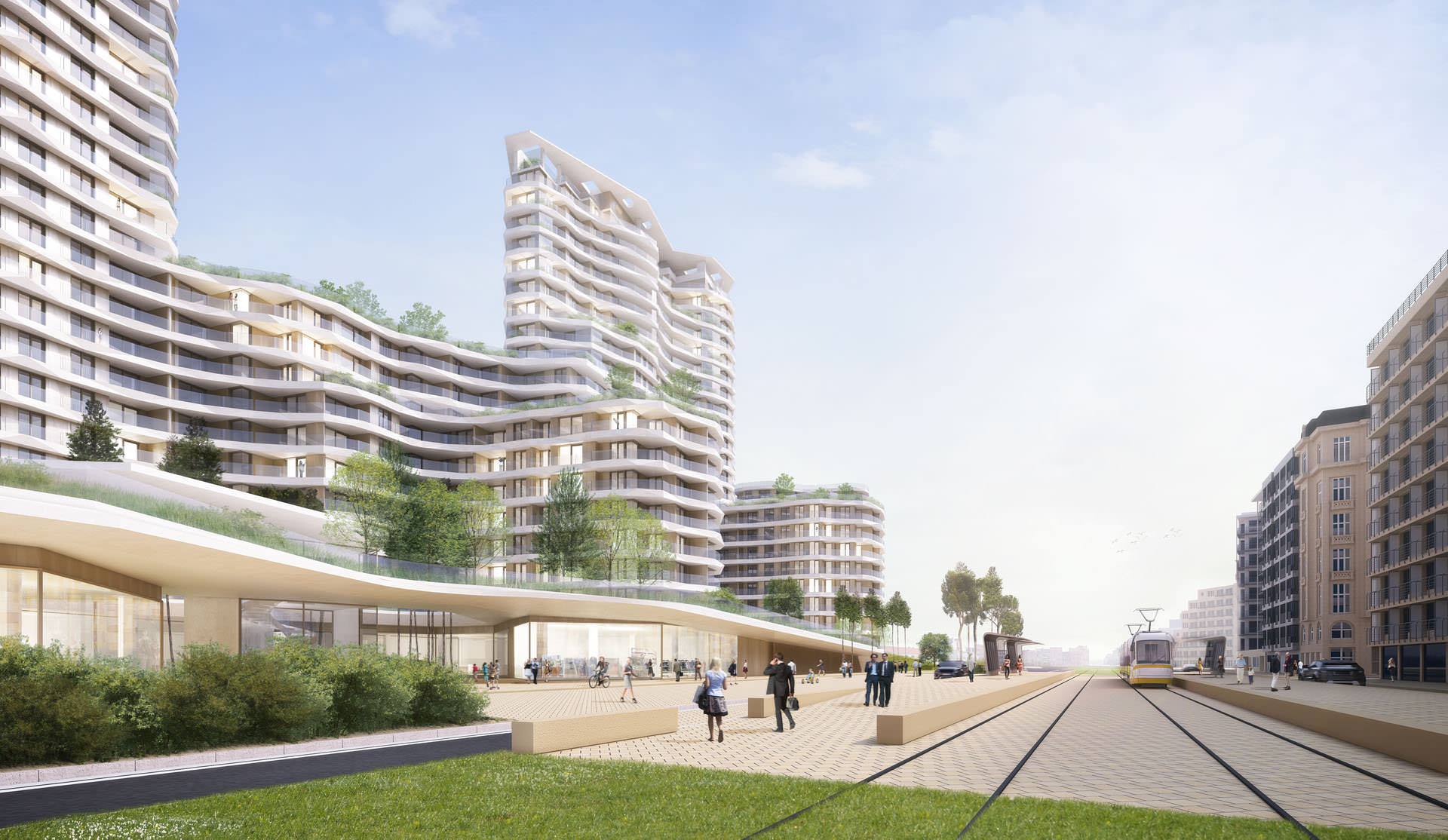
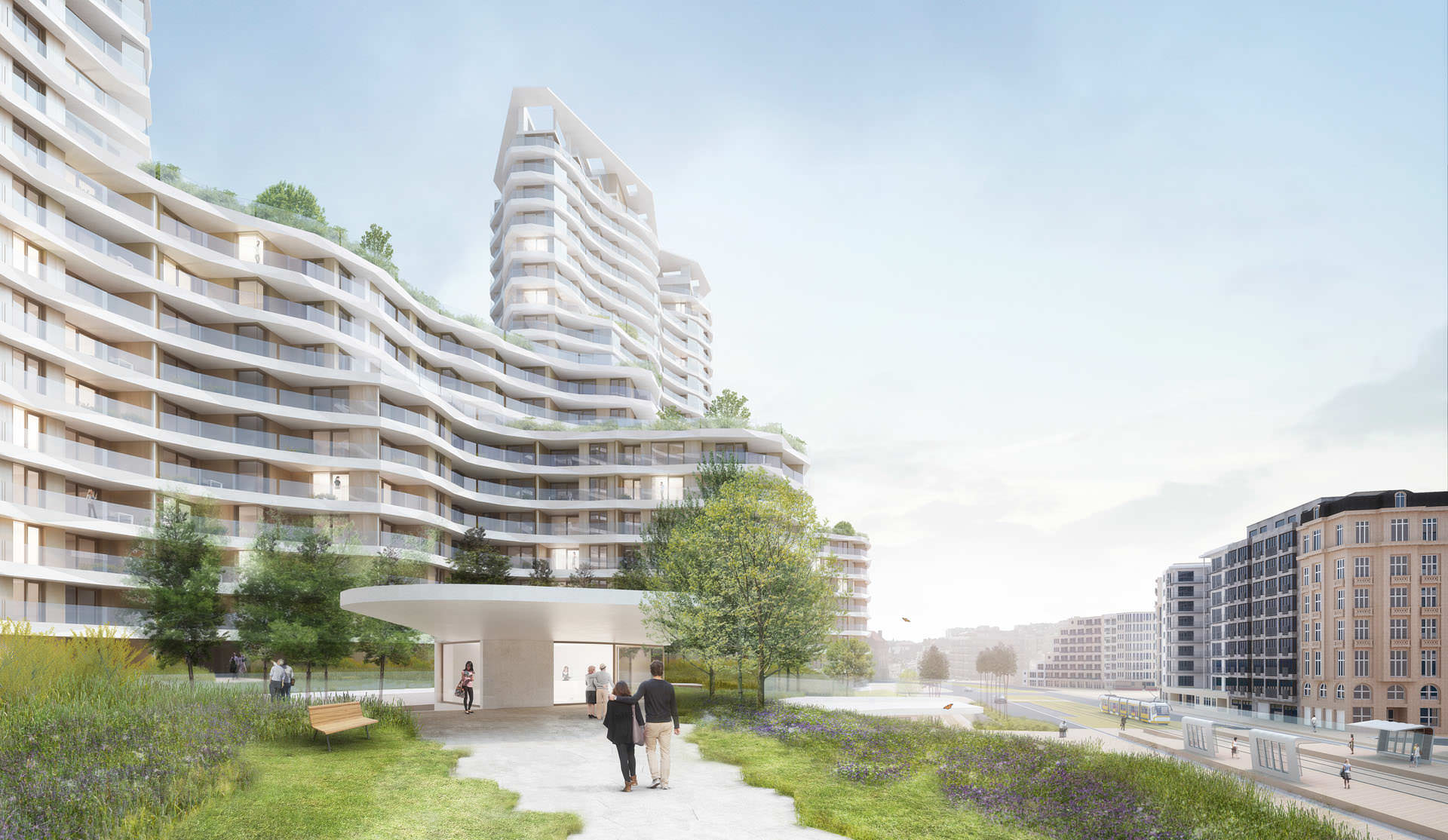







looks like 10 years old renders.
The renderings are nice, and the design is interesting. I do find the trees in image 5 a bit odd, the lollipop look throws the scene off. I assume the trees have no lower canopy to illustrate the ground floor architecture, but my eyes are constantly drawn back to the strange trees. Just my two cents.
Great work!