Making of The Museum ‘Butterfly Effect’ by Stefan Hirschsteiner
I’m happy to introduce the making-of Stefan Hirschsteiner‘s ‘The Museum’ Grand Prize Winner – ‘The Butterfly Effect’. Stefan takes us through his complete process, starting with the concept and on with using SketchUP (with lots of Plugins!), key points using Maxwell Render and postwork all the way to final images. I learned a few new SketchUP tricks in this one and hope youll enjoy this article, learn from it and share your thoughts by commenting at the bottom of this articles page.
Author : Stefan Hirschsteiner
Stefan studied architecture in nuremberg from 1999 until 2004 at this time he learned several 3d programs like 3dsmax, Cinema 4D and Rhino and found a passion for archviz. At the moment he’s employed as a project leading architect at KJS+ Architekten in Erlangen. Along the boring stuff, like building houses, he also does all the internal and competition visualizations for KJS+.
Introduction
In chaos theory, the butterfly effect is the sensitive dependence on initial conditions, where a small change at one place in a deterministic nonlinear system can result in large differences to a later state. The name of the effect, coined by Edward Lorenz, is derived from the theoretical example of a hurricane’s formation being contingent on whether or not a distant butterfly had flapped its wings several weeks before.
I honestly think that there is not much I can add about the technical side of the project, because the workflow was not so special and there are already so many great tutorials on making it better. So I will try to concentrate more on the Soft Skill side. How did I get to an idea, what was my intention, mood, story, etc.
Concept Phase
For me, this is the most important and probably the most joyful phase of a project. Only wonderful, crazy ideas – without “the pain” of realizing it yet!
I usually start with one or several mind maps, brainstorming every aspect and idea of a project which comes to my mind. For me this method proved to be quite efficient way of sorting bad ideas out, and quickly get a rough overview of what is needed for the particular project, before really starting the work.
Derived idea from The brainstorming
My first attempt was, to show the NNG after a great event, so that the viewer would wonder “what the hell was that show?”, “what happened here?”. I really liked the idea, but found it quite difficult to get the right mood and contrast to the NNG.
So I decided to give this idea a little twist. I still assumed that the show is over, but suddenly the art becomes alive and tries to escape!
I first played with the idea, to fill the NNG with white cuckoo clocks, where the birds become alive but it reminded me too much of Hitchcock´s The Birds. Another very interesting idea was oil-paintings which come to live (i.e. painted picture of a waterfall with real water flowing into the NNG very interesting but also a quite common theme which I saw many times before).
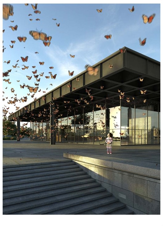
Finally, I decided on the butterflies because of their symbolic value, and the pictures I had in my mind of the yearly monarch migration in Mexico.
Also the NNG (and Mies of course) itself with its huge influence on many generations of artists, architects and visitors seems to be some kind of butterfly effect to me.
I also liked the strong tension between the strict order of the build, solid and old NNG and the chaos of a vivid flying butterfly swarm. The paper butterflies found Inspiration by the butterfly swarm from Marc Köschinger.
After I found ideas I like I do tons of mini sketches to the particular theme just for myself, to further sharpen the idea and start to think about composition. I really try to think of composition as soon as possible, because I think it is one of the most difficult aspects in Architectural Visualization.
These mini-sketches, even if not too detailed and accurate, are absolutely the most valuable tool for my whole decision-making process. Because they are done so quick and often tell me everything I need to know for the final shot already.
I really would advise to sketch more, render less
I also collect as many reference pictures related to my idea as possible. I often do a collage of all these pictures so I can see everything at once, this also helps me to derive a special mood for the theme.
This is the time, I usually do just a rough base model of the whole scene to get better site awareness and test my sketched shots and compositions in this rough 3D Environment.
The Base modeling, fortunately, was done completely by Ronen, so I could concentrate on the story and composition of the views.
My personal goal of the concept phase is always to get some kind of plot / storybook for the final work. This should include the base theme, rough composition, rough view angles etc. and a kind of mood if possible.
I really force myself to (at least roughly) nail down my camera angles as soon as possible, so I can concentrate further modeling and detailing effort to only the parts where I really need it. I know this reduces my flexibility later on, but it also greatly reduces the wasted time on generating non relevant details.
The Rough Plot
1. Calm
Close-up Indoor Shot with only paper butterflies in a dreamy morning light atmosphere.
2. Initiation of chaos
Indoor Shot. First real butterflies are introduced. Also some dead Paper-Butterflies. Maybe a Butterfly Catcher, who tries to catch the view visible butterflies.
3. breakout
Close Outdoor Shot. Things are starting to get really wild. (wild angle shot). The NNG is completely full of thousands of butterflies and the first ones are outside.
4. Freedom
Very peaceful outdoor shot. The whole swarm is in the air. Staring, happy people on the ground
After looking at my concept retrospectively, I have to admit, that I didn’t´t manage to deliver the idea completely. Especially the transformation from paper butterflies to real ones is not evident in my pictures. I probably should have shown some paper-chrysalises which are transforming into real butterflies…maybe next time 🙂
Modeling / Detailing Phase
The Butterflies Geometry
Of course the most important part of the concept are the monarch butterflies. And the fact that I would need many of them forced me to do them as low poly as I would get away with it. I first tried a free butterfly from The Free 3D Models, But it caused problems with SketchUP and was even to high poly for my intention. I ended up roughly remodeled it, so SketchUP could handle it.
I created 4 variations of the real butterflies as components and a proxy for each of them.
Real Butterflies test render
The same for the Paper butterflies Proxies :
And the test render
For the butterflies I used a friends Rhino version. The rest is completely done in SketchUP
The Butterflies Placement
Due to the fact, that I don´t have any particle / crowd simulation solution like RealFlow (I tried Blender, but I could not get it working properly) I decided to literally hand place every butterfly in the scene, which was the most tedious process I ever did. I finally managed to do it with a mix of the following very useful SketchUP Plugins :
Matrix proximity by TIG and LSS Matrix by kirill2008 to create a large amount of butterflies in 3d space
Random Delete by TIG to randomly reduces a percentage of the selected butterflies
Random Replacement of Components by Sdmitch to randomly replaces components by a set of other components. So I was able to distribute only one proxy, and afterwards randomly replace it by a whole set of proxies
Compo Spray by Didier Bur to scatter Butterflies on the ground
Despite these really cool little helpers I was forced to erase and place many butterflies manually to get the wanted chaotic look of the swarm.
Even In this early phase of the project I realized, that I would not manage to submit the intended 4 Pictures, because for every shot the butterflies have to be placed separately of course. So I focused on Calm as a starting point of the story with a few elements of Initiation of Chaos (flying real butterflies) and “breakout” as a very dynamic counterpart to the first picture.
The Surroundings
Almost all surrounding buildings are based on Google Warehouse models which I redefined in SketchUP without great attention to detail because they were not too prominent in my shots.
Vegetation
The trees I did in Arbaro some years ago. They look really terrible in close-up but quite ok when they are far away and you squint your eyes. I first imported them into Maxwell Studio, where I did the materials, and then re-imported them to SketchUP via the new MXS reference feature of the Maxwell for SketchUP plugin (very useful, this will completely change my workflow in the next projects).
The tree inside studio
Test render
The MXS Reference inside SketchUP
Detailing the NNG
The detailing was mostly done with SketchUP´s own tools and the plugin Round Corners by Fredo6 for the beveling. For the Curbs I used Sculpt tools by BTM.
Texturing / UV Mapping / Materials
Almost all the textures are hand painted based on www.cgtextures.com images. Some of them were Arroway Textures Concrete and Stonework ones.
For the outdoor floor tiles I decided to do only two variations of a 4×4 Square. I randomly distributed them in SketchUP via the Extrapolate Colors plugin by Chris Fulmer and Texture randomizer by TIG to get enough variation in the tiles.
Sample Textures
Granite Diffuse :
Granite Displacement :
Specular Map :
Water Puddle Alpha :
Metal Column Diffuse :
Column Specular Map :
The UV Mapping was done with UVMapper Professional, which is clearly not the most comfortable UV mapping software, but usually the results are good enough for my intentions. To get an object properly into UVMapper, I first triangulated it with the Triangulate Plugin from Osbo.com, than I exported it with the UVTools 0.2 Beta Plugin by Whaat. After Mapping I finally imported it back into SketchUP again. (also with UVTools)
Maxwell Render Materials
I almost always use a rough base layer with an additive specular layer on top.
The glass material was a simple AGS solution with a slightly green tint and a bump map applied (I modeled 2 glass panes for the curtain walls to get nicer reflections). The metal parts are based on the mxi wizard materials too. I changed them a bit to suite my needs.
Example materials
Granite tiles base layer :
Granite tiles spec layer :
Butterfly Front wing SSS :
Lighting
Both images were mainly illuminated by VHDRI´s from Hyperfocal Design (expensive, but really good)
Not too much else to say about it
Rendering
I rendered both images at 4k resolution and did a separate pass for the outdoor butterflies. I always do several additional passes for mat id, object id, shadow and z-depth too.
Usually I am always unsatisfied with the raw results of my renderings. But even knowing that does not prevent me from panic a few hours, before I finally try to fix the problems in post.
This leads me to the second most important aspect of my workflow – Post processing (always saves my life)
Post Processing
General Thoughts
Looking back to the original concept is always a good habit. Especially while doing the postwork, I tend to somehow loose my way during the process. In this case, looking back helps me to remember what I originally wanted to say.
Originally, I intended to start with a very cold, blue mood for Calm. I slowly wanted to introduce some warmth in Initiation of Chaos. Breakout should be clearly the most warm, energetic shot. The final Shot “freedom” should be some kind of very natural, friendly shot. All pictures should be some kind of dreamy, only “freedom” was meant to be less diffuse.
With only 2 shots left, I simply did the cold one (with little warmth in the butterflies) for Calm and the direct opposite for Breakout, mostly warm, with little cold in the shadows
Entourage Kids
I usually don´t buy entourage people for my work, but this time I really felt, that the kids are almost as important as the butterflies, so I decided to buy the Kids V1 bundle from http://www.viz-people.com/, which is very good I have to admit.
Workflow on Breakout
I used the Maxwell to Photoshop plugin, to import both mxi images (main render and butterflies) with all the rendered channels into PS. I did some general lighting adjustments, and brightened up the way too dark underside of the roof directly in 32bit before I converted it to 16bit. Here I darkened the metal parts a little bit with a hue and saturation adjustment
The SketchUP Viewport :
Raw Render :
Lighting adjusted :
Darkening of metal parts :
After that I did the motion blur on the butterflies with a mix of Gaussian Blur, Motion Blur and Radial Blur. I also adjusted the saturation and the lighting of the butterflies a little bit.
Butterfly alpha :
Butterfly motion :
The Swarm in scene :
Swarm desaturated :
Swarm light :
After that, I duplicated the butterfly layer for creating the reflections on the glass with the Layer in Multiply mode
Butterflies reflection raw :
Butterflies reflections dimmed :
I placed the child, roughly color corrected it with a hue/saturation adjustment (the overall color correction comes last). After that, I did the child´s shadow (duplicated black child layer in multiply blending mode with Gaussian Blur applied) and painted in some light and dark parts on the girl itself with a black layer in color dodge blending mode for the lights and an empty layer in multiply mode for the shadow parts.
Child raw :
Child shadow :
Child color rough :
Child lights and shadows :
The final step was the color grading and the desired look. I first shifted the whole image to a more blue cold hue with a selective color correction, then I gradually introduced some warmth with photo filters in soft light blending mode and a color balance adjustment.
Shift to blue :
To get the dreamy diffusion look, I duplicated the whole image, blurred it and did overlay it in screen blending mode.
Chromatic aberration :
Some chromatic aberration was done with lens correction. I also added subtle noise to better blend everything together (I am always afraid of noise during render, but add it later anyway.
Warm up :
Contrast :
and a little vignette to guide viewers eyes to the girl.
More warmth + vignette :
The last step becomes more and more important to me – the final naming of the picture. I think this simply adds a more finished and “intended” look to the pictures and helps “selling” the idea
Finalize :
Almost the same steps were done for Calm
here are the step views one by one
That is basically all.
I have to admit, that although it was harder to writhe this article than to create the actual images, I enjoyed it a lot and hope somebody will find it useful.
Stefan


