Making of Simple Interior
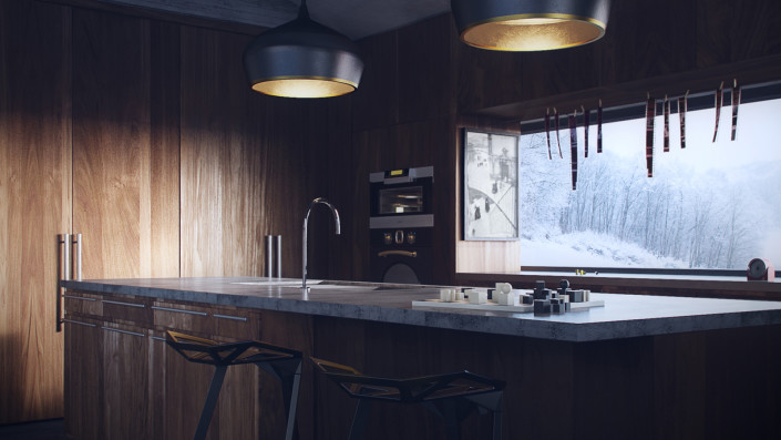
First making-of for 2016 is by Danny Kai, diving into the creation of his Best of Week 21/2015 “Simple Interior” visuals. A simple residential project in Oklahoma that Danny worked on at Vizorium. For me it looks like chiaroscuro paintings, and captured my attention looking into how they were made… Enjoy!
Introduction
Hello!
I grew up in a place where comfort zone seems to be everywhere I go. I’ve previously struggled with the balance between profit and non-profit driven projects, especially considering the initial mindset when starting a project. At this moment I do like to think that I’m in the right place in terms of convincing myself not to look at the money first because that way I would be able to put in 100% of passion into projects.
This is a project I’ve done with the company I’m currently attached with, Vizorium. The initial idea was to create a short animation, but due to the commitments and deadlines I’ve only managed to complete the still images stage.
Thank you Ronen for featuring this project!
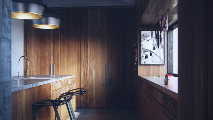
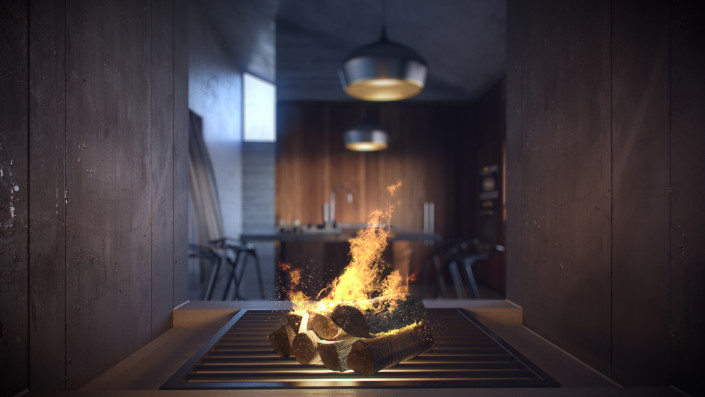
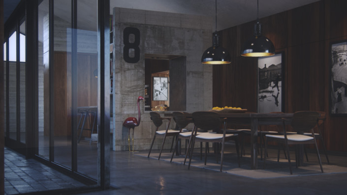
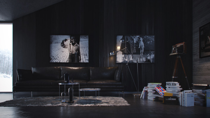
Here are the 9 Images in this set :
Getting into the Moment
Before starting a project, I like to spend a little time re-watching some of my favourite movies to study color schemes and compositions that I would like to achieve.
In this case the movie I’ve chosen to watch was “The Secret life of Walter Mitty”.
As a film photography lover I often seek for inspirations that I could instill, in turn, into my projects. In my opinion, the director of photography for this movie has done an awesome job! One thing I like about this movie very much are the scenic and landscape cinematographic shots. These are often very minimalistic but still powerful.
Throughout the whole project I’ve often remind myself to create these minimalistic scenes but still powerful just like :
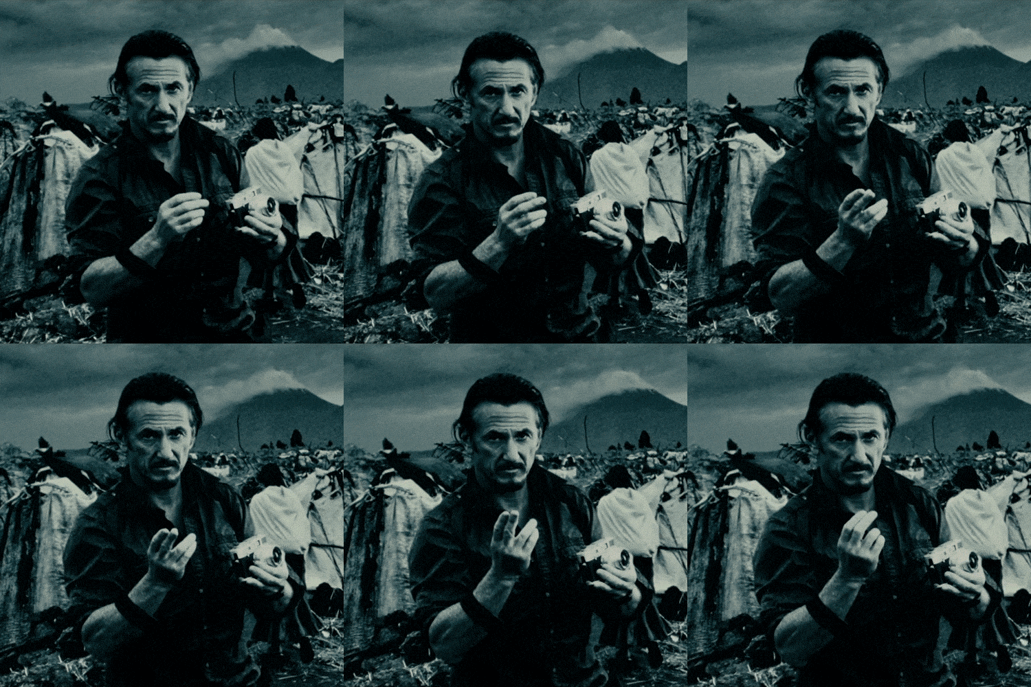
The moment Walter Mitty zoned out to this photo of Sean Penn, subtle movement yet the impact was amazing.
Or when Sean Penn quoted
It is simple gestures like this that comes with a powerful impact.
Nuff said!
I’m sorry if the above sounded cliché but that is how I work and I believe every artists have their own way of getting their inspirations.
Modelling, Cameras & Composition
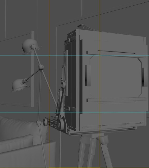
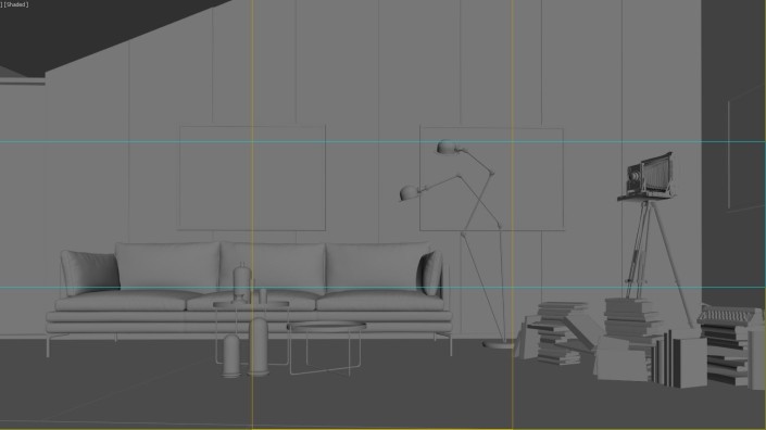
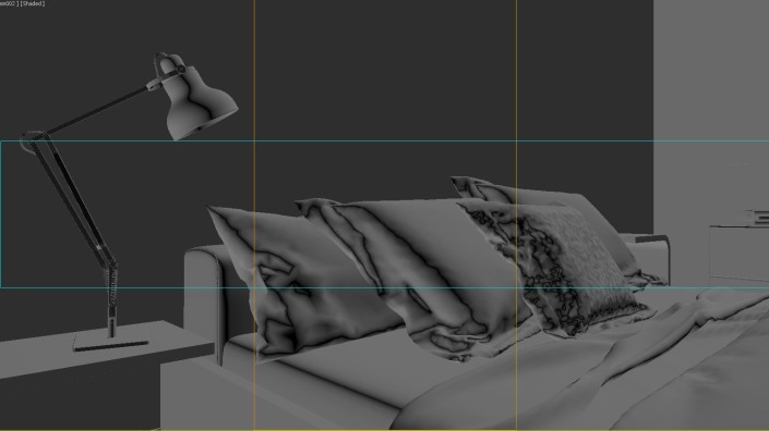
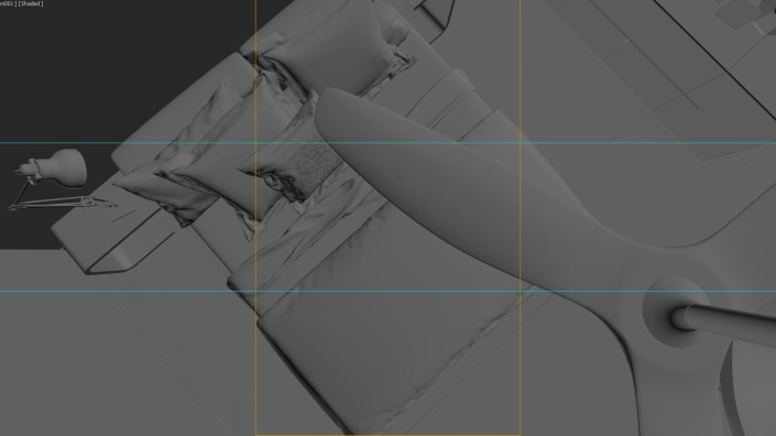
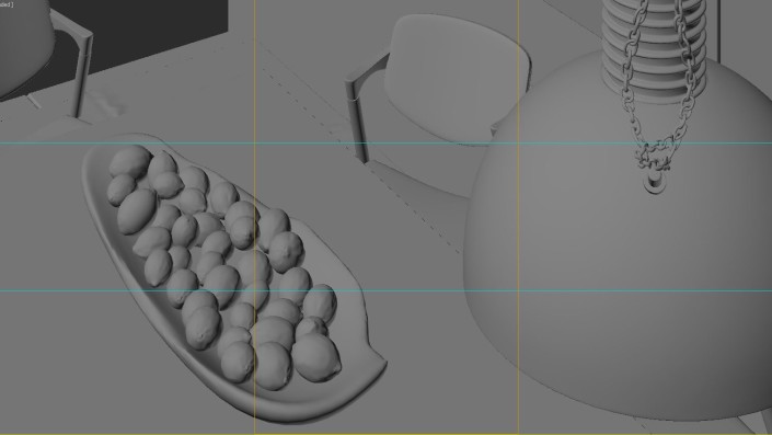
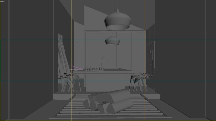
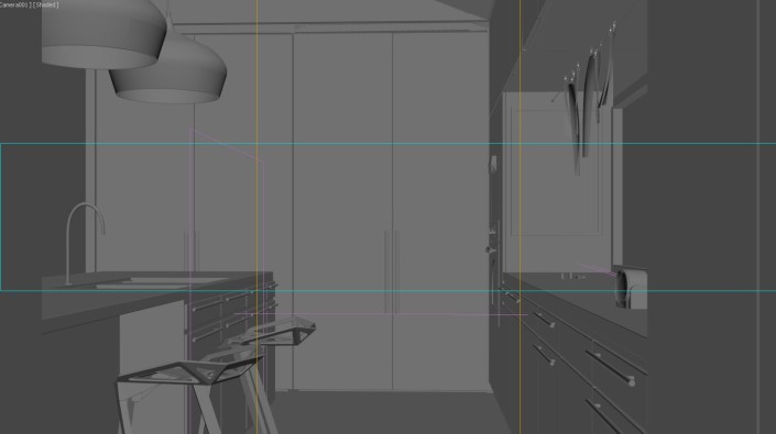
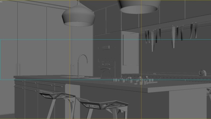
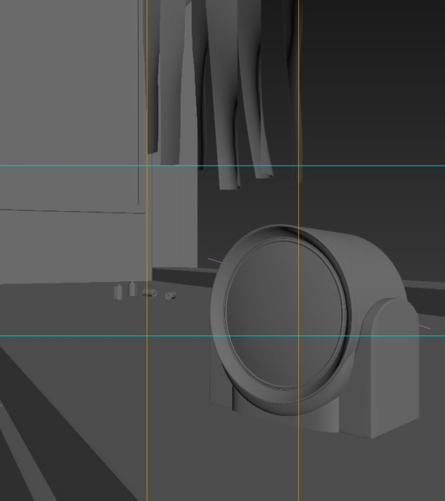
I was given the basic 3D SketchUp model by our client. It wasn’t that detailed and most of them have double stacked objects. Some details are added while working with the compositions and below are the viewport screenshots for all the cameras and some non-included views.
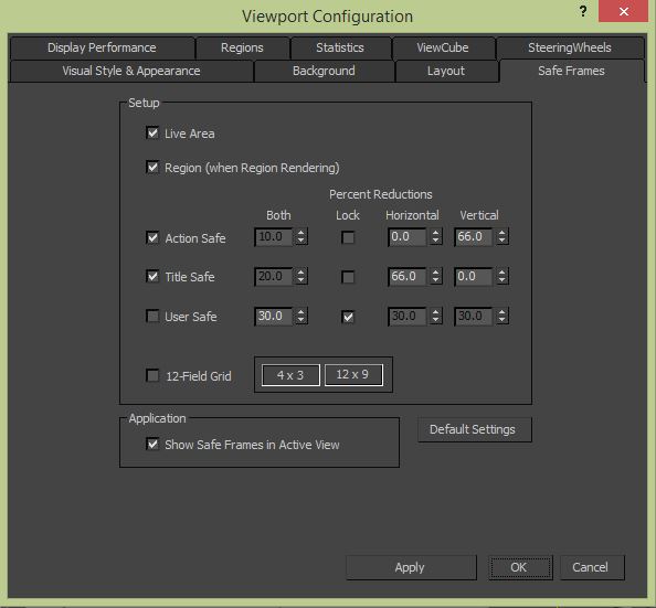
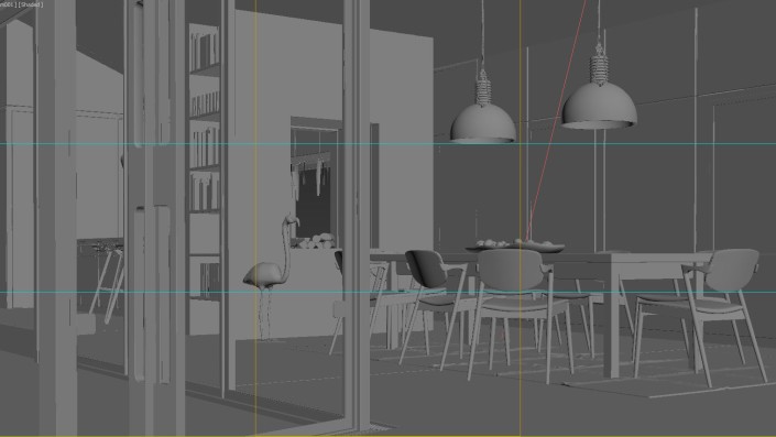
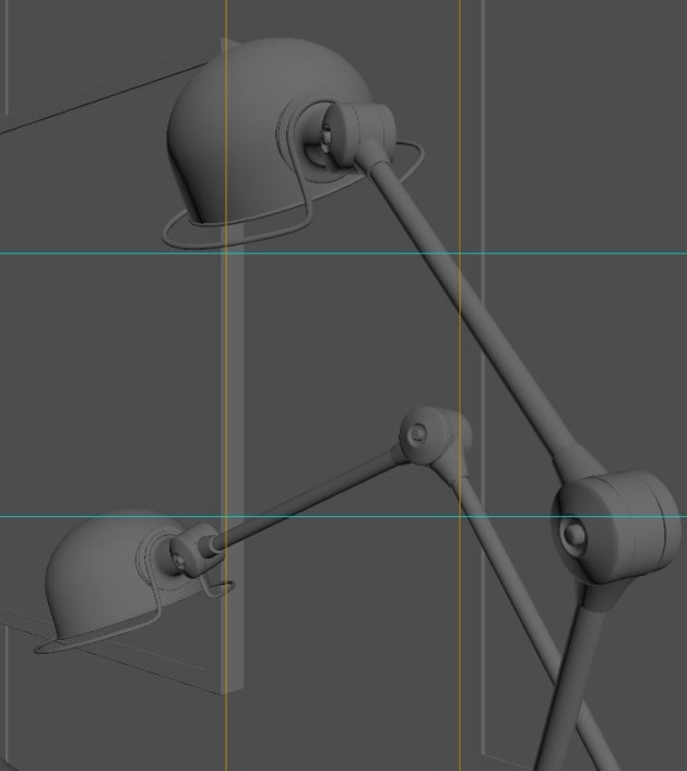
I’ve also learnt to use the viewport safe frame setting as below to represent “Rule of Third”‘s so it helps during composition.
And the frames as they were setup
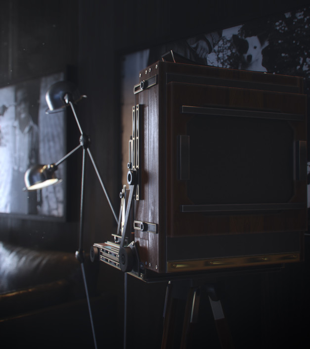
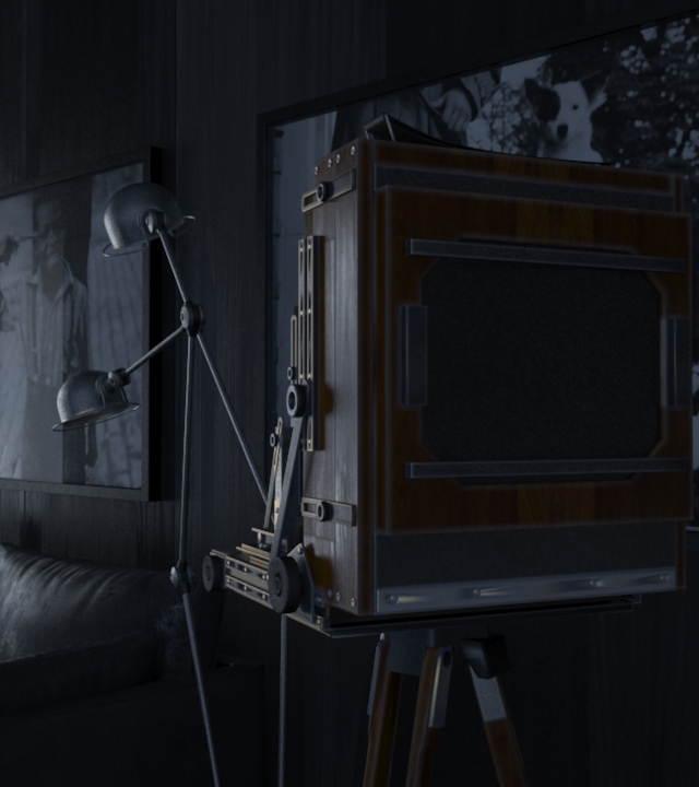
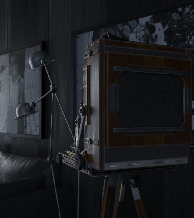
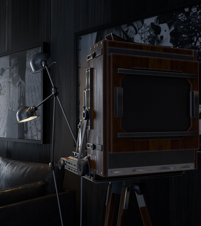
All models are built mainly with splines and typical boxes. I try not to talk a lot about the modeling since there isn’t much I can add in that department. Some of the models like the vintage camera are courtesy of a colleague of mine.
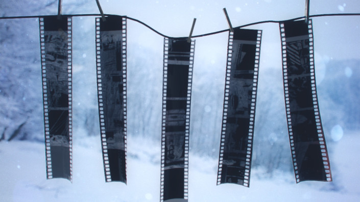
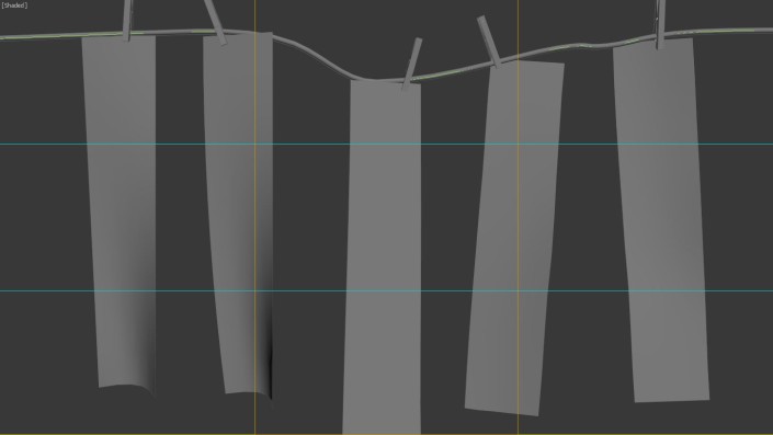
A simple wind simulation was used for the curtains and mainly for the Film strips.
For random film orientation I would just differ the amount of wind strength for each of them.
Materials
In this particular project I used the workflow taught by no one else other than the master Mr. Grant Warwick in his Mastering CGI courses. Initially, I’ve struggled with the high subdivs material workflow but recently GW had introduced a new lesson which tackles that issue and I think everyone could take a look at it.
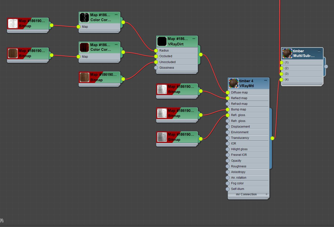
Timber Walnut
In order to avoid repetition I’ve created four different walnut materials using the Multi/Sub-object as the Parent.
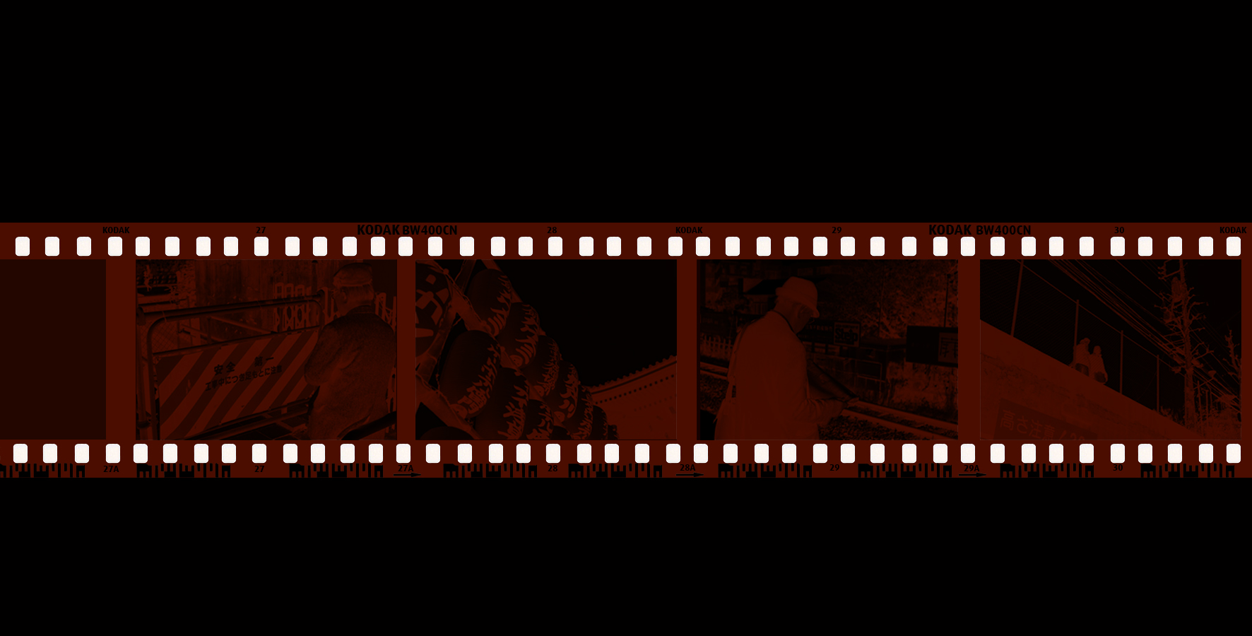
Film Strips
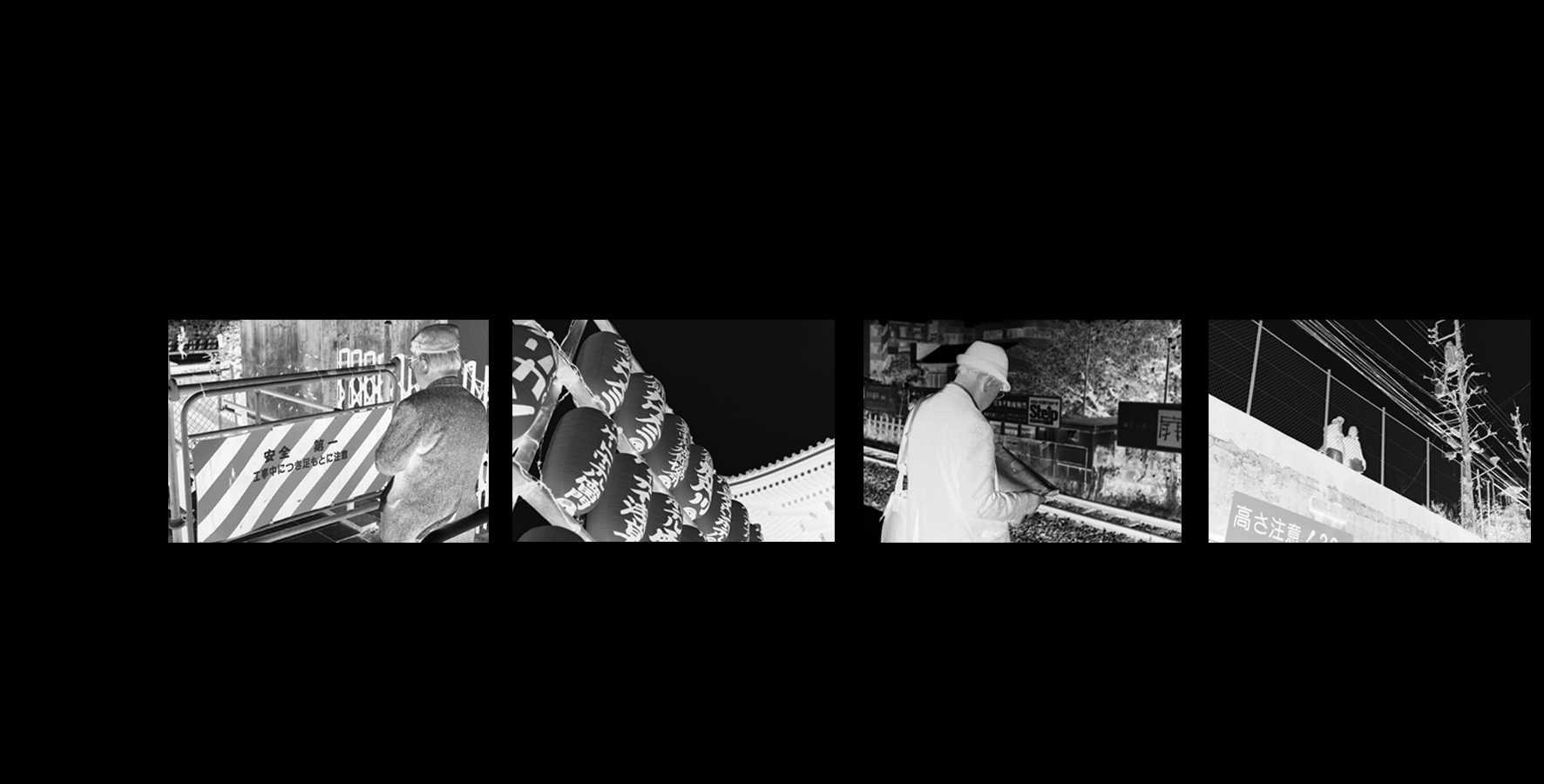
I’ve customised the films using my own photos I’ve shot with my Leica M3 during my previous trip to Tokyo. Simple conversion to black & white then inverse the image to get the film negative look.
Diffuse
Refraction
Opacity
Here are some of the stuffs that I’ve shot in film : http://dwhiskers.tumblr.com
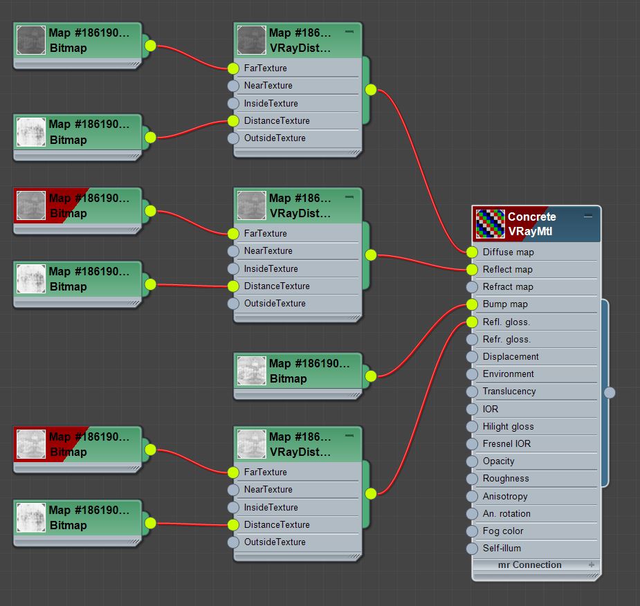
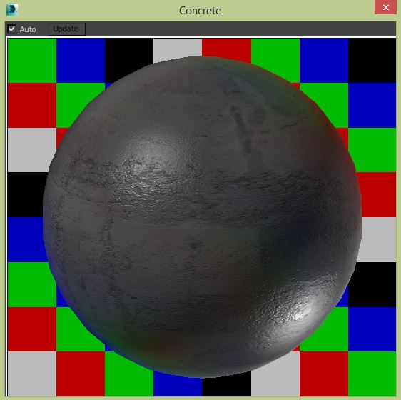
Concrete
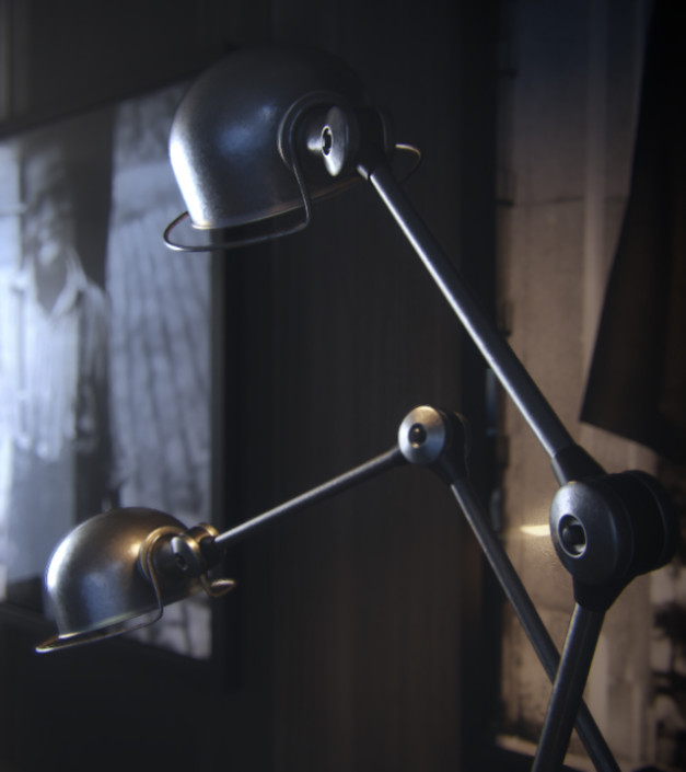
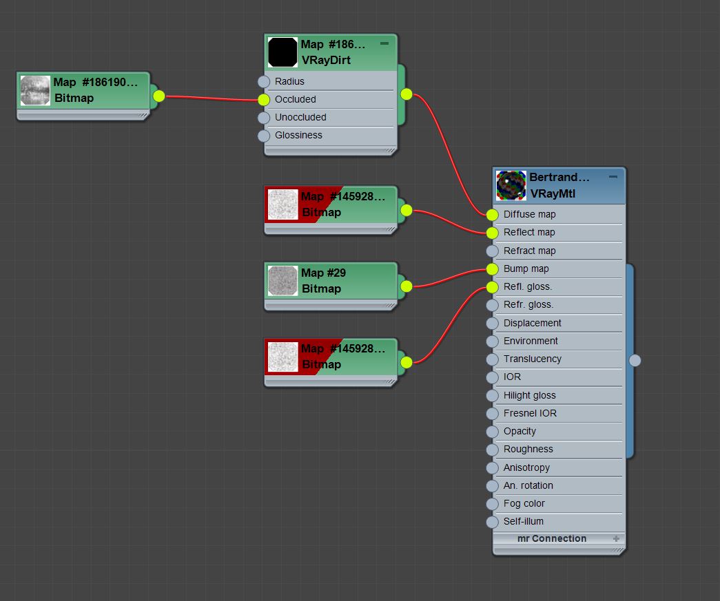
Black Coated Metal
The black-coated material used in the dining tables pendant lights is from Betrand Benoit’s Loft scene just that I’ve changed the BRDF to GGX.
Lighting
The lighting process is the part I enjoy doing the most!
The idea was to try to achieve a minimalist yet powerful overall look & feel. The scene was illuminated using the typical V-Ray Dome Light with an HDRI. When it comes to HDRI’s I prefer the trusty ones by Peter Guthrie – PGSKIES.
The way I do lighting is usually to focus on the shadow first instead of “Lighting up the Scene”.
Below is one of the examples :
Lighting with just HDRI
Lighting with cold fill lights
Once I’m happy with the density & shadow of the environment lighting, I then fill in the scene with cold fill lights that affects the reflections & Specular to enhance highlights in the scene.
Last but not least, I’ve added the warm fill lights just to add a little warm fuzzy feeling to the mix. Just enough for easier control in post production.
Rendering
I’ve used Brute force + Light cache and each render took around 5-7 hours on one computer. The pc I’m using is as an i7 with 32GB RAM packing a GTX 760.
Initially, I wanted to render the DOF in Camera, but due to the amount of noise forcing to compensate in terms of higher subdivs, I decided to go with postwork DOF to avoid longer render times.
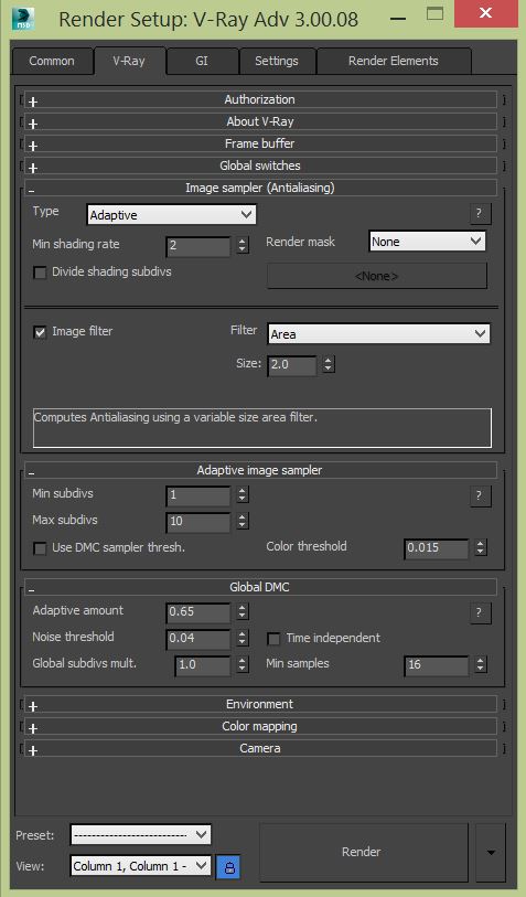
One of the scene’s sample render settings :
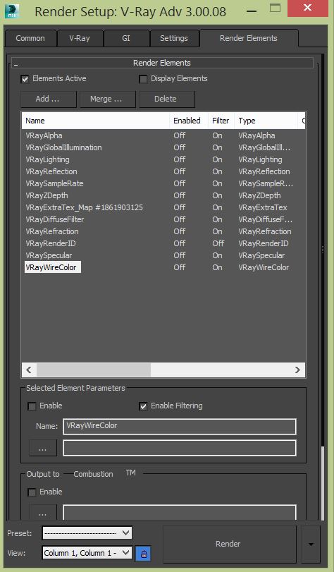
The render elements I’ve used are pretty much the common ones but I’m in love with one particular pass which is the V-Ray Sample Rate which gives you a whole new understanding towards V-Ray goings behind the scenes of the render.
Post Production
The software I’ve used for post productions are such as Frischluft for Depth of Field & Magic bullet for color grading.
Nothing too special there too.
Big thanks to Ronen Bekerman for the invite to write this behind the scenes and I hope you guys found it interesting.
See you on the forum 😉

















Congrats my friend!
This was a great post. I really took a lot from it!
Glad it could help = )
Danny Kai Proud of Msia!! Thumbs and wait to see more works from you feature here!
i like to able to feel the space, get a sense of presence – some wire frame is nice – to get a sense of what is beyond …. the parts of the building that one can not see …
Jac Kwon always awesome to see a fellow Malaysian 🙂 , thanks
very nice
i can see clealy several references from alex roman & bertrand benoit
They are both amazing artists that I’ve looked up to!!
Great sharing! So proud of you!
adilasunny = )
I love it when talented people say “it is simple do this” “it’s a simple procedure” “lighting this is easy” “it takes some time to model but it’s nothing hard very simple”.
encouraging but really funny 🙂
ihabkal It is really simple !! Happy rendering ~
Gracias senior = )
that fire…not so hot.
Really beautiful work! you talked about a GW “In this particular project I used the workflow taught by no one else other than the master Mr.http://www.ronenbekerman.com/af/grant-warwick in his http://www.ronenbekerman.com/af/grant-warwick. Initially, I’ve struggled with the high subdivs material workflow but recently GW had introduced a new lesson which tackles that issue and I think everyone could take a look at it.'”
can you tell me which lessons ?
davidyandrahi Thanks david , http://masteringcgi.com.au/course/mastering-vray/?action=curriculum
I believe it is Lesson 11 -Architectural Optimization Part 2
Any chance we can see the camera settings? 🙂
chrislund Hey for sure !!
Very neat work. I have one question.
Why did you use Vray distance on the concrete material?
Thank You in advanced
HermunM Hey I will try and explain as clear as I could . https://www.youtube.com/watch?v=Xt4-x6HinQM I want to have a slight differences in tone (Like a dirt) thing but only for the objects that intersects with the concrete material .