Making of Mediterranean House by nookta
nookta‘s Mediterranean House was chosen by Chaos Group to accompany the launch of V-Ray for SketchUP v2.0 release and rightfully so. nookta managed to produce a highly emotive visual using a simple SketchUP model rendered with V-Ray directly from SketchUP. In this article, Bahadir Ozbek from nookta tells the story behind the image. Enjoy!
Author: Bahadir Ozbek
nookta is a German based Architectural Visualization studio founded in 2012 they have strong focus on aesthetics and style.
Introduction
First of all, thank you for your time reading this article and a big thanks goes to Ronen Bekerman for inviting me to write it.
The project was a competition entry for CG Record. I actually only wanted to do something for my personal portfolio and was very surprised and happy to see this image among the top 10 at CG Record and also being picked for the launch of V-Ray for SketchUP v2.0 by Chaos Group!
Before I even got going with the work, I tried to imagine what could this house and its surroundings can look like. I knew I want it to be minimalistic, open and cool. I also wanted to convey a sense of comfort.
The overused sunset scenario was quickly dismissed in favor of an early cooler morning look & feel.
For me, the most important goal was to be able to spark emotions when you see the image. Having a super perfect 3d model is not a must for that, therefore I invested more time in post production.
That said, the 3d model needs to hold up to some standard. Using SketchUP I aim for low poly count at all times, but in key areas, specifically in view, I do add details. I make sure that architectural detail work, the edges are rounded and the furniture are precisely modeled.
The 3D Model
The base 3d model was provided for the participants of the contest. I cleaned it up a bit and added some furniture from the 3d Warehouse and some from Vitra imported as 3DS into SketchUP. I highly recommend you check the Vitra site if you need good 3d models.
I worked those furniture models a bit more as the were to rigid initially. For that I used a great plugin for SketchUP called Artisan. Most use it for doing general site work, sculpting terrains and such, but it does magic on furniture too!
See the before and after…
Here are more model views…
and an extra render done – exterior one…
Lighting
For the Lighting I used a V-Ray Dome Light – One of the great new features of V-Ray for SketchUP v2.0 with HDRI from Viz People.
This pack has 10 High Resolution HDRI Sky maps sized at 12000px X 5800px ready to use for commercial work too.
This pack has 10 High Resolution HDRI Sky maps sized at 12000px X 5800px ready to use for commercial work too.
I have no other light source in the scene so I choose a bright sky that gave a blueish color to the surfaces.
Rendering
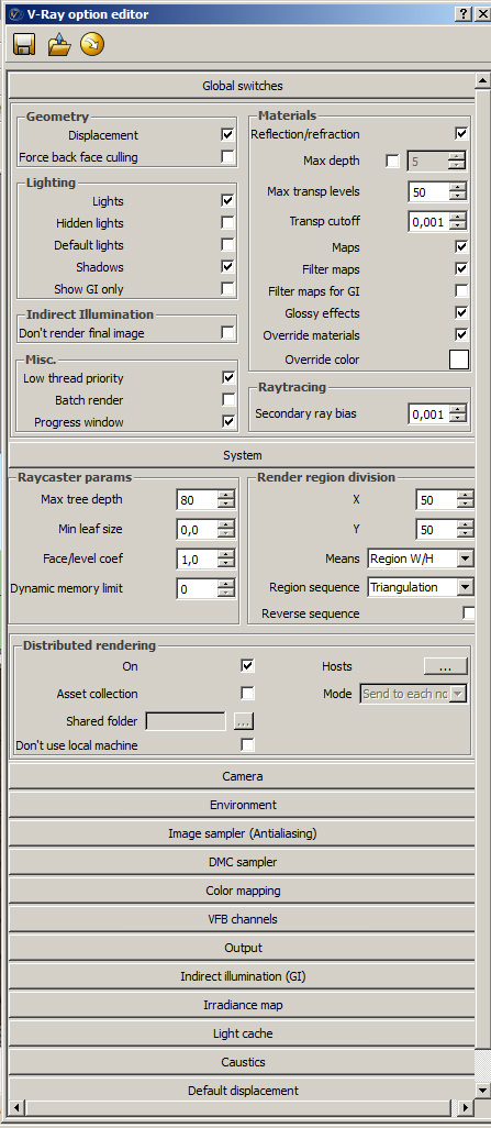
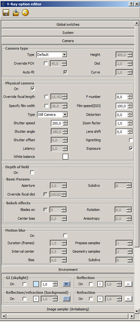
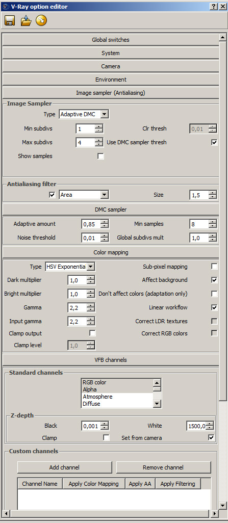
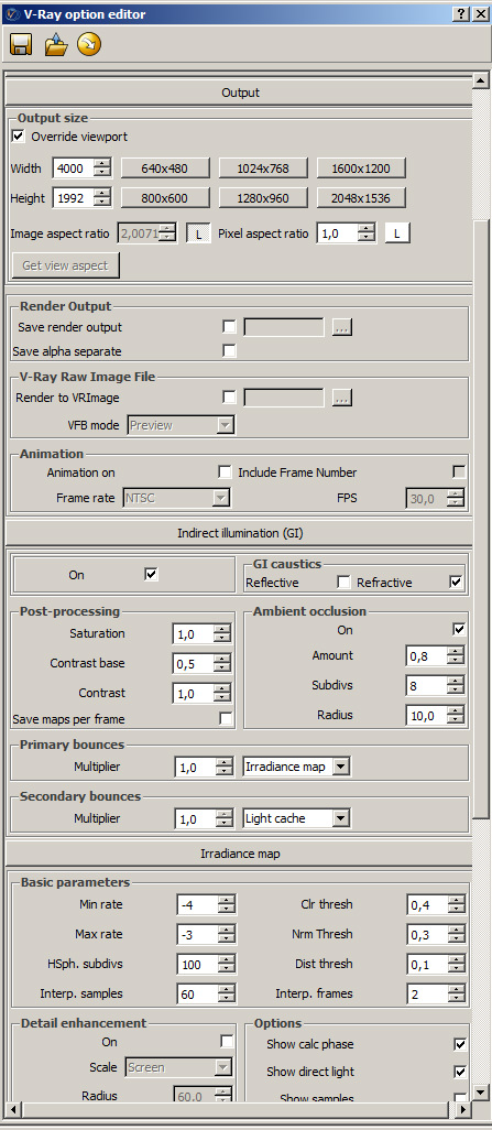
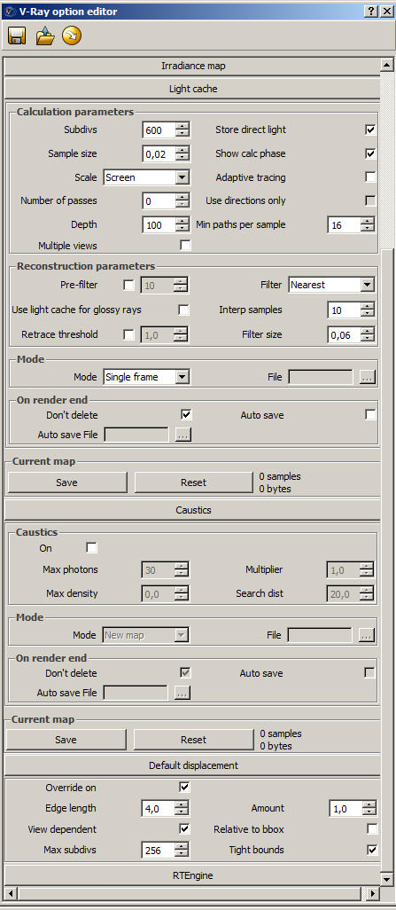
This is very straightforward… I use a combination of Irradiance Map and Light Cache to save on render time, knowing I do most of the work in Photoshop in anyway.
Here are the setting for the Rendering :
Materials
I tried to use low quality textures or just diffuse colors to save on system resources and render time.
Here are the most important materials.
Floor
Bricks
For the bricks map I needed a good displacement and map. So I used the program CrazyBump to help in making these.
Used double-sided material for the light glass…
Here is a cool tutorial about double-sided material for SketchUP users…
I added the dirt map later in Photoshop.
Post Production Stage
So lets see the RAW render first…
And these are my layers in Photoshop before Ronen asked me to do the tutorial… Not that pretty!
This kind of layer structure is not a good example but sometimes you have no time to name the layers (or maybe you’re just lazy).
For understanding I have grouped some of the layers
Adding Background
For the forest in the left corner I have created a collage of different trees from my library and matched the color using different adjustment layers.
The background image also made of several levels.
For the foggy effect I’ve taken a simple brush and painted with white over the background.
I spend a lot of time doing this part, because the sky really sets the mood for the entire image. I think it is important that the colors of background should fit together with the rest of the image.
Added a bit of bluish color on the left-side and on the window. Some glows on the surfaces and made the lights more intensive.
Added a bit of vignetting effect and entourage.
Turned up the contrast.
A little color correction and here is the final result!
Thank you for reading, and I hope you liked it and that it was helpful to you!
Best regards,
Bahadir.





Hi,
Can I have ur mail id so that I can ask few doubts regarding the post which u have posted here.. so that I could be really helpful for my work here… I would be great that if u share the mail id of urs to interact with u….
spellbound awesome work… really…
Thanks
Regards
Vinodh
who can do it again? i can not do same it ? video tutorial? thanks
incredible!!!!!!!!!!!!!!!!!!!
Amazing job in SU, congrats man. Question though how did you get a wire colour channel on sketch up ?
super