Making of HOVER ‘Time Traveler House’ by Tolgahan Gungor
The Time Travler House earned Tolgahan Gungor the 1st Runner Up award in the HOVER architectural visualization challenge. It is a very unique piece of art which also awarded him the special category prize for best design and a respected CGTalk CG Choice Award. This tutorial focuses more on the conceptual part of things then technical. I hope you’ll enjoy it, learn from it and share your thoughts by commenting at the bottom of this tutorial page.
 Author: Tolgahan Gungor
Tolgahan is a 30 years old 3d artist based in Izmir, Turkey. He participated in several CGTalk challenges and works professionally via AVIS Graphics, his own firm. Read the Interview with Tolgahan to learn more about him and the way he works.
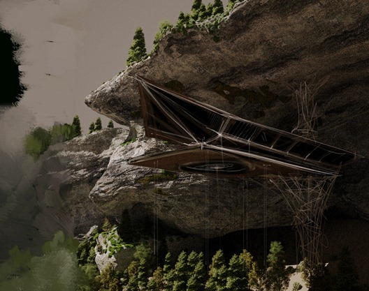
Before we start, you we will see my final submitted entry below I have managed to make many more views for this project during and after the challenge, and Ill share most of them here too.
Concept
I was inspired greatly by the works of Lebbeus Wood in the making of the Time Traveler House entry for the HOVER challenge and I would like to share these samples with you as a starting point for my article.
When the competition had started, I decided to do the first concept that came to my mind. It had to look like as if it was stuck into a rock but at the same time it had to be seen as it was hung up in the air. Although I had the complete structure of the building in my mind, I made some changes due to some comments and suggestions that other participants and visitors made on the WIP thread of the challenge.
Modeling
Because I did not use any references while doing the model, it was a very hard session to complete. Sometimes I had to throw away some samples after studying it for 2-3 hours. I used poly modeling method while creating the models and made load of sketches at the beginning of the project just to be able to visualize every single detail.
I started with sketches like the ones you can see above and kept going with the modeling and revisiting this way of sketching over and over again until I came up with the final version.
I had many changes during this stage as I focus on the outside look of the house as well as the inside.
That was the point I turned to a project by Massimiliano Fuksas The Grotte Niaux. This reference sparked more design and modeling changes until I finally got something I was happy with.
Here are some of the sketches and modeling parts that I made after this reference.
And a breakdown of the complete house
The Rock Face
Before the building I made the rock in which the building is nestled in. I intended for this rock to look like a mountain with a cave in it.
After the first draft, I started to model it by preparing a low-poly version model first and then, with the help of soft selection inside the edit poly modifier, I shaped the cave in a way that will allow it to receive the house in a natural way.
I did the rock bottom to top to and to accentuate the height and heavy feel I reversed the slope so that the mountain will also seem to hover over the wooded valley below.
The texturing was basic diffuse painting and then just generating bump and displacement maps out of it is Photoshop.
The Bottom Surface
While doing the surface I used VRayScatter most of the time but I also applied displacement below the scattered elements to enhance the display of the dried plants. I felt I needed more variation of color and so I added the yellow shorter grass among the dominant greens. I think this single element was the greatest contributor to the render time.
I was greatly inspired by houses located on isolated places that are on Frank Lloyd Wrights books. Falling Water being the most famous one.
Here is the viewport view with rock face, house and bottom part
Time Machine
This was first a decorative object to be used at the first place but then I decided to make it the main object located in the middle of the house. Below you can see inspirations for it
And one of my first concept sketches too.
When this machine works it gives the impression that the world moves right from here. I made a glass ball and inserted many working wheels and little balls around it that represents the planets.
Trees and Plants
Most of the forest trees that I used were either made using Onyx Tree or pre-made iCube R&D trees (Palm and summer tree sets). For my next project I will model the trees myself and texture them myself because this time they were lacking some amount of details.
Lighting
While doing the lighting the first impression I wanted was that the shadow of the trees on the house and the sunlight to be seen as little as possible. However it was very hard to do this. With a VRaySun, I back-lighted the scene and lighten the area that the house is located on by using indirect illumination. And for shadows on the house I used an Omni Light that gives out yellow light.
On most cameras I wanted to see the trees bushy and I wanted the light to be seen ineffective. But it was very hard to control both, so the the effect of the light became poor. The most important reason of the trees not to have shadows was because the area was sloping.
That was the hardest problem I had and I tried different compositions to sort it out. But I could never do what I really wanted. I wish I had made the area flat. But then it would make the height of the house ineffective.
The struggle I had was mostly about the concept and the composition. I did not have enough time and information to concentrate on technical details. Therefore I mostly focused on the shape of the house and the hole in the mountain.
While lighting the hole of the mountain I stopped the light going inside the mountain by excluding the lights. With this it gained depth and the house came forward.
Because the renders were taking long times with a VRayDome light, I used a VRaySun instead. But I guess if I do another similar project I would think as if the house is lightened in a photography studio. I will light the trees separately, the house separately and the back space separately and use different lights for each object. Otherwise it is so hard to control the light.
I used HDRI for some glass reflection on some images and fog on some images but because it was my first time trying VRayFog, I wasnt very successful especially while using noise for fog, renders slowed down. I used VRayZDepth instead to create fog which I believe was enough.
Rendering
For all renders I used i7 860 8gb ram. I tried not to use irradiance map because some subdivs were insufficient due to indirect illumination. These also caused some errors on distributed rendering. So I used brute force and light cache on renders. Even though I had some noise problems still it is better not to have faulty look.
Postwork
I saved all images as 16bit EXR because they were mostly dark and later I had to lighten them back in Photoshop. I had to change the sky with the help of an alpha channel for the background. I had to make too many color corrections to suit the main image. Especially on some points I tried hard to seem it greener where the area is green.
I used VRay Material ID render elements. I tried to achieve the look of seasonal changes by gradient map on trees by using soft light layer. I increased the effect of glow by painting those areas with Wacom tablet. While coloring the images inside, I tried the hot colors to come forward and leave the cold colors beneath. Like on most areas I colored the background green and the front in orange. While doing this I made two layers on two Photoshop programs and used alpha channel that was applied a gradient map. I also tried nuke and color grading which were not so good.
Here’s a 2 part video about the color grading work done on the LOTR films that can easily translate into our own work.
Summery
I could do little of what I actually thought of doing. Apart from this Id like to apologize for the deficiency on uv mapping and technical problems. Id like to thank Ronen Bekerman for arranging this competition. Im looking forward to joining the next one.
Ive started my new project Tesla House. This is the project Id like to share which I am working on in details.
I also would like to thank Benjamin for helping me out with modeling and Özgen Algan for her ideas.
Tolgahan’s HOVER Challenge thread
Here are more images that I made of these house…
You are welcome to comment on this article and ask questions using the comment box below!






Very interesting making of, I really enjoy reading it.
Thanks
Awesome work Tolga! super…
the idea of the time travelling machine inside the building is really cool.. I love the simplicity… eline saglik.
Great!.. by far that was probably my favourite entry.
(With DIA’s one =) ‘Grotte Niaux is a piece of art =)
amazing!!!and also I`d like the concept.I think it feels great spending a night in this place.
Wow 🙂 thnks guys.
I’m pretty much sure Tolgahan knows my reply 😉
That was a strong concept! I especially like the fact that you’re developing such s scene through your paintings, which are for themselfs worth to decorate a wall. Well done!
You are truly an artist! I loved your workflow, using traditional techniques at the beginning, and technology for the finals. GREAT JOB!
amazing!! that’s beautiful , loved the idea of the Time machine :):)
but can i ask about “vegetation” used – shown in lighting image – is it a software?? modeled? or ready for use 3d object??
love the overall making off , it can teach me alot of stuff i need 😀
great making of! i like your workflow and your conceptual drawings – very good and manual way to develop a scene.
kind of gives this render-ting a human touch 🙂
regards
Lasse
Wow – amazing image, and such an in-depth tutorial!
Thanks
Great Making of! Thank you for sharing all your thoughts with us!!!
Tolgahan Gungor SIR CAN U POST YOUR CAMERA SETTINGS ??
Pure dedication looks clear in all of tolgahan’s work. I wish him all the bestest best.
Can you tell more about lighting and materials? Thanks..
Thanks at everyone (especially the ronenbekerman.com) who followed and liked my works for this challenge. thanks.
Sorry about that… I made sure the text is okay but the image slipped on me 😉 fixed now and thanks for the article!!!
A very Interesting comment thread over at reddit has sprung into being today about Tolga’s image…
Titled “Would you live here?” it attracted many comments (208+) & votes (680+) – check it out and say your mind about it too.
http://www.reddit.com/r/pics/comments/l5mxb/would_you_live_here/
1nd is like “second place BUT first runner up!”
You could say so, yes – fixed it to 1st Runner 😉