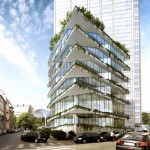
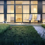
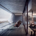
Making of House at the River
Lino Dumont‘s House at the River renderings awarded him Best Visualization of the Week NO. 29 using Maxon Cinema 4D as his main platform for setting up his scene and rendering it with V-Ray. Lino managed to mix the site photo with the render creating a smooth blend and great looking green painterly look to it. Check out his process of making this all work. Enjoy!
Author: Lino Dumont
Lino Dumont currently works as a visualization artist at GWJARCHITEKTUR – check out their website to see what they do… www.gwj.ch
Introduction
When Ronen asked me to do a making-of for the blog, I felt really honored. Its one of my favorite websites to get inspiration and learn new techniques through all its great articles and making-of’s. Thank you Ronen for inviting me to do so and to all contributors from which I learned so much! It is great to be given the opportunity to give something back, so here is my making-of The House at the River.
On Site Photography
First tool I used for this project was my scooter!
Well… this one above is not actually mine, but since the project site was very near to our office location I took my scooter for a ride packing my Canon EOS 500D and went out for a little photo session by the river.
This is the unedited image I took that day.
I also took a shot of a big panorama standing at the place where the building would be. It took about 8 photos while turning around and put them together with the Photomerge option in Photoshop.
It ended up being 25,000 pixels wide, and below you can see a smaller version of it…
Modelling
There is actually not much to say about the modelling. I got most of the model from an architect that already built it. It was built in Bentley MicroStation (I think that is a first mention here). Sadly, I found no plug-in for MicroStation and Cinema 4D, so we had to export it as an OBJ. Since MicroStation exports pretty crappy OBJ files I had to deal with many issues concerning face normals and double objects.
Texturing, Lighting and Rendering
I render with V-Ray, so all materials and lights where made with the the V-Ray for Cinema 4D plugin made by LAUBlab. I wont go deeply in all the materials… most of them are just some standard materials from various online sources which I edited a little bit.
For the lighting setup I used the Cinema Sky with a V-Ray Sun as custom sun object and then fitted date, time and location to when the photo was shot.
I also added a sphere with a little hole in the top around it, to which I applied the panorama in the luminosity channel.
With the built-in Camera Calibrator tool in Cinema 4D R14, I could easily fit the camera angle to the the photo I took from the river.
Hit the render button and that was it, the rendering straight outta Cinema 4D.
For more about the camera calibration (which is similar to SketchUP’s photo match feature by the way), check out the Gorilla! Greyscalegorilla 😉
Postwork with Photoshop
It was time to put photo and rendering together. I worked on the alpha mask of the rendering so some of the trees from the background photo would come in-front of the building.
I added some grass I took from another photo and worked on the sky with the clone tool, so there would be less trees behind the building.
After that, I added the rest of the vegetation on the walls, gave the sky some more contrast and added some barely visible light rays. For the light rays I just made a copy of the image on a new layer and added a radial blur filter to it (see image for settings). The layer was set to add mode with 21%.
For the final “artistic” touch, I took a texture of a brown paper and an old photo and multiplied them on top of the whole thing with about 12-38%.
Lightroom
Most of my mood and colors are done inside Lightroom because you can get nice results pretty fast, and it is very easy to transfer to other images in a set.
I started with setting a simple basic color mood by making the image a bit warmer and using some graduated filters on the sky and river, giving them a blue and green touch.
Then it was basically just a lot of playing around with all the settings untill I got what I liked. I also used some brush strokes to light the area around the building a bit up, so the focus would be a little bit more on it.
I showed it to the architect and he had the good idea to add some light shining thru the tree on the left. I did that again with some brush strokes wich basically just turned up exposure and temperature.
Some final work on color and contrast and that was it!
So thanks for reading, and do take a look at the architecture office I work in 😉
Hope you enjoyed it and see you around,
Lino Dumont.


![By Tim Simpson from Manchester, England [CC-BY-2.0 (http://creativecommons.org/licenses/by/2.0) or CC-BY-2.0 (http://creativecommons.org/licenses/by/2.0)], via Wikimedia Commons Lambretta_scooter_racing_at_3_sisters](https://www.ronenbekerman.com/wp-content/uploads/2013/08/Lambretta_scooter_racing_at_3_sisters-728x519.jpg)


