Making of Cluttered Reading Corner
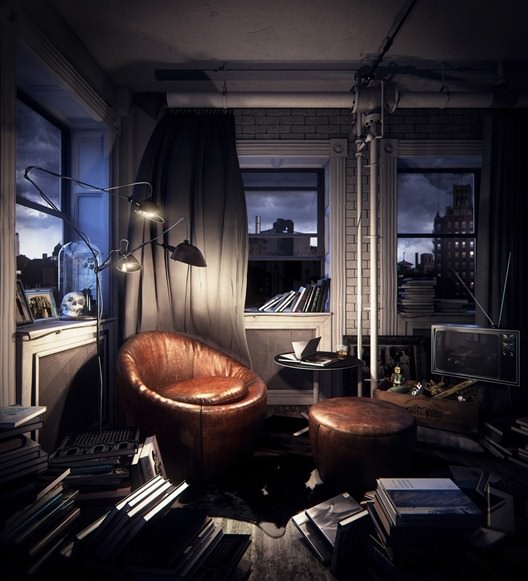
August started with Peter Drew featuring his Cluttered Reading Corner scene on the forums, wining The Best of the Week with that image. What started as a clean scene to showcase furniture, turned into an eclectic collection of objects within a dark moody corner of a room… and how nice it did! There is so much more magic and feel to this image than a clean version of it could ever have. In this article Peter is sharing with us some of the highlights involved in the creation of this work. Enjoy!
Author : Peter Drew
Peter Drew has been in the industry for 8 years, and has worked at top studios in Sydney, and currently in New York. He is an internationally awarded 3D artist and photographer.
This article is not going all the way, about all aspects of making this scene, allowing you much space to ask questions about specific topics you like to know more about… so after you run down this one – ask away in the comment section below 😉
The Creative Process
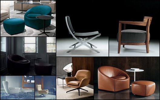
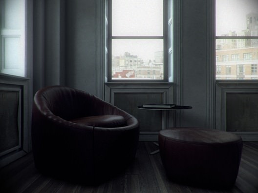
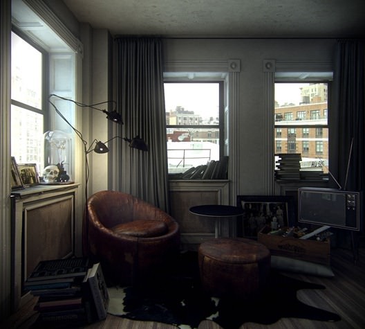
When I started this project I wanted to create a clean, minimalist space A 3D showroom for rendering individual pieces of furniture. I used Minotti marketing images as my reference as I love the palettes, and the clean, understated styling.
I try to run my personal projects the same way I run my professional projects, so I start off with mood boards to express my intent.
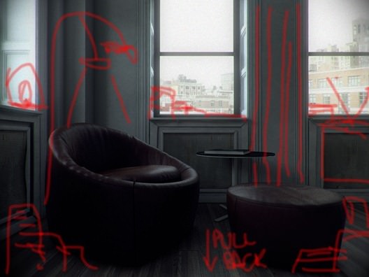
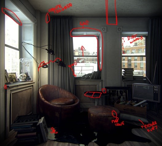
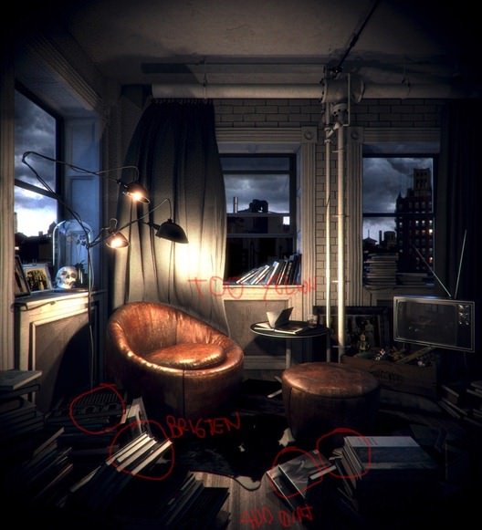
After going down this route for a while, I found myself not enjoying the results so much, and began making markups on the image. I find these quick sketches help me immensely in moving the images forward and self critiquing is an excellent skill to have.
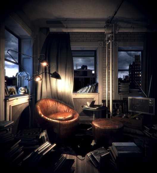
I reassessed the creative and started to add lot’s of little details, and so the render became about creating this cluttered space, with a collection of individually modeled pieces creating the whole messy feeling. Again, I gathered references to help me make my design decisions.
I began to feel comfortable with the amount of clutter, however I still felt the lighting and mood of the image wasn’t quite there.
I began looking at a darker, more focused lighting, as well as using the clutter to lead the viewer’s eye right where I wanted it. I used the books to either side of the bottom corners to lead the viewer’s eye towards the chair, the curves of the lamp, also lead the viewers eyes down to the chair. add the expressed lighting highlighting to the chair and the subject of the image becomes apparent.
The image was really getting somewhere and with a few more tweaks, more clutter and some post production I was happy with the final product.
Modeling
I don’t want to spend too much time on these subjects, as frankly I don’t do anything wildly different, and there are a million and one tutorials that go through these stages already.
Everything is poly modeled using the standard 3dsmax tools, and I used ZBrush on furniture and cushions.
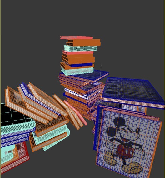
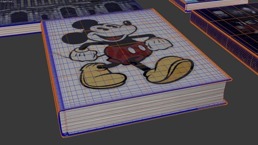
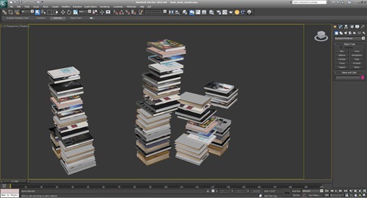
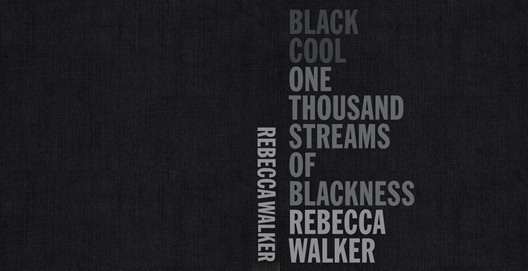
The biggest modeling challenge was to have the patience to model about 30 different books, each one in different shape and size, and then photograph each one, create a flat map of the covers and unwrap them. It took a while, but was worth it to have custom made models that literally no one else in the world has. It makes your renders stand apart from everyone else, and I urge everyone to do so.
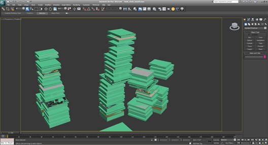
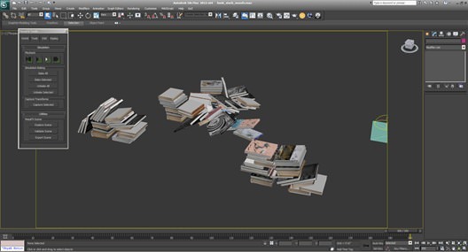
One of the newer features in 3dsmax is the inclusion of the MassFX physics system. I used it to get the stacks of books looking more natural than hand placing individual books. The first step was to create low poly geometry to represent each book, easily done with a box. Align the box to the high poly book and then link the high poly book to that box. In this way I run the simulation on the low poly boxes, as opposed to the high poly book models, thus allowing the simulation to solve much quicker.
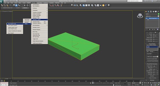
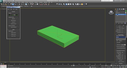
Once you’ve done this, select the low poly box model, open the modifier drop-down and, scroll down to ‘OBJECT SPACE MODIFIERS’ and choose ‘MassFX RBody’. Select the Rigid Body Type as ‘Kinematic’. Scroll down and you’ll find a ‘Mesh Type’ drop-down where you should select ‘composite’. Scroll further down the panel and you’ll find a ‘Physical Mesh Parameters’ leave the options as they are, and hit the ‘Generate’ button. This will create a cage around your mesh for the simulation to react to. Now go to the ‘Animation’ menu > ‘Simulation MassFX’ > ‘Utilities’ > ‘Show MassFX Tools’.
With the tools open, go to the ‘tools’ tab and hit the ‘play simulation’ button. Once you are happy with the simulation, you can bake the key frames in the ‘Simulation Baking’ section. Please note that if you don’t add a ground plane into the scene, it will use 3dsmaxs default ground plane location in the simulation. I did a few different stacks and ran the simulations to end up with some options.
Texturing
Not a whole lot to tell here, I tend to use a lot of procedural textures, and knowing I was only creating stills, I tend to save out a whole bunch of mattes and paint dirt and detail in Photoshop.
I find this a quick and effective way of texturing. As I said earlier I did photograph a huge portion of my art books, and created flat images of them, then unwrapped the models and applied the texture.
Lighting
I almost always use HDRI’s to light my scene. They take longer to render but have a quality of lighting that cannot be matched. I use a VRay Light ‘DOME’ and add the HDRI as a map to this. I then render the scene with a VRay Camera, until the HDRI renders correctly
exposed. Once I nailed this, it is the last time I touch any of the exposure settings on the VRay Camera.
I’m a big proponent of using my understanding of photography and real life lighting situations to affect the way I light and expose a scene. If you are a 3D artist and have never used a DSLR, step away from the computer pick up a camera and go shooting. It’s the best learning experience and gives you an understanding of the fundamentals of creating a Photo Real image.
Other than the HDRI dome setup, there are some VRay Sphere lights for the lamp and that is basically it.
Post Work
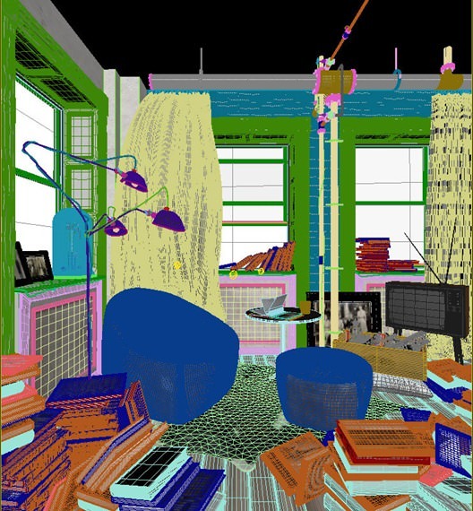
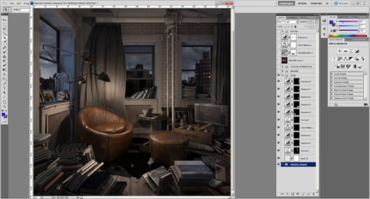
This is the stage where things really get together and form the final image. I render out the scene with a lots of elements. For this image I used the RGB, refraction, reflection, total lighting, VRay lighting, VRay Global Illumination, AO and specular. Plus, I render out wire color and about 20 individual matte files.
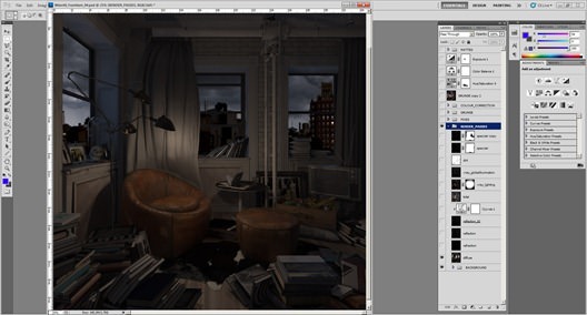
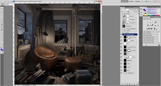
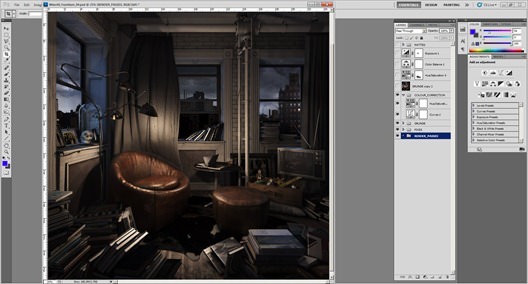
As you can see, the raw render is pretty flat and dull. The first thing I do is add the render passes to add some more pop, the highlights are accentuated and I start painting some more directionality to the lighting.
Next, I make some individual adjustments by using mattes I rendered out of VRay to add more contrast to certain pieces with curves, or upping the exposure of certain areas. All this is done in a non-destructive workflow with masks so I can re-adjust later.
I add some more grunge and dirt into area’s that look too clean or boring. I find this easier and more customizable than unwrapping the models and painting the maps inside 3dsmax. Obviously, this doesn’t work for animations, but it’s quite effective for stills.
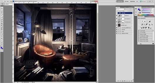
Next. I add some basic color correction, curves for added contrast and a hue/saturation to remove some of the vibrancy of the reds and yellows.
I then add some glows and more color correction using Magic Bullet Looks, and some flares to the light bulbs using Knoll Light Factory.
Some final adjustments to hue/saturation, color balance and exposure and the post work is done.
Thanks for reading my first making-of. I look forward to writing many more, and thanks to Ronen for continuing to provide this amazing resource and community.
You can see more of this scene on the forum thread – The Reading Corner.
Peter Drew,
Cheeky Beagle Studios.









Comments are closed.