Making of Church of the Light
Elvin Aliyev’s 3d recreation of Tadao Ando’s Church of the Light and adjoined Sunday School extension is one of the best made and look better than any photo I’ve seen of these projects. His render set showcases the design in a remarkable way with his attention to the materials, camera placement and light which shows great respect to the work of the master that Ando is. Now we can have a glimpse into Elvin’s work process.
Author: Elvin Aliyev
Introduction
I started the 3d recreation of Tadao Andos Church of the light for self-education purposes only. After some time working on it, I took a long break and returned later as part of trying myself at an Evermotion competition.
The experience that I had during my work on the Church cannot be compared to anything Ive ever done before in the realm of 3d architectural visualization. This only made me more eager to share this experience with you all hoping it will be useful for you too.
See the real Church of the Light photos at archdaily AD Classics : Church of the Light / Tadao Ando
And here are some of the finished renders I made
You can also see more in the Church of Light spotlight
Modeling
The modeling process of the Church was pretty easy. Ive found a pre-made SketchUP model over at the 3d Warehouse and did the rest very quickly.
When it comes to the details, like organ or a floor lamp, I had to do them based on reference images and this part of the modeling took some time. There is an overload of photos for this project online and so finding the right ones was just a matter of putting in the time, prowling it all.
Here are some reference boards I made
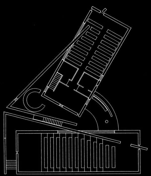
Helping me with the initial SketchUP model cleanup was a very basic plan, and it did not take too long to have a general model ready for texturing and further development.
And the basic model within 3dsmax ready to go for more advanced work
Here are screenshots of more specific elements that were modeled for this project
Here a more specific one showing some hint of cables going down from the microphone stand it is not 100% perfect, but it doesn’t have to be just what shows in camera is ok.
There really isnt that much to the macro modeling of a Tadao Ando project it is all in the play of light on the materials in 3D, much the same as in real life too!
Here are some overall views of the model…
Textures & Materials
This part of the work was the most complicated one for me during the making of this project being able to make qualitative materials and textures. 10GB less on my HDD and hundreds of cigarettes later I accomplished that I hope.
Here a final image showing an area with both woods and concrete
I used Arroway Textures for the concrete and wood which I mixed up with various other textures from cgtextures.com for the dirt and blur effects. The concrete texture resolution was a large 12000p? X 5000px and I had 4 of them (2 for the Church and 2 for the Sunday School).
The wood textures resolution was 10000p? X 3300px each. I used these big sized textures only in the diffuse channel though I reduced the other maps to be 2500px wide (bump, reflection, etc.).
Why? Because it saves resources and helped with a little side effect I needed of blurring the reflection map a bit. When you make the reflection map smaller 3dsmax diffuses it a little, so you get the needed effect.
It also should be noted that I practically dont have objects without textures. I dont like doing an unwrap and drawing a texture on it in PS. Thats why Ive been using the VRayDirt everywhere it was possible to overlay dirt layers on top of the clean texture version.
If the object was bright, Ive inverted the normal and made the dark corners, and if the object was dark vise versa. Bright and dark materials have one main difference to get the realistic look of a light material is much more difficult. So, Ive used 3 wood materials for the church and 8-9 different wood materials for the school. Textures can be the same but you have to give them different reflections, colors and glares. In some cases you have to mix them to get the right effect given the light that falls on the surfaces.
The Concrete
The concrete materials are a blend of clean texture maps from Arroway Textures and various stain, dirt, etc. maps gathered from cgtextures.com. You can hardly ever use a clean ready-made concrete texture and pass it as a believable one real life is much more complicated than that. Concrete tends to show the marks of time on it more than other types of materials and this aspect must be addressed to get as photoreal as possible.
Heres a detail shot focusing on a concrete intensive corner in the project
Here is a collection of the maps that I used during my work on this project
Arrow Textures offered a great base to start from with hi-fidelity detail that will show great up-close. Using VRayDirt allowed me to overlay various other maps to mimic the natural patina that any concrete surface gets after some time.
It is important that for the base you get high-resolution & high quality textures, but for all the rest you can work with pretty much anything, resizing, cloning and hand paint it in.
Here is the concrete material node tree view
Here are some of the nodes in greater detail
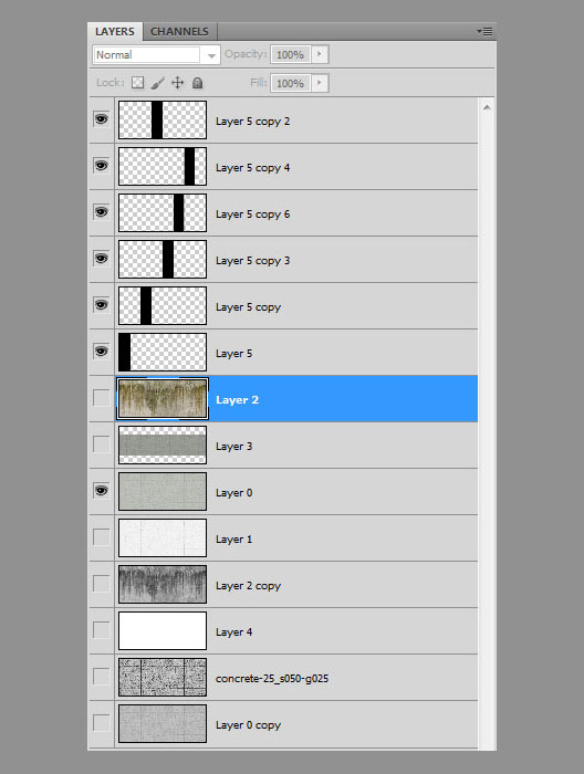
I layered the textures in Photoshop so that I can mix them up although, as mentioned, this was a very small impact process. Most of the layring was done inside 3dsmax using VRayDirt maps.
Here the mix of the original clean concrete texture and some dirt to form a more real looking diffuse map to be used as one of the various concrete version made for this project.
The Dark Wood
Unlike the concrete textures, I had to work more manually here. I did not look for too much dirt & scratches maps for this one I did them myself in Photoshop using the small brush for scratches and spots and the large brush for the larger bump detailing. As Ive said before, Ive used 8-9 materials for the textures of the church & Sunday school.
Heres a close-up shot on the dark wood benches and flooring
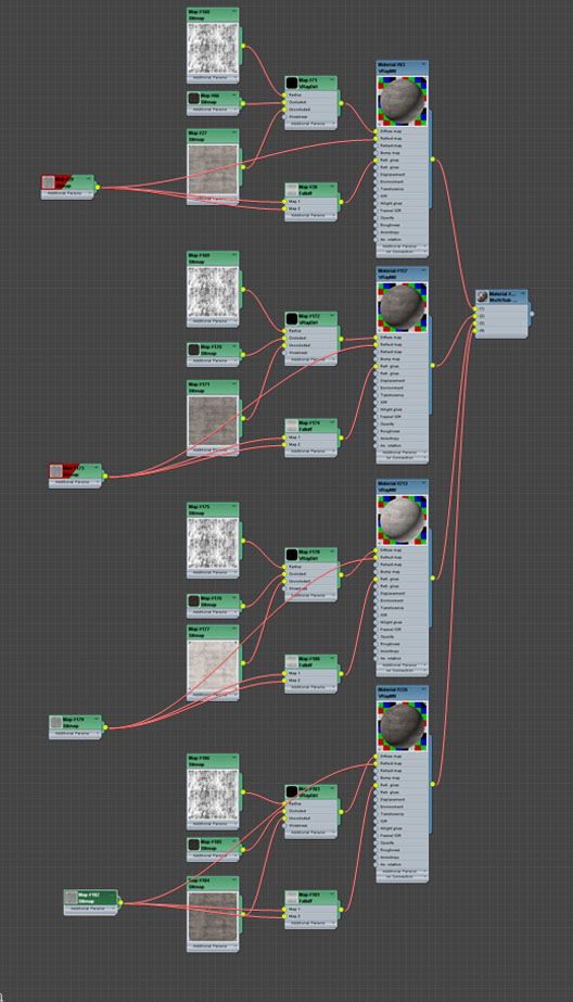
Here is the dark wood material node tree view
Here are some of the nodes in greater detail
A screenshot from the viewport
The dark wood for the bench was based on a very bright wood texture map that with some paint work turned into what was needed
The Wood Floor
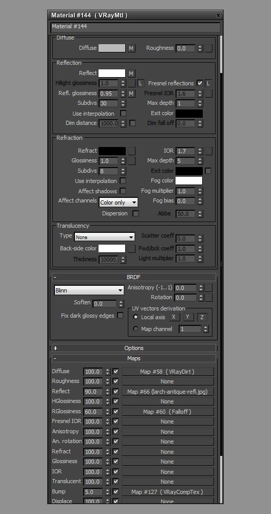
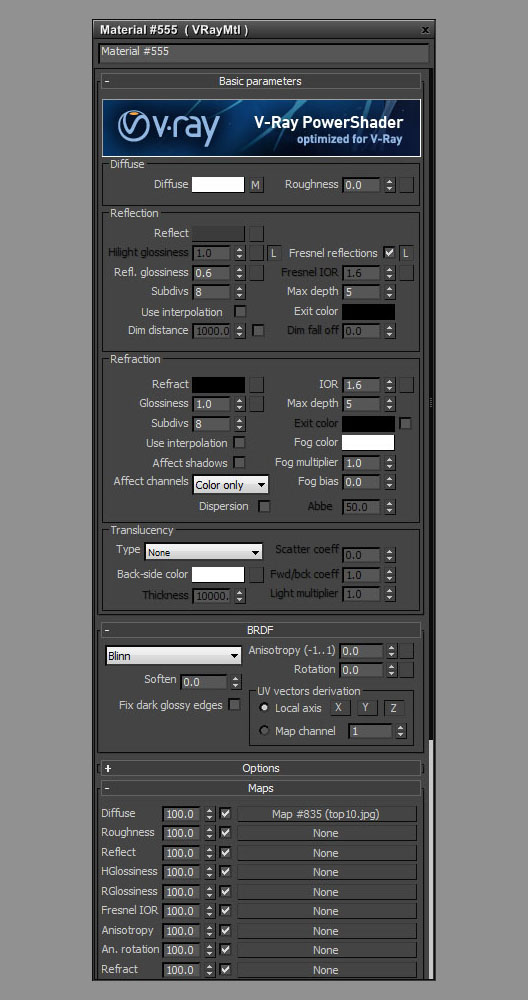
Here are the settings, textures and node view for the dark wood floor material
And the texture maps used
Ground Material
Here’s a really brief overview of the ground material node tree and maps… first the master node tree, with several sub materials.
Focus on one of the sub materials…
Diffuse map…
Specular map…
Displacement map…
Paper & Books
You wont find anything white and 100% clean in this world. VRay actually helps in that regard by producing noise and maybe not so clean GI solution when using lower render settings (pretty cool as it saves time and promotes the photoreal look). Even so, I mixed it up a bit anyway.
The most difficult thing was to find the books (especially religious ones) in Japanese. I ended up translating some pages to Japanese as I didnt want to make too much of a focus on books anyway.
Lighting
Lighting such a dark interior is not so hard as you might think You just put skylight portals with the simple option enabled, thus ignoring all outside elements that might affect the lighting going inside (this cuts calculation times) taking only the sky map lighting into account.
If you dont have anything outside the window, you can disable this feature.
Using a VRayDomeLight with an HDRI assigned to it, doesnt make too much sense for the interior, but for the illumination of the exterior Ive used it with one of Peter Guthries HDRI maps which I find are very good.
In general, the illumination is a very delicate matter, you cant use the same methods and you should be careful with textures dont lighten or darken them too much, even if the floor is rather dark. make room for some adjustments in the postwork stage better that than re-rendering.
Here are the lights used in the scene
And the lighting settings
Rendering
The render settings here are very simple. Just take a look at the settings in the screenshots below
Postwork
I saved of the renders into *.exr so that I can open them in Adobe After Effects and use PHOTOLOOKS, MSFIRE and COLORISTA plugins (by REDGIANT). I actually didnt use Photoshop for this because it has several restrictions when working with 32-bit photos.
Here are some raw renders for show…
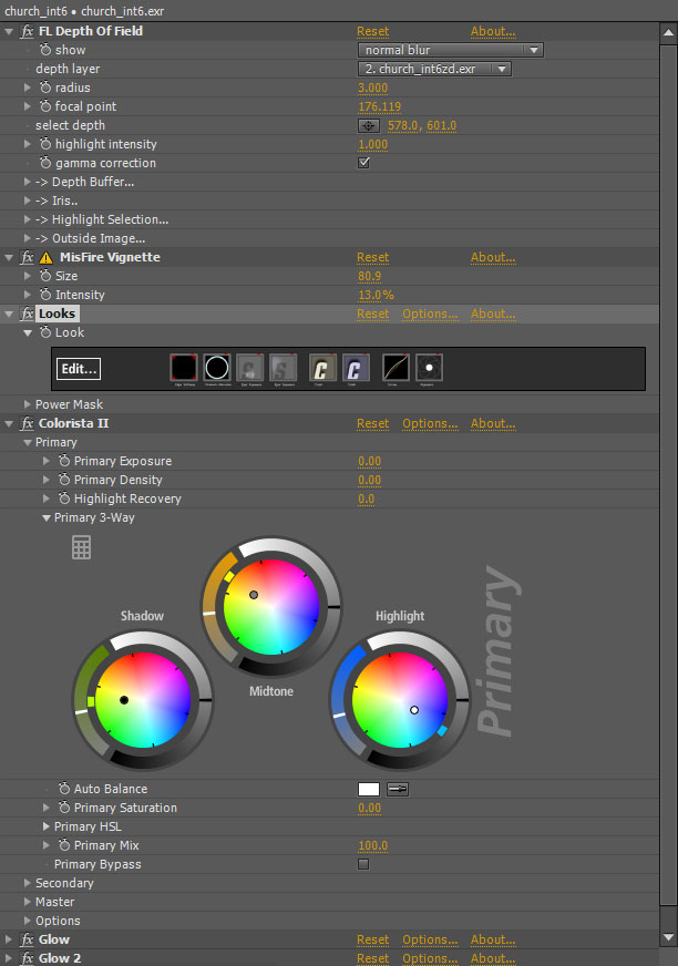
I used FRISHLUFT for the depth of field effects, as I find no sense in wasting time and render this effect with the built-in DOF in the VRayCamera however good it is.. I also used MSFIRE for the vignette effect, as its flexible and reconstitute the needed effect more accurate. And, of course, PHOTOLOOKS fasters processing, simple and flexible post possibilities and the steady habit it introduces to any kind of effects. The process takes less than a few minutes, if you’ve done everything right.
Here are the settings screens if After Effects (not much explanation here, i know… but feel free to ask whatever you like about it).
Conclusion
Thats all! I had great fun describing my process here. I hope you found this information helpful Feel free to ask anything by commenting below!
My best regards and gratitude goes to Mr. Ronen Bekerman for his excellent blog.
Elvin.






















that’s just Great stuff! thank you!
again…thank you ron for offering so amazing tuts
tnx for the tutorial, esp. the post work in AE 🙂
more of these would be great 🙂
Great images and making of.
Can someone explain to me the use of a fall off map before the bitmap in the reflections? Is it to create less reflection close up and more reflection in the distance, or is it for something else?
@DeanMoran In these cases it is to control the amount of reflection for viewing angle of the surface… what will it be if looking straight at it (perpendicular) or from the side in various angles all the way to grazing angle (parallel, like standing next to the wall shoulder touching it and looking along that wall).
You can also control this effect by choosing to work with the Fresnel option in the VRay Advanced Material settings… the fall-off map is kind of a “hack” of the real physical thing… but it is really down to whatever work for you. Fall-map can be very flexible to tweak.
@ronenbekerman Tnx Ronen. Been doing some test with a simple chrome dome and the effect is really nice, adds nice depth to the material. Guess I’ll be editing quite a few library materials tommorow… 😉
@DeanMoran If you look with more attention you will see that I use Fall off map for reflection glossiness only. Fresnel reflection is responsible for only reflection intensity of the not glossiness reflection ! I use fall off map to regulate the reflections glossiness. In this case, the further we look, the sharper the reflections are. It’s strange that Vray doesn’t have an option like Fresnel reflection for the Reflection Glossiness.
@ElvinAliyev Tnx for the information Elvin. I’m wondering how it all relates to Mental Ray, which is what I work with. In Ludvik’s making of (http://www.ronenbekerman.com/making-of-esherick-house-part-2/) he doesn’t use fall off maps. Maybe the IOR setting in MR does more than Vray? Or he doesn’t think it is needed. Been testing it out and I’ve been getting some nice results, although tbh they seem less about the actual reflections and more the added effect it has given. For example adding a fall off map with a scratch texture in the A&D Chrome material gives a nice smoky mirror look, but adding it to a wood mat. doesn’t seem to do much. I’ll keep testing 😉
Cheers.
Fantastic piece and very instructive tutorial. Thanks a lot for that!
Fabulous post, yet another winner on the Bekerman blog!
I’ve read and re-read, and I’m afraid I’m still coming up short. Can someone explain why the diffuse of so many materials described above is made up of a comptex that blends two identical vray dirt maps (one inverted, the other normal)? I gather that it was something about the material being either light or dark, and about how the vray dirt is working on the corners, but I’m afraid I just don’t fully follow. Thanks to anyone that can clear it up for me!!
@sassbh I have used two Vraydirt maps – one for the dirt in the corners and the other for the dirt on the corners
It was a surprise for me to see this post today – thank you Ronnen for posting it. This project is not less than a year already and now Id have ‘done lots of thing differently. For example, instead of the Multi/Sub-Object I’d have used the Vraymultisubtex, as it tunes easier and needs less memory. etc.Thanks again and happy Novruz to everyone!
It was a surprise for me to see this post today – thank you Ronen for posting it. This project is not less than a year already and now Id have ‘done lots of thing differently. For example, instead of the Multi/Sub-Object I’d have used the Vraymultisubtex, as it tunes easier and needs less memory. etc.Thanks again and happy Novruz to everyone!
Looks very good…
What kind of color mapping did you use?
Thank you this tutorial.
Looks very good…
What kind of color mapping did you use?
Thank you for this tutorial.
awesome work Elvin….
congrats and thx so much for this making of
and a big thx to Ronen for this great blog entry…
it will be very useful.
Really nice work!
Maybe a little bit too dirty, in my eyes.. 🙂
In image 25 you plug VrayEdge to a VrayComp.
Probably to soften the edges mixed with a bump of the dirt material.
What blending mode did you use- and could you give a bit of additional detail?
hmmm,.. Ive seen this before… Oh yeh, that’s right, it’s a complete rip-off from the Alex Roman Making of: http://vimeo.com/8217700
If you didn’t, Well done.
@ThereWillBeJustice look better, it’s the same project ! )). No jokes, some of the technique is borrowed still, for example, the concrete and the postworks. Alex Roman is genious, you have to learn from him, but I still think that some new info always helps.
@ElvinAliyev Totally agree.
Thanks for making this Tutorial. What kind of “Color mapping” did you use?
Best regards
@Frika Linear
Thanks for this useful making of, really nice work.
Just one question, for the interiors, since you didn’t use VrayDome, what did you use? (I see a ColorCorrect map on the Environment slot…maybe for controlling some sky jpg?)
Best regards,
@pep I”ve used vrasky and the colorcorrection which has increased blue
Man this is absolutly amazing!! I don´t use 3dmax, but i really enjoy to try to understand your process. thank you very much, keep posting!!
on the lighting settings img there is an editable poly with a vraylight modifier? impossibral!
Nice work and very informative, I have some questions, why the two Crush tools in Looks?, one yellowish and the other bluish. Is there a difference adding two differents colors instead of one? Thanks.
maybe a kind of bleach bypass?
Bloody hell – there’s only one nag to this and its that you must’ve taken the pictures in the church – not drawn them ! 🙂