Making of Butterfly House by Thiago Lima / Part 2
Here’s the follow-up to Thiago Lima‘s Making of Butterfly House / Part 1. In this article Thiago will cover the rendering and post-production (stills and short film) as well as focus on some of the bigger challenges he had to deal with during his work and how he solved them. Enjoy!
Author: Thiago Lima
Thiago Lima is a Brazilian artist specialized in architectural visualization & advertising. He is a graduated of Graphic Design, bringing this knowledge into the field of architectural visualization offering a unique approach. He won the 2012-2013 3D Awards Non Commissioned Film category with the Butterfly Short which is the subject of this article. He now focuses on 3D online training/courses and workshops around the world.
Introduction to Part Two
First, if you haven’t read Part One then please go ahead and take the time to read the Making of Butterfly House by Thiago Lima / Part 1 😉
Waiting…
Great to have you back here!
In this article I’ll focus on a few challenging aspects of creating the Butterfly scene and how I solved them. Most of these had to do with the amount of details and size in terms of computer resource usage, as well as managing it all in the viewport and scene level. After that I’ll jump ahead to the final stages of the process, just where I left off in part one, which are rendering, postwork and some information about the short film making.
Challenges of Creation
Scene Dimension
As you can see, the overall environment area to be treated is much larger than the Butterfly House size. In fact, there are 23,800 square meters of terrain in this scene, with grass scattered all over the place, blade by blade.
Polygon Count
Since one of the main goals was to make lots of closeup shots, the modeling had to be detailed enough to accommodate this. This increased the poly count a lot. In the viewport I had 28 million polys on exterior shots, and it was possible also to see interior elements of the house like furniture, decor, lights, etc.
Solutions / File and Scene Management
Increment Save
Activate increment on save in 3ds Max preferences. It will create a new file each time you save, so you always have backups of your file this way. When you finish the project you can delete the older files. This is very important specially in huge scenes where some things can make 3ds Max crash easier. Saving to the same file can be a big problem on crush as it may corrupt it and lot of work may be lost. Let 3ds max handle this for you without thinking about it.
Layers
Layers are something I can’t live without! I adopted layers a long time ago and it’s really useful to manage heavy and complex scenes with a great amount of elements.
I marked with colors the most important ones. For this I start the name with CAPS, so they are positioned first on the layers sequence. This makes it much easier to find what you want. I know it is possible to use groups + isolate selection, but I really don´t like to use groups since my models in separated state are faster to pick individually for tweaking some material/uvw without the need to open or ungroup them. If I want to select a group of objects I use the select objects by layer.
Solutions / Environment Elements and Proxies
As I was planning to create a lot of vegetation and it needs a lot of randomness I used Forest Pack Pro to do the larger spans and MultiScatter to add some bushes and random elements as well as MultiScatter Painter to scatter bushes, leaves and flowers exactly where I wanted them. Some grass elements are iGrass from iCube, edited and mixed with elements which I created.
The following images show how I separated all the different kind of vegetation elements in the scene…
Trees
Almost all trees in the scene were converted to V-Ray Proxies, except the ones near the camera which I assigned a V-Ray Displacement Modifier on the trunk to give it more realism.
On the proxy trees, I assigned different colors and divided them to 2 groups. First one (left) colored trees, second one (right) conifer. I used the text tool to mark them for easy find. All 10 kinds of trees were created inside OnyxTree software. I used the box or none display mode of the proxy objects to get faster viewport response.
Some people are curious about why I didn’t use Forest Pack Pro or MultiScatter to scatter the trees? The answer is simple, I like to play with colors in my compositions, so with isolated placed trees it is easier to move them wherever I want making a better color composition. For me, the position of the trees are based on render composition so randomness is not working very well in that regard.
I know that Forest Pack Pro has the tool to select one or more trees inside a scatter and change their position, but I think in this case it was unnecessary.
TIP : Use the limit to camera visibility feature of Forest Pack or manually separate into layers groups of trees based on their position like North, South, West and East Trees. This way you can hide some trees that will not be visible in any specific camera position making the render faster (do keep in mind reflections will miss those tress – so be in control over this).
Grass
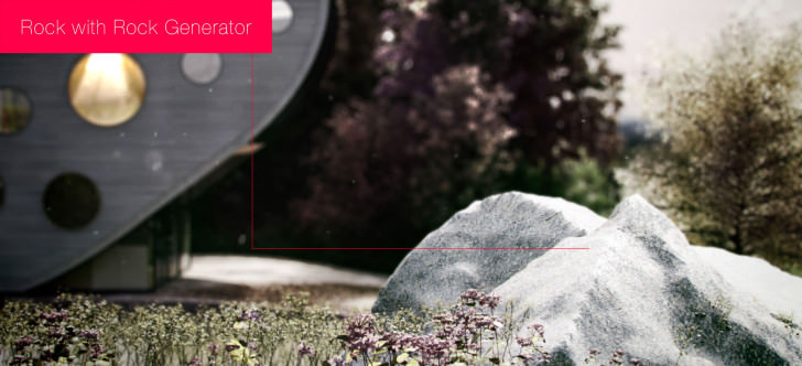
The scene contains 3 kinds of grass, 3 bush types, 5 leaves, 6 flowers, 4 rocks and other elements. Without proxies and dynamic scattering (with fast viewport preview like point clouds) it could reach more than 2-4 billions of polys in the viewport. It was very important to get things done in a way I could scatter all of this in an easy and organized way to have full control over it, without increase in render time and sluggish screen performance.
The main grass and trefoil were distributed together, using the Cluster function of Forest pro to limit areas to different kind on vegetation’s, see on the image above the areas colored with green x pink similar to a procedural noise map.
This way I could work separately with these parts of the environment, making individual lighting and shading tests. In other situations, hiding some layers which couldn’t be visible in camera.
Solutions / Scene Management based on Shot Location
With the environment issues solved, I now needed to think about how to render the exterior shots, showing some interior elements and how to render interior shots using the exterior environment appearing through the windows.
Files
I separated the files by weather, so I can change the lighting and environment without worry to lose some configuration to another kind of light. I’ve also separated it to 3 areas : Exterior, 2nd Floor and 1st Floor. That way the renders processed faster and the viewport had not so many polys to push.
For the exterior shots I selected almost every interior model and converted to a low poly version using the Pro Optimizer modifier. It worked really well as I only needed them for general indication and they were far from the camera. On other hand, for interior shots I used the exterior part almost exactly as in the exterior shots. All I did was deleting some parts that could never appear trough the window. I did it cause I wanted the environment being perfectly similar on every shot.
Render Settings
I hate to wait long time for renders!
I only increase render settings If I see some rendering error (splotches, noise, no contact shadows). A lot of people asked me If I used the services of a render farm to render all 101 stills of the Butterfly project and I say that it really wasn’t necessary.
V-Ray users tend to increase settings without doing some simple optimizations first, like setting up the lighting properly. If you do a good job with the lighting, specifically making good use of V-Ray Light Planes, you will not have so much problems with GI, splotches, missing shadows, etc.
I only had two renders that were slow (14 hours each), and most others took between 2 to 3 hours each at 2500 pixel size render on the long side. Close-ups were even faster taking 30 to 50 minutes per render of the same size. So in 4-5 days all the renders were finished.
So let´s see some settings, shall we?
As you can see I use insanely low settings, and this is my settings for at least 80% of the renders that I have done.
1. Don´t use sharp filters
They will cause aliased edges and will be harder to get rid of all the noises in the GI, Materials and Shadows.
2. Use the Area Filter and increase the filter size
The more you raise it the more blurry your image will be. If you get some real references you’ll see that the world is not as sharp as we tend to show it in our 3D renders. With a higher filter size you will fix the noise of your image so much easier without the need to increase any other setting of the materials and lights.
3. Deactivate show calc. phase for Irradiance map and Light Cache
this is relevant to the render tests stage. This way you always have a reference of the latest render to compare if you´re making progress (you can use the history tab for further back reference).
4. Use the max Number of Passes for Light Cache
The passes number should be the same as the number of threads you got running on your workstation. At that time I had an i7 960, so 4 cores = 8 threads with hyper threading.
5. Activate the Retrace Threshold
If you get some splotches, missing contact shadows or lighting passing through the ceiling – turn this on in the Light Cache reconstruction parameters area.
6. Make the buckets smaller
In case RAM is an issue make the buckets smaller. The render will be slower but each bucket will be manageable.
7. Don´t abuse Ambient Occlusion
Maybe skip it completely. Try to achieve a nice contrast, shadows and realism using real lighting. Too many simply overdo this effect where as some things are made to be felt subtle then you think.
Post Production
I rarely do any post production in my projects. Sometimes I just increase contrast and that´s all. In order to do it nicely there are some render elements that I suggest you to use.
I don´t use them all in every post production but I like to do save them all just in case. Of these 9 render elements I will focus on 3 specifically : Raw lighting, Specular and Z-Depth.
Raw Lighting is a render element which will allow you to make your shadows and contrast so much better. The Z-Depth element will be used to control Depth of Field and to create a fake fog effect based on distance. To make the depth of field effect I use the DOF PRO Photoshop plugin. The final result is awesome and very fast.
For this making-of I´ll use as example a render which I did a lot of post production on (relatively). Take a look at this video :
The Short Film
I made this short initially just as a teaser for a new 3D online training that I’m actually teaching (will be released in English soon). I thought about making it as viral as possible to spread around, doing a better job of showcasing the work than just still images. So after 101 images I just did it.
First I created the background music, which is based on free samples mixed together. Then I used the still images to think about a fast storyboard.
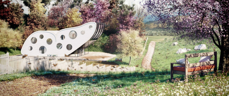
The main point of it all was to show my skills with texturing, materials and lighting. That’s why there are a lot of close ups in it. Another thing is that I kept the concept in secret for a long time, posting in social networks the name of the project Butterfly with just some close up shots, that way no one knows why Butterfly is the name of it. I’ve tried to explore this on the short film, revealing the design of the house piece by piece and in the end showing why it is called the Butterfly house.
The short film was done in 2 days… HOW? The fact is there is little to no 3d animation going on in it. 99% of the short are still renders animated with fake camera shake and particle effects made with After Effects.
Brute Force is not the only force 😉
Another thing is the inspiration of this work – I’m obviously showing lots of influence from The Third and the Seventh but the main inspiration was this one, called Last Day Dream :
I try not to get so much of an influence from other projects so that I’m not crossing the copying threshold but in this case I wasn’t so worried about it cause I don´t even think that the short film could be more important than the 101 images I made… I didn’t expect that people will like the short film so much. If I knew about it for sure I would focus about it more.
Here are a few tools I used in the process that worth a mention :
Frishluft DOF – It was very helpful to change the DOF (foreground to background) in post production.
Trapcode Particular – It is very similar to 3ds Max particles, so it’s really easy to create with it as I´m used to do.
Optical flares – It helps a lot to create light flickering and bloom/flare of the sun and artificial lights.
Basically, for all shots I´m using the 3D camera of After Effects to create better depth effects so you can see some blurry particles in foreground or scratches in the camera lens when the foreground is out of focus.
Another nice thing is that motion blur in the particles works more realistically cause it uses reference of distance – So what is nearer to the camera will have a faster motion blur, as happens in the real world.
The skies were replaced with alpha channel by free animated skies. I changed the speed to make the time-lapse effect.
I will not get into it much more, but you are always welcome to explore my course about how to create it all from ZERO.
End of Part 2
I hope you liked this second and last part of the making of and I’m sorry if I missed something important… if you have questions just leave a comment below and I´ll be happy to answer here.
Cheers,
Thiago.


Comments are closed.