Making of Aquarium of Canada
Continuing the exploration of NPR techniques of Architectural Visualization like Hybrid 2D/3D Digital Water Color Paintings, I bring you Scott Baumberger’s making of process of the main entrance to a large new aquarium in downtown Toronto, Canada. I’ve featured Scott’s work before in a roundup of several ‘Digital Watercolor’ breakdown videos he made that captivated my attention. Those, along with Les Chylinski’s 2D/3D Hybrid Workflow roundup and Jeremy Kay’s latest making of Urban Plaza and the feedback it got has led me to feature this article by Scott, a precursor of several more to come. Enjoy!
Author : Scott Baumberger
Scott Baumberger has been offering high-quality illustration services to architects, designers and developers for fifteen years. He uses a digital process to produce imagery that ranges in technique from photo-realistic to simulated watercolor effects.
Scott’s illustrations have been featured in many publications including Architectural Record, Urban Land, Building Design & Construction, 2004 & 2008 NYSR Portfolios, Best of 3D Graphics, Architecture in Perspective (AIP) catalogues 15-25, as well as monographs for KPF, FXFowle, and Callison.
In 2001, 2002, 2005, and the years 2007-2010 his work received an Award of Excellence in the AIP Competition, held annually by the American Society of Architectural Illustrators (ASAI).
Introduction
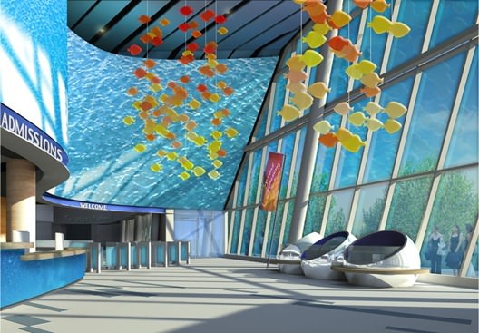
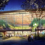
This is a rendering of the main entrance to a large new aquarium in downtown Toronto, right at the base of the CN Tower. We had done several night-time studies of the space and for this view we wanted to depict it during the daytime.
The architect provided a very large SketchUP model, and the first task was to simply explore the spaces and become familiar with the sequence of the visitor experience. A viewpoint that showed the ticket desk, gate, and then a hint of the exhibits reinforced the progression of experiences as the viewer would move through the space.
Getting Ready
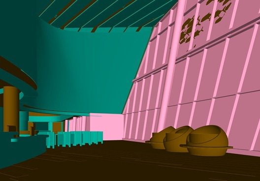
Below is a raw color-only export of the final viewpoint in SketchUP. This is the framework that everything else will hang on, so its really important to get the composition right at this early stage.
Its pretty sterile, and since the client has requested a warm colorful image… theres a lot of work to do!
Here is another export from SketchUP with the Color by Layer turned on in the Styles menu. This allows me to quickly isolate different parts of the model for selection sets (Same as a material ID pass in your favorite render engine, only here it is by layer).
With the viewpoint locked in, I looked at different times of the day and different times of the year to generate an interesting shadow play. For this project, I used the Shaderlight plugin for rendering. I kept the materials pretty basic, and they came through very well. The ray-traced reflections in the sphere exhibits are especially nice.
To get the most contrast in the lighting I hid the glass panels in the curtain wall at the right. The fish pattern in the glass wall is on a separate layer, keeping them visible created some nice shadow casting on the mullions, but there were several areas that needed to get cleaned up.
I also had to clean up some of the splotches in the GI solution, even though I know there will be a paper texture later on and I can accept a pretty high level of overall noise, but the splotches still had to be smoothed out.
You might notice the curving shapes on the floor have disappeared in the render – at this point the client requested that we leave it out. With the initial client approval of the viewpoint and lighting, Im off to the races!
Heres a blowup of the spheres, love the wavy reflections!
Starting the Paint Job
The first thing to do is clean up some of the GI artifacts that I mention in the ceiling and add new detail at the desk. These are all painted in Photoshop with a standard hard round brush in a new layer set right on top of the base render.
This is a good example of not having to model every last bit of an object for the rendering. Sometimes its much easier to just paint it in rather than going into the model and adjusting there. Especially if its not your model! I also adjust the exposure in the far exhibit to get some of that detail back.
Next I tackle some of the texturing at the desk. Standard wood materials applied via the Overlay mode are scaled, distorted and warped to match the perspective. Its worth the effort as I can change the strength of the material as well as make hue, saturation and levels adjustments as we go through the process, up to the end.
The water bubbles at the desk are built up in a similar way using non-destructive blending modes such as Multiply and Overlay to keep the original render from being completely covered up. Blue tones are chosen to harmonize with the sky beyond.
Signage above is added as Text with a Layer Style added to create thickness. This is another example of painting being faster than modeling. Trying to warp the signage along a spline in 3d and getting it composed properly for this viewpoint would be very tedious.
The Canadian Waters sign in the far exhibit uses another Layer Style to get a glossy effect. Ive also cooled the main ceiling plane and finished cleaning up the metal bands.
The large wall above the desk and entrance is a theatrical screen for projecting images. During the day, its designed to be a backdrop with stock footage of water & caustic patterns. The intent is for these images to have a tropical quality, so I punch up the cyan and turquoise colors throughout. Because of the curve in perspective, I broke up the screen into the foreground and background segments. As with the rest of the texturing, I use Multiply, Overlay and Color Dodge blending modes to maintain the shadow pattern from the rendering. I also add a blue wash at the ceiling panels, simulating a subtle glow from the screen. Can lights are also added here and there.
Adding the Background Sky
Now its time to move on to the sky. I tend to work from the back to the front, and the background can be pretty garish at this point. But I know that I will be adding trees and the glass panels on top of the sky group and these will tame the initial wash a bit.
This sky is painted in a similar fashion to a watercolor wet in wet technique. First, I start with a gradient from deep blue to a canary yellow and then drop in some green and purple color. I then use the Smudge tool to push the color around until it feels right. In general, I try to have cooler colors in the distance to suggest atmospheric perspective. Although the final result is pretty soft, using the Smudge tool creates a more painterly effect than just sticking with gradients alone.
With the trees and clouds added, the sky is now feeling much more natural. Still, its good to leave a bit of the green and purple showing through, this helps the image from being too blue. Next, Ill tackle the large glass wall at the right.
The Glass Curtain Wall
Still working from back to front I add a simple glass railing and few people outside. Then with the glass area selection I fill in a flat blue color for the glass surface itself. A custom layer style is added to simulate the glass thickness and also hint at a slight ambient occlusion that would occur at the inside corners where the glass panel meets the mullions. The initial sky wash is pretty subtle by now.
Here are the settings for the Layer Style I used for the glass panels. I changed the blending mode for the Inner Glow effect to Multiply and the default yellow color to a dull blue. Then I experimented with the Choke & Size settings until it felt right.
The end result should be pretty subtle.
Reflections really help the glass come alive.
Reflections of the mullions are painted in with the Paint Bucket tool on a new layer set to Soft Light blending mode. Vertical surfaces are white and the undersides of the horizontal mullions are nearly black.
For the screen, I make a copy of the water image, flip it horizontally and distort it until it seems right. For this layer, I left the blending mode at Normal, but dropped to opacity down to 50%. By setting the mullions reflections on top of the screen layer, I dont need to worry about any masking.
Glass panels are painted in with the same technique at the back wall and at the entrance stalls.
Next the fish mobile is added.
Since were not sure what the final material will be, I leave it generic and kind of plastic looking. They are meant to be translucent with some internal light scattering to help them glow day and night.
I created these entirely within Photoshop with a custom brush. The shape was provided by the client, and the brush itself was set to scatter to create the desired random pattern. It took some experimenting to get the right look, but it went fairly quickly and again much faster than trying to do it via 3d modeling.
Reds, oranges and yellows were chosen to complement the predominantly blue scene. Once I got approval of this technique, I made a copy of the close mobile for its reflection (Im not real worried about it being completely accurate, but it is important that its there). Soft Light blending creates just hint of a reflection which is all I need.
The last-minute addition of a grand opening banner to the design is painted in as well. I dont worry about its shadow because there is a good chance it will get covered up by entourage later on.
Changes, Always Changes!
At this point, we get a design change with the floor pattern.
Remember I took out the swirls at the render stage. About halfway through I was directed to bring it back! Fortunately I still had the swirls on a separate layer so I quickly exported just a color pass from SketchUP and composite this back into the scene (I really only need the selection to get the perspective right).
With this new area selected, I add a granite texture in Overlay blending mode in order to preserve the shadows cast on the floor. A tiny bit of ambient occlusion is added to help set it into the rest of the scene. The joint pattern in the rest of the stone floor is brought in via a lines-only export from SketchUP. I set this layer to Multiply blending mode and then masked it to the floor area, minus the new granite swirls.
Now To the Fun Part!
With some guidance (and reference photos) from the client I build up the exhibits.
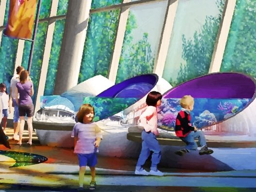
The three spheres at the right are meant to be hands-on for visitors to explore while waiting for the gates, etc. As with the rest of the texturing, the images, glows and washes are all added in non-destructive blending modes to maintain the glossy look from the original render.
Additional color is added to the inside of each sphere to help differentiate. Distant exhibits behind the gate are developed with the same technique. A deep blue glow is added for contrast and atmosphere.
Next, people are added to the scene with careful attention is given to their placement. The intent is to have a lot of people to indicate an active, busy space but at the same time it is important not to cover up key design features. With this in mind, I set up view corridors so that the entrance and and the far exhibits are still visible. Children are positioned at the sphere exhibits to reinforce their hands-on quality.
People shadows and reflections are now added. The reflections are kept simple and emphasized in areas of shadow.
Getting close now!
The client suggested adding a color pattern to the floor to indicate overhead lighting passing through the fish mobile, mostly as a way to liven the scene and bring in some more warm colors to the bottom third of the image.
The colors are cast on the people and on the desk as well. I also made a copy of the left mobile set to Color blending mode to indicate a secondary reflection of the mobile on the screen.
Into the Final Adjustments.
I added several gradient washes to vignette the edges and provide additional color balance. A paper texture is applied to the top of the stack in Overlay blending mode. I like to use a Pattern Adjustment later for this effect so I can tweak the scale, rotation, etc. without any loss of quality. With a Levels Adjustment layer I add more contrast and punch to the image.
One of my newer tricks involves a roughening technique using the Art History Brush tool. Once Im happy with the overall image, I make a flattened copy of all layers at the top of the stack (Shortcut Shift-Ctrl-Alt-E). Using the Art History brush I zoom in at 100%, pan around the image and scribble out any remaining artifacts, any jaggies. Really anything that still looks computer-ish).
After a few minutes, it usually looks a lot better at full size. The key is to go fast and loose using a tablet. Try to follow contours of objects as you would if you were really painting it. If the effect is too strong anywhere in the image I can mask it out or just dial down the entire layers opacity if need be.
This step can really help the image feel like a painting. It can be difficult to see the effect at this scale, so Ive included a couple of blowups at 100%.
Thanks for taking the time to read the article, I hope you will find it helpful to your work. Of course, feel free to comment below if you have any questions or feedback.
Scott.


