Making of 93 Tram
As mentioned in the latest newsletter, I bring you Tom Svilan’s making of 93 Tram scene. This will be the first Blender + Indigo Render article in this blog. This combo is not the usual thing in archviz and I’ll try to publish more content related to the use of Blender and Indigo in particular. In this article, Tom describes his process from CAD to Finish, creating 3 Interior / semi exterior night time 3d renders. I hope you’ll enjoy this article, learn from it and share your thoughts by commenting at the bottom of this article’s page.
Tom is a 3d artist based in Ottawa, Canada. Doing architectural visualization work with the not so common combo of Blender + Indigo Render. Tom recently participated in the GH House challenge and his entry was picked as my personal judge favorite. You can check it out at the GH House challenge winners page and also directly in his ‘Swamp Thing’ WIP thread. Tom also entred the HOVER challenge and show great progress so far – Tom’s HOVER WIP Thread.
Check out his personal blog for more info – https://tomsvilans.com/blog/
Feel free to comment about any aspect of this article or things you think need more detailed explanation. I’m sure Tom will answer it all 🙂
Introduction
Genesis: In the beginning Tom received the email attachment containing PDF’s and CAD drawings. And the drawings were without form and color, and a general lack of specific information was upon the face of the elevations. And Tom said, please shed some light! After an extended e-mail exchange between the Client and the Clients Architect, Tom received a rough material schedule for the project. And Tom saw that everything is good and he could begin working.
And now let’s get to business 🙂
When starting this particular project, I already had the general elevations of the whole building as I had done exterior shots of it a while back, and I guess the client was now moving towards marketing the individual apartments so I was asked to do some interior shots of the penthouse apartments on the 10th floor. Fine and dandy. I got the floorplan, a section through the building for my interior heights and a couple of photos of the kind of interior the client wanted (pretty basic stuff, mostly just furniture in white-walled rooms with recessed lighting).
CAD & Blender
The first step was to clean up the drawings in AutoCAD and make sure that I had all the relevant information for modeling. This meant deleting unneeded information such as text and dimensions and background stuff. Once I got the plan and section cleaned up, I saved it as a separate DXF file so that I could import it into Blender. As always, the original files are never touched for obvious reasons. Ending up with 20 very similar copies of a drawing is way better than accidently saving over your only copy of a certain, very important detail.
So, with my DXF file ready, I fired up Blender…
Its no real surprise, at least to me, that some people find it hard to believe that Blender can work with CAD files. Ive heard CAD is more precise, Blender is just an animation thing or There is no OSNAP in Blender, therefore how-the-hell-can-you-make-any-straight-lines and you ought to be burned at the stake. The truth is, for someone coming from AutoCAD or Rhino or pretty much any other commercial modeling package, Blender is just plain weird. I remember the first time I opened it, I just sat there for a minute, stared, went Well… thats interesting, closed it and went back to CorelDream 3d (which is the first, and by far the worst, 3d program Ive ever used but it came with the Corel Suite). After spending time with it, however, and making silly animations of spaceships, I cobbled together a pretty reliable method of doing things.
Blenders 4 Big Breakthroughs for Archviz
The first big breakthrough was finding the DXF/DWG import script, which is when I started to seriously do some Archviz. The second big breakthrough was Blenders snapping system which sped things up about ten-fold and saved me so much time and infuriating effort. The third big breakthrough was finding out what, exactly, the GeomTools script was all about, though I didnt need it in this project. The fourth big breakthrough was particle instancing which, again, I didnt need in this project.
Between those four things, Ive found a reasonable way of doing Archviz. Anyways, back to the project.
Loading the DXF
Using the DXF importer, I loaded up the DXF files I created from the original drawings. The important things here were to :
- Make sure it imports everything as a mesh (edges and vertices) and not splines (just quicker to work with and less of a hassle).
- Make sure the scale responds to the actual scale of the drawings (I always work with 1 Blender Unit = 1 meter, so since my drawing was in mm, I have a glob.Scale value of 0.001).
- Separate all the materials by COLOR (this allows us to pick apart the different colored lines because the whole drawing was on two layers, which I suspect is the result of architect crippling his CAD drawings for me, thank you very much, buddy).
Hitting Start Import, I let Blender do its thing.
A thing to remember – newScene should be disabled as that will create a new scene for each drawing you import, which is unnecessary.
Modeling the Architecture
The modeling was really simple. Once the drawings were imported as a mesh object and aligned (plan is moved up to the floor level of the section), I extracted the walls by selecting all the edges and separating them into their own object. Extruded up and subdivided, I snapped the door frame and window sill heights and bridge the openings where necessary. Deleting top and bottom faces and making sure the normals were OK, the walls were done.
Making the floor plate was as simple as creating a plane, deleting a corner of it so that we just have edges and tracing the floor plate in the plan. Using either the Beauty Fill command or Convert Edges To Curves script, I filled in the boundary. The terrace was done the same way. Easy as pie. So thats pretty much it for the architectural part of it, the rest is interior decoration.
Additional Modeling of Interior
The hardest part to model was probably the couch and accompanying easy chair and it wasnt even that bad. Simple box modeling, adding resolution with loop cuts and a slight displacement modifier on the cushions to get some irregularity across the cushions. The armchair and footrest are simple derivatives of the same.
Actually, the kitchen sink was probably the trickiest since its one of those modern ones with the coiling neck. The was done just by modeling the coil and then bending it with a curve. The rest of it was just an extruded and beveled cylinder. Its got about 4 pieces and could be said to be rigged, if I wanted to make the neck come alive or something.
The chairs, stools and tables are also chopped up cubes with extrusions. Beveled edges all around. The glass tables are made of curve objects that have been extruded about a centimeter and the legs for the curvy wire one are just made by subdivision modeling (cubes again!). The little grass plants outside were made with Onyx, though they barely play a part in this scene.
Materials
The scene was originally made for VRay but I will skip that and talk about Indigo materials. The important thing for Indigo materials is that all textures are UV mapped, which means a certain amount of unwrapping is involved. Between the usual Unwrap and Unwrap (smart projections), you can Unwrap most objects pretty quickly and efficiently.
Most materials in the scene are basic Phong materials (Indigo terminology for materials with a specular/reflection component. The glass is a typical transparent specular material with an IOR of 1.55. The window frames are a Phong material with NK data of aluminum and a low exponent (high roughness). The floor is simply mapped with a top-down project from View method, textured with a diffuse, bump and exponent map (with a low exponent, I didnt want super shiny floors).
Im a sucker for tileable textures as I get lazy and often dont have time to spend on individual textures. Most textures are from CGtextures.com, the rest are from my personal photos and painted textures. Below are some material settings screenshots you might find useful 🙂
Setting the Lighting & Mood
In essence, the lighting of this scene is pretty basic. A somewhat regular grid of downlights, kitchen counter lighting and an HDR background are all that is involved. The individual levels and white balance were adjusted within Indigo while it rendered, using the very handy Light Layers. You can change the color of the lights with a color picker or a temperature setting. The HDR map was brought down from 6500K (pretty much white, untouched) to about 5200K (more red, less blue) using the light Temperature adjustment. The color temperature of the interior downlights was also dropped a bit to warm them up. The kitchen counter light was tweaked with a slight greenish cast to simulate fluorescent lighting.

HDRI Look & Feel Outside
The light flares are caused by Indigo’s in-camera Aperture Diffraction. This works off your camera’s f-stop to create a controllable flare around bright spots. I used the Circular option in this case as I just wanted a bloom so that the light sources don’t just look like white spots with sharp edges.
After that it was mostly just tweaking the light temperatures and relative powers to get where I wanted to go. The vignetting is automatic in Indigo, as it would be in real life. The wider the lens is, the less light reaches the edges, or something like that. I think it should be plausible enough to construct a lens that compensates for that, which is why I’m still hoping that the vignetting will be made optional sometime. As you can see in these renderings, sometimes it can be a bit much, but here I thought it contributed to the dark, brooding mood.
I used Camera tone-mapping with the dscs315_4 film to get lots of contrast and a green cast to the shadows. The warm tones of the bright lights contrasted with the green mid-dark tones of the film but it still left a distinct greenish cast to the image.
Post-Processing
There wasn’t all that much post-processing for these renderings. Not more than the usual. Most of it was simple color correction using Selective Color and Black & White adjustment layers in Photoshop to tone the images a bit. The greenish cast was lessened to achieve a more balanced color tone, though I kept hints of it in the low end to keep with the cold mood.
Finally, a little bit of camera distortion and chromatic aberration in Photoshop was added to get rid of the super-crisp edges here and there and to generally tie the image together.
I learned a lot with this project. Mostly about mood lighting and materials but I think it also helped me with transferring my intentions into a 3d image. Often it seems like a surprising result (Oh, that looks cool, I guess I’ll go with that.) but I think it’s important to be able to follow a clear idea from the moment you start and end up with a product that stays true to that idea.
Anyways, voila! Not sure of the total time for this project, as the initial part dragged on for weeks while I bounced things back and forth with the client, but re-creating it in Indigo took about a week or so, not including rendering. Once I get a hardware upgrade I could finally crank out the high rez renderings in a few days.
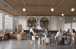
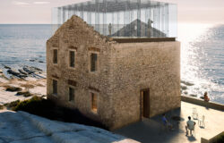
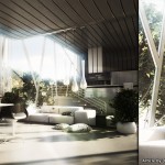
Blender + Indigo + Photoshop – Final Images…
Tom’s original 93 Tram thread (Plus other things too)
If you are a Blender or Indigo Render user let us now by commenting below and what you like most about it 🙂
You are welcome to comment on this article and ask questions using the comment box below!




i’ve never seen nobody else working like Tom with blender + indigo 🙂
Amazing skills !!
blender seems like an amazing complete 3d package and FREE! might be good to look into what it can offer compared to the other packs out there.
Congrats Tom!! Great skills!
Very nice as mentioned on one of the forums I saw your work, think it was CgA. Thanks for the tut as well.
Thanks, guys! Blender is, in fact, completely free and is definitely worth checking out! A free alternative to Indigo is Lux Render, the open-source unbiased renderer with some crazy new GPU capabilities.
Here in Ottawa as well! Great work Tom, Wow, Blender can do that…really.
Time for a revisit. Have been getting familiar with Modo by Luxology.
Thanks for the great tutorial and workflow information.
Will be now on to look at your current site.
Fantastic, congrats my friend, i like your style every day more and more…
Great tutorial. I made something architectural and it was pretty difficult to simulate the point of view from a human and close range of the walls etc. What´s your tip for camera settings in blender? Thanks
“Not more than the usual. Most of it was simple color correction using Selective Color and Black & White adjustment layers in Photoshop to tone the images a bit.”
Can u please tell us about the above mentioned steps in photoshop
have always struggled with it
Thanks