Making of Trojan House by Christian Behrendt
The Trojan House by Jackson Clements Burrows Architects was first posted on the blog in the inspiration section, and later followed by a Render vs. Photo of the Trojan House post based on Christian Behrendt’s personal rendering project. I now publish his making of Trojan House using Cinema 4D (C4D) and V-Ray for Cinema4D. Enjoy!
Christian is 20 years old and been learning 3D for about 5 years now. He started working in the 3D business, professionally, since 2010.
Introduction
I’d like to thank Ronen Bekerman for giving me the chance to contribute to his blog and this community. I really appreciate this opportunity (Due to many reasons, the main reason I appreciate it is also the reason I started working on this project in the first place I’m quite new to V-Ray).
On my first job I also made first contact with V-Ray for C4D. I always admired architectural visualizations but never had the opportunity to work with V-Ray before. So I was very excited to finally being able to use it. Sadly we weren’t using it very much at the office at that time and so I decided to start my very own personal learning project.
As V-Ray for C4D is fairly new compared to the 3dsMax version, the community is also smaller and there aren’t as much tutorials. Also there are a lot of things which are a bit different compared to the 3dsMax version, especially when it comes to the workflow, so that my main goal was trying to translate these techniques over from 3dsMax to Cinema 4D.
Modeling
As far as modeling go’s, I do not consider this project to be particularly hard, aside from some special objects. The furniture is 99% modeled by myself, as I didn’t want to purchase any models for a self learning project. Furthermore, I already had modeled a lot of furniture before so I had a small library I could just pick models from, which sped up modeling a lot.
This library that I could pick from is also the reason I decided not to rebuild the original interior, as my goal was to learn something about V-Ray rather than rebuilding the exact interior.
Considering the modeling techniques, it’s also nothing fancy. Mostly simple box modeling, but there is obviously some spline modeling going on.
The house itself was easy to model. In my opinion the crucial part here was to understand how the house is built in reality, which is very easy if you have the plans. I started with a very simple representation of the house, then subdivided the planes according to the number of boards in reality. I Then beveled the edges and deleted the newly created polygons to form the small gaps between the individual boards. After that I just extruded all the remaining polygons.
For the round holes in the window covers I decided to go with Booleans. Usually, Booleans are not a preferred modeling tool, but in this case it worked just fine. I used it on flat surfaces, with a fairly simple material on it. The resulting poly-mesh really didn’t make any difference in rendering (of artifacts in reflections).
The biggest challenge were the interior walls, since for some parts there simply aren’t good reference shots and the building plans didn’t cover these areas. I decided to go with poly-by-poly and just understanding the walls whilst building them, which worked out fine, because I already had finished the exterior walls by then. In the end these few areas weren’t even covered in the renderings properly, but I did them anyway to allow full freedom in the final viewpoints selection process. I did not have any predetermined viewpoints in mind.
Creating the Rugs
As V-Ray Fur wasn’t available at the time, I had to find another way to make the rugs. Cinema 4D has a very powerful Hair Module integrated which was just perfect to realize the rugs.
With this native Hair Module I was able to control the behavior of the rug strands by tweaking its length, thickness, curliness, density, and much more and with various options like texture maps, noises, splines, etc.
Normally this wouldn’t render in V-Ray, but the module can also put out real polygon geometry at render time, so that V-Ray can use it. This is very useful, as you can set up a rug with ten-thousands of hairs literally in seconds, without any impact on your viewport performance.
The Book Shelves
As it can be a pain setting up book shelves manually I was looking for a more convenient way to do it. For this Cinema 4D has the very powerful MoGraph Module. Like the name says it is originally intended for making motion graphics, but it can do so much more and I wouldn’t want to miss it in my daily work, even if I wouldn’t do any motion graphics at all.
First of all I scanned some books and magazines of mine and crawled the internet for some more textures (I found a great library on the Evermotion forum which I’m sure you all know of).
After that I modeled some books and UV mapped them correctly. I then converted them to proxies (I’ll come to that later in more detail for C4D users). The first screenshot shows how the shelve looks without MoGraph.
There are actually 73 different books, but some of them are in the same place now. MoGraph has a clone-object feature which can create grids of objects you specify. So I created a “clone-object” for every book shelve and put my proxies in it. Then MoGraph got a big palette of so called “effectors” which can influence your clones in various ways. I used the “random-effector” to resize and place the books in a more random and natural way. The “random-effector” also offers another great possibility, and that is to create material variations. Knowing this you can set up the materials for the books with a special shader, that allows you to merge a set of sub-shaders from which the “random-effector” can choose which shader it will apply. This way you can easily create a lot of variation just by changing the hues, saturation, inverting colors, etc. of your original textures. Combined with differences in size and positioning this already gives a very natural look which would take a lot of time to setup manually.
The second screenshot shows how this would look, but the colors in viewport are wrong. There is another great possibility to further increase the look by combining the result you got now with the dynamics engine.
As proxies aren’t recognized by the dynamics, I worked around that by making simple box bounding shapes representing the books and specified the proxies as children of these boxes. This way they followed the exact movement of their parent object, whilst still being proxies.
You can see that you can create really huge book-shelves in no time with MoGraph. You can see the result in the third screenshot. For the simulation to work, you actually have to play your scene, like you would do with any other animation, as the dynamics are dependent on real frames and cannot be simulated in one frame. The simulation for every frame is so fast, that the entire simulation only takes as long as you playback your scene. In my example I decided to stop after 90 frames, which was 3 seconds. After you’re satisfied with how the shelve looks you can just cache the simulation, so that you don’t have to redo it all the time and you always get the same result.
Vegetation
The grass, trees and bamboo fence were done in a very similar way (they just didn’t need the dynamics), but as you put more and more objects in your scene viewport navigation can become a real pain, especially when creating proxy generators (objects which allow you to create proxies without having to export an actual *.vrmesh manually) in combination with a large amount of objects.
There is a global switch which can be used to turn off all so called generators, but this switch also turns off some other objects like symmetry which you usually want to keep activated. So I was looking for a convenient way to deactivate all proxies at once to keep viewport performance intact when I needed it.
Cinema 4D has a very nifty node-based system which you can use to control objects, called xPresso. With xPresso I was able to connect all my proxies to a simple switch, which allowed me to turn them off and on as I pleased. The screenshot might look very confusing, but it’s only due to the mass of objects. But in fact I only forwarded the on/off properties of the checkboxes on the right to the on/off properties of the different objects.
Texturing
I didn’t pay too much attention on texturing on this project. This is due to the fact that I didn’t want to make any close up shots of objects, so they didn’t need too much detail. This is also the reason I used readymade textures and didn’t hand paint or mix any textures at all. The textures themselves come from well known resources like cg-textures. Nothing special.
Material creation
The material creation process is the most interesting point as it has the biggest impact on realism in the end. I learned a lot about materials in V-Ray for C4D forums where Stefan Laub provides excellent support. My understanding is, that V-Ray for C4D and for Max have a slightly different material system.
At the screenshot above you can see a lot of layers in the V-Ray material editor. These layers are logically stacked over one another. This is especially interesting when it comes to the specular layers. You might have noticed that there are 5 of them. The reason those layers are so interesting is that many materials in life have more than 1 specular layer.
Think of a wooden floor for example, with its basic wooden specular layer but on top of it there is also a coating layer most of the times. That coating has a different specular layer, with its settings for glossiness, IOR values, etc. This way you can easily create and combine different specular layers, which gives you great results and is very easy to set up.
There are also two diffuse layers, I only use them very seldom. If I intend to mix different textures together I usually create a so called layer shader, which basically gives you the same options for stacking and mixing of layers, you got in Photoshop. You can stack as many textures as you like this way, which is the biggest advantage.
Here are two screenshots as an example of the material stacking system.
Other than that, the material options should be the same as in V-Ray for Max. There are some general things you have to be aware of though. It’s crucial that there are no over bright materials and that all materials have Fresnel reflections with the correct IOR’s which differ from material to material and specular layer to specular layer.
It was a great help that Stefan provided a set of IOR’s for different materials, as you don’t really find a lot of information about these on the internet and most of it are not correlated to the V-Ray BDRF material system.
Lighting
If your materials are setup correctly lighting should be easy. I always try to imitate lighting situations as real as possible. With V-Ray this works like a charm because of the very good GI and especially the Physical Camera. You can just use real world values for you it, even the ones from your reference photos, and then adjust your lights according to this camera. If you now use real world power values for your lights you should end up with a great result. For light sources that will be seen by the camera I tend to use mesh-lights, for light sources that won’t be seen I mostly use area lights set to sphere mode to imitate light bulbs.
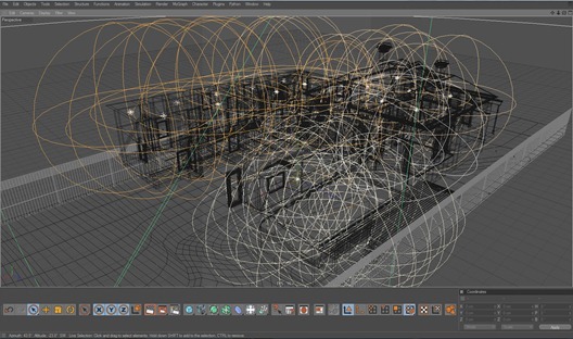
The screenshot looks very messy, because all in all there are 60 different lights. Most of the lights were only used in the night shot. Each light is placed where a light would be in the real world. I’m not a big fan of creating lights in different locations in my opinion you get the best results by staying as close to reality as possible.
In the night shot I used an HDRI from openfootage.net which I also adjusted according to my Physical Camera. For the day shot I simply used the Physical Sky feature. Cinema 4D also has its own sky module, this can be very handy if you have to imitate specific locations around the world, as it allows you to set date, time and place for the Sky. The Sky itself doesn’t work with V-Ray, but it can place the Physical Sky for you, so that you end up with the same result. It’s really great and simple. So I just set it up for Melbourne, Australia in this case, as I knew the house is located in this area somewhere.
Rendering
This was actually the hardest part for me. As I mentioned, I was fairly new to V-Ray so the amount of options was overwhelming at first. Even though I feel like I learned a lot I know my render settings are far from being perfect. I used higher settings than I might have needed, because testing around with render settings too much would have cost me more time in the end. Setting up the GI was fairly easy, I struggled far more with Image Sampling as there were some materials which just wouldn’t clear up properly.
For the interior images I ended up with pretty similar render settings that Bertrand Benoit used for his Tribeca Loft project. The exterior images obviously used slightly lower settings which is completely sufficient. As I set up my renderings all in the same file I sadly can’t provide the exact settings for every image.
For Color Mapping I always use Reihnard with burn of 0.55 and Gamma of 2.2, as I always want a 32-bit image as output.
Postwork
Postwork is very important in my opinion, even though I try to use as less as possible. I’m not a big fan of placing 2D trees etc. I want to do as much as possible in 3D itself. But there are a few things which are just so hard to do in your 3D package and for me this is where postwork comes into the mix.
As I mentioned in the Rendering section already, I always render out 32-bit. This gives me the most flexibility. The first step for my postwork is applying a 2.2 gamma on my rendered image, as the saved out image has a gamma of 1. Then I play around a bit with the exposure to get it to the level I like.
Due to some changes in C4D’s internal color management the newly applied gamma value isn’t always 2.2 anymore, because the original image sadly isn’t saved correctly with linear gamma of 1. So I just went with a gamma value which looked natural to me.
Next step is adjusting the levels with help of the histogram. I try to make the images a bit more dynamic by adjusting the ranges, and according to this also play around with gamma again a bit. When I’m satisfied I save as a copy and break it down to 16bit. This is where my ‘magic’ happens. I got a set of adjustments I always apply to my images. I always use at least one gradient layer. It gives your image a very nice look according to the gradient you apply. I have 2 gradients I usually use for this according to the look I want to make. Often I even mix two gradient layers. Then I mostly apply a curve modifier in Cross Process Mode. I also apply a Lens Correction to my original image. It’s just a slight effect but I think it adds a lot of realism.
There’s a lot of discussion out there whether or not to apply these lens distortion, vignetting and chromatic aberration effects I do it. I want to mimic real world cameras and photos, so in my opinion it just adds a bit of realism. I’m aware that it’s an imperfection that real world photographers might want to get rid of, but nothing is perfect, is it, eh? Of course you have to be really careful with these effects and use them very subtle, this is when they help the most.
After I applied all my ‘usual’ steps I apply a Color-Balance modifier and then I just start playing around with it. If I got anything specific in mind on which direction I want to go with the image I just try it out and see where I end up. I think it’s a great way just to flinch your eyes a bit and play around, you might even discover some variations for your image you didn’t have in mind before.
Christian’s Trojan House Forum Thread.
You are welcome to comment on this article and ask questions using the comment box below!






This was interesting to read! I’ve never used gradient filter thought from now I definately will. Thanks for all the tips!..
Nice to see such a good render made in C4d. Hope to see more. Keep it up.
Great! thanks a lot! very interesting to read!
C4D FTW!!! 🙂
very nice making of! Great to see some Vrayforc4d stuff here.
Hope there will come more like this!
Thank you all 🙂 I’m very glad you like it and I’m proud to contribute to this great community.
I learned a lot during this project and I hope it won’t be to long until I can finally show something new 🙂
Amazing!
I was wondering if you could post the IOR’s stefan gave you, it would help us all.
Yes, of course.
water 1.333
glas 1.5.- 1.5
diamonds 2.13
all compound materials like wood, stone, concrete etc 3-4
plastics 5-8
metalls 20-100
http://forum.vrayforc4d.com/showpost.php?p=60481&postcount=9
nice to see C4D/vray work getting some attention
good job Christian !
Great job Christian. Just a couple of questions: I was kind of surprised to see that you modeled the house in Cinema. Did you use real dimensions or did you eyeballed it? It’s easy to eyeball things, but how do you use specific dimensions in an efficient workflow in Cinema? It’d be great if you could talk a bit about that. The other question is: Why VrayforC4D? I assume you’ve worked with AR, so what made you change? Is VrayforC4D that much better than AR3?
I would really appreciate if you could address these questions.
Sorry for my bad english.
Thanks.
I worked according to some plans that were available at ArchDaily. There were no scales given so I just grabbed some usual measurements, like the width from doors etc. and went from there.
Regarding dimensions worfklow – I’m not sure I understand what you mean. I build everything in cm, so everything fits together nice and clean in the end. Also the new unit system in R12 prevents bad scaling of objects, due to different units/dimensions.
Yes I also worked with AR and I also like it, but it just depends on what project you’re doing. For ArchViz I think V-Ray is by far superior. The material system enables you to create much more realistic results, also the GI works like a charm and the physical workflow with light intensities, physical camera etc. adds up to it. In the end you can work with V-Ray like you’re a real world photographer. You don’t have to worry about faking something or change materials because they don’t work in every scene.
Thanks a lot for anserwing my questions Christian.
When I asked you about maintaining an efficient workflow when modeling in Cinema, I was talking about when you have an architectural project that you have to “obey”. When you have specific dimensions for each object.
I usually inport floor plans from AutoCAD, that come in as a bunch of splines, which I then extrude.
When it gets tricky, is when I have to move things around and model some other objects from scratch. Again, with specific dimensions, say a handrail than needs to be xx centimeters from the edge of the staircase or a table that needs to be placed right (exactly!) in the middle of the room.
I believe this happens because I never quite figured out how to work with both Cinema’s snap settings and coordinate system, which makes moving things to the righ place so difficult.
Ah, ok I see now. There are different ways you can do such things.
For the handrail for example, you just go to the poly mode, grab the repsective coordinate of the wall polygon or spline point, and then you select you the points of the handrail (I suppose you’ll be doing handrails as a Sweep), insert the value and type in + xx . Thats the beauty of C4Ds coordinate manager, you can easily do some equasions in there. So in the end it’s just getting the right values and do some math. Nothing fancy 😉 Usually I never even use any snapping modes and do everything manually.
great work Christian !!!
also nice to see some fellow c4d/vray user showcased here 🙂
congrats
kizo
great work 😉
very cool stuff!
good to see c4d/vray work here too!!!!
herrmannsdörfer
Nice trick with book shelf, cannot really believe that you actually used dynamics to do that, but at the end it looks very natural. Nice job!
nice job man!
Christian, thanks for this beautiful set of images.!
I was just asking myself whether you render out images with linear workflow checked in colour mapping. And if yes, do you still change Gamma to 2.2 in post?
you mentioned you Reinhardt method but maybe i just didn´t get it.
Thanks again for your detailed post…
Cheers
Micha
Yes I render with LWF activated. If you have to apply gamma 2.2 depends on how you plan on saving your image – but this has nothing to do with LWF at all 😉
You only have to apply the 2.2 gamma if you want to save out as 32bit. Because if you want to save out as a 32bit image you usually want to do that in linear color space so that all information is stored correctly – but this will result in a 32bit image with gamma of 1, so you have to apply the gamma of 2.2 afterwards. This is afaik the correct way of saving out as a 32bit image currently. You should also activate “Adapation only” 😉
If you want to save out as a 16 or 8-bit image this process isn’t neccessary.
Thanks a lot for sharing this the post work really gave me a great one
NICE TUT
amazing =)