Making of 330 North Green
The Porch at 300 North Green visuals was published 2 months ago by Pictury and today I’m happy to share this making-of, showcasing their unique two weeks blitz they do as a team, in this case for SOM who designed this Chicago office tower. Enjoy the read!
It is an absolute pleasure to share with you guys our latest commission for SOM, The 330N Green, a fantastic 20-story office tower planned for Chicago’s booming Fulton Market District in the West Loop.
Pictury is a multidisciplinary ArchViz studio. We are a team of handpicked CG artists, designers, architects and creative minds who band together to craft realistic scenarios inside high-end visuals, just what a picture would do.
To be peak performers, we focus on one project at a time during a fortnight! Yeah, we are into tight deadlines 🙂
To meet these deadlines we follow a simple yet efficient working process :
- Week #1 – Pre-Production: Order, Modeling, Basic Materials, Cameras.
- Week #2 – Production & PostProduction.
Let’s start!
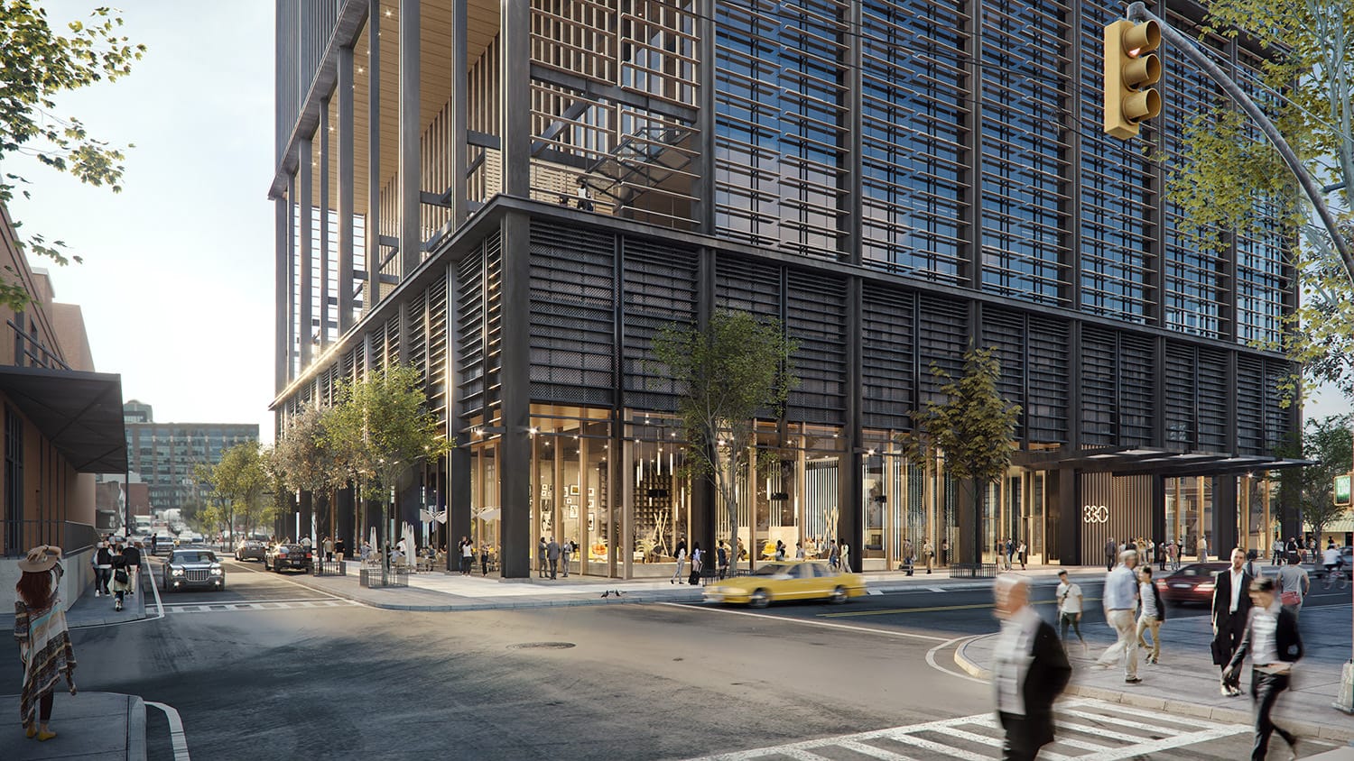
This is the final result…
Week #1 – Pre-Production: Order, Modeling, Basic Materials, Cameras.
We start reviewing the brief, the model and the geometry of the project. We accept all formats, but we always adapt it. How?
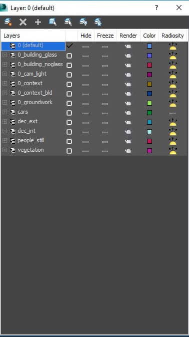
First thing first – Layers Order
A helpful tip at the very beginning is to keep the building_noglass layer frozen with the “show frozen in gray” option deactivated in the object properties.
This will allow us to visualize them in render avoiding any bother when selecting interior elements.
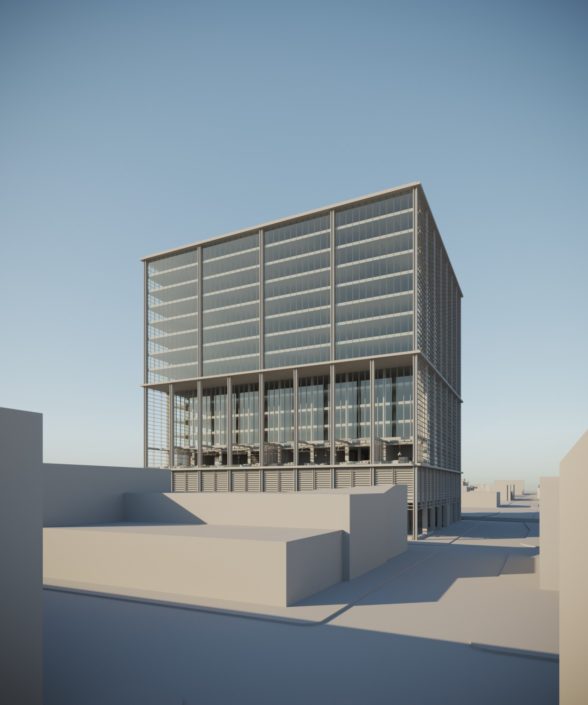
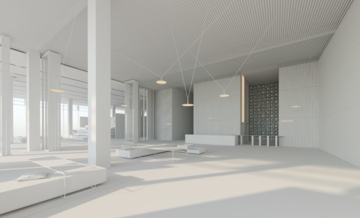
Most of the times a partial/total remodeling of the geometry provided by the client is needed. Sometimes it is also necessary to remodel the context or the common areas, which are rarely supplied.
Besides the central building remodeling, all the elements in color have been either remodeled or added.
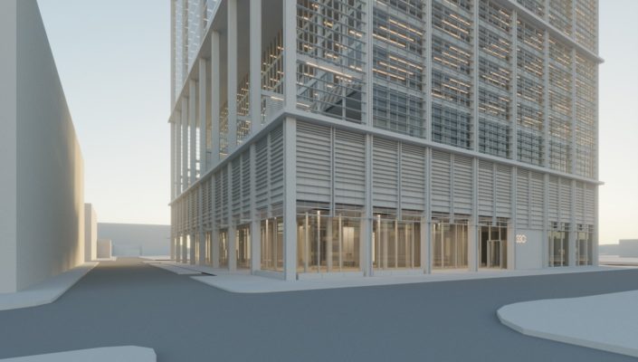
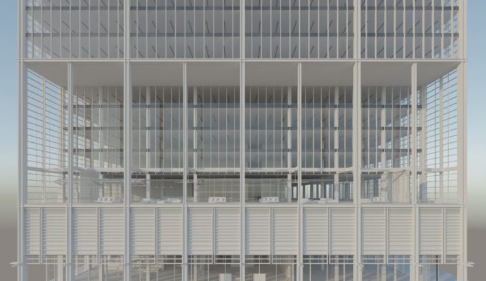
The glass is always challenging. Generally, it needs to be remodeled by disassembling and adding a logic thickness. We usually include blinds in this type of floor-to-ceiling glass facades.
A quick way to do it – select all the window exterior faces and detach as a clone. Now that we have the remodeled geometry, we disassemble it into individual elements and, using one of the several scripts easily found on the net; we place the pivot on the upper central area.
Once this is done, we can make random selections and adjust from local some of them in height. We can freeze the adjusted ones and repeat the process with different heights to gift our facade with spontaneity and randomness.
When done with this, we need to attach all the elements and place them inside the building. We can move them manually or apply a shell towards the interior, selecting and erasing the exterior and edge faces.
Remodeling finished. Now we focus on Materials – the main ones provided by the client and the basic ones thought for context. This phase is crucial for the team to start giving consistency to the overall commission.
We use Corona Render, almost exclusively, for the material creation following the PBR method so that they can efficiently work in any given light situation.
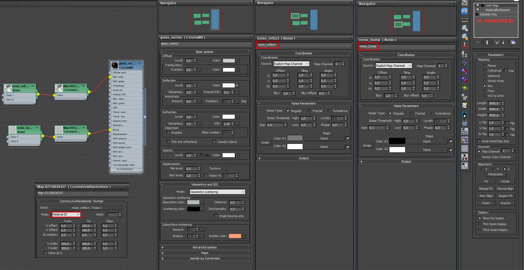
For floor-length windows, we can use this setup – it generally works just right.
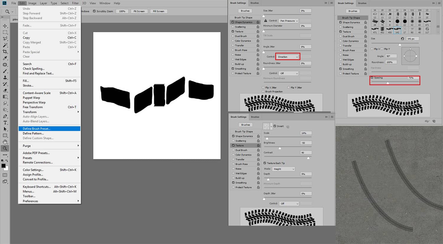
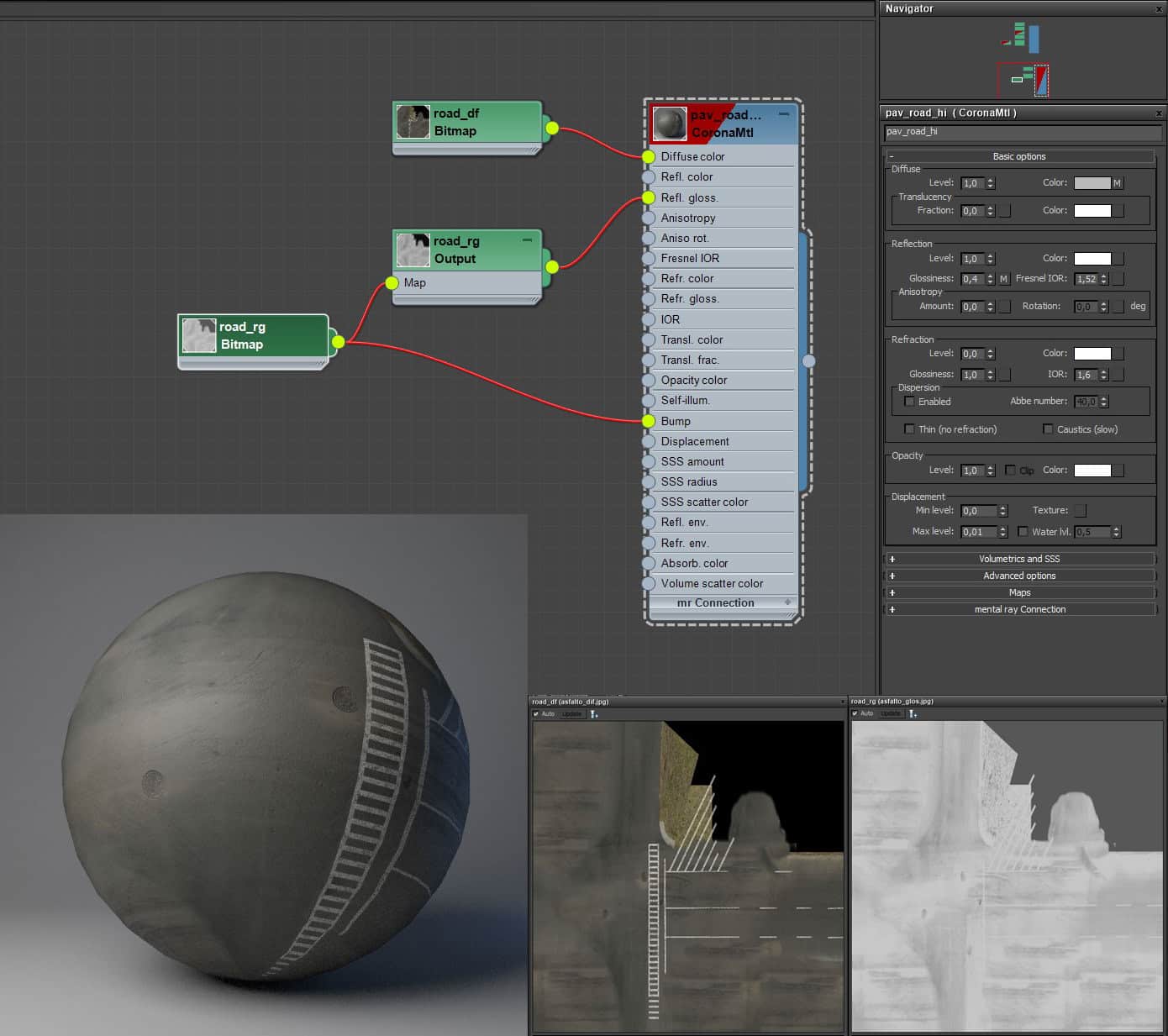
For pavement surfaces, we either use a tileable road sample or a real texture capture – adding some dirt or tire marks in Photoshop.
Tip: it is always much more comfortable to create a brush for those effects.
The fun starts here – Cameras.
We enjoy a lot this phase. We explore composition and points of view from a master archive with the remodeled basic geometry. We genuinely appreciate discovering new angles and not overused perspectives. Now it’s the client’s time to choose.
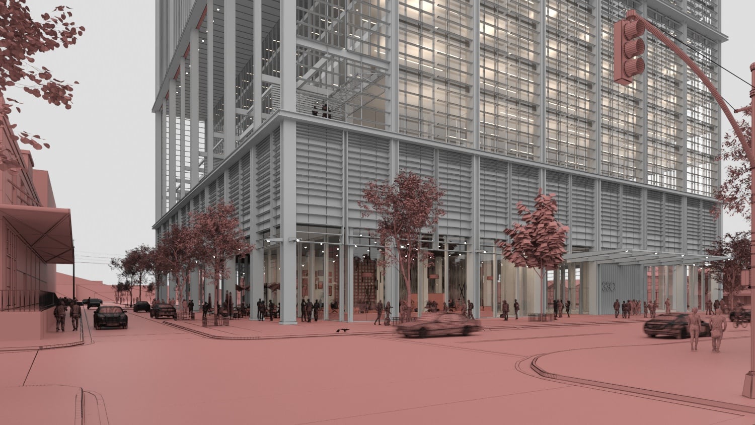
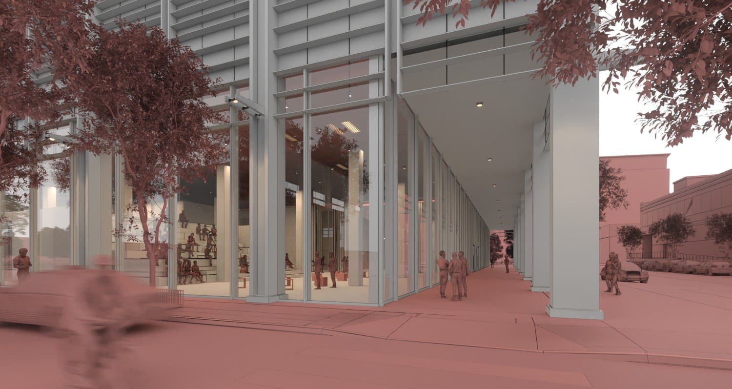
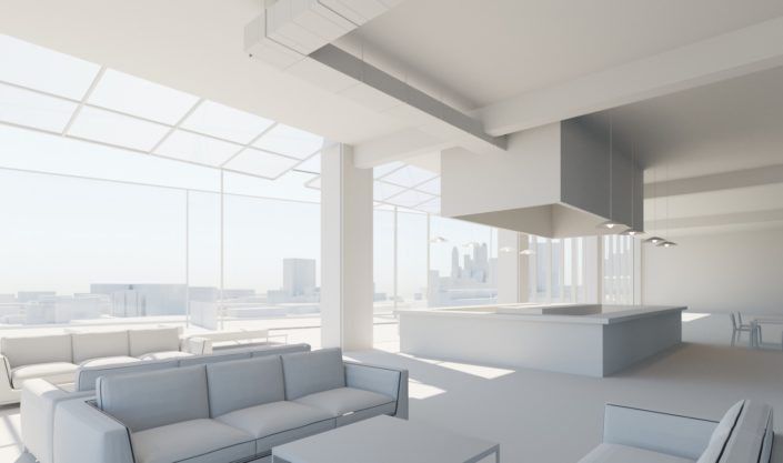
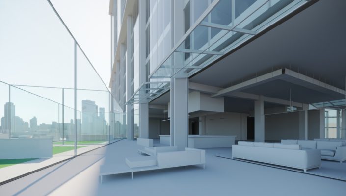
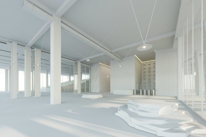
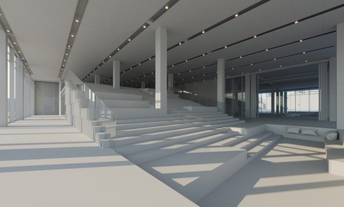
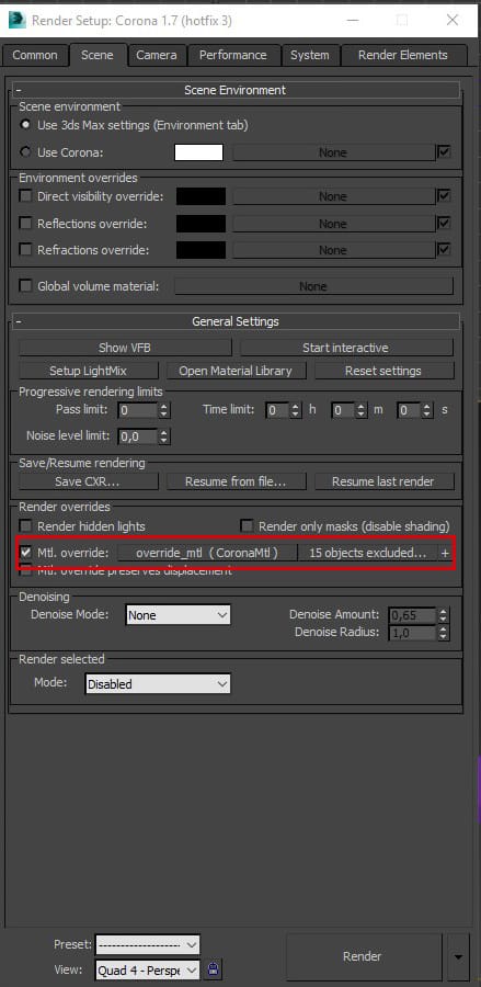
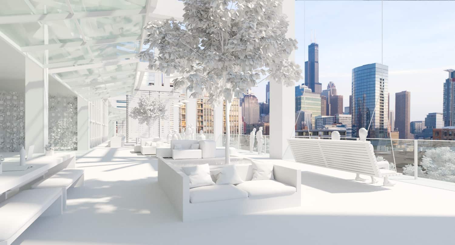
We generally use MTL Override excluding refractive glasses and surfaces.
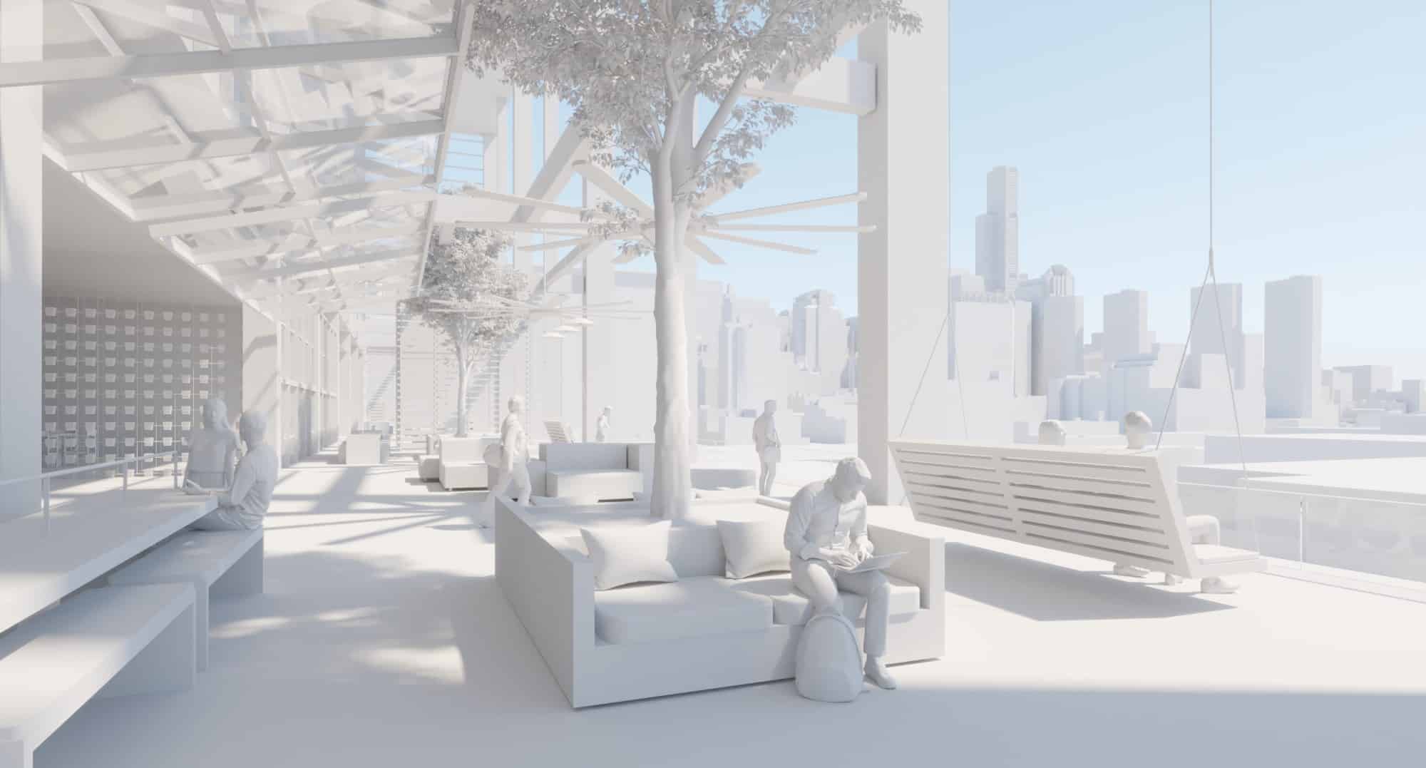
This allows a quick preview rendering to study light and camera angles in depth and show the client a proper geometry.
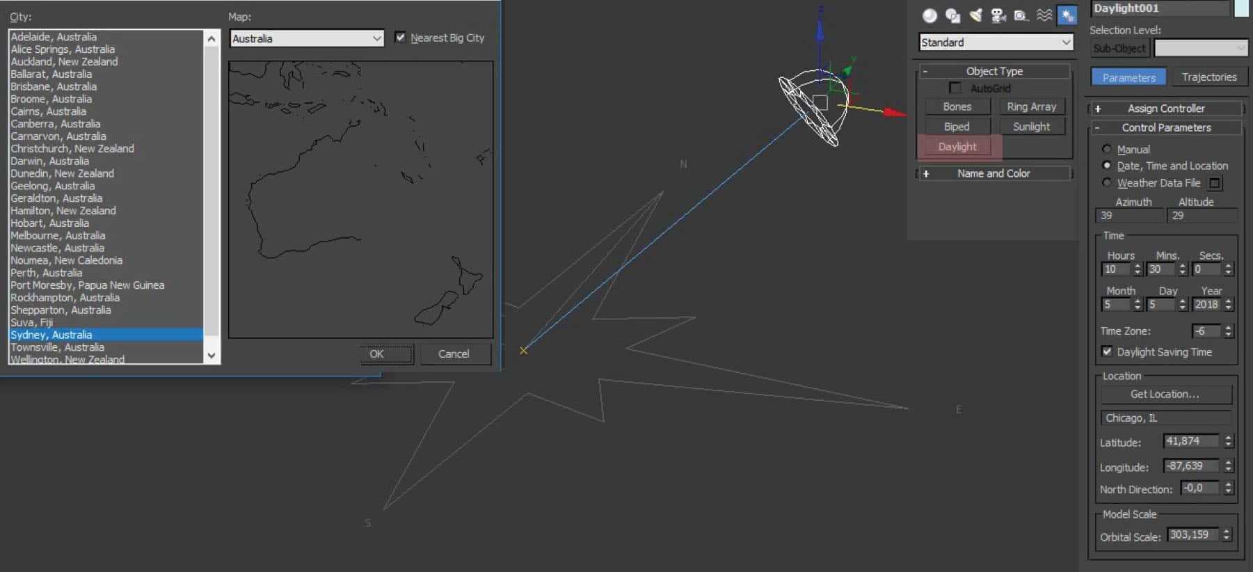
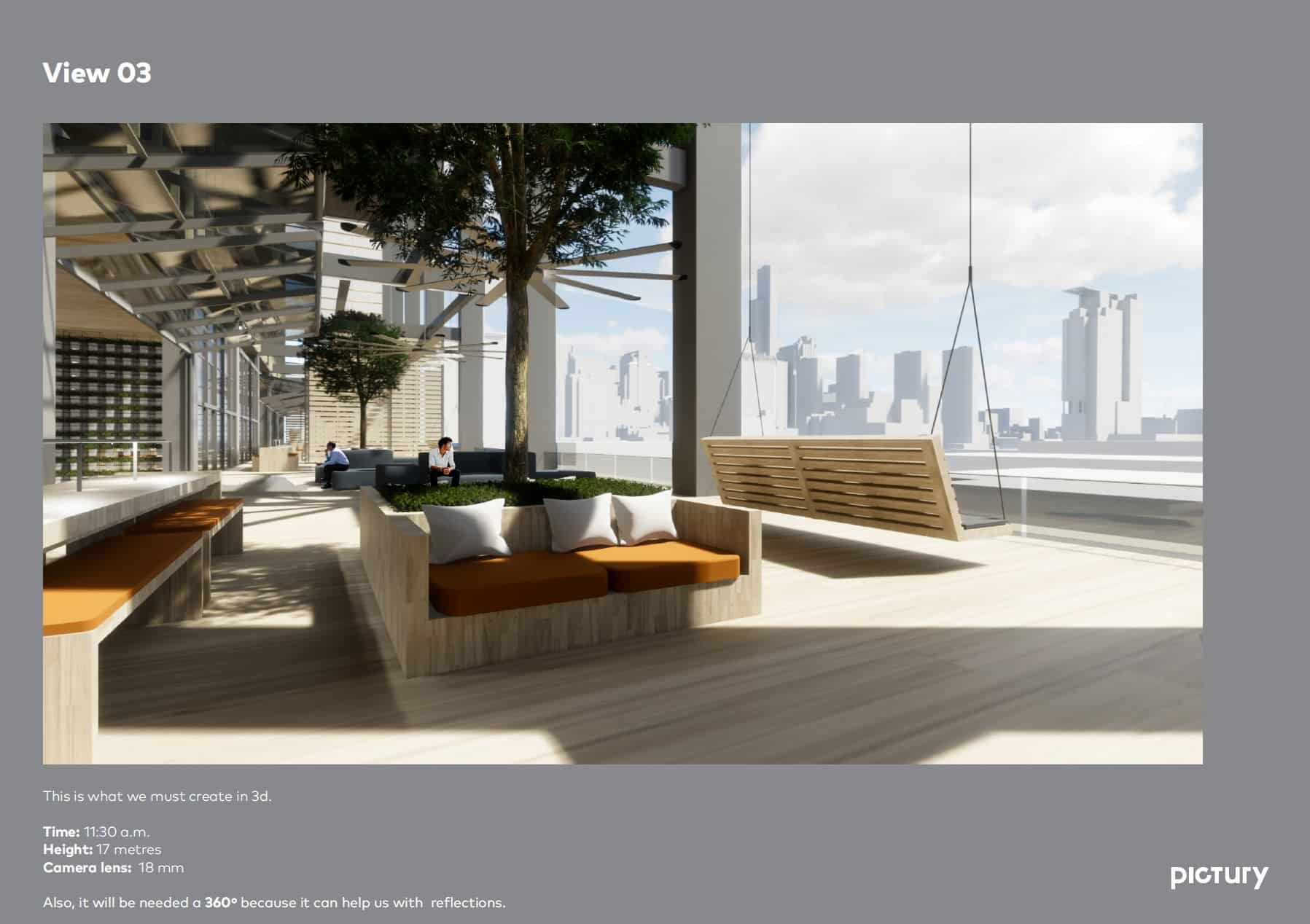
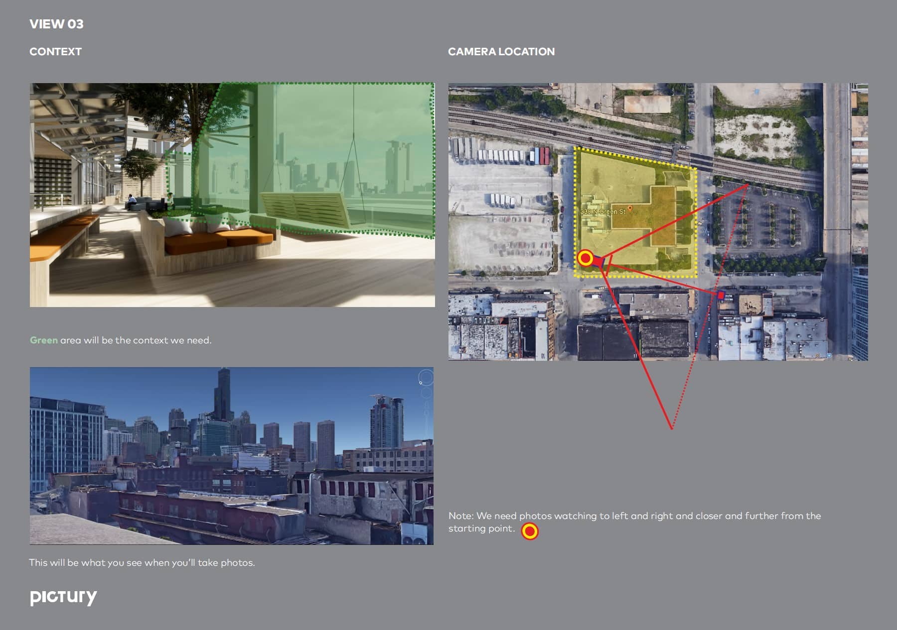
As this commission called for real surroundings, superb drone images were used. Superb ones because the light conditions were actual and aligned with the location. This is not done haphazardly. Instead, we develop a very thoughtful and accurate study of virtual cameras in the actual location, and the most appropriate time frame according to the time zone. We take note of the exact exposure time, the camera height and position, the lens and the real camera crop factor is applied. We add Day Light system with Corona Renderer Sun and Corona Renderer Sky and set the corresponding location and time zone.
Week #2 – Production & PostProduction.
At the beginning of the second week, we work on the interaction of the light with the primary materials and the essential composition elements. The light conditions of this commission were both interior and exterior.
The setup is basic – Corona Renderer Sun plus Corona Renderer Sky or HDRI for ambient light. HDRI for nighttime or scenes without direct light.
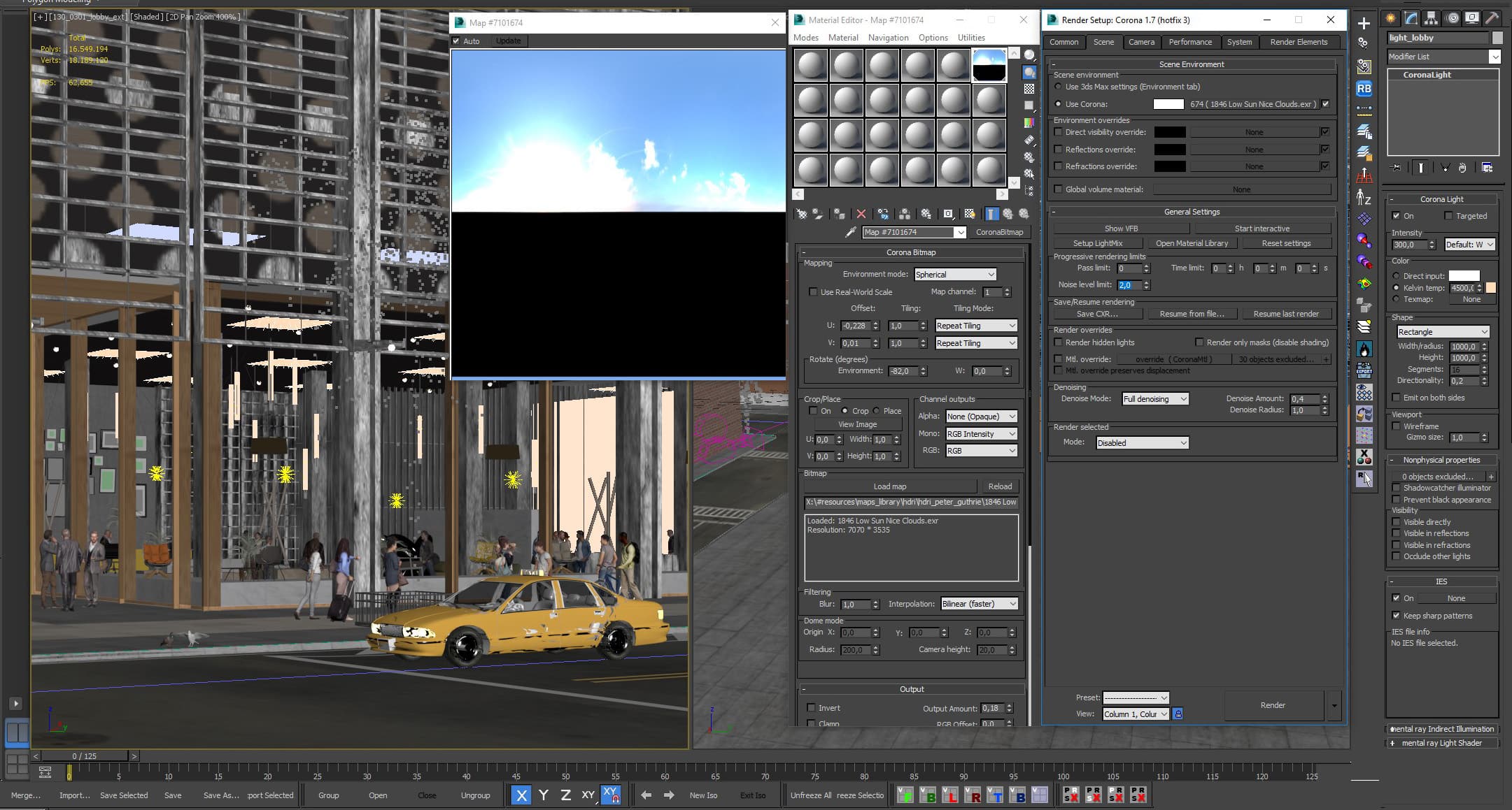
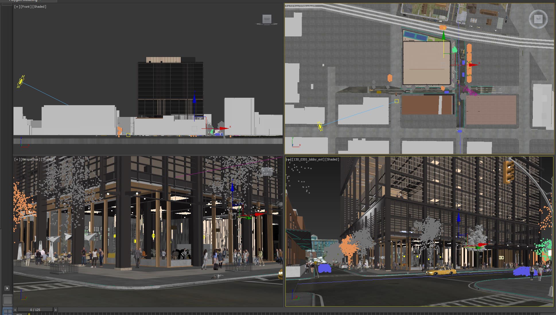
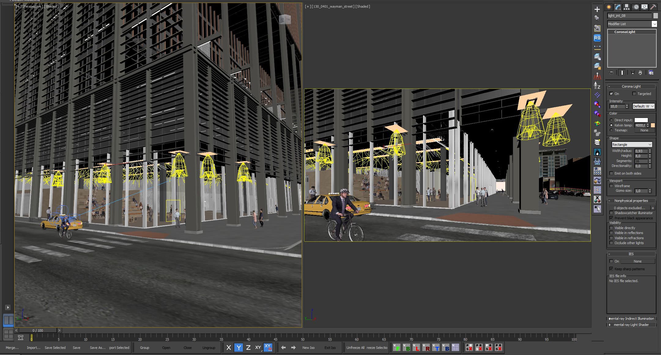
Scene 1 – HDRI + Interior Light Setup
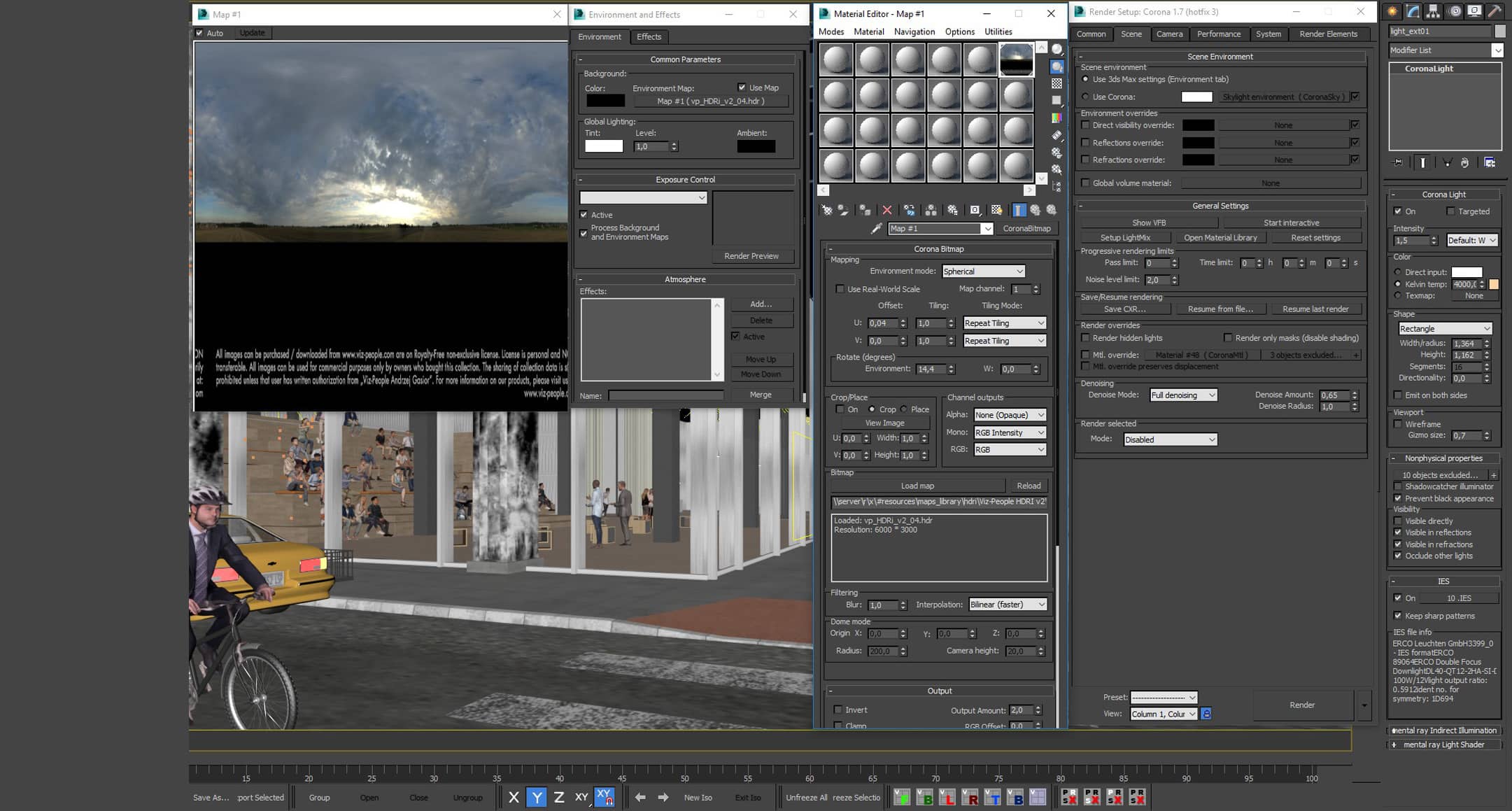
Scene 2 – HDRI + Exterior Light Setup
Corona Renderer Sun gives excellent results together with Corona Renderer Sky or HDRI. It is possible to adjust Corona Renderer Sun plus Sky and afterward replace Corona Sky for HDRI with a similar intensity setup using Corona History. Then, we need to bring it to the desired intensity and hue level. And altogether it will give a much richer light hue and a wider variety of reflections.
If we are using a real background, we will start by opening it on an already rendered view in Photoshop – we can drag the raw image file as an intelligent object to keep all its info and being able to edit anytime.
Then, we save the temporal background as a jpg file to drag on our Direct Visibility slot, already uploaded on a Corona Renderer Output map, so that the result in the render is similar to the final result without exposure compensation needed. This will help us so severely with the edges aliasing when applying Alpha during post-production.
Note: keep in mind that if you adjust any parameter on Corona Renderer Frame Buffer (white balance, for instance) once the rendering is finished, the background will change. Nevertheless, it can go back to original if the rendering starts again.
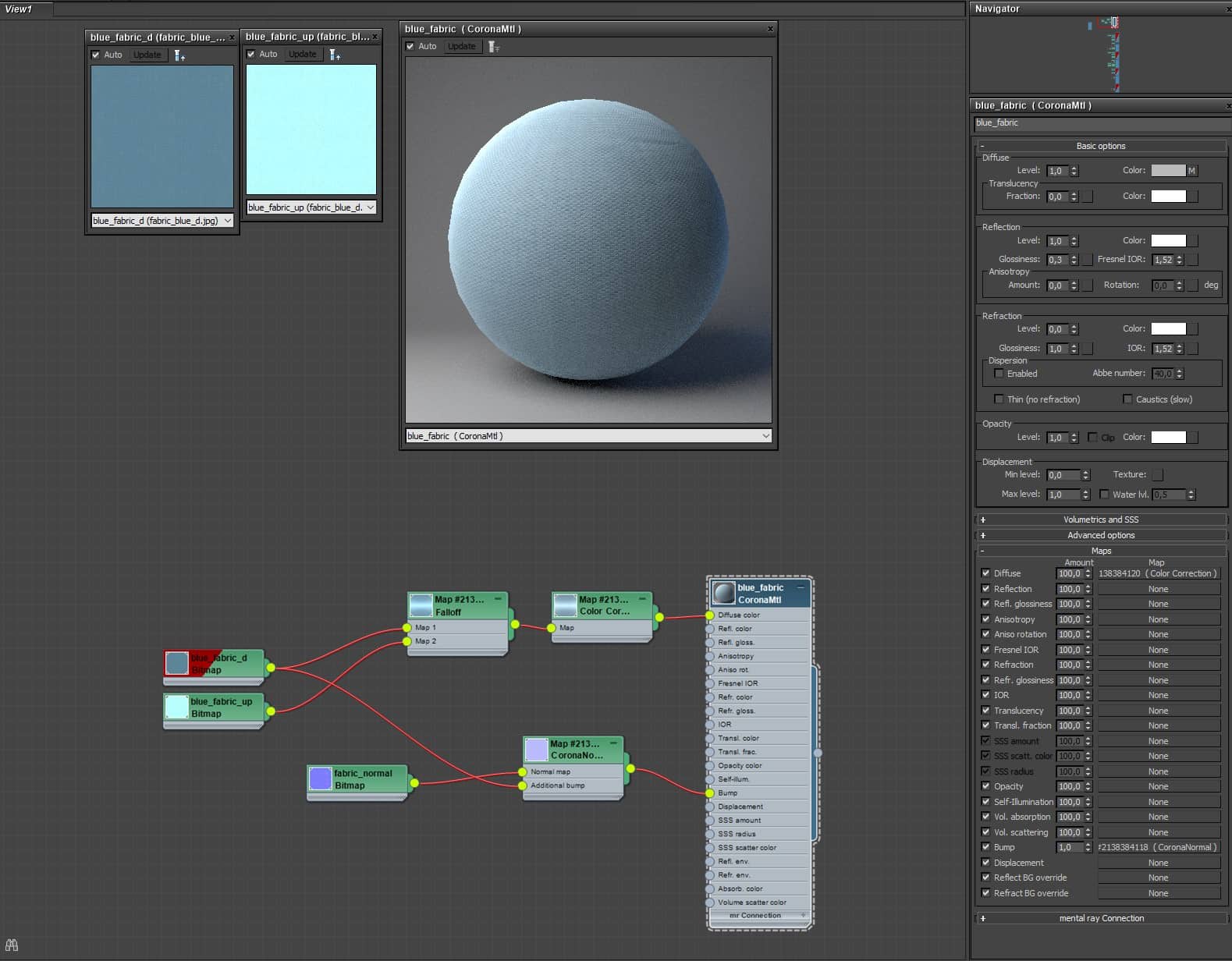
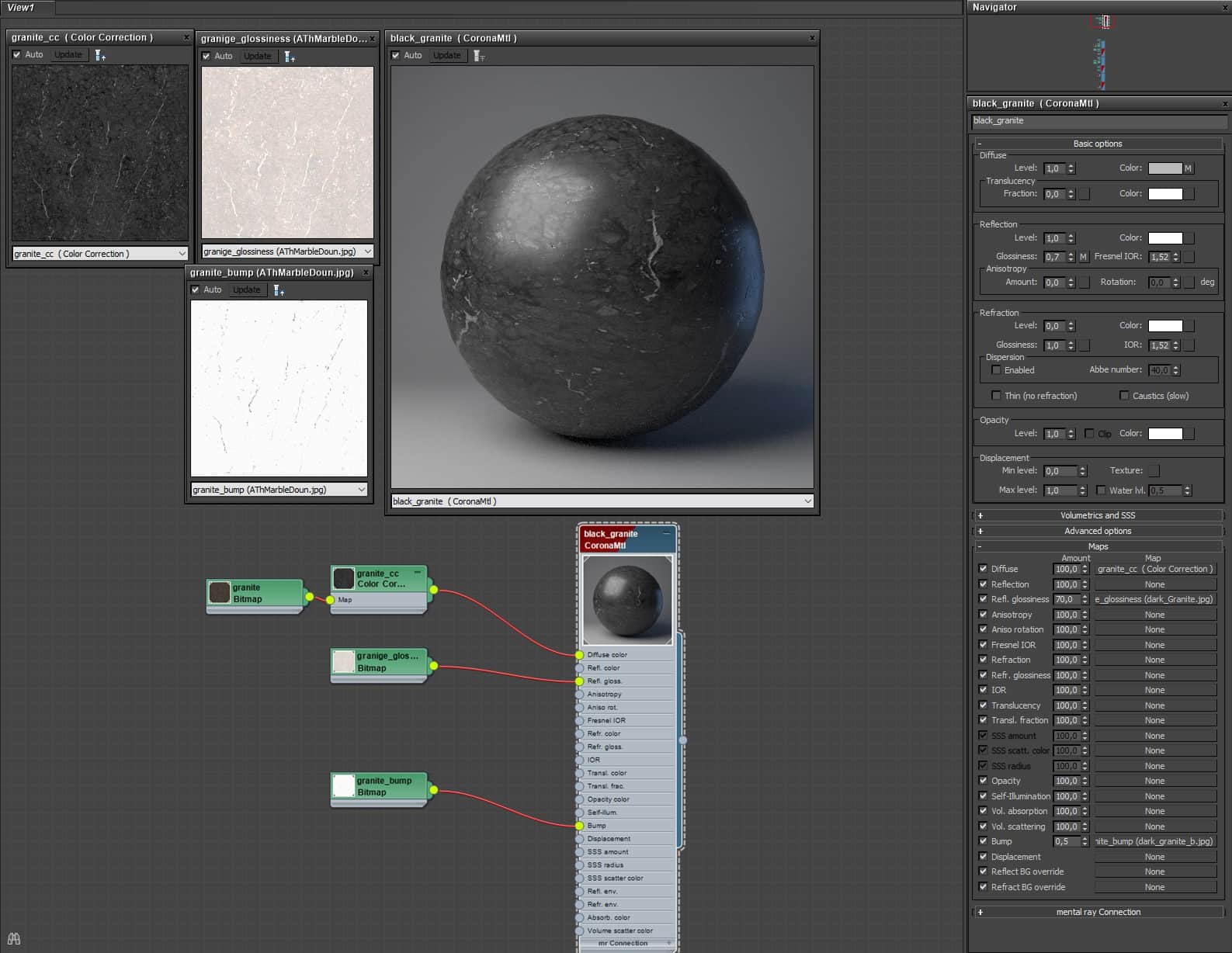
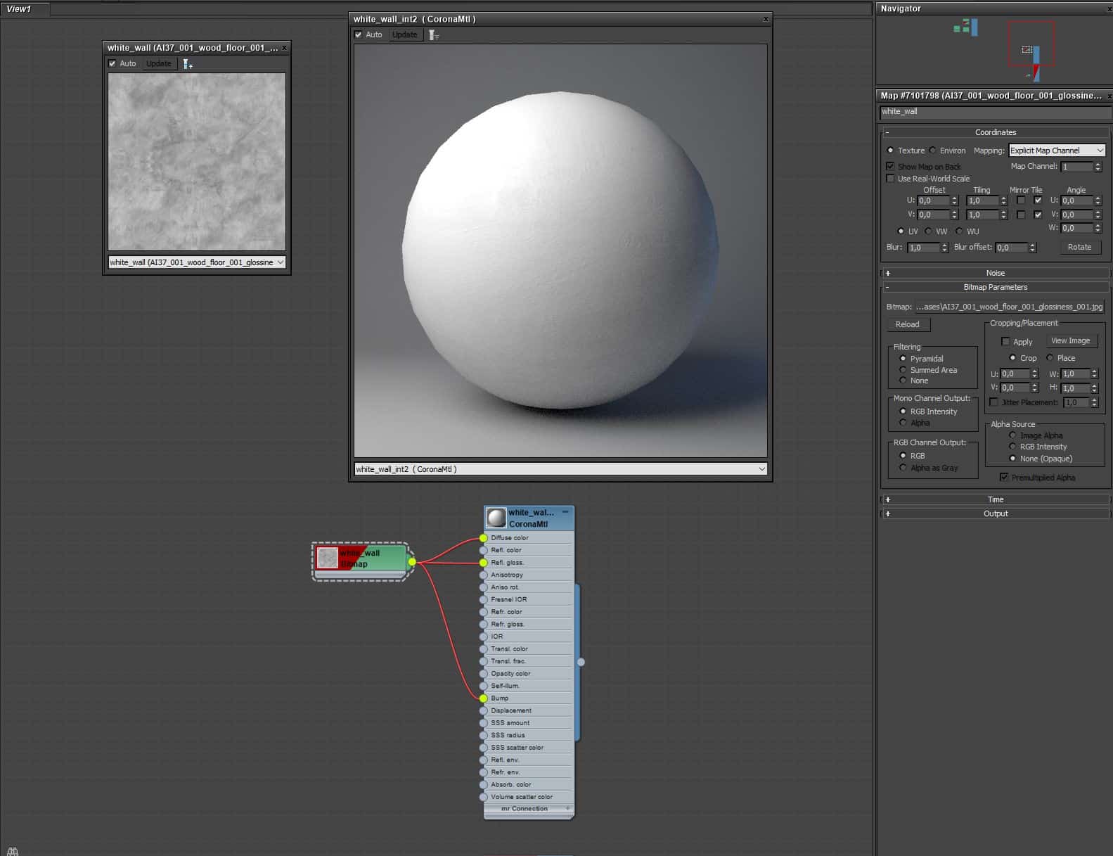
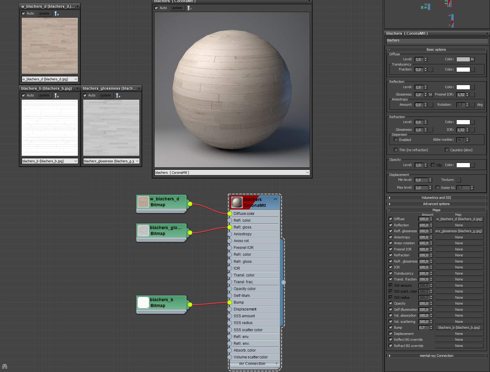
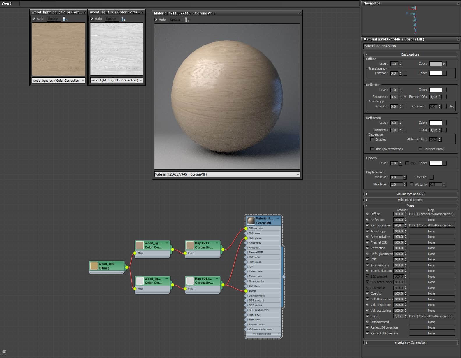
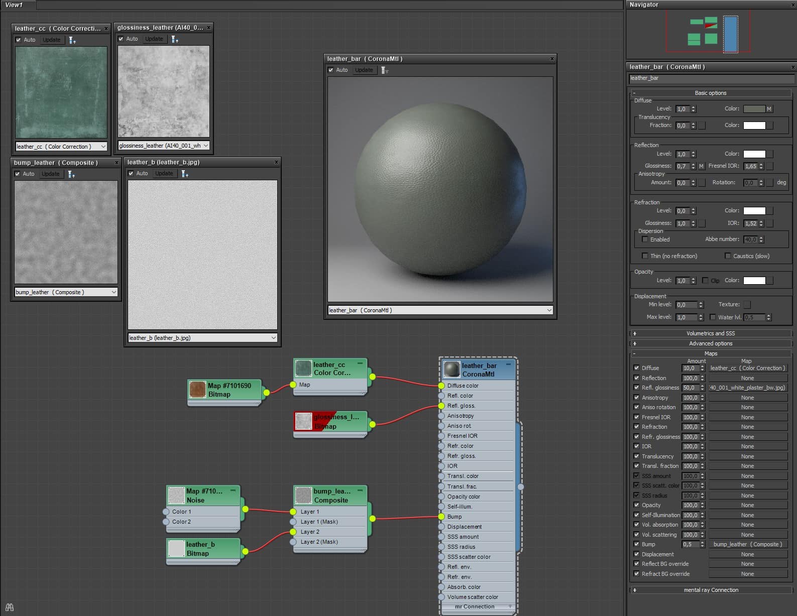
Once the light setting is ready, we move to materials. The setup remains essential, but the channel mapping (like glossiness or bump) gets specific to gain richness in reflections and reliefs, making materials far more realistic and consistent.
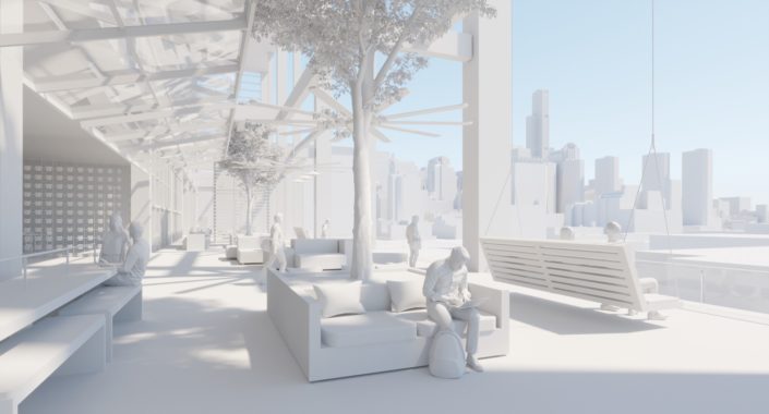
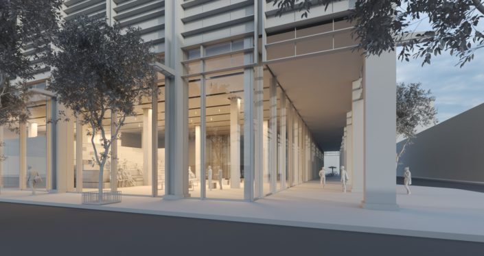
Now it’s time to design a creative composition that will liven up the scene – by adding elements such as furniture, road marks, sidewalks, context buildings or landscape; not forgetting 2D and 3D characters to shape the acting. We always integrate pictures of real people at the forefront and leave 3D characters for the background, if they are hardly visible in detail.
Tip: always include 3D scanned models in the clay views to help the image composition and do not forget to replace them for greater realism and quality.
Post Production.
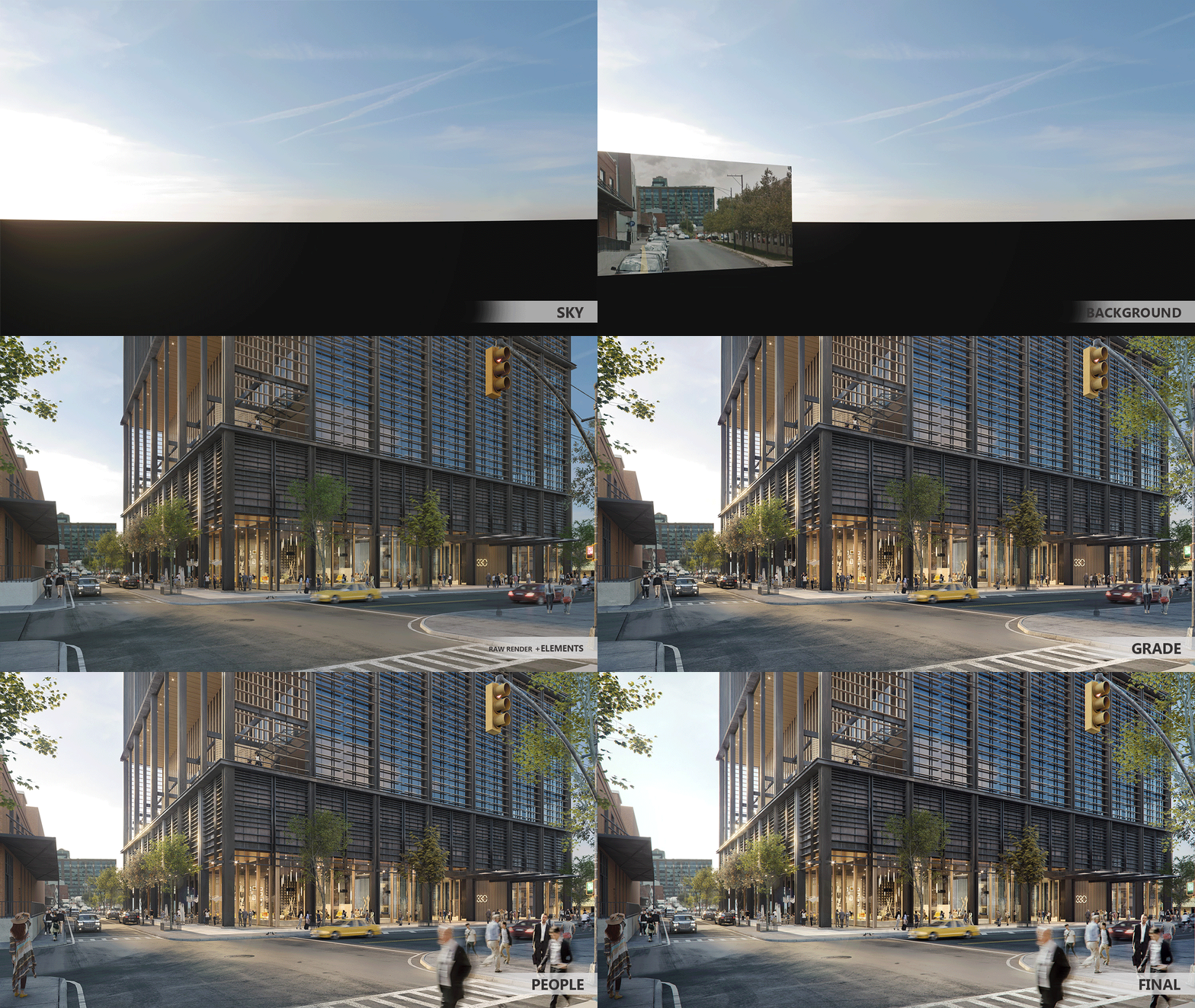
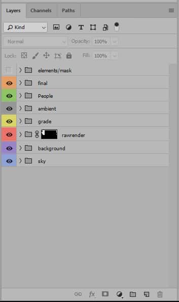
Teamwork is essential for us, so we always follow the same layer order :
- SKY – where we do quick edits on the sky without changing the rest of the elements.
- BACKGROUND – where we group mountains, trees or buildings on the background between the Sky layer and our render; easily edited in isolation, creating several volume layers.
- RAW RENDER – (with Alpha) – on this layer we always insert our raw render and add elements such as light select or reflection pass to highlight specific items. When keeping this group isolated, we make sure we can replace any element anytime without changing the result.
- GRADE – (with or without Alpha, if we want to affect all the lower elements) – in here we encompass color adjustment, contrast curves and any other image setting through RGB mask or Wirecolor.
- AMBIENT – this is the group where we volume up to the lights, add z-depth and special effects (like flares or lights in movement as a result of a prolonged exposure).
- PEOPLE – in this group we add all the layers regarding 2D characters (that usually have limited depth information and admit less postproduction). This way we work individually on each of them without previous settings that could rest quality to the image.
- FINAL – this group is for the final adjustments, like vignetting, focus mask or minor contrast settings.
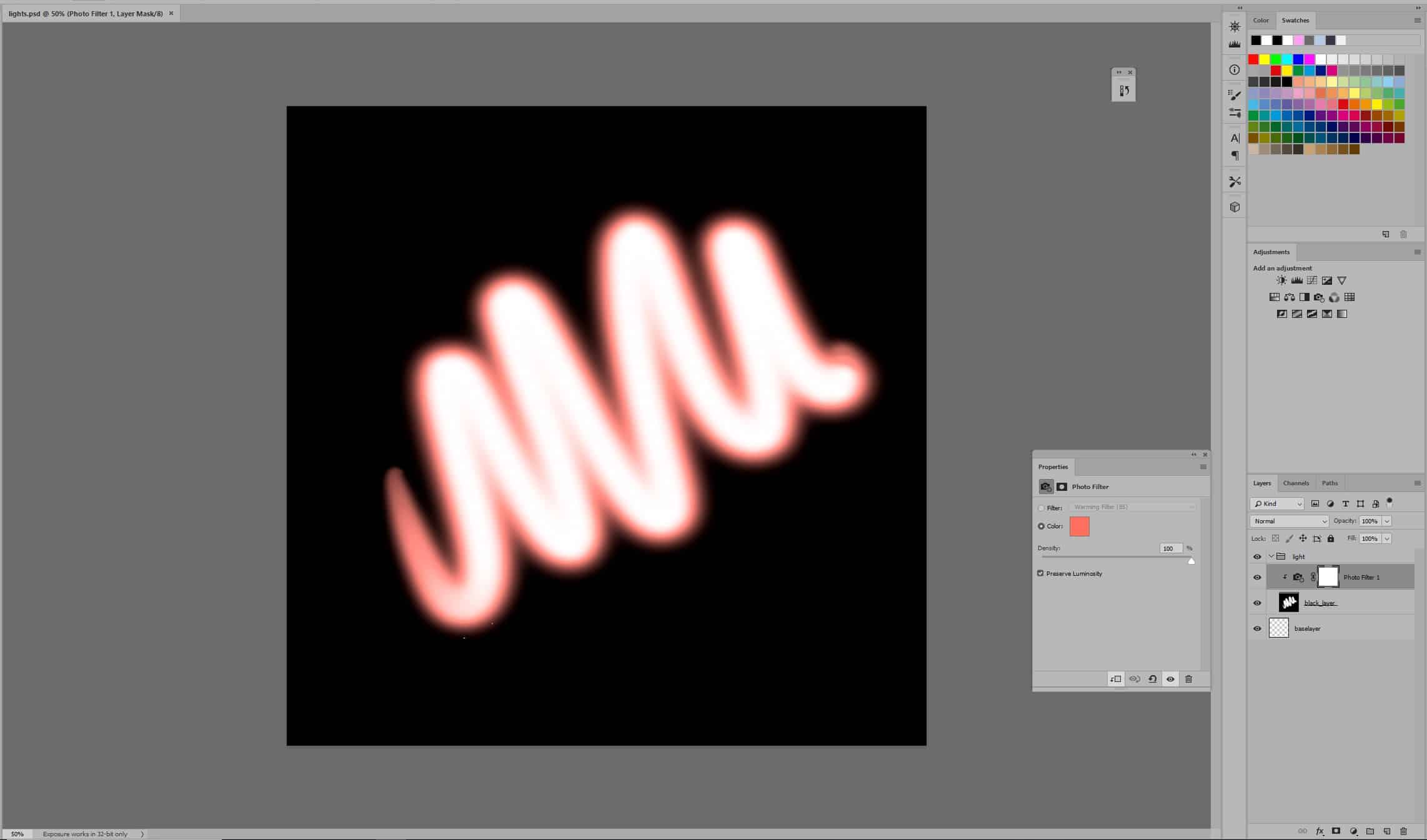
Tip: use a black-filled layer on screen mood linking a photography filter where to choose the desired color and paint in white smooth and realistic brightness.
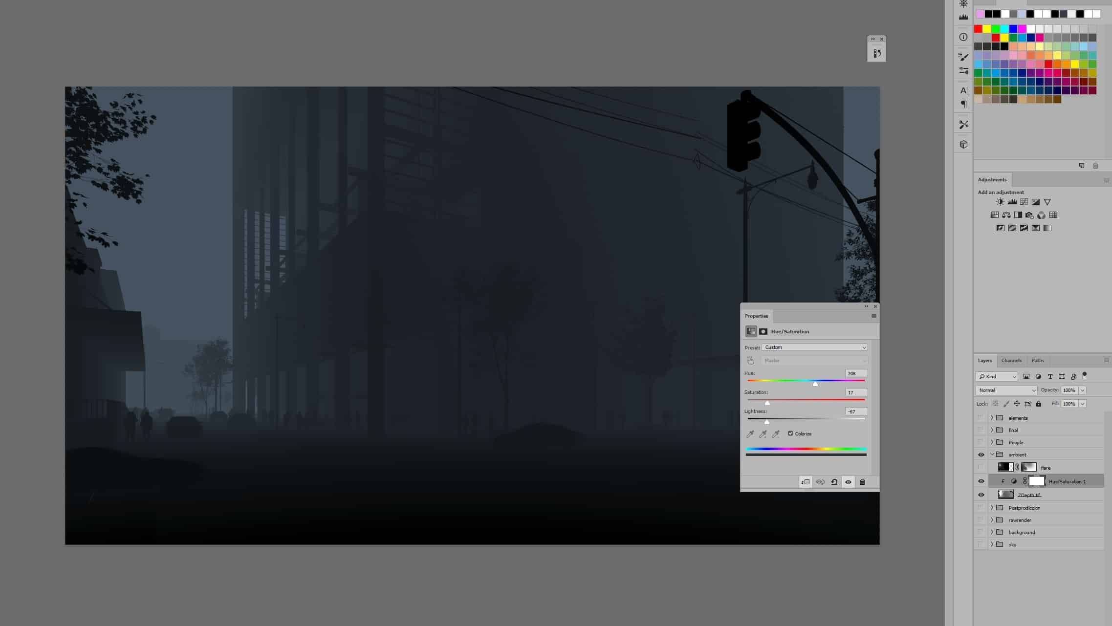
To add content to the scene, we use z-depth on-screen mood linking a hue-saturation layer on painting mood to adjust intensity and coloring.
This is an organic layer organization, so it is flexible if other settings are required. It is a convenient and straightforward structure for the team to check any project at a glance and edit or correct it on the go.
Cheers to all!












It looks excellent, I think a night version with all the lights and interior environment in action would be amazing. congratulations!