Tomorrow Challenge 2018 entry by User-67844391

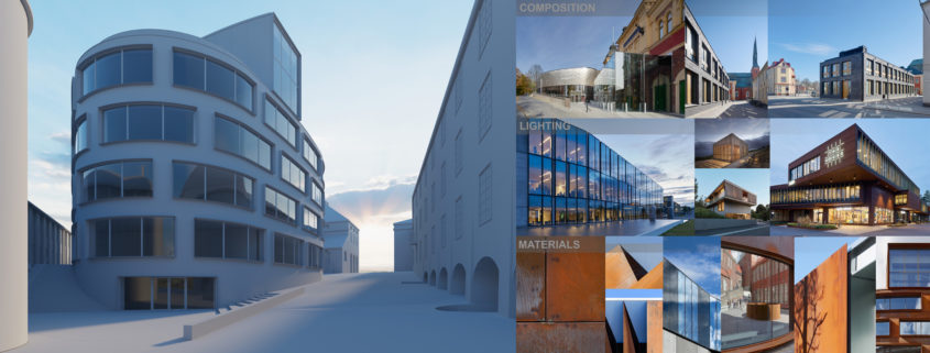
After first acquaintance with the object and available 3d model I decided to start with strategy and `main idea`. I always try to make everything in 3d with small post correction, so everything suppose to be real (real camera hight and lens, environment, weather and lighting). So I created a plan how to move forward and not to stuck.

The Strategy:
0. Moodboard
1. View search.
2. Lighting.
3. Adjustin geometry.
4. Materials and texturing.
5. Tests.
6. Final rendering.
7. Post-production.

As it`s `one shot` image I found out that the best way in this situation is to do everything comprehensively. My `main idea` is to show how the building collaborates with historical environment and how people interact with it.So I made basic moodboard and according to it I developed some criterias for `perfect shot`:

1. Focused on the buildind, but still consist of surrounding historical buildings.
2. Show main ways of interaction people with the building. Customer expirience as main factor.
3. Dynamic and dramatic. Exterior lights and wet roads. After rain.
4. Evening lighting to show dignity and plastic of the object.

So now I know how to move forward and without any `running` around the building I decided that the only suitable view which works with all my criterias is view from entrance.
I made basic lighting just to be sure that it works with building`s plastic. And after quick camera moves I found perfect view. To be fair it`s really hard to work after such proffesionals as Åke E:son Lindman, because subconsciously you always turns around them. So my view is looks more like attempt to adjust real view.

Tomorrow Challenge 2018 entry by User-99163046

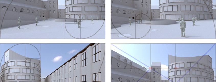
I believe that the composition is the most important and difficult aspect of an image.

After defining the story concept and having decided that the focal point is the triangular square, I began to move around the scene to find the best point of view.

The difficulty of this process is to keep in mind that many important elements such as vegetation and people will be added in post-production.

Tomorrow Challenge 2018 entry by User-99163046

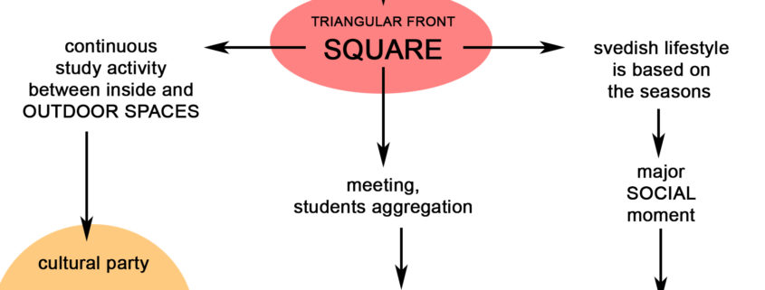
Before starting with the composition and lighting of the image I started doing research about the story of the university and the location. I try to understand more about Swedish culture and what the project can represent for the university students.

This help me to define a concept and find a story, a main theme to contextualize the building and make the final image more interesting.

For me the key element of the image is the small triangular square in front of the building, a social space directly connected with the faculty of architecture.

Tomorrow Challenge 2018 entry by User-21188106

In this first stage I focused on the analysis of the building from an architectural and material point of view.
The building is part of a historical urban context and the materials present highlight the dialectic between the traditional and the contemporary.
The first thing I did was start getting familiar with the building and all the surrounding elements.
To do this, I imagined that I was there and started walking around the building a little bit, finding several angles and perspectives that could help me to spot possible camera positions.
After that, I started to illuminate the scene through a basic hdri to try to highlight the shapes of the main building and the surrounding environment.

Tomorrow Challenge 2018 entry by User-68854530

Camera 2
Making a good architectural photos with normal lens (50mm) or any other theme photos for that matter, is always challenging. As in real life photography I always like to explore suitable viewpoints using this focal distance. This camera angle best shows urban context of central building without perspective and distance distortions with calm poise of ordinariness. It really accentuates that rotunda appearance. In this view whole building is central subject but somewhat flat without much third dimension. Depth is in distance from viewpoint to focal point.

Tomorrow Challenge 2018 entry by User-68854530

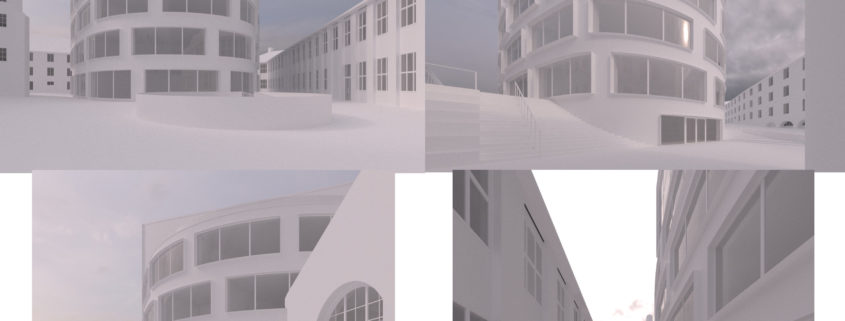
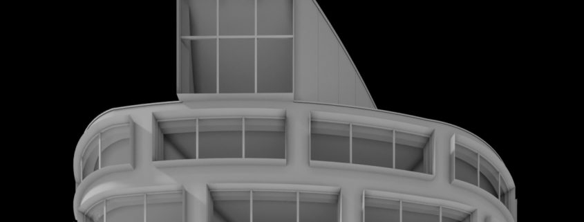
Being architect and visualizer at the same time I have developed habit of analyzing basic architectural qualities ( in this case the ones that are relevant for visualization) such as form, plasticity, transparency, ‘depth’ etc. as the first step. Just like using a scale model in architectural practice. I do that with simple AO and glass materials because transparency is important in this first step with addition of some directional light for more contrast and stronger shadows. I find this very helpful even if I don’t use any kind of direct light in the final scene. Any other lighting, materials, etc. are irrelevant in this step.
I will choose several potential camera viewpoints and I will discuss each one in more detail while establishing simple evaluating criteria.
Exploring around the scene I found out that almost every viewpoint provides better composition when using portrait orientation because of narrow space and rotunda like appearance of central theme building in perspective views. Because of general necessity to use wide angle whole building itself looks slimmer then it actually is. We can guess those are the qualities architects looked for while designing this structure in not so large square. I decided to use portrait orientation with classic photography aspect ratio of 5:4.
Camera 1
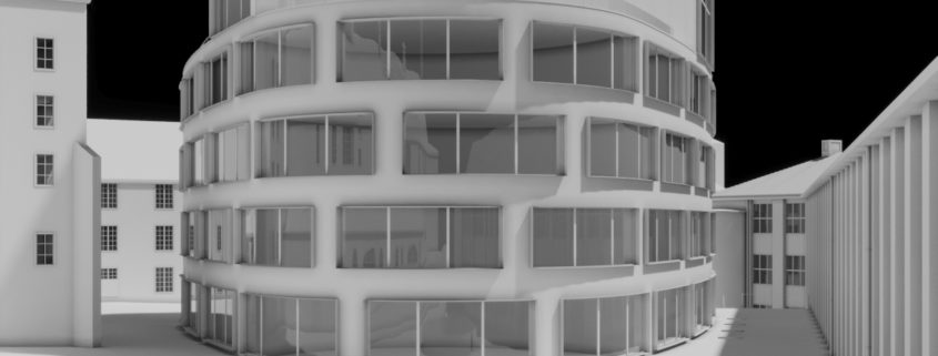
Using wide angle perpendicular to the facade of the building provides architectural elevation feel which in my experience us architects, designers and visualizers usually like but other clients not so much. This view especially emphasizes large windows and interior depth and provides us with insight of what is going on inside. Exterior have ‘layered depth’ feel and it looks like the whole building ate most of the public space available. Because of a very wide angle and too much distortion whole scene looks almost too much gimmicky.