Tomorrow Challenge 2018 entry by User-19501841

Hi all,

Good Day

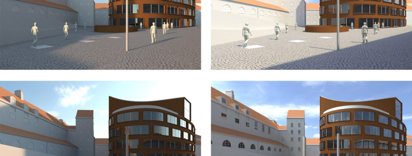
My concept is simple. My main source of light is V-Ray Sky and some V-Ray lights; I have tried various HDRIs, but settled to the default sky of V-Ray as of now.

I will try to create winter scene in a very simple manner, but natural and realistic.

It is a very rustic scene with lots of concrete, bricks and metal shaders; the corten steel shader is a tricky one.

Best of Luck

Tomorrow Challenge 2018 entry by User-92270532

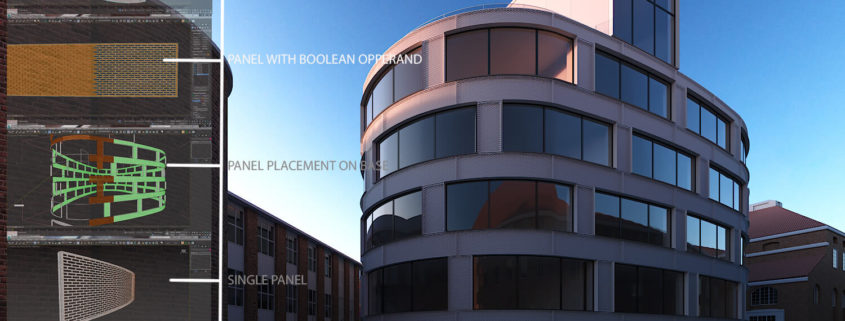
Given that the main part of my concept is to come up with the extra perforated cladding, i looked through various ways of archiving it. I looked through a couple of plugins that would help but i found that i had to go it on my own. Here below i shall take you through the (fun) process:

1. Corten Base: First i isolated the main facade base so that i could make divisions for the base corten panels that are already existing.

2. Second was to optimize on the Level of Detail(LOD) that would be perceived from the frame/shot that i’d preferred. So the whole building has about 250 panels, i took to work on only those that are visible in my view.

3. Since the building is curved i had to work on one panel at a time. I wanted the panels to also have some kind of frame that will receive the perforated sheets. So using Edit-Poly technique i created the frames for each panel and Detached the faces that are going to receive the holes in them.

4. I then created chamfered boxes and arranged them according to each panel (since the building is curved) in the “Running Bond” character that relates with the Brick environment buildings.

5. Using Boolean in Edit Poly mode, i made the subtractions for each panel.

6. I then rearranged them back to the main facade base.

Well, this was quite a tedious technique and maybe there’s a faster way to do it,hahahaha. (thank goodness for insomnia) ,)

Tomorrow Challenge 2018 entry by User-21188106

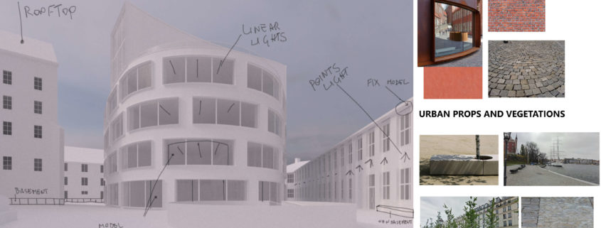
Before starting the modeling and texturing stage of the scene,
I have identified the possible camera position and based on this I have drawn a non-definitive draft of image plan.
This draft allows me to focus the attention mainly on the parts of geometry to be adjusted or added ex novo,
on the insertion of further artificial light sources, last but not least, spot the basic materials to be used.
At a later stage, the materials and further additional elements will be defined in detail that will help to give more realism to the scene.
The main idea is to preserve the material of the facade cladding.
In my opinion, corten steel generates a very interesting visual contrast because even if it is chromatically similar to red brick,
at the same time it translates well the relationship between the surrounding historical buildings and the contemporary building.
Based on this consideration, the building will be placed as the fulcrum of a story aimed at enhancing the material difference.

Tomorrow Challenge 2018 entry by User-14750014

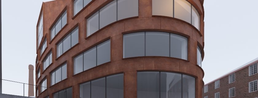
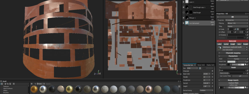
well, i think the most important and difficult part of this project is material of facade. i love to render everything in realistic ways and physical base, so i’m thinking about substance painter for creating material of facade because of power of procedural. so i had to fix few issue of modeling to be suitable for unwrap, and i did it again to be ready for import in substance.
and after import i did really simple test for the material and dirt.as i said this part is the most difficult section of this project so i have to do some test 🙂

Tomorrow Challenge 2018 entry by User-92270532

Looking at references off Archdaily i got a deeper appreciation of how the school was designed to have a more minimalistic and modern look and yet still have a relationship with the old built environment.
This relationship can be seen mainly in the cladding of the new school. The corten cladding relates to the brick buildings because of the rustic feel they both have. The placement of the corten cladding and the openings (Windows) of the new school are also arranged in the “Running Bond” fashion like the brick buildings.
I really love that relationship, however, in my opinion, i feel that the new school seems a little skinny (for a lack of better word) because of the depth of protrusions of the frames around the openings.
So my concept explores the “Running Bond” relationship while maintaining the original look. To do this, i thought i could add an extra layer of cladding with perforated corten sheets with a “Running Bond” character.
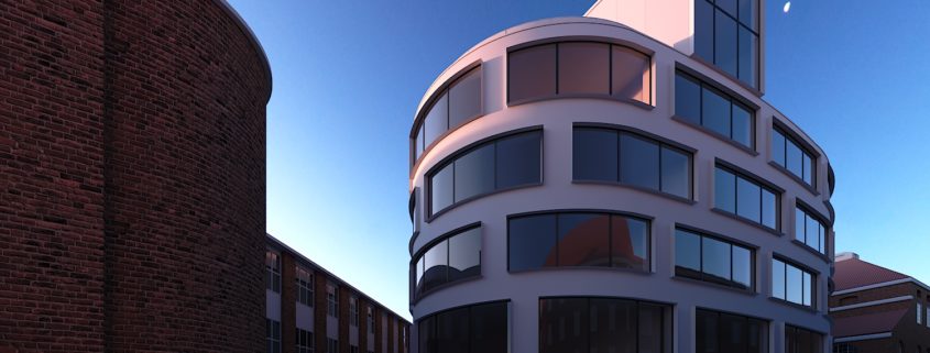
I’m also looking at showcasing this in a dusk scene environment with very soft shadows and a pink/ orange light highlighting one side of the building. I feel that the contrast between a clear deep blue sky and the deep red corten/perforated cladding will bring the project out more.
Further to compliment the lighting, i’m looking to have an achromatic contrast between the natural blue light with the warm artificial lighting in the buildings.
Normally i start of with the frame and lighting because it gives me more confidence when working on an image if i get them to my satisfaction. So here i share the framing, general lighting and mood that i’m going for.