Tomorrow Challenge 2018 entry by User-35204214

THE STATE OF THE ART: THE REFERENCES AND ENRICHING THE CONCEPT THROUGH THE TECHNIQUES

In order to solve my question about going beyond the composition, I started to think about the significance of the references and how they could help me build a complex image supported by the concept that I want to accomplish. I know that my references need to be of great importance, artists whose work have a great amount of detail that are thoughtfully and elaborately construct. It is important to think and analyze recognized artists because they already have a previous knowledge and they have researched the state of the art for creating their own pieces.
THE REFERENCES
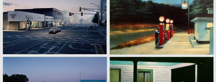
Gregory Crewdson is a recognized American photographer known for his “surreal formula, resulting in decidedly cinematic images reminiscent of the films of Steven Spielberg. These photographs have become increasingly spectacular and complex to produce, requiring dozens of assistants, Hollywood-style lighting, and specially crafted stage sets.”-(Guggenheim.org). I chose him as my main reference (Especially his work in Twilight: Photographs by Gregory Crewdson and Beneath the roses) because of his use of lightning that is not only creative, but it makes the particular subjects within the frame to stand out. He has total control over his composition being the light one of his main tools. Besides, even if the themes in his work are surrealistic, he manages to use the lightning in a natural and realistic way.
In addition, he uses photography as tableaux vivants to narrate. His pictures tell a story through a cinematic look in a single frame and his characters are well defined. He is an artist where every object, character, lightning and the composition has a reason to express an idea, an idea that is meaningful to him and that it creates meaning to the observers.
Another reference that I took into account is Edward Hopper (One of Crewdson’s references). “His vision of reality was a selective one, reflecting his own temperament in the empty cityscapes, landscapes, and isolated figures he chose to paint. His work demonstrates that realism is not merely a literal or photographic copying of what we see, but an interpretive rendering.” -(edwardhopper.net) I chose him because of his complex character development and story in a specific moment in place and time.
My references have in common that they use their own vision to show a moment that allows the observer to get involve with the image and interpret it. They all go beyond the composition and their images speak for themselves. They use refined techniques to convey meaning and sense. As Edward Hopper said: “Great art is the outward expression of an inner life of the artist, and this innerlife will result in his personal vision of the world.”

Tomorrow Challenge 2018 entry by User-21417289

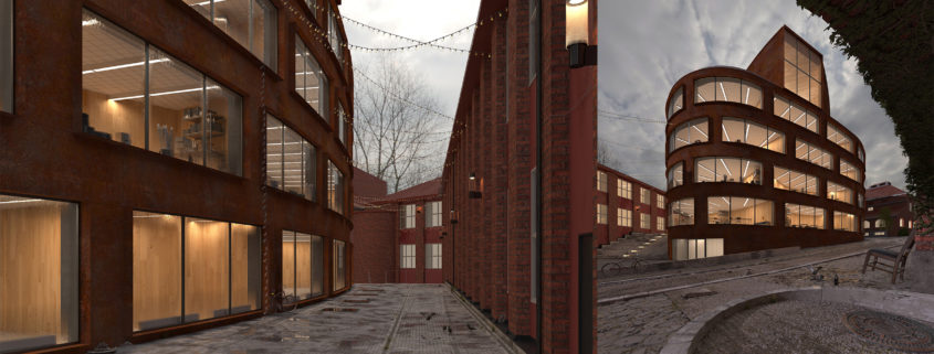
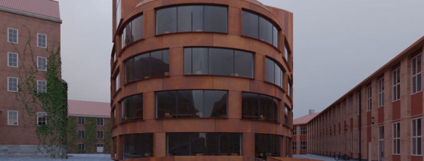
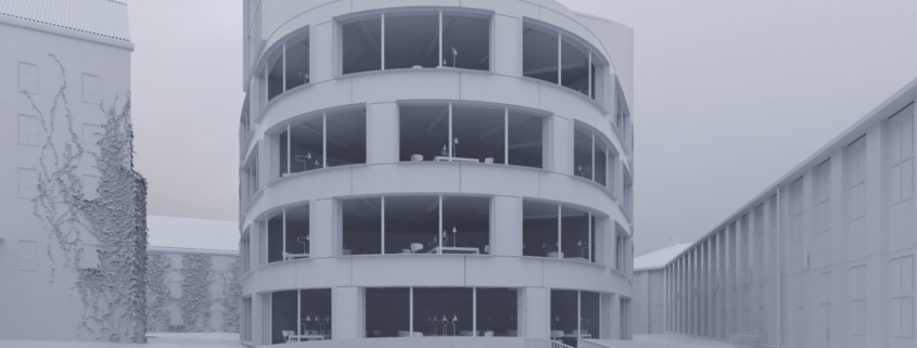
Here is the raw render of my two options with props added. Still going to do a few more adjustments before going to the last part: photoshop.

I still don’t know which one Im going for at the end – I wish we could submit more than one… I’m falling in love with both! So I have decided to finished both, submit one and keep the other for my portifolio. 🙂

Tomorrow Challenge 2018 entry by User-41925195

hello,
so finally I have found some free time to start working on this challenge.
Process and pipeline for this challenge started with loading up provided 3d model to check the asset and what has to be re-modeled, added or removed.
After assessing 3d model, I have started looking at reference material online to get more feeling and information regarding building and surroundings itself.
After getting familiar with subject itself, I went back to 3d asset and started exploring possible camera views and composition. At this stage I had 3 composition options and started dissecting each one into multiple layers; interest, focus on subject, complexity and geometry.
I was always interested in merging exterior and interior, if possible, or at very least bringing some exterior elements to interiors, and one of these options was giving me this possibility, and that is the view from courtyard and stairs location what I believe is the back side of the building.
Commercial buildings are interesting and so much different from housing and private houses, mostly because of the shear size and scale, also budget etc.
Building facade, in this case, is for a most part the same, material vise, and I felt that just showing full building in one shot would be visually poor and not so interesting.So, there is option to present main building,courtyard and part of the interior in the same shot/composition.
Most of archviz around tends to capture just one “side” of presented subject, but I find it somewhat boring and uninteresting, so I have decided to go different route, when for once that option is here.
Based on this decision and somewhat locked composition, I started looking for some similar references and grouping them in categories as
composition, lighting and overall mood.
Also I have decided to keep most of the original materials from real scene, but also change small details, like the courtyard pavement, as it feels cold and plain atm.

Also I want to bring some foliage and more nature feeling in the same area, so I will add one tree inside of the yard and compliment it with wood flooring meant for exterior. This way it will feel more warm, softer and more inviting.
For a lighting and mood I am going for a bright sunny day, with hard shadows casting on the exterior glass wall, also some interior lights will be visible as they are mostly on providing reading lights for students. Also I find the interior walls somewhat visually interesting so would be great to see them trough the glass walls.

After I am done with additional modeling and details, I will start working on textures and shaders, and for this will be using Substance painter -main building, and Vray for materials and rendering.
Hope to have time to finish this project.
Cheers
br
M.

Tomorrow Challenge 2018 entry by User-10352988

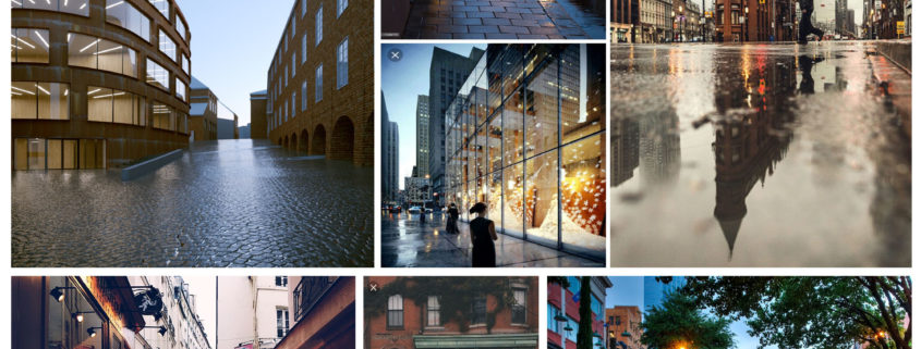
After picking up the camera angle I went ahead and started to look for some references for the mood and overall look of the image. I couldn’t resist doing an image post rain with a clear dusk sky, the way lights reflects on the wet pavement and concrete gives a interesting look to it. Also is possible to give a moody, a bit cozy, maybe a bit nostalgic feeling to it, playing with different light temperatures and tones.

I’m pleased with the camera angle, I think it has a sweet balance between the school and its surroundings. It was a bit tricky to find a different angle from the existing photos there’s no doubt these already catch the best angles of the building but of course there’s also a chance to tell a story, add features and life to the composition.