Tomorrow Challenge 2018 entry by User-25988898

So here is the progress I have made since the last update.
I changed the angle of the camera, as the previous angle seemed to me a little jammed and also I wanted to show more of what is going down the stairs.
Added some missing elements (sewage hatches, drains for water, chimneys, etc.), which in my opinion, greatly animated the picture.
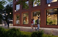
I hope this update will give you more insight into which direction I’m moving, although there’s still a lot of work on materials, elements of the exterior and interior.

Tomorrow Challenge 2018 entry by User-20985993

Hi, everyone! I start with searching for references and viewpoints. I think the last one is the most important thing in whole work because composition with lighting will make the first impression on the viewer. And as we know the first impression is the most important. Now I’m in process of making a decision between two viewpoints and creating a story. Good luck everybody!

Tomorrow Challenge 2018 entry by User-16180394

To me, the most powerful and effective images in architectural visualization are the ones that show the proposed building in the context in which it will be found once it is built. To show the architectural feats of a proposed building in an image is great, and will intrigue the viewer, but only if the building is placed somewhere familiar will the image be grounded in reality, making the viewer understand the context of the proposed building and believe that its construction is feasible.
Most of Tomorrow’s best images are great examples of nonexistent buildings being shown in an existing environment. One of the reasons why the aerial view of the Gateway Tower in Chicago is one of my favorite Arch Viz images is because although the angle is not the best to show the design of the building (it is not the best angle to show that the building leans toward the road at the base, for example), the context in which the building is found in the image instantly tells the viewer the significance of the proposed building. The viewer doesn’t need to be told anything verbally to understand the significance of this image and anyone familiar with Chicago will instantly get it. Same thing with the Hyperloop image. Nobody needs to be told that’s in Dubai. Anyone familiar with the Burj Khalifa knows it. This is the kind of images I want to create.
With that in mind, my concept is to create an image of the School of Architecture as if it hadn’t been built yet, as if we were proposing it to the community and I had to show anyone familiar with Stockholm and the KTH where the building would be found – what would be its context. I want to show how the shapely new building contrasts the existing angular ones, and how the weathered corten steel contrasts with the other buildings’ classic bricks and ivy-covered walls.

Tomorrow Challenge 2018 entry by User-76078368

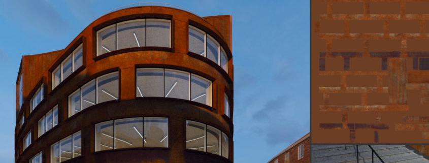
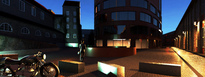
I am starting to refine the models and my lighting as per my final concept. I want the lighting to be dramatic but still feel natural. I have decided to use 3D scanned models that I have downloaded for free from the internet. As this will be an evening scene with lighting leaning on the dramatic side i felt the 3D people would work best as they will feel a lot more grounded because of all the lighting and reflections. The biggest challenge is to get all the materials to respond naturally to all the lights in the scene. I have unwraped the Corten plates on the building which i will paint the textures in photoshop. I have reversed my usual workflow for detailing a scene which is to detail, The Hero building first and the environment. In this case I am doing the enviroment first as i feel the building from the side i have chosen is simple enough to work on last as well as there is no client that needs to see their building in more detail during the process.Another challenge i have faced during this process is using free resources the i have found on the internet and re-purposing them for my project i.e the poeple, the motorcycle and textures which meant I have to be more creative with positioning of element and hiding of details without taking away from the main theme.

Tomorrow Challenge 2018 entry by User-76078368

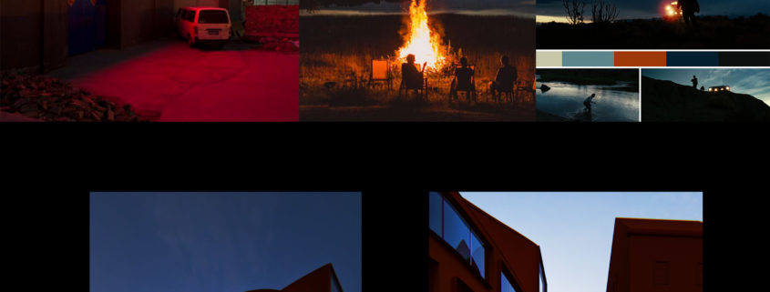
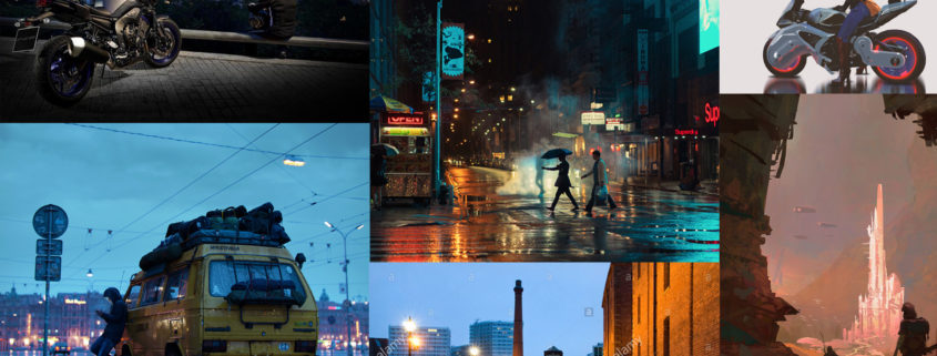
After some exploration fun. I have put together my final concept for the competition. It is centred around female bikers. My last post was about a box cart race. Going from there I decided motorcycles was more in keeping with the sort of vehicles i saw in many of the reference images of School of Architecture at the Royal Institute of Technology. I love the look of wet cobblestone paving at night. I don’t want it too wet but enough to get nice anisotropic Reflections. I draw inspiration from personal experience, real world photography, other 3D artists as well as concept artists. I was really inspired by “Her Eventual Hesitation” art work from Marek Denko.