Tomorrow Challenge 2018 entry by 2018 05 24 1015

Hi!

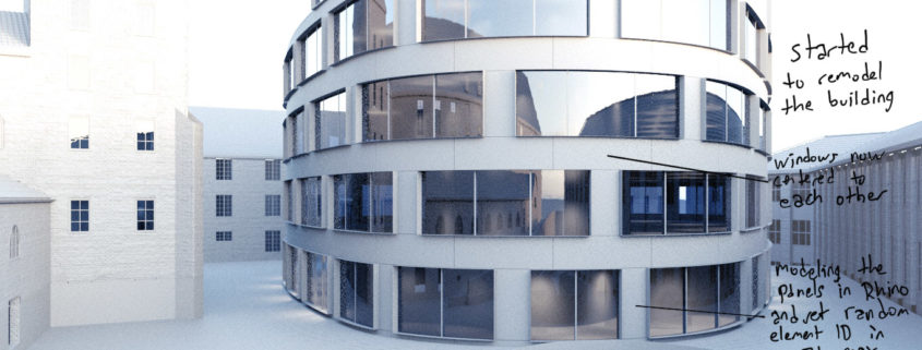
I started with study some reference photos and early on looking at the corten material of the building. I realized that I had to remodel it a bit so it looked and matched how it’s built.

I found some drawings online, and mainly focused on the centered zig zag composition of the building facade on second to fourth floor. Was a quite fast process and then I run the random element ID script to the facade. I will also combine it with some Vray Dirt to mask out different materials on the facade.

I did some modification of the exterior stair situation aswell from reference photos.

It’s a really fun and enjoyable competition!

Thanks!

Tomorrow Challenge 2018 entry by User-73529690

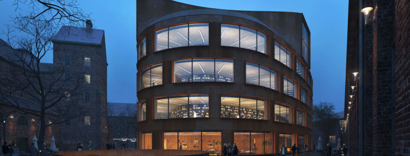
Since my last post I’ve slightly changed my camera direction. I like how this lines flow. Also I modified the stair and the railings. I used zbrush to add some details on the stair and on the pavement. I refined the building a bit.
I pinned the image with props for the interior (except books).
Next step I’ll show view vith shaders. I’m still fighting the main facade shader.

Tomorrow Challenge 2018 entry by User-39287284

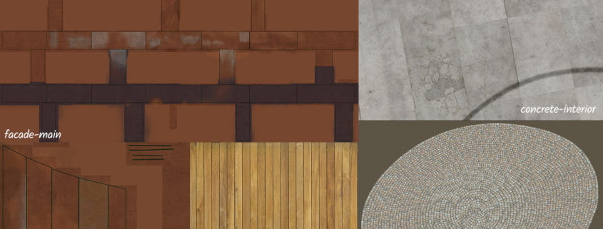
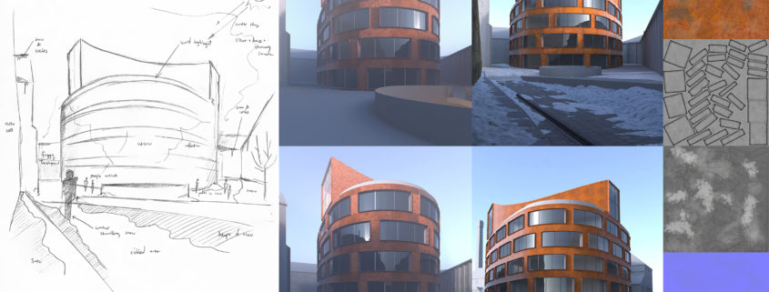
In this update I share the unwrapping work and diffuse maps of some of the main materials in my scene. I desired to match as close to present facade to challange my texture painting skills. I always like to add some deformed and weathered parts into the textures to gather more natural look. Then comes to create specular, normals and displacement maps as well but as they take a little time after having the diffuse maps so I didnt prefer to include in this update. More to come.

Tomorrow Challenge 2018 entry by User-63417399

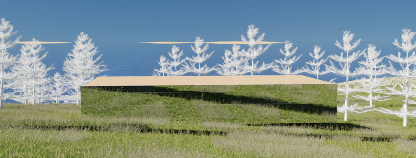
I have tried a few scenarios of presenting the building. First of all, the surrounding strongly reminded me of my one old alone walk in Bispebjerg, Copenhagen. It was a cold, hazy December night with snow slowly falling down and dimmed lights coming out of the windows. Somehow it made a strong impression on me and I wanted to translate this feeling into my rendering here. Thus, I knew I want to stay faithful to the surrounding buildings that inspired me, as well as the main building that is to be shown.

Basing on these initial guidelines, I put the scene in some testing. I noticed that the School of Architecture building looks much better from the distance than in the wide angle. That’s mostly due to the distortion of the curved facade in the closer perspectives as well as the absence of the most of the roof structure in them. Therefore, my decision regarding the camera placement was much easier. I had to exclude two viewpoints which seemed very interesting (ie. the one from the lower street with terrain stairs building some nice framing for the perspective and the one incorporating into its foreground the circular staircase on the square on the opposite side of the building) – they were too close and the building was too distorted in those angles. In the end, I chose the long shot that shows the entire building with the glimpses of its surroundings.

I tried some settings for the hazy night rendering (like in my initial impression) but they turned out to be distracting a viewer too much from the school building. Eventually, I ended up with some winter morning/noon mood. I had unwrapped the facade and painted the facades before doing all those aforementioned tests because I wanted its vivid hues to play the crucial role in the scene building.

Tomorrow Challenge 2018 entry by User-22308414

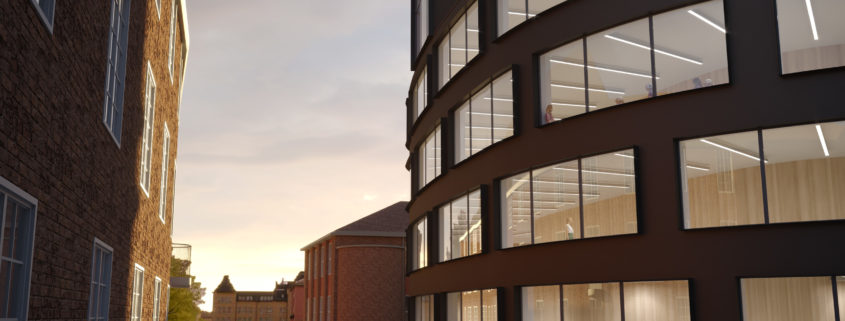
We have now modelled and textured the interior walls and placed the light tubes according to the reference images. For the outside we worked on the building surfaces and we put in an image as backdrop, depicting the plaza in the distant. We have also started to add people to create the mood of a summer evening with some people walking by and some still working on the inside.