Tomorrow Challenge 2018 entry by User-24012069

I spent a few hours for sketching one day, and finalized it the next day. It was like 8 hours in total.
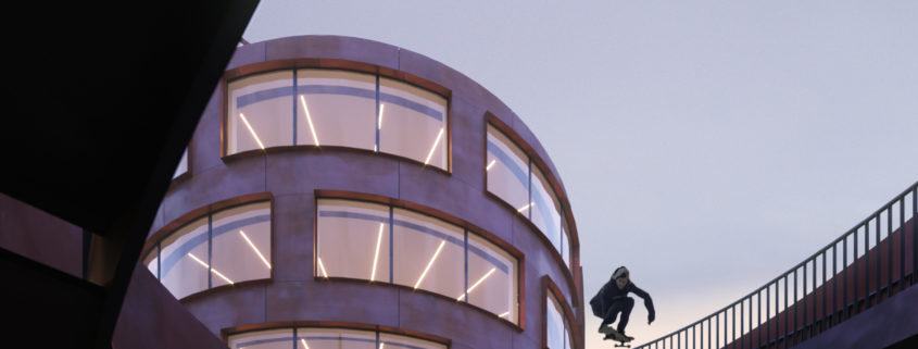
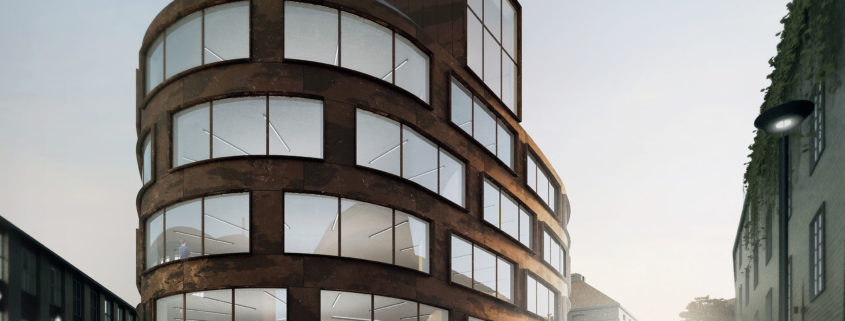
I didn’t know what to do in the beginning, so I was just rotating the model, looking for a good spot, then I found the stairs in the front (the one with the railing), and I thought “Oh I’d like to jump that”, so there came the idea for the skateboard image. I I placed a dozen cameras, but none of them worked, so I moved around and found this nice hole with the big drop, and tried to find the best composition here.
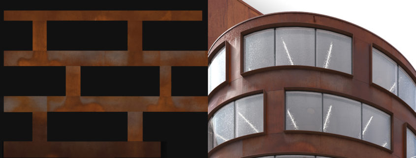
I really enjoy the sketching phase of my images, I quickly created a simple light setup with very basic materials, and jumped into PS to see if the image is working properly, and created a few variations for the sketch. The The next day, I got into modeling and shading. Obviously, the facade tiles were the biggest difficulty here. Curvy, tiled, corten steel is a nice combination for a little nightmare. There might be some better ways to do it, but I basically remodeled the curvy surface because I needed the individual panels for multitexture to divide a couple different corten steel plate textures.

Tomorrow Challenge 2018 entry by User-17480765

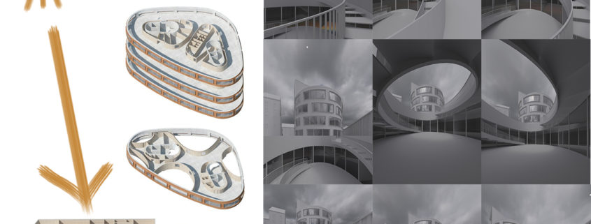
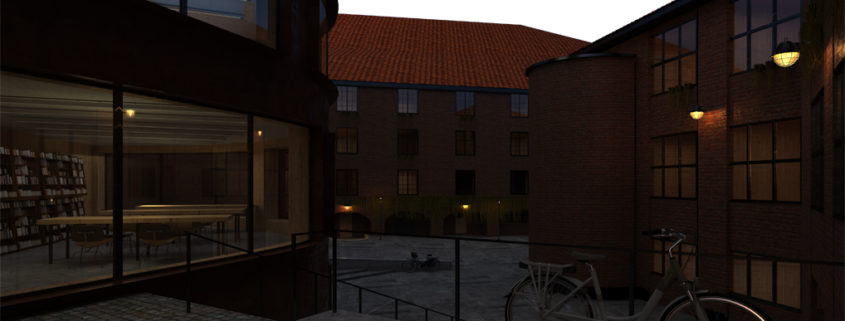
At the first moment, I spotted the courtyard under the street ground. I wanted to find a camera position, that somehow connects to the courtyard.
In the beggining I wanted to get to know to the geometry, so I shot the first whiterenders, without interior lights.
I was looking for positions where the curves of the fence and the stairs emphasize the building itself. I really enjoyed that searching, I post my favourites ones.

Tomorrow Challenge 2018 entry by User-28124750

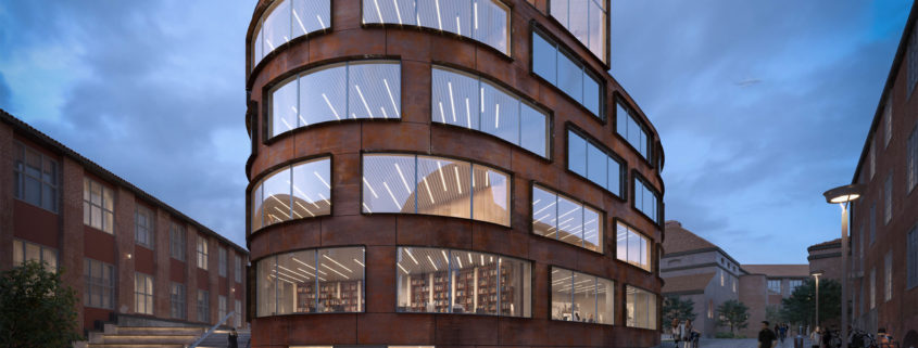
As an Architecture student, I wanted to depict the first lights of the day that every morning we see when we go to university. I’ve to say that in the first lights test I wanted to work with dusk and with stronger lights and shadows, but at the end, I decided to use another color palette that I think is more pleasant with site colors and the beautiful architecture of Tham and Videgard. The image wants to speak about student that every day work on projects together, they talk and share their personal and professional experiences, so in that image no one is alone.
Working on this project was really stimulant for me because I tried to push my skills to show the best that I can. Now I think is time to speak about workflow, I worked with Cinema 4D and Vray for the render, and with Photoshop for post and color grade. My work started with a cleaning and detailing phase where I decided to add some stuff to the model, I worked a lot on the panels because is one of the key elements of the project, I think that they determine the relationship with the surrounding site. After that, I worked on composition and shaders. The hardest part was to have a strong 3d work because wanted to try a combo of shaders with the Vray Blend material that I used for Corten facade and Cobblestone. I’m quite happy with the result, I think Ii have grown up a lot working on that competition!
As always i do i wanted to put a figure on the foreground that is related with the architecture that i’m visualizing, i think that she closes the perspective on the architecture.
Another important thing that I’ve to underline about that visualization is that I changed my mood and color working on the final image, I think that is not a bad point, just a good way to be self-critical.
In the end i’ve to say thank you to Ronenbekerman (That competition allows me to show for the first time my work) and Tomorrow for the great chance!

I hope u like my work, thank u.