Tomorrow Challenge 2018 entry by User-14412875

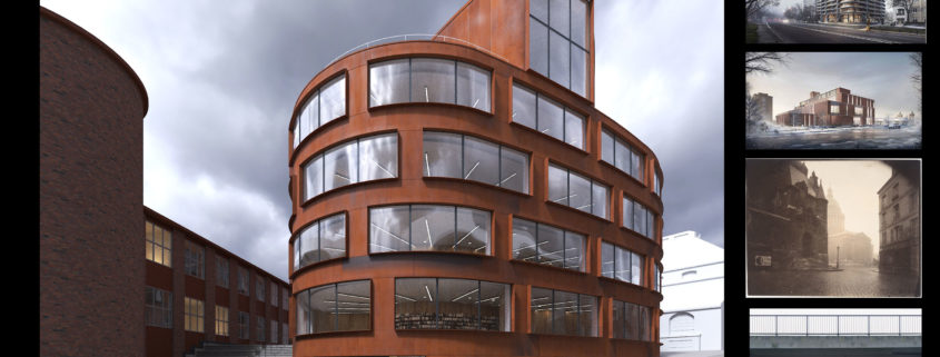
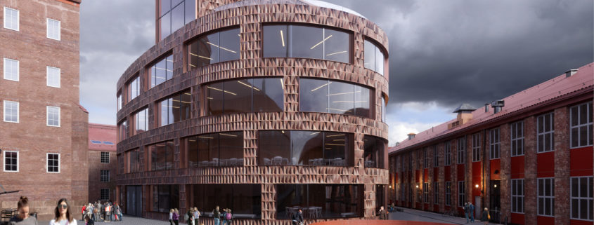
The cool impression of curved form and rusted panels of the building immediately drew a moody image in my mind. I decided to create an atmosphere depicting cold and humid day with hazy skies giving the urge to get inside as soon as possible.

So I picked an angle depicting the entrance side and the area in front of it. I decided to use HDRI for lighting, the one with desaturated cloudy skies. The light seeping through clouds will hit the front curve, emphasizing beautifully crafted form and intricate panel materials of the building.

Here I am showing some of the reference images and my angle.

Tomorrow Challenge 2018 entry by User-35204214

MODEL DETAILS AND COLLECTING PROPS

I’ve added some models of Evermotion to decorate the building, for example, you can observe inside the windows some objects like the lamps on the desks, the kevi chairs, some pots, purses, books, etc.

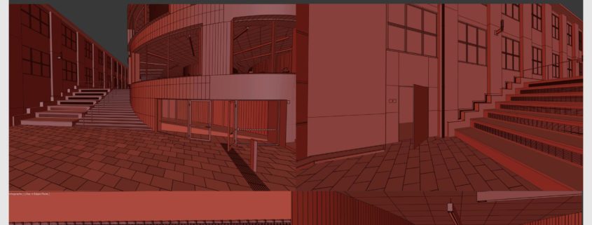
So that the model would look more similar to the reality, I added details on the stairs, I adjusted details on the entrance door, the tiles on the roofs, the sewer covers, I also modelled the floor outside with a floorgenerator. The lamp posts outside the building that can be seen in the reflections.

Inside the building, I added somethings that are important like the ceiling and the ceiling lamps, the wooden walls and some windows inside. Besides, I also modelled the blackouts.

Tomorrow Challenge 2018 entry by User-14750014

the first step of any project is serach about the project.position, access and needs. the second step is defining concept.
my concept is playing with light and shadow.
i think this building has a great potential for more design, i want to make it special so i decided to design something to be creative and at the same time have harmony with site. i could not maeuver so much on the facade because of windows, at last i decided to parametric design with a little bit parametric material.
i think its a good way to have both sides, harmony with the site(material)and make it more modern and special(parametric pattern).
for the modeling of pattern i used rhinoceros with paneling tools. i had to model the base geometry of building again to have great curves. after some trial and error, i could create pattern and array them on the facade, they are rotated randomly in 4 directions.
in 3ds max i fixed issues of ground model for unwrap. and export render of that into photoshop and created the texture base on site(found in google maps). there is another coat layer in 3ds max for the dirt with custom mask.
also i modeled some little objects for the roof and sites. most of them have dirt texture to be realistic.
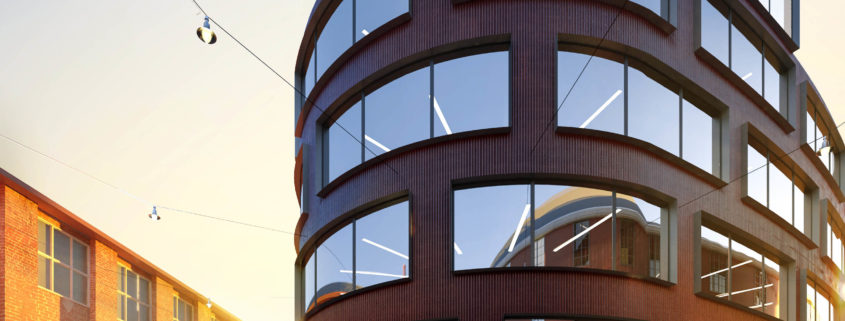
for the lighting i searched for more architectural images of sweden and i realized that the sun has a little soft shadow and its not to warm ( it was important for catching mood of final render )i tried to do render with soft sun shadow and cold feel.
for material i was loyal to the site feels. most of objects are layered material with one or two dirt layer like ground and walls.
i always use arnold in maya for automotive rendering and vray and corona in max for architectural projects, but this time i want to test a gpu render engine like redshift or fstorm. i choose fstorm and it was good enough for the final result.
in post production section,color correction is the most important part for me, i dont like to add little images to the render.only people are 2d images. in the office we create everything because of animation,and we use anima for people.

if i want to do this project again most of process will be same.maybe for the lighting i will change the mood and do dusk render.and also do people with anima for sure.

the difficult part of this project was design of facade and creating patterns base on exiting surface.specially straight surface.
after that adding people and have a good feel of communication between them.
some part of project need more time to be better like texturing but its not difficulty actually.
this challenge was a great experience.

Tomorrow Challenge 2018 entry by User-10463065

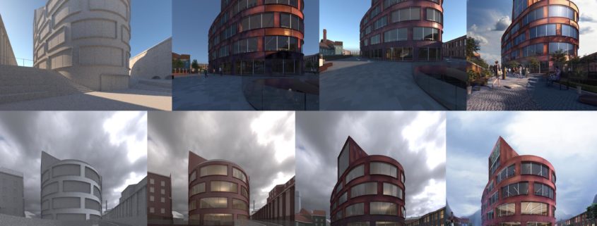
REGARDING THE LIGHT, I FOCUSED ON ENHANCING THE CURVES OF THE BUILDING AND ON HOW THEY ARCHITECTONICALLY RESOLVE THE CREATION OF THE CENTRAL SQUARE. THAT IS WHY I CHOSE THE LIGHT OF THE SUNRISE (WHICH IS HORIZONTAL) AND IT ENTERS FROM THE TWO STREETS WHICH ENCLOSE THE BUILDING.

AS FOR THE HISTORY OF THE IMAGE, I FOCUSED ON THE SQUARE. IT IS AN EARLY SUNDAY MORNING AND THERE IS A WOMAN WHO TAKES HER COAT OFF AND PLAYS WITH HER TWO DAUGHTERS IN THE PUDDLES CREATED BY THE CLEANING OPERATORS WHILE THE AUTOMATIC DOORS OPEN.

FINALLY, FOR THE INTERIOR, I CHOSE A SOFT LIGHT. ONLY THOSE LIGHTS WHICH ENHANCE THE CURVES OF THE BUILDING ARE STILL ON, AS IF THE BUILDING HAS JUST BEEN OPENED TO THE PUBLIC.

FURTHERMORE, I CARRIED OUT A POSTPRODUCTION STAGE FOCUSED ON KEEPING JUST FOUR MAIN COLOURS FOR THE ENTIRE SCENE IN ORDER TO ENSURE THE HARMONY OF THE COMPOSITION.