Tomorrow Challenge 2018 entry by User-10281381

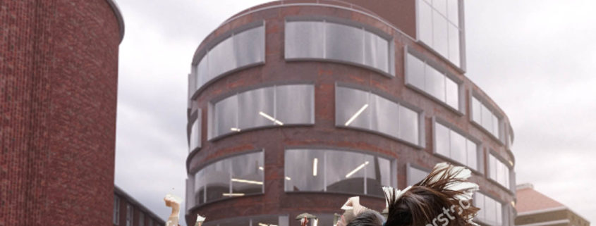
While searching for an idea and inspiration for the challenge I’ve came up to a decision, that cloudy reportage shot is what I miss in my regular archviz practice. In general, all the process went vice versa: instead of starting with light and composition, the first thing I’ve done, was search of an image with people, that could determine my further camera angle, light and mood. Next step was to pick up correct light, camera perspective, distortion values and gather all this into an interesting artistic reportage shot.

Tomorrow Challenge 2018 entry by User-16180394

Like I mentioned in my original concept post, my goal was to show the new architecture school building in its context, so it would be necessary to show some of the other existing KTH buildings too. I chose the camera position to be in a place where, even thought most of the image is not showing the main building, everything in the composition is pointing to it, forcing the viewer’s eyes and attention always to fall where it should be.

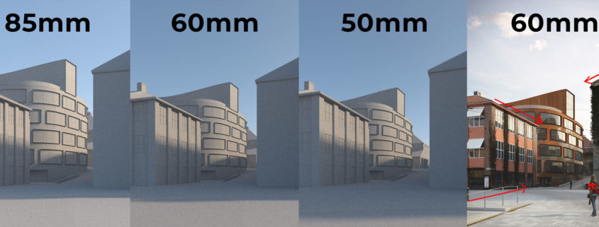
In the beginning I was thinking about placing the camera far away and using a lens like 85mm (on a full-frame camera) in order to compress the space between the buildings so the arch school building would look bigger in relation to the other buildings, even being farther back. As I was working on it though, I felt that at 85mm the image was looking flat and lacking dimension. Plus, a narrow FOV like 85mm is not very common in architectural photography, so a view this narrow wouldn’t help make the image look photoreal. At 50mm the vanishing/perspective lines started getting a little too extreme for me, so I decided to settle on 60mm.

Tomorrow Challenge 2018 entry by User-18744033

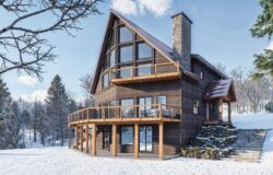
Architecture as a shelter.

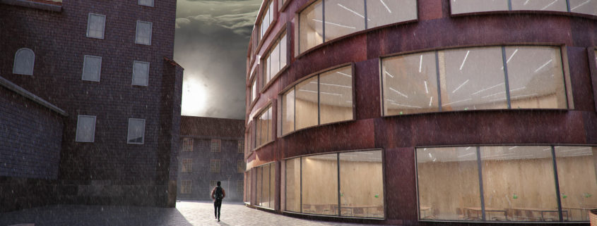
It’s winter time, and the storm is coming….. Architecture since day one has been source of shelter for humanity. It doesn’t matter how cold it us, always a good design contains and protect people from nature, specially in countries with hard winter like Sweden. The image reflects that issue using cold tones for exterior (blue and white), and warm tones for interior (red and orange), achieving an opposite situation, highlighting the building as a warm and comfortable space to use and live.

Tomorrow Challenge 2018 entry by User-16180394

I promised that I would do a complete writeup of my process before posting my final submission. So here we go.

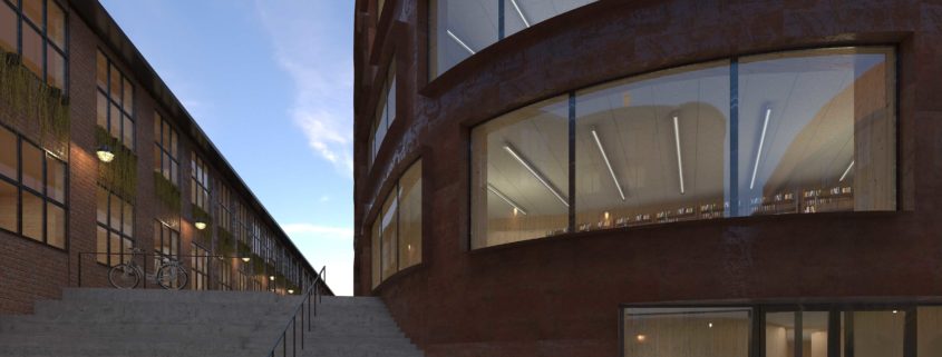
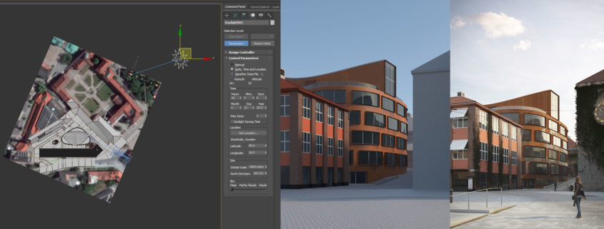
Since one of the only directions given was that the image should be natural and realistic (a point that I’ll come back to often), I thought it would be a good idea to start by studying the possible positions of the sun. To do that I used a satellite image from Google Maps as reference to find out where the building was pointed to, and then proceeded to use Max’s sun system to find out the position of the sun for Stockholm. I decided that the angle of the sun at 9 in the morning during summer would light and highlight the main building in an interesting way. Also, by positioning the camera close to the angle of incidence of the sun we would be able to see the more reflective parts of the corten steel that haven’t “rusted” out completely yet.

The final render had a V-Ray sun with an HDRI in a dome light. The V-Ray sun was set to a 5 size multiplier to simulate the light of the sun going through the early morning clouds/mist, effectively making the sun’s shadows softer. The HDRI was later added to give that “GI” feel. The sun in the HDRI was positioned in the same general direction as the V-Ray Sun. VRayEnvironmentFog was also used.

Tomorrow Challenge 2018 entry by User-52378255

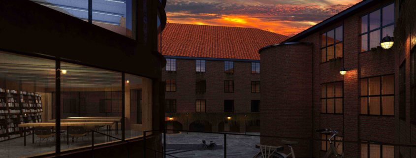
I’ve tried to take a look more bright and optimistic of a life in a university, but as I was working I realised that that’s the common ground, it looked like a stockphoto, and as a digital artist, my goal is to bring something else to it.
My process was more artistic than technical, I know the final image don’t show the whole of my thecnical habilities, but when someone try to show everything that they can do, they tend to overweight the image with, that’s what I tried to stay away.
In the end, my image ended being more like a DC Movie than a Marvel Movie, but (beside personal taste in that matter) I really liked the end result and I hope you like it to!