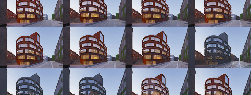
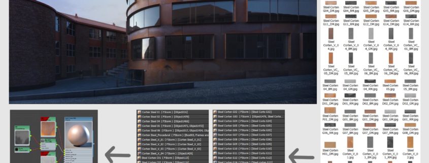
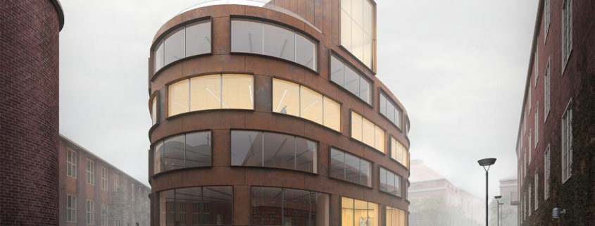
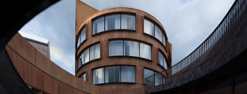
From the start I thought about making the material in a non-procedural way, so that I could capture the main characteristics of the building. I separated every piece of the geometry of the corten exterior, I divided them in a similar way taking into account the picture references. It was a challenge remodeling some parts of the building according to the plans so that it could be closer to reality, this included remodeling the structure distribution, the window frames, the glass for the windows and some inner walls that will be seen in the final frame. The next thing I did was to organize the pieces so that they wouldn’t look perfectly straight and lined up, for doing this inside 3DMAX I applied a noise modifier to each one of the pieces that I already had separated, that created the discrepancy between the pieces. I also applied a chamfer modifier with a small size in the piece so that the edges acquired some reflection.
Using the photographic references and the painting in photoshop, I painted, adjusted the color and the value of each one of the 40 panels approximately. When solving each one of the layers of the material, the diffuse layer, the reflectance base that is one of the most important and that showed values in the areas with more reflection of 0,2 in an approximate reflection index of the steel in outdoor conditions just like in the pictures. In its areas with less reflection and that are rusted the values were of 0,036 in a linear space. After solving the exact point of how much glossiness the material had, the values were of 0,4. Then, I painted many of the blended textures to create relief (BUMP). It was a big challenge painting all of this by using photoshop.
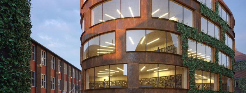
One of the main reasons I invested a lot of time in the material is because if you understand the material, you understand that under different light conditions it changes, its color changes and its reflections. Understanding the material gives you the possibility to illuminate without having to fake. Having a comprehension of the steel and reproduce it was a big challenge. Technically, the corten is a mixture of two materials. First, it is a steel that is a conductive, so its base reflectance is higher than a dielectric. In a second place, the rust that is a superficial layer in the material that protects it from the inner corrosion. Components like copper, chromium and nickel are the reason for its reddish color, which it can change its tonality according to how strong or weak is the rusting.
When finishing the material, I did some testing in different light conditions to verify that it would accomplish its initial purpose of being able to recreate a physically correct material that looked natural.


