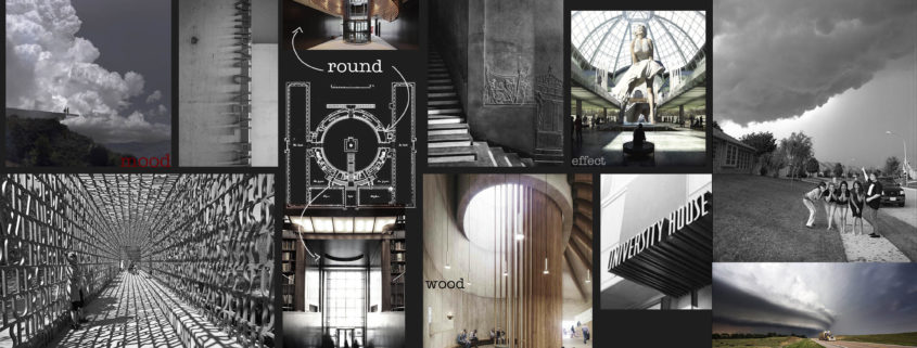
As an interior designer who works almost always with interiors, it was kind of difficult for me to find a concept that works due to different parameters that come in play like; how weather can change the perception of architecture or how to tell its relation with the environment while maintaining artistic aspect, etc.
After some thinking and research as I still continue modeling for props, I’ve finally decided on a simple, storyboard-like set of renders.
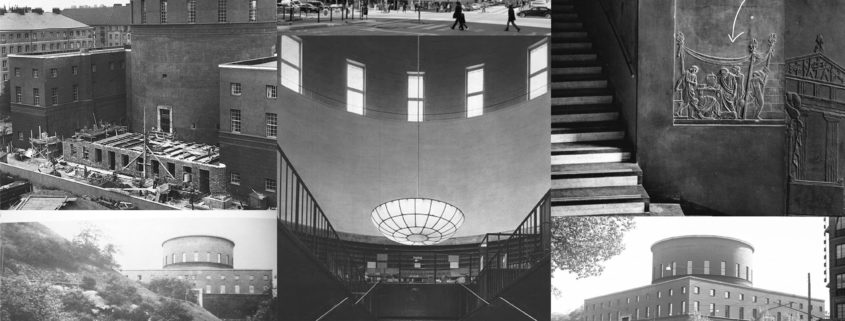
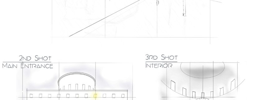
It starts with a scene from the park; it’s early in the morning, the weather is rainy and foggy, you see someone heading to library. The pool, rain puddles and wet pavement reflecting the building, adding many layers of complexity to the image. I also like the main road is still in the composition,
Second scene takes place at the intersection of the street and the main entrance. You see the same character again. I thought a neoclassical, symmetrical building needed a symmetrical shot and I placed it on the low angle.
The story ends in the main hall, again, very similar to the previous scene I used a symmetrical composition. But i have to confess I’m still unsure about this one. The problem is this kind of angle adds impact to general atmosphere but lacks details you would get with an angled shot including closer objects. There are some later-added furnishings in the center which, in my opinion, kills the mood. So i decided to remove them and put something else instead.
I presume the most time-consuming element of this project will be texturing and shading. I’ve been testing and planning to use Substance Painter/Designer for this purpose. There might be fair amount of particle simulation and sculpting involved. I don’t like to add people and stuff in post-production so human characters will be made in 3ds max too, but in a long shutter type of way, like many architectural photographers do.
That’s all for now.
Happy New Year ! See you in WIPs.


