A new and exciting challenge is about to begin! Tomorrow is back for the 3rd time and looking for their next star. The best submission will be awarded 1000 Euro cash prize and a well-paid full-time position at Tomorrow with benefits such as social welfare, exercise bonus, field-trips and most of all become a proud Tomorrow team member.

Tomorrow 2019 Challenge entry by Dmitry Kiselev

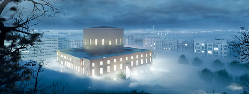
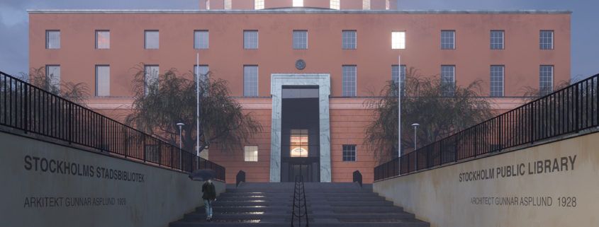
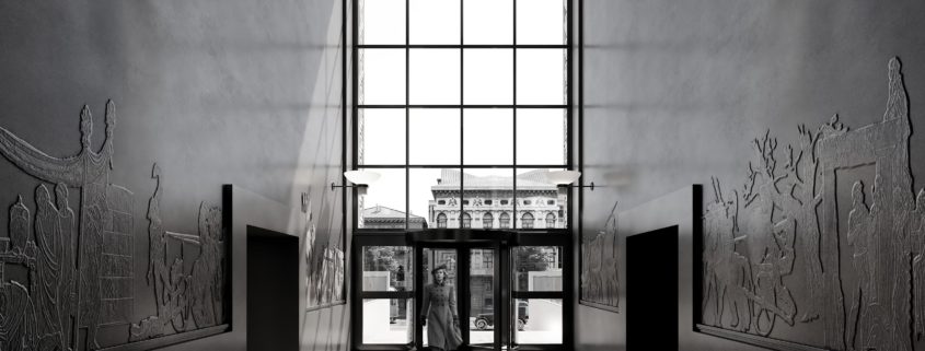
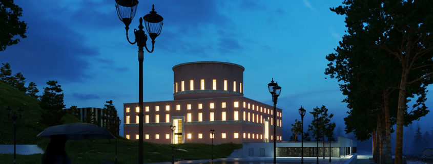
On this stage i have been working with some surroundings. To make the other city look like Stockholm i used OSM export function together with simple export from Grasshopper and Elk. Facades were modelled rather quickly. In general i had about 10 hours for updates, so thats what i did this time. Fog was animated and to make it more smooth and realistic i turned on the motion blur and used realistic exposure. I also used volumetrics for basic fog what greatly affected the time(also the testing time) but gave me the effect I needed. The moonlight that comes from the back Also some preliminary postproduction in PS applied. Going to add some vegetation, texturing surroundings and make a terrace with the Kentaur silhouette. I think i gonna finish it anyway in my free time.

Tomorrow 2019 Challenge entry by Tunahan Karaman

Hello !

All the textures you see in this render are made with Substance Painter / Substance Designer, or both. For some textures i started from scratch and for some used Substance Source materials and modified them to my liking. Unwrapping, exporting, importing, going back and forth from 3ds Max to Substance for every object just brings tons of workload (I’m not blaming the software, it is awesome and still pretty much the only way to achieve what i wanted). In the end, the raw render was kind of far from what i expected. So this is where i gave up. Having a full-time job, i realised i just can’t go back and do all the texturing again.

Still, i wanted to finish at least this one scene for my previous efforts. It is very simple : Hdri overcast lighting with a few other lights, 2-leveled environment fog, and a little post production work.

Anyways, thank you for the challenge and i wish good luck to everyone participating.

Tomorrow 2019 Challenge entry by hossein khanzadeh

Hello everyone 🙂
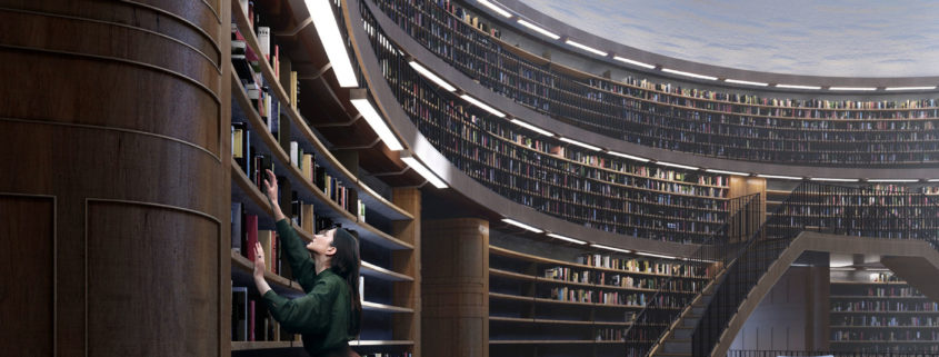
In my opinion, The absence of light in the city makes the enlighted library present as a point to invite people ! so i used to dark style and warm lighting.
First off , I used a single material to implement my desired custom lighting. Secondly, with taking a look at the reference photos, I came to realize that I should use dark spaces to make the competition subject ( Library ) dray attention with its lighting.
Moreover, In the interior space, I tried to use the contrast of light and shadow to have a soley dark or bright space.
One of the challenges that I face during the course of this process was the texuring and shadering of the library’s interior wall. I unwrapping !
Additionally, In 2nd render it was difficult for me to place the camera since the lawn was covering the lense, However I managed to get desired frame.
Finally , Thanks for the great opportunity you give to 3d artists to get noticed.

Tomorrow 2019 Challenge entry by Joel Hutton

Hi everyone, here are my final submissions for the competition. Feel free to leave me any comments, feedback, etc.

For this round of tertiary detail and texturing, I made heavy use of procedural dirt materials using Coronas AO node, as well as several techniques of layering materials with the Corona Layered Material. The people are all 2D and have been re-lit to match the scene lighting. All narrative elements are true to the concept board I posted earlier. Good luck to everyone!

Tomorrow 2019 Challenge entry by Ahmed Solis

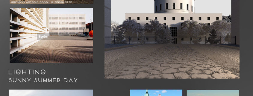
This infography explains the creative process behind the “summer day” picture one of my entries for the challenge. The one point perspective is a composition which can appeal to be simple but if handled correctly the results can astonish the public. I wanted to get far from the classic arch viz framing, composition and lighting, also for the color palette and saturation. Most of the framing was inspired by my personal gallery of “pueblos magicos” like San Miguel de Allende, classic colonial facades mostly flat looking so the best way to capture them is by a one point perspective picture.